NOTE: If you don’t want to read look at the attachments first.
Trading is full of little unpleasant surprises due to the confusing layout and lack of information in the UI, both for people attempting to play the market and your average player who wants to just sell/buy an item. For convenience I’m going to list the big issues along with some basic suggestions on how to fix them:
One thing before I begin:
The Black Lion Trading Co should take money out of your bank only for transactions and should deposit profits directly into your bank. This would allow for an easy bank transaction history page showing your balance over time as well as deposits and withdraws.
Listing fee for sales:
Many players aren’t aware they’re going to lose the listing fee because there’s nothing that strait up tells you. I’ve heard multiple people say they’ve lost gold this way.
Solution:
A warning in bright red text on the sell screen that says: “Warning: listing fee will not be returned on order cancel” or something to that effect.
The “My Transactions” tab:
-The items I’m buying and items I’m selling pages:
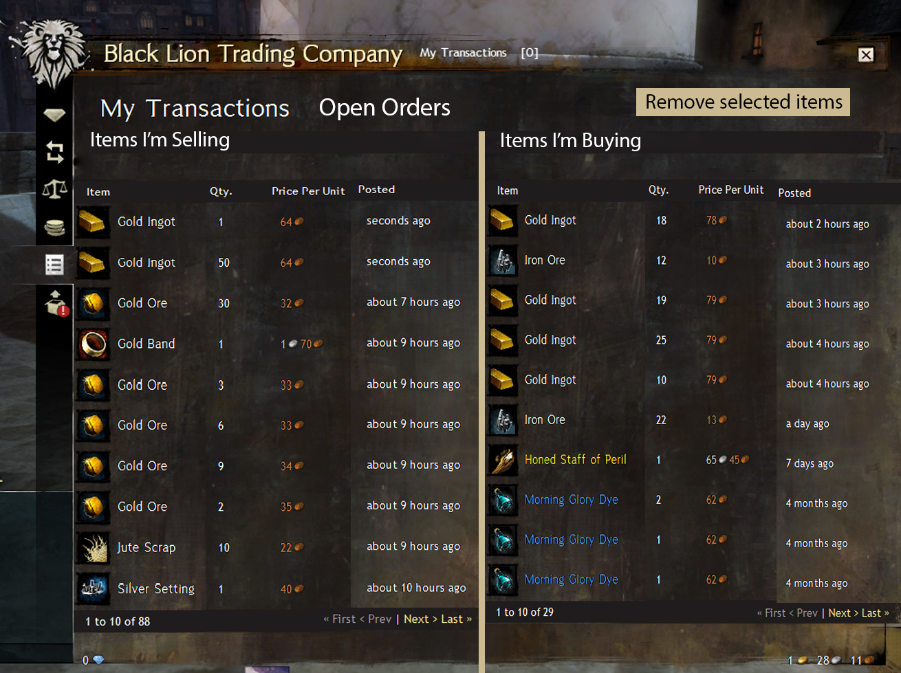
Not only is it really painful to have to switch between these pages to see everything you’re trading, but it’s also really easy to forget what page you’re on. If I’m buying and selling the same item and I want to cancel a buy order It’s very easy to accidentally cancel my sell order because I didn’t notice what page I was on.
Solution:
Make buy and sell orders appear on the same page. Divide the page vertically and in large bold text have one side labeled buy orders and the other labeled sell orders. At the top of each of these columns have totals for the amount of money in buy and sell orders.
Enabling modification of buy orders would be great, it’s a waste of time to have to remove some items and then go to a trading post to pick them up only to list them again.
The items I’ve sold/ items I’ve bought pages:
-These for me are the worst part of the UI due to a complete lack of information. You also have to spend lots of time looking between two pages for buys and sells.
Solution:
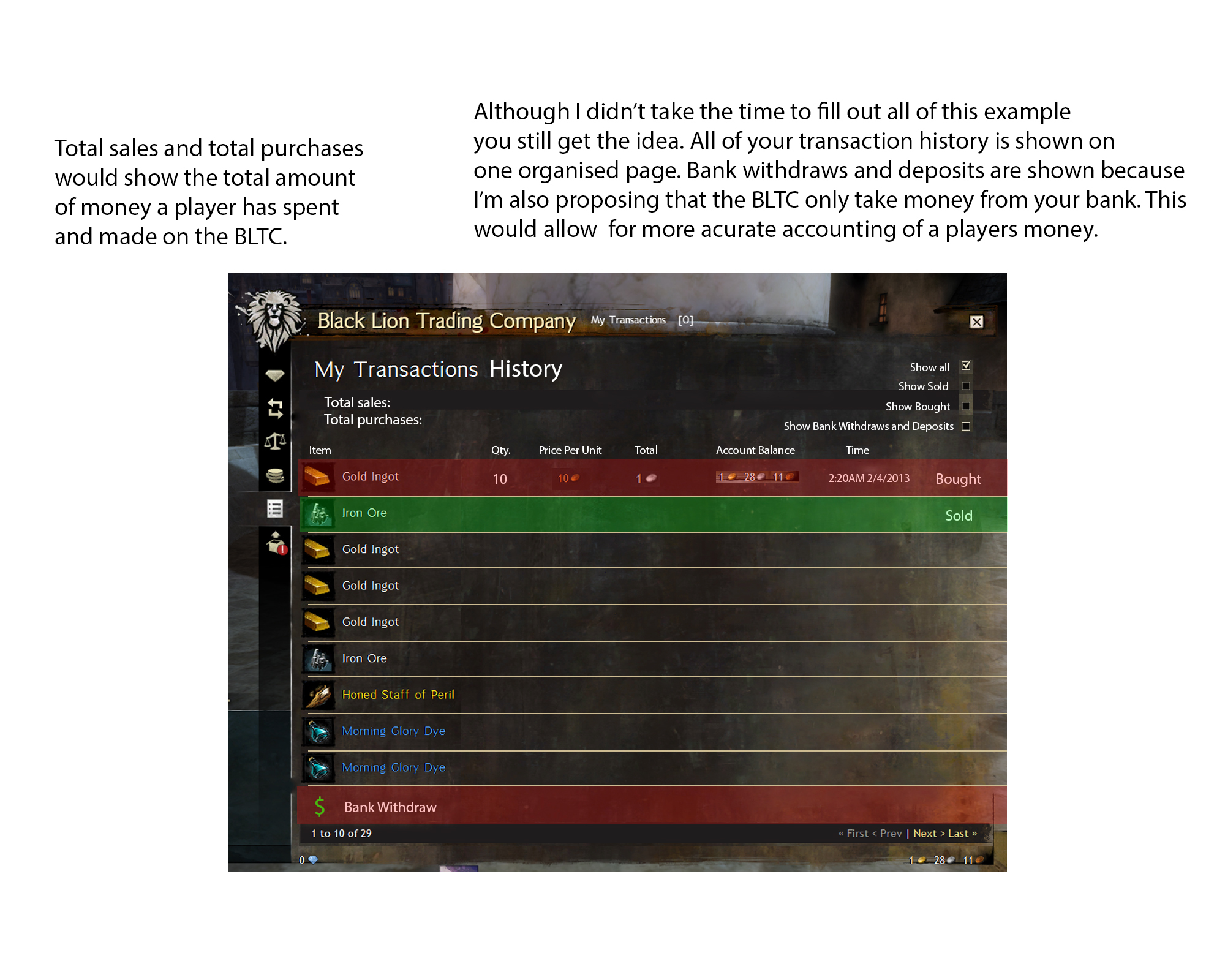
The pages should be combined in to one tab labeled “transaction history” This page should have all orders listed one after the other sorted my time. This transaction history would be the exact same one you would have through the bank. So there would be deposits and withdraws from your bank listed as well. The listings should look like this:
Exact time item was bought/sold-item name- Qty.-total cost-profit listed in red for cost and green for profit-price per unit-account balance at transaction.
This layout would make it easy for anyone to keep track of profits as well as what they’ve bought and sold all from one page.
The market pages for items:
-Right now there are two separate pages for buy and sell orders when you go onto the market to look for an item. This leads to tons of unnecessary clicking between these pages to see if it’s worth it to place a buy order or just buy from a seller.
-If you go back to the market to change your orders you have switch between the buy/sell orders windows for your transactions then go to the market buy/sell order windows and then back to your transactions window to remove the item and re-list it.
Solution:
Highlight your order prices in the market window and allow you to right click and modify them from there.


