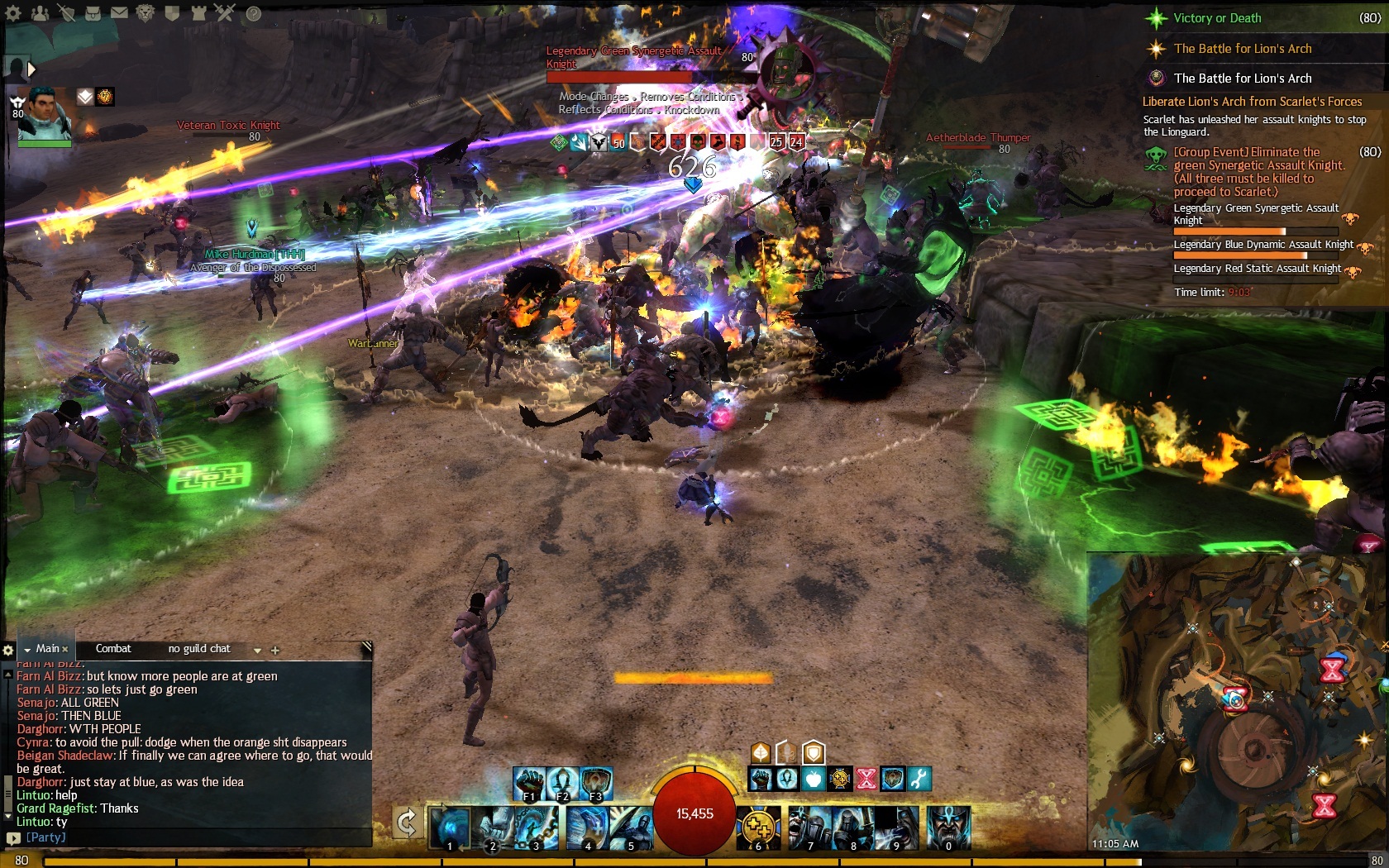
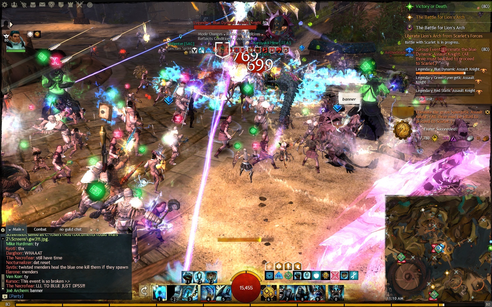
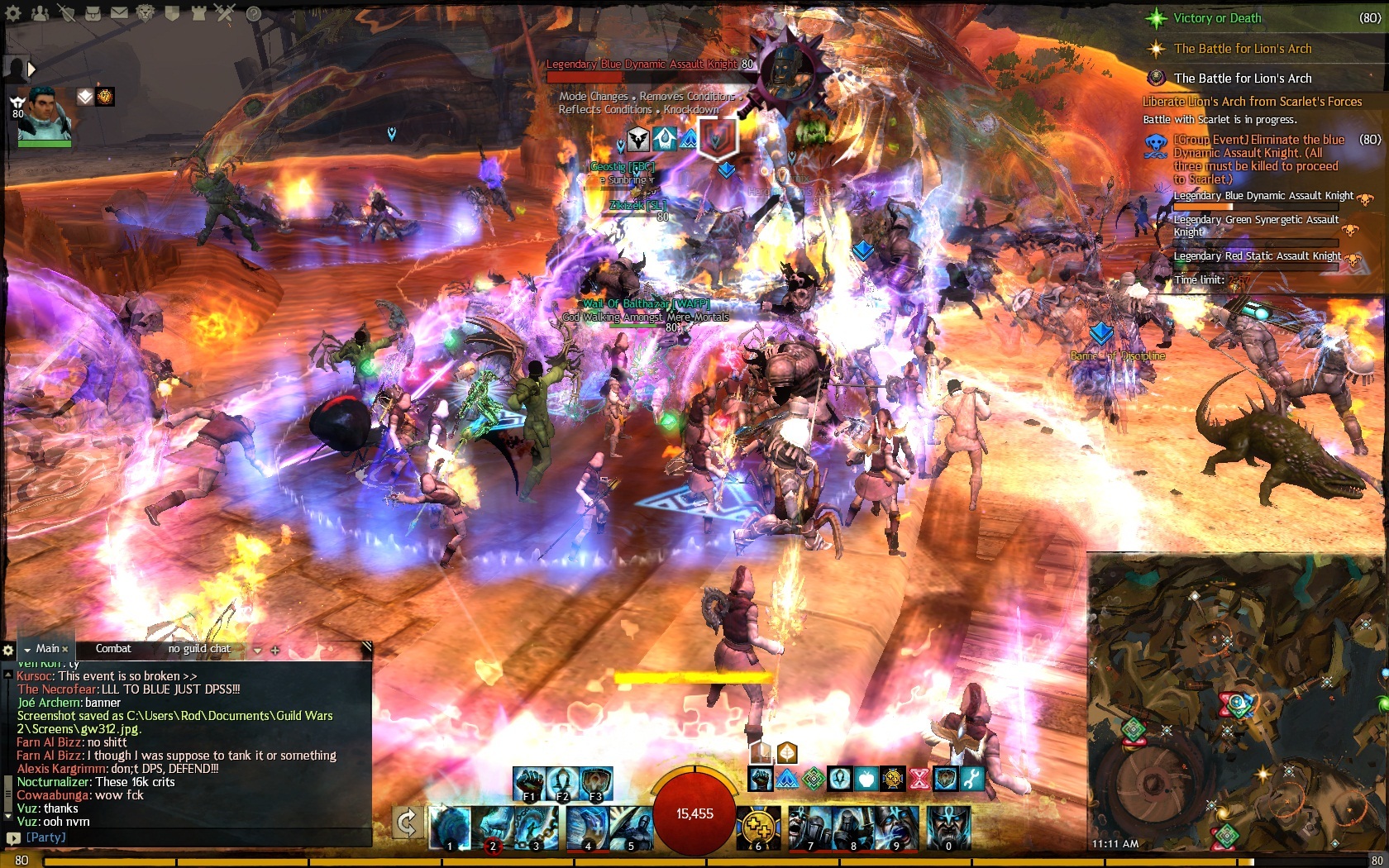
How to move target's hp bar somewhere else?
Agree. The hp bar specifically gives me trouble when watching the grawl shaman in fractals. My screen has is full of graphic flare like that too. How long do players have to complain about graphic flare?
This is something that has long bothered me.. especially in the grawl shaman fight in fractals as was just mentioned. ANet has made a game where it’s important to watch bosses’ animations.. then goes and covers them up with a healthbar and a plethora of particle effects. :P
+10000
I hate it there, try laying down Barrage on max distance, if you mouse over it forget about aiming, that AoE is gonna end up in your feet.
just tilt your camera sideways a bit so it’s not pointing right at the mob, problem solved!
Northern Shiverpeaks
just tilt your camera sideways a bit so it’s not pointing right at the mob, problem solved!
I have to do that for so many things in this game
should’nt have to do that. should have a more customizable UI
We have the option to switch to Simple Party UI, which gets rid of the head images for party members and compacts everything nicely.
This is exactly what we need for the mob info at the top-middle. I think it should still be at the top, but there is no reason to have the large image on the right like they do now. Without this image we would just have the boss name, HP bar, abilities list, and boon/buff/condition bar. This would take up significantly less space.
I am 100% behind this idea.
When fighting the new Knights bosses in LA I should not have to crane the camera way up to see the hammer animation so I know when to dodge.
This can’t be too hard of a fix.
alternatively: let players move the vertical position of where the camera focuses on. like let people focus it a foot above the characters head (instead of their waist), so you aren’t as inclined to angle it down like that just to see the enemy.
Mystic’s Gold Profiting Guide
Forge & more JSON recipes
yes that would be nice. I really just wish they let you move everything on the UI. I don’t know why i have to choose between chat log and combat log.
If they can’t fix the spell effects (at this point i really don’t think they are able to) i really wish they would add a “display target’s target” box. That way, even if i can’t see the mob, i’ll know when it’s looking at me or someone near me.
Yet another bad thing about this game. The UI is ugly and not customizable.
In WoW I have way, way more options.
I came from using wow for 3.5 years where everything is customizable, and while I appreciate that part of WoW, I enjoy not having to worry about it. That being said, the biggest boss I have fought so far was the FIRST dragon in the story mode. So I may eventually get annoyed by it.
I’d say that my biggest complaint is a lack of online access to my auctions/auction house. And a lack of any sort of character view outside of the game. This is ONE area that Blizz has ANet beat. Battle.net is awesome for those who cannot play all day but want to make some gold off of auctions.
Another area in which blizzard has them best is that actual gameplay is fun and rewarding rather than being designed to herd people into the gem shop.
Chadster and Dark,
Can we please stay on topic. Strong the censorship in this one is. Hope you understand me, just trying not to get topic locked or deleted before any answer is presented.
ty
If it would allow click-through it would be a huge boost for me. Give us giant monsters to fight and your camera forces us to stare at the ground… wtf? Not to mention the fact that you can’t actually tell where to lay your aoe since the monster ring is at it’s feet on the ground covered by zerg and effects.
In GW1 I had moved it from top center to right above my health bar so I could monitor both of them without eye strain. It’s a much more tactical location for it to be.
Just let us zoom out more. It won’t break the game in either PvE or PvP.
Then let us zoom in more to First-Person View so Charr and Norns can finally do jumping puzzles.
I can understand some of their reluctance on each of these things, but leaving the situation as it is for so long (don’t even get me started on “zoom jitter” or “camera pumping”) is frankly scandalous for a game of this popularity and caliber.
Always follow what is true.” — Sentry-skritt Bordekka
YES please! This has bothered me so much, especially bad if you’re fighting at 900+ range using ground targeting and even target selection gets blocked by the enemy display UI so much. I had completely rearranged my GW1 UI, why can’t we have this option in GW2?
I’ll second the idea that we need to be able to adjust the UI, or at least zoom out further and zoom in to first person.
Better zoom out/zoom in is not a balance issue. Why are we prevented from doing it?
delicate, brick-like subtlety.
Moveable UI elements should be MANDATORY for all MMO creators.
Everquest vanilla (Yeah, that long ago) had a fully moveable and even customizable user interface…
Better zoom out/zoom in is not a balance issue. Why are we prevented from doing it?
Actually it is. In wvwvw, you can’t use certain siege in certain places because the camera does not allow for your targeting reticule to be placed at certain spots.
Those who use the zoomhack stuff CAN do it for that reason alone. There is a balance issue involved in the zoom. Don’t get me wrong. I hate how close it is, but there is a balance issue to consider.
(edited by Kumu Honua.2751)
Definitely needs to change, Support.
yet another flaw GW1 never had any trouble with:
http://wiki.guildwars.com/wiki/User_interface
You can do it. Oh, wait. That was GW1.
GW1’s interface was practically 100% customizable. Why is GW2’s interface practically 0% customizable? In a sequel, shouldn’t the good features be kept and the bad removed?
Moveable UI elements should be MANDATORY for all MMO creators.
Everquest vanilla (Yeah, that long ago) had a fully moveable and even customizable user interface…
Better zoom out/zoom in is not a balance issue. Why are we prevented from doing it?
Actually it is. In wvwvw, you can’t use certain siege in certain places because the camera does not allow for your targeting reticule to be placed at certain spots.
Those who use the zoomhack stuff CAN do it for that reason alone. There is a balance issue involved in the zoom. Don’t get me wrong. I hate how close it is, but there is a balance issue to consider.
isn’t the balance issue you describe caused because only some people have zoomhack and others dont? How would it be a balance issue if everyone had access to the same level of zoom, same siege, same maps, etc.?
Turn the HUD off for now.
Turn the HUD off for now.
Absolutely no HUD during a boss fight?
…
Now, if we could right-click on elements and select to exclude certain ones from being hidden when the entire HUD is hidden (so we can selectively hide excess/problematic elements while keeping others visible) that would be nice.
Or have an “In Combat” and “Out of Combat” setting so certain elements we choose are automatically hidden when we enter combat.
| [Free Ports For All “Not So Secret” JP Needs (and 1st Try Dive Tips)] |
| [Classic Thread: “all is vain”] |
Having the ability to customize and move things around would be cool but what frustrates me is the blob of light on bosses, champs, etc and not being able to see them.
OMG the clutter! My eyes. After last night’s patch even the Hologram started to “explode” this orange light of fire. My eyes bleed.


