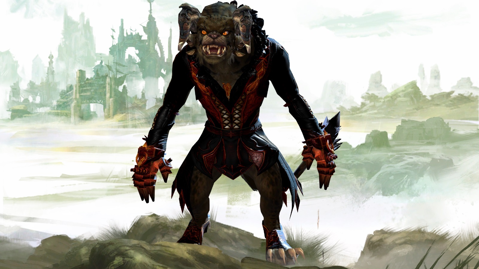
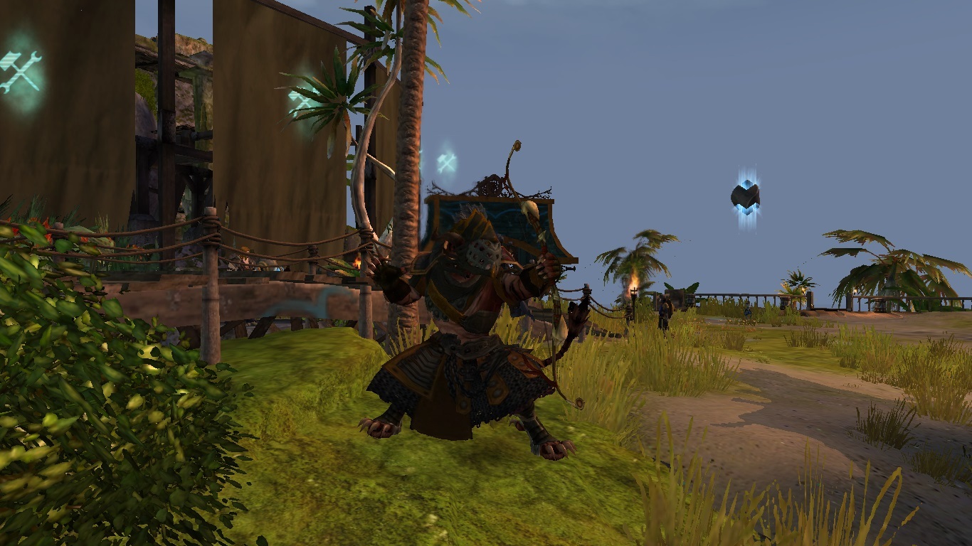
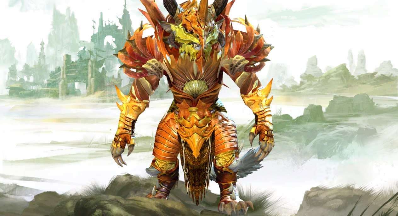
Rate the Charrmor (Charr Armor) above you!
@bigboss. 9/10. Love the colors and always love the T3. My only compliant is the actually coloring of your choice weapon. It’s purple, but you have no purple in your armor. Put a little purple in there even if it’s only 2 or 3 pieces and on the third color slot.
@Kiono. 7/10. You almost look like a Charr trying to be a human, but the coloring looks pretty good. Also as above with bigboss, you’re weapon doesn’t match the coloring of your armor. Put a little bit of yellow in there.
@Ehragus. 10/10. Solid choices all around. You look great mate.
http://imageshack.us/a/img706/8797/nx3m.png
SE shoulders, gauntlets, and boots with CoE chest and leg. Helmet is undecided.
Probably going to change the shoulder armor too since it clips with the upper neck area of the chest piece.
Hmm idk Doomfrost, not totally feeling it with the colors and the shoulders. It is far too bright and “clean” looking for Charr. Maybe if you changed the shoulders as you mentioned and went with some darker/neutral colors it would look better. What class are you though? That might give a bit more help to what you are going for.
Here is my necromancer. I am currently working on changing out the gloves for something other than the Flame Legion ones. Chest/pants are are also Flame Legion, but they are the best looking ones I have found, but I had the flaming tail graphic sigh
Definitely like your armor, has a dark look to it. Gets a 10 from me.
Anyways my armor supposed to be clean, my Charr is a clean freak even though he’s an engineer. ^^ I wanted “heavy” on the outside, but “light” inside as far as looks go. My dyes change periodically, but I like the sapphire color overall.
@DoomFrost 10/10, I like the clean and bright look ;D
@Takarazuka 8/10 given that it’s Charr light armor. Personally hate the massive Orrian shoulders though.
Armors in the past:
- Lvl 22 Karma Armor + Pirate Weapons
- TA Armor + Bifrost (you either go crazy on the armor to match Bifrost or not at all, I chose to go full kitten)
- HotW Armor + CoE Daggers
But since alot of charr are copying my TA look recently my newest outfit is:
- Vigil + Meteorlogicus/Zodiac Dagger
“GW2’s PvE is almost as bad as the PvP.”
Gentlecharr
Monocle + Aetherblade + Clockwork + t1 shoes
http://i.imgur.com/SsBcZpf.jpg
http://i.imgur.com/mrCqJ8g.jpg
http://i.imgur.com/dJRAnhi.jpg
i like this pirate
here is my ranger armor:
#1 PVE Commander EU
Desolation motto: Guests Go Home
Love the color choice! Interesting Armor set. First time I’ve seen that one around. I’ll give it a solid 7/10
Here’s my charr warrior Gorger. Really the only character that I play on. The dyes are Deep Glacial Teal and Celestial. Mixed set
I’d say it’s a 7/10
The job on your armor is ok, but the color scheme is not convincing.
It looks good because it doesn’t hurt, but it’s not something that gives you an hurray.
Guess what guys, my guardian is back in an upgraded look!
If you remember I had troubles finding a good looking pair of boots: well, I think I’ve found them
Order of whispers’ boots are good and balance the look, also the small belts are awesome on the t3 bands leggings.
And since last time I promised some nude pictures to show the color matching of the fur and hair too, here they are.
Colors on the armor are:
Icing for the white
Redemption for the yellow
Red for the red (XD)
Siena for the brown
Sky for the hair and eyes XD (this color matches his story, he had troubles with the Foefire :P).
The first 3 pictures show him in a lighter version of his armor (shoulders, gauntlets and helm off) for when he’s at rest or doesn’t need big protections (he enjoyed the Order of Whispers after all, he learned how to be sneaky… a little :P)
The last picture shows the armor with the celestial dye (IF I HAD IT!)
Broke as hell ç_ç, that’s why I tried to use cheap dyes (ah, get this economy!)
Since last time I left the blueish guardian look to embrace a more seraphic or majestic Guardian look.
Now if only they’d release eagle wings for back items
(edited by Syrpharon.7491)
9/10 my warrior shares the exact same dyes for the helm- and pants- and it gave me quite a lul.
Since theres that, here’s my thief with a couple combos since mediums are a bit trickier.
8 out 10
It’s nice but I don’t like the helm or boots personally
Mine is pretty much the cultural armor (t1 and t3). I didn’t use it for ages because I didn’t want to just use a set for creativitys sake and didn’t think it looked theify enough
Bought it on a whim and now I like it. I feel uncreative but meh whatever. It goes well with Rox’s quiver IMO.
Ironically despite the fact that I can’t use most the medium armor due to clipping and weapon floating getting on my nerves I’m more happy with this character appearance than my human mes.
Edit: hmm attachments are doing weird things
(edited by Demented Sheep.1642)
10/10
I always liked that coat. Also, bonus points for getting the rox quiver. Yay for realism!
My charr was intended to look emaciated, so it was a constant frustration for me that despite his slender frame, he had these BIG BROAD SHOULDERS that made him look buff. However, I finally found an outfit that downplays his shoulders and makes him look thin XD
@Weindrasi 8/10. I like your armor its very unique and I don’t see it much but I am not a huge fan of how skinny you’re. I guess thats what you are going for so I like it!
Here is my Charr warrior. My armor is T3 cultural armor. My dyes are Celestial, Ruby, and Redemptive. My goal was to match my Sunrise which wasn’t easy but I think I found something that matches decently.
Eric I like your dyes : 8/10
Here’s the armor on my charr guardian : mix of T3 cultural, primeval, braham and vigil. This is my only character so I’ve spent a lot of time on it; I use ancient silver as my main color with icing and silver for the details
I’m also adding my town clothes : top hats are cool!
Beyond The Wall [Crow]
WvW Havoc Leader
(edited by Grak Steelwall.1230)
I’d say it’s a 7/10
The job on your armor is ok, but the color scheme is not convincing.
It looks good because it doesn’t hurt, but it’s not something that gives you an hurray.Guess what guys, my guardian is back in an upgraded look!
If you remember I had troubles finding a good looking pair of boots: well, I think I’ve found themOrder of whispers’ boots are good and balance the look, also the small belts are awesome on the t3 bands leggings.
And since last time I promised some nude pictures to show the color matching of the fur and hair too, here they are.
Colors on the armor are:
Icing for the white
Redemption for the yellow
Red for the red (XD)
Siena for the brown
Sky for the hair and eyes XD (this color matches his story, he had troubles with the Foefire :P).The first 3 pictures show him in a lighter version of his armor (shoulders, gauntlets and helm off) for when he’s at rest or doesn’t need big protections (he enjoyed the Order of Whispers after all, he learned how to be sneaky… a little :P)
The last picture shows the armor with the celestial dye (IF I HAD IT!)
Broke as hell ç_ç, that’s why I tried to use cheap dyes (ah, get this economy!)
Since last time I left the blueish guardian look to embrace a more seraphic or majestic Guardian look.
Now if only they’d release eagle wings for back items
Heh you run almost the same setup I do aside from 3 pieces :P
@Grak 10/10
You have a very unique look with the mixture T3, Vigil, and Primeval/Braham. The colors of your armor too compliment your fur color.
As already posted bellow, pics of my Two guardians and my warrior. The Orange one is a Ex-Flame Solider Redgen Furyblaze.The Grey furred one is Reth Grimrazor, he’s a priory Charr(White and Red are his Warband colors). The last one is Lerious Warhowl, He’s a Lionguard Charr :P
Redgen Furyblaze – Charr Guardian – [SHD]Shade Warband – Tarnished Coast
Lerious Warhowl – Charr Warrior – [SHD] Shade Warband – Tarnished Coast
(edited by Lucentfir.7430)
7/10 – decent
4/10 – the abs and colors on the chest piece really weird me out
10/10 – excellent armor choice for this one, only way i could see to improve this one would be to use a more vivid yellow for contrast
——————————————————————-
Here’s my mesmer. Did a bit of a mix and match with the cultural sets and vigil armor. Oh, and I like fire and lava and flaming swords.
8/10 It’s hard to get cloth to look nice on a charr in my opinion! So good job. I’m not a big fan of the colors, but otherwise nice looking charr.
Here is Mar I used Mithril dye and Orange Cream dye. It’s a mix of CoF, the exotic karma set, and the dragon set, with cultural tier 2 helm.
Alltho I’m a big fan of mix and matching I’m not really sure about yours. Especially not the orange cream dye, hehe. I would go with something that matches your weapons a little bit more. But since you mixed and matched in the first place, i’ll give you a 6/10!
Here’s my beast. Adjusted him a bit since my last post.
And thank you Lonewolf Kai for the previous rating!
(edited by Ehragus.5843)
8/10
You got that creepy likes dead things look going on. I tried for the more of a angelic warrior of awesomeness! bahahaha!
(edited by ActionCat.4162)
Ehragus – Shadow armor looks pretty good, and it looks great on your charr. I’m surprised you didn’t wind up using the shoulders and gloves – they don’t look that awful.
ActionCat – you’ve got lots of glowing parts. The wings go well with the weapons – it’s a shame that you can’t dye the radiant glow to match, but it works well with the shield.
Still loving the heritage set – replaced some of the dyes and the gloves/boots, but the helmet’s been a tough one. I figured that masks were the way to go if you didn’t want half your facial options cut out – only problem is, any that have come since release float about an inch above your face, and cover up the eyes. Oh well.
(edited by Sharkey.9805)
I know.. i wish they made a dye that gave the glow effect to armor pieces. ..course then you would have 1000 toons running around with so much bloom effects it would blind everyone! It would make it complete though! Something else i noticed was how shoulder items when you color them with dye it is different than other armor pieces, i had the nightmare shoulders and they never colored the same as the other pieces of gear, so i got the cultural tier 3 ones and they worked even better!
Sharkey.9805 I’ll give your charr a 7.5. it seems like you’re going for a gentlemen type of look for your charr. Maybe it’s me but it’s something disconcerting about a charr in traditional human attire.
Here is my charr warrior “Draken Kingsroar”. He has a mix of cultural armors teirs 1, 2, 3, along with Jade weapons and Rox’s quiver. He’s primary color is orange shade with emerald green for secondary.
(edited by Thesiuss.2679)
I give your charr 9.5 – he looks very impressive and harmonious)))
her is my charr (mix of Flame Legion, dredge armor and hellfire):
(edited by Morigath.6783)
I give your charr 9.5 – he looks very impressive and harmonious)))
her is my charr (mix of Flame Legion, dredge armor and hellfire):
I think your attachment got accidentally removed, because I can’t see anything to vote on :/
This is my new look that I put together last night. Saving up for the tier 3 helmet and shoulders, but this will have to do for now.
(Tier 1 boots and gloves, tier 2 pants, Order of Whispers chest piece, and twisted watchwork shoulders from the clockwork chaos living story stuff.)
I rate the Charr armor above me with a 10. I really like the way the shoulder looks, surprised to see someone pull that off well XD. I also think the weapon goes right along with it, very nice.
_________________________________________________________
This is my main, she’s an Elementalist named Sleep Elemental. The name came from my narcoleptic episodes that were going on at the time of her creation…
I tried to stick with a blue pallet adding hints of yellow and some glowing white to give a sleepy good dreams feel. I was very excited when they added the new zodiac weapons, I think it really adds to her overall look.
(edited by BlueSoda.6297)
This is my char, a warrior named Khalar Bladestorm
This is my char, a warrior named Khalar Bladestorm
Similar color scheme to my Guardian. What dyes are you using so I know what to look for. I like your darker greys and the deep red.
fans hate Joffrey. They hate her the way Star Wars
fans hate Jar Jar Binks.”-not a direct quote, but still true.
This is my char, a warrior named Khalar Bladestorm
Similar color scheme to my Guardian. What dyes are you using so I know what to look for. I like your darker greys and the deep red.
haha well i use Abyss dye and Wrath dye
This one is my Elder Flame Legion Shaman(Elementalist). I tried to make everything fit within it’s theme
@king 6/10
Colors are nice, though the armor set is somewhat over used/See it all the time.
Redgen Furyblaze – Charr Guardian – [SHD]Shade Warband – Tarnished Coast
Lerious Warhowl – Charr Warrior – [SHD] Shade Warband – Tarnished Coast
@lucentfir i give it a 7.5/10 great combination of colors but the chest i think is a bit plain but all around its good
 here’s my first pic of my charrior
 Glaucus Aurum
(edited by cobski.6548)
@lucentfir i give it a 7.5/10 great combination of colors but the chest i think is a bit plain
but all around its good
here’s my first pic of my charrior
Glaucus Aurum
Yea Plain chest is the best, if i went with something too flashy then it would have taken away from the whole outfit :P also Flame Shaman, needs to have a more old Shamanny look to retain the theme.
Redgen Furyblaze – Charr Guardian – [SHD]Shade Warband – Tarnished Coast
Lerious Warhowl – Charr Warrior – [SHD] Shade Warband – Tarnished Coast
7/10 I like the armor above. Some really creative ideas here! This is mine! Went for the Gladium Looted look.
8/10 or 9/10, I can’t really decide because you chose a “cool screenshot” which sadly means that the armour is not quite as recognizable as I’d like it to be :P It definitely looks good, I just can’t tell how good exactly.
Here’s my charrmancer, I tried to give him a battle ready medium armour look (he’s ash legion and fights with axe/dagger a lot).
[Neutral log-in screenshot and another action shot]
7/10
I like the colours, and it’s nice to see a caster forgoing the robes. Does end up looking a little top heavy I think, but that’s just because we don’t have many pants options. =P
Here’s my ele’s outfit I finally got around to putting together a couple days ago.
Northern Shiverpeaks ~ [dO] Drop Otter
6.5 Needs something to break Chest/Legs to the Fur colour/
This is my Chemical Support Guardian. Wanted to NOT look like a support guardian, and the then the Slick back pack came out. So went for a Chemical/Industrial look
SE – Helm/Chest/Shoulders
AC – Gloves
Karma – Boots
T2 – Legs
Slickpack back
Charr T2 mace + T3 Sheild
Starter colours – Jalapeno and Ebony
(edited by Ajaxx.3157)
Really nice. Not only do you have the steampunk soldier theme going, but you colour-coordinated it well too. 9/10
As for mine, it’s a new elementalist I made in light of the new hairstyles. I’ve taken the obvious Beast from Beauty and the Beast look. Only took 1 hair style and 2 total makeovers to get the clipping minimal 
Style basically only consists out of Ascalonian clergy vest and pants, with some low level basic boots. As you can tell, I’ve taken the least menacing route, trying to make a calm, serene and majestic lion.
6.5 Needs something to break Chest/Legs to the Fur colour/
This is my Chemical Support Guardian. Wanted to NOT look like a support guardian, and the then the Slick back pack came out. So went for a Chemical/Industrial look
SE – Helm/Chest/Shoulders
AC – Gloves
Karma – Boots
T2 – Legs
Slickpack backCharr T2 mace + T3 Sheild
Starter colours – Jalapeno and Ebony
Is it supposed to look like a cow????
Its a Actually a Tauren from WoW, that hacked into gw2
Really nice. Not only do you have the steampunk soldier theme going, but you colour-coordinated it well too. 9/10
As for mine, it’s a new elementalist I made in light of the new hairstyles. I’ve taken the obvious Beast from Beauty and the Beast look. Only took 1 hair style and 2 total makeovers to get the clipping minimal
Style basically only consists out of Ascalonian clergy vest and pants, with some low level basic boots. As you can tell, I’ve taken the least menacing route, trying to make a calm, serene and majestic lion.
You certainly look like nobility xD
“Knowledge” as “Truth”…
They are sheep ruled by fear…
Who can say no to a charr who looks like the Beast? I think I’ll give it a 10. XD
And here is my main, Flame Shaman who goes for a robey look. Should speak for itself!
And revive Baelfire.
ohh and ratchet ill give you a 9/10 for the set. You made your charr look sick also not just the armor
@Reinkarnated – Awesome
Your Charr looks really nice 9/10
Here is my Engineer
Which dyes are those? That brown is really nice, I’ve looking for something like that but didn’t manage to find it.
This is my charr, Gavvar Shadefrost (in the middle) and Lammergeier (to my right) and Krom Shaderend (to my left). The 3 of us love the Vigil Armor set a lot and have mixed and matched with it to get a great set. Me personally, it took me ages before I found it and when I got the right armor set and dye scheme I was really proud of it. I could wear it for a long, long time.
That was what I said before a patch around 2 months ago, about a week after I made the set when uh…that happened.
(edited by Rainwhisker.4603)
Sorry I can’t quite see enough of the armor in the above screenshot to rate it. But you all get a 10/10 for pose coordination!
Here is my Engineer:
10/10, I really like that mask and the combination fits well.
Here is mine, full Order of Whispers light armor dyed with Abyss and Gold. Plus the OoW Greatsword.
