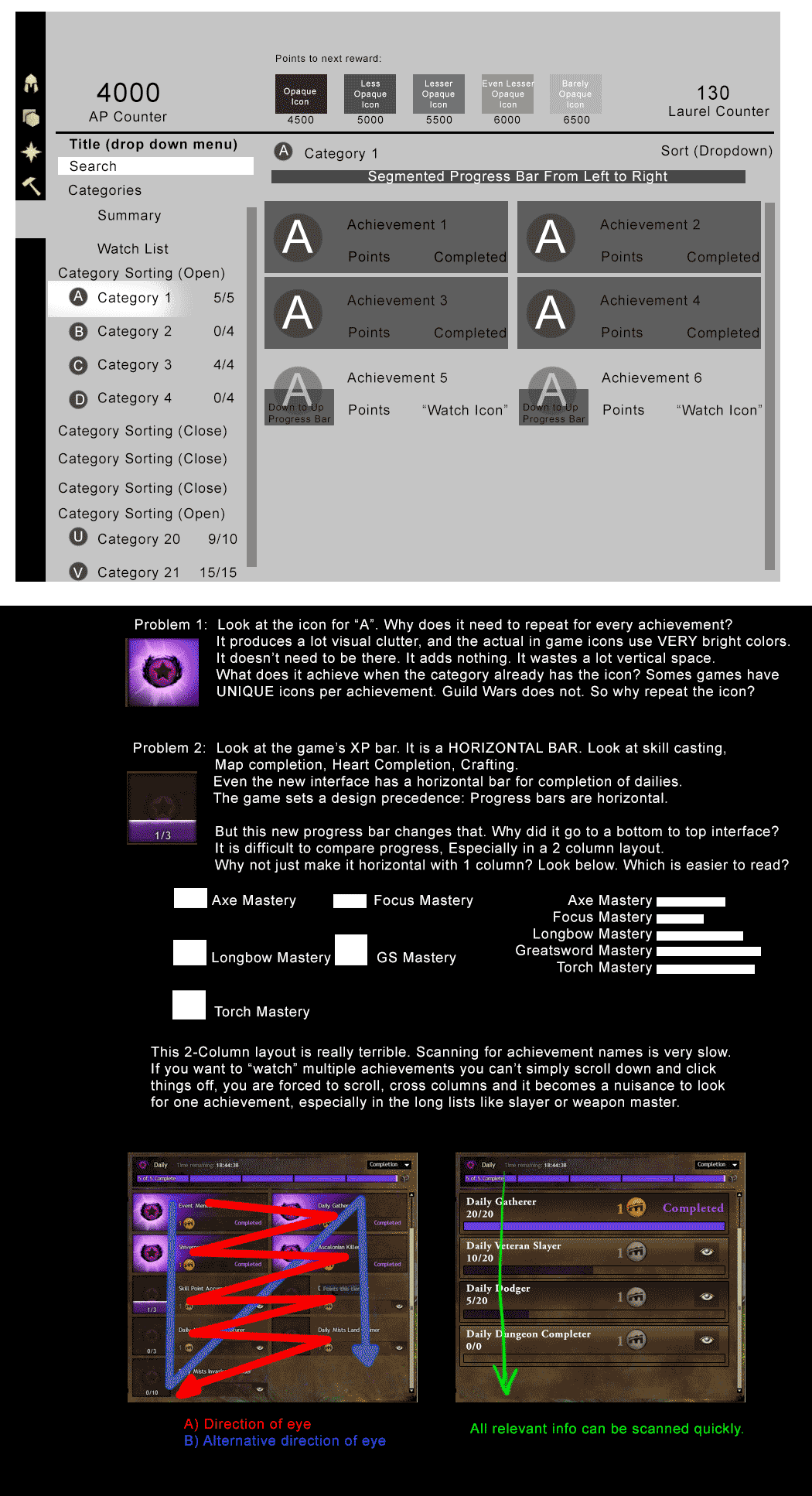
The underlying issue for me is the 2 column layout for achievements. Scanning for achievements quickly can be difficult with this layout. The data is presented poorly and comparing progress on some of the bigger lists like Slayer or Weapon Mastery becomes very difficult with the “Bottom to Top” progress bar in the icons.
I think Anet took a step backwards in interface design when they made this 2 Column layout.
Please see my images for details with my suggestions and ideas for fixes.
!http://i.imgur.com/zuXfsuE.gif!
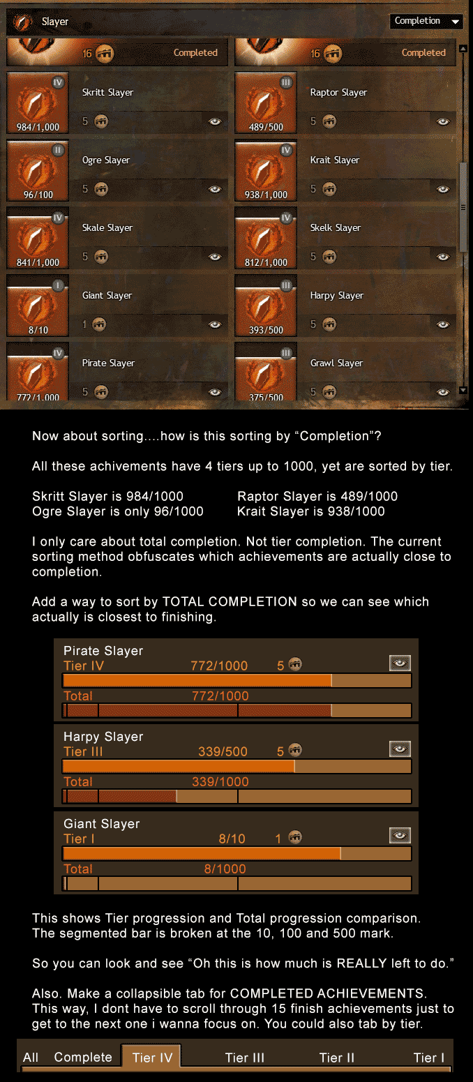
The second big issue is sorting. By default, sorting is done by completion. However, completion is based on tier, not by total completion. This makes sorting all messed up, especially in Slayer or Weapon master. You end up something that is 800/1000 (Tier IV) become considered LESS finished than something that is 9/10 (Tier I), even though both have a total completion of 1000.
While this is fine for short lists, the bigger list, the more difficult it becomes to properly read the data quickly. We need a way to sort by total completion.
We also need a way to hide finished achievements. As the list gets bigger, finished achievements sit at the top. They will take up the whole screen without providing new information. A tabbing system or collapsible/accordion sections would be ideal.
Please see the second image for details
!http://i.imgur.com/iB1mQVC.gif!