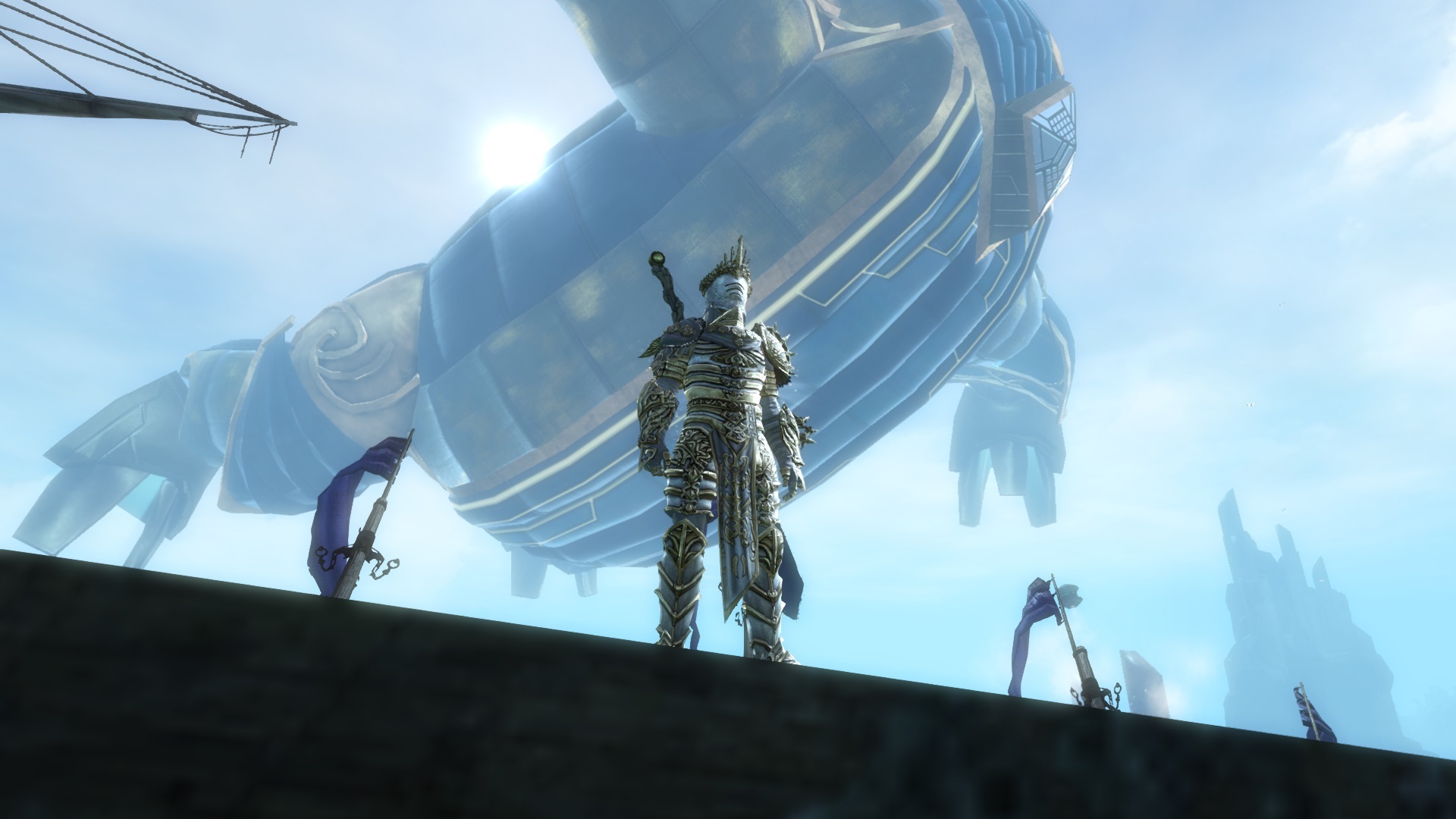
The Ascended Gear Look…
Light – Female -Looks good
Light – Male – Looks a little court jester’y…
Medium – Female – Shoulders I could go without… i think its the fuzzy/fur that’s throwing me… Helm, Lose the Mohawk…
Medium – Male – Shoulders ^ Same, Helm, lose the wings…
Heavy – Female – Helm not digging it at all, the left arm Shoulders and Gloves just don’t seem to match the rest of the armor.
Heavy – Male – Helm not digging it at all, the left arm Shoulders and Gloves just don’t seem to match the rest of the armor.
Reason for the critic:
I’m sorry, but from the waist up, I tend to cringe… I’ve really tried to find the right way to describe it… I think the best way to say it is, Boots and Legs (at least on heavy) look like Armor ready for battle, but from the waist up, it’s more ceremonial… Glitz should lean more for town garb (imho). You can always make battle armor shiny and elaborate, but i don’t think it needs Glitz… Bottom line, Please re-imagine helm, shoulders and gloves at least.
Thank you for reading a little artistic criticism from a grateful player, Keep up the good work, you are all Awesome

