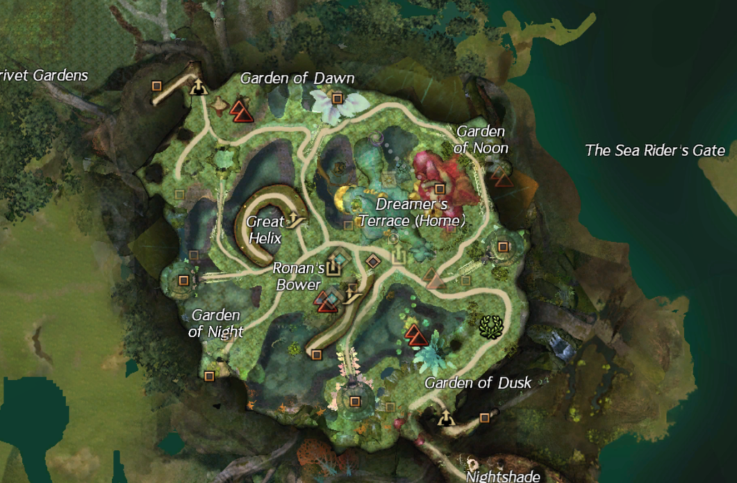
The map is a jumbled mess of transparency and icons. You look at it and don’t know what’s up and what’s down.
I think the map should be reworked. The only idea I have that might work is turning off the transparency of the different floors, but maybe someone has a better idea.