Character select screen
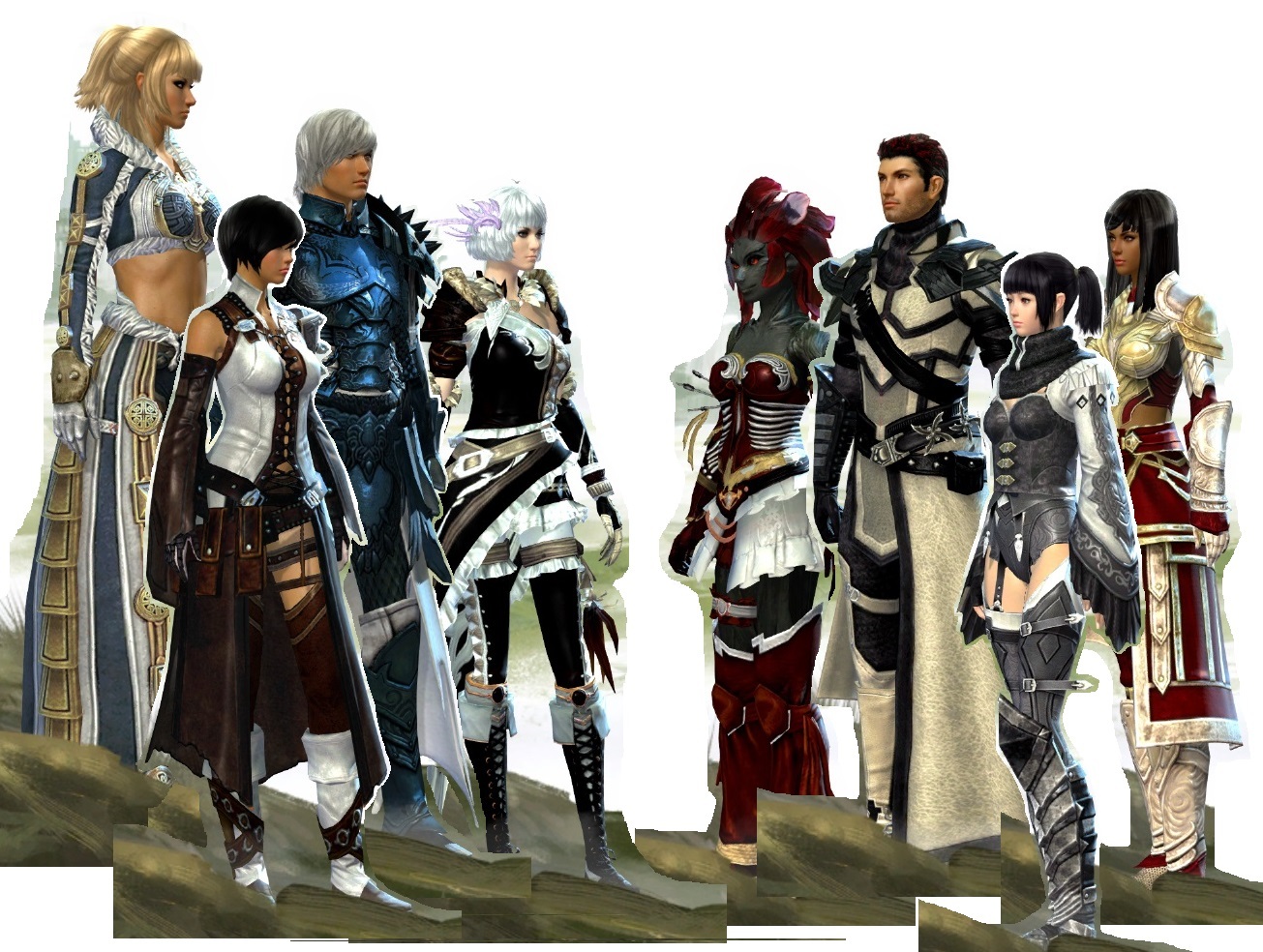
 I don’t want to be manually making pictures like second pic attached just because this game doesn’t have that sort of feature, haha.
I’d be happy if the screen simply displayed eight (instead of seven) characters without the scroll arrows being necessary. If I’m going to run one of each class, I don’t want one of my characters to be forced to sit at the kids’ table in the corner of the room.
That’s pretty cool. I like the group picture that GW1 initally had at launch and eventually got rid of. It’s one of those little QoL items that really has no bearing on my gaming experience, but is a potentially cool setting for epic screenshots. They should absolutely display the back item and toggles for weapons. A hide UI/display all toggle would be cool too for checking out the fruits of you combined labors, displaying the your created army.
[TTBH] [HATE], Yak’s Bend(NA)
I don’t think cluttering things up with an info box is necessary, but I wholly support the idea of having multiple, height-adjusted characters on-screen at once.
Posting to remind devs I still want the character select screen to show 8 boxes instead of 7 since we have 8 professions! It’s unfair to have one profession off the screen! Also an option to pick the order in which they’re displayed instead of whoever was played last to always be shunted to the far left!