(edited by ElemenZ.5486)
Poor UI, lack of customisation
I agree with the OP. I am not asking for addons. PLEASE KEEP THOSE OUT!!, but let us choose what weapon skills are in each slot (1-5). They should be able to be swapped to chain combos better. More option on sclaing the UI, and Overall layout of the UI…
Anet your considered a A+ rated MMO Company, please fix this HUGH oversight to your current UI.(Bioware was even able to add this in to SWTOR, Surely you can)
Revenge Is A Meal Best Served Cold
Several things for the UI. No, no MOD please.
UI:
• Allow movement of UI elements. i.e. put self health and target health near each other.
• Option for Self Health bar that is moveable, instead of bubble.
• Casting / Charge bar below target bar. (ability to see when target is casting)
• Within range indicator below 1-5 buttons is inaccurate.
• Target of Target display
• World Map: Turn on / off items from legend. Would help trying to locate that last POI or Vista for a zone that you just cant seem to locate.
• An apply button for trait points, as well as a minus, so you can work on a build prior to applying it.
• Display actual HP instead of percentage.
• Character Screen: Zoom ability, Dye screen center character as well.
• Pop-up windows (your in queue, or confirmation box for equipping an item) should not interfere with game controls… i.e right mouse click to turn etc.
• Pop-up windows: Ability to respond via keyboard. Spacebar / Enter for Ok, Y or N or Yes or No.
Putting the laughter back into Slaughter!!!!!
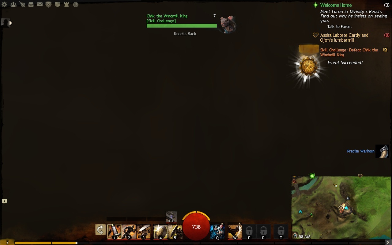
- CLOSE ALL DIALOG BOXES bind, this should close EVERYTHING on the screen that is not a part of the standard UI with one button press. (Remove everything except what you see in the screenshot below, including close the map quickly.)
- ALLOW ‘CALL TARGET’ WHILE NOT PARTIED Why am I handicapped if I don’t bug someone to party up with me?
Attachments:
____________________________________Skekzyz
The Dark Crystal [TDC] – Henge of Denravi
The Dark Crystal [TDC] – Henge of Denravi
Without taking the time to list all the improvements and/or modifications needed here, I agree with most
of the above.
The UI needs ALOT of work. Please allow for much more customiziations here.
UI customizing would be a great feature to have without the use of add-ons.
I doubt I will use add-ons if they decide to support them here. I have had about enough of them from several other games in the past.
Member of Cradle Guard
While I loved having addons (to the point where customizing the UI was as much fun to me as the actual game I was playing), I would be content with the gw2 UI if the stock UI allowed some of the customisabilty that UI mods give.
Firstly, crucial information is missing, unclear or over simplified in the UI. Since a lot of spells have a fixed range, I think it would be important to be able to gauge distances easily, but at the moment, I’ve seen no distance or range meter (maybe there is one, but not anywhere noticeable).
Second is that most things aren’t movable or resizable.
Third, and most crucial to me is to make the ability bar customizable. Yes I do know bindings can be changed, but I am someone who likes to switch playstyles often (eg. with swapping weapons, playing alts). I always mod mmo games I play so that the skills are grouped in a way that is meaningful to me (eg. aoes vs single target spells) and also arranged to graphically represent my bindings (eg. in a 3 by 3 grid, to refect how i have them bound on my keyboard). As it is, I’m either getting stuck in one play style (since it takes me a long time to get used to the various spells and binding when they’re in no meaningful order).
Honestly, I’m really finding combat a chore now, since I am either repeating the same spells (from bindings I have learned) over and over, or I am dying a lot from bindings that I’m not used to. Considering that GW2 combat encourges movement etc. without being able to rearrange the ui/abilities into a configuration that is comfortable to me, the game is simply getting tedious.
This is one of my top frustrations with the game. I’ve never been very big on add-ons, but I didn’t need add-ons to move my buttons around in previous games. I play very differently between a PvP character and a PvE character, and not being able to change my keybinds per character is a source of contention for me that I can’t really vocalize correctly.
I like to play with my num-pad. I can bind everything to my num-pad, but then I lose the functionality of my mouse. I’m not going to go and spend a boatload of money on a spiffy gamer keyboard and mouse (college has all my money, heh), and it actually does annoy me to not be able to customize my bar for how I play.
I’d also really, really be happy with an option to hide everything on my UI except my chat box. I actively roleplay, and the world is sokittenpretty that I’d love to be able to hide my UI down to the chat-box itself. Speech bubbles are horridly clunky and ugly in any game, and I don’t want to have to rely on them when I’m trying to immerse myself in the beautiful.
tl;dr:
- Please make bindings per character, or have an option to make them character specific.
- Please allow me to rearrange my abilities. I don’t need more button slots, but I’d like to be able to move that one ability I rarely ever use to the end of my button line so it stops futzing with the other abilities I do use.
- An option to hide my entire UI except the chat-box would be beautiful.
I remember them saying that they have further plans with the UI. So I guess keep it going, I’m sure they’re reading this thread.
To add: I also like the ability to re-position my UI just like how it was in GW1. And that too, the ability to choose which data to show (those numbers), I for one only want to see my crits. It will also make the client lighter on our mediocre systems
I’ve modded UIs in the past and enjoyed it very much. I do think the UI in this is decent and I am a fan of the style and some ideas. Quest tracking and achievement tracking are very solid. I’m also, this time around, playing without any UI because the game has a very good implementation of that. However, I am very much in favor of expanding the ability to customize the UI in general, move elements, and provide us with the ability to selectively display various elements. Please consider adding in more options and giving more customization of presently available features.
Is not a problem talk about “WoW”… if you keep the “i want this game be more like WoW” trolling attitude away.
That game have a lot of amazing features. UI customization is one of them…
I like you idea.. thumbs up :-)
For Those About to Zerg (We Salute You)
One of the ridiculous things they let into the release of this game is only having one set of key-binds across all characters and all weapons. Whose idea was that??
I do like the UI as a basis and would love it if they brought it to next gen gaming. I am pretty sure they are working on filters etc. The game itself imo is top notch (and I am really F-Bomb picky).
Also please add more filters to the Broker. If I am looking for light armor, that is all I want to see
Tranzik 80 Mesmer (Stormbluff Isle)
400 Tailor/400 Weaponsmith
I beat the Game in less than 2 Months.
400 Tailor/400 Weaponsmith
I beat the Game in less than 2 Months.
I agree with the previous posters in that the UI needs a little work, but also I would like to see bigger fonts as well for the chat box, as even the biggest is..well..not very big at all. Also, the ability to change font colors would be extremely useful. As a roleplayer especially, it’s difficult to see emotes because of the grey coloring…and tiny font.