Attachments:
(edited by Adamantel.6427)
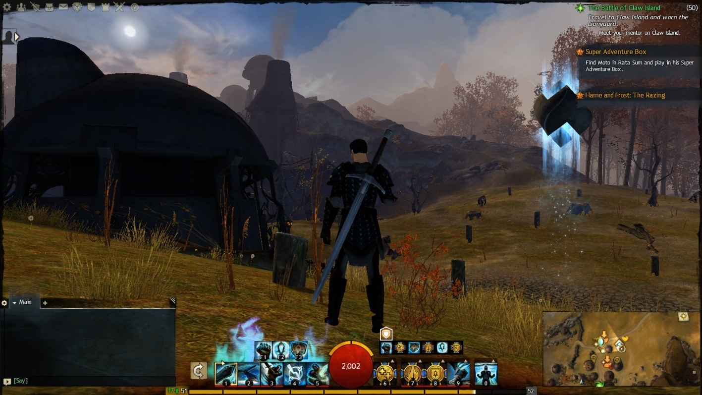
Welcome. My suggestion referes to the experience bar on screen and the point is that it’s way too long, thus when it’s full there is a looong green bar right there attracting a player’s attention way too much. As I’m sure you’re aware of, interface elements are very crucial not to attract too much attention because it affects the gameplay very negatively.
Here is an example of what I mean and how I see it as a little longer than the skills icons bar while not harming the interface consistency, unlike in my view the current, extremely long exp bar does. Additionally in my opinion the shorter exp bar would greatly increase the clarity, it would be much easier for the player to read the leveling progress from it. Right now it is far from clarity.
(edited by Adamantel.6427)
Not affiliated with ArenaNet or NCSOFT. No support is provided.
All assets, page layout, visual style belong to ArenaNet and are used solely to replicate the original design and preserve the original look and feel.
Contact /u/e-scrape-artist on reddit if you encounter a bug.