(edited by Kormona.7156)
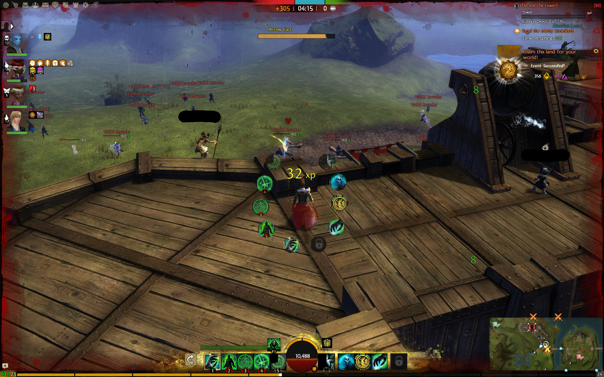
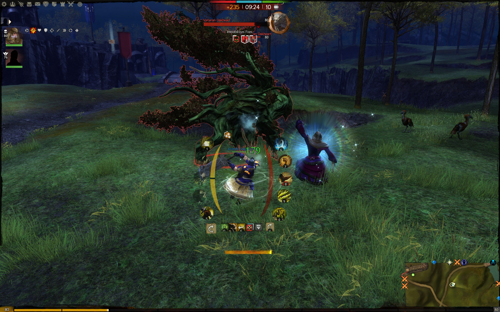
UI idea for combat
While I think this could be a good idea (It doesn’t affect me, but I see where you’re coming from), I doubt anything like this will happen. Anet have stated that the UI is designed in a way to have as little UI on the screen as possible. They want their players to play the game, to see the action in front of them instead of playing the UI with a screen filled with UI all over the place covering half of the fight infront of you.
As for the red health on your character, I disagree with that part and it would completely destroy the idea of collecting dyes in the game to colour your character how you want to. This would force everyone to bascially have red armor in combat which wouldn’t be good.
I can see that with the coloring of the char, and i was thinking of another design for that. It could instead be an inner bar on the right side with the icons outside of it, may get time to see how it will look later today.
About the "They want their players to play the game, to see the action in front of them instead of playing the UI with a screen filled with UI all over the place covering half of the fight infront of you. ".
It will take less space than the current UI. And my idea is that since Anet want us to watch the screen not the ui, then the infomation we need should be place so we can see it while also looking at the combat .
Right now i have to look down and sometimes i miss incoming attacks since the combat is so fast. That’s why i want to see if this can help since all the information u need will be centered on the screen.
And while not in combat they could shade the ui down.
Having the health bar down the side would be a better suggestion then the first one, but you’re also missing an endurance bar which would need to be changed too.
While I agree this would make the UI easier to see, it would aslo make it harder to see the combat. The current UI is completely out of the way of combat as I don’t think i’ve ever had combat as close to the UI before, this allows you to see everything and only have to look down at your skill bar when you need to.
I personally only look at the UI to see my health, otherwise I use keybinds for all 10 spells. This allows me to constantly see everything around me, if you use the UI you’re suggesting people may find it harder to see aoe circles, mobs might get “lost” behind the skills an asura for example may be hard to see if positioned in an awkward place. It would also make turning the camera around much harder as you’d have to make sure that you’re not currently hovering over any skills before right or left clicking to drag the camera around, which isn’t going to go down well as I already see loads of people mobing about camera moving and deselecting targets ect.
Another issue would be ground targeting. If you’re trying to place a quick ground target close to you, you may end up pressing one of the skills while in the heat of combat which may completly change the battle for the worse. Again, this would make combat slower and harder to play with
(edited by EliteZ.1682)
Made a adjustment to see how it would look, and it’s just a suggestion as a alternative combat ui. But i would also like to be able to move healtbar higher up or to the side of the char since that’s also the only information i need since i also use keybinds.
“. It would also make turning the camera around much harder as you’d have to make sure that you’re not currently hovering over any skills before right or left clicking to drag the camera around,” The ui suggestion i have is only to show the information and to use the skills you use keybinds.
Uploaded new picture
Sorry but this will never work since I want to see around my character.
Website: http://xifix.weebly.com
Made a adjustment to see how it would look, and it’s just a suggestion as a alternative combat ui. But i would also like to be able to move healtbar higher up or to the side of the char since that’s also the only information i need since i also use keybinds.
“. It would also make turning the camera around much harder as you’d have to make sure that you’re not currently hovering over any skills before right or left clicking to drag the camera around,” The ui suggestion i have is only to show the information and to use the skills you use keybinds.
Uploaded new picture
This idea is quite nice, at least an option to switch between those two would be good.
@SSalp absolutely, my gf need those buttons to click on but for me i just need the information about my hp, if my skills are on cooldown and so on. It could probably be even simpler but i’m not good at drawing.
So a option for a simpler ui which are only there to give me information, and are centered around the battle so i don’t need to look away from what i’m fighting would be nice:)
Even moving the hp bar to the top of the screen would help me since i mostly fight bosses that i can see above my character on the screen.


