hate this
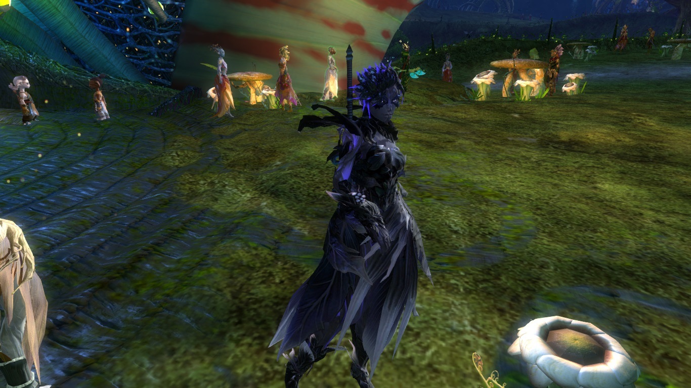
I prefer the top picture. But I was really not into the super bright glow that came with the change in Oct. I prefer the more subtle shading. My example:
Attachments:

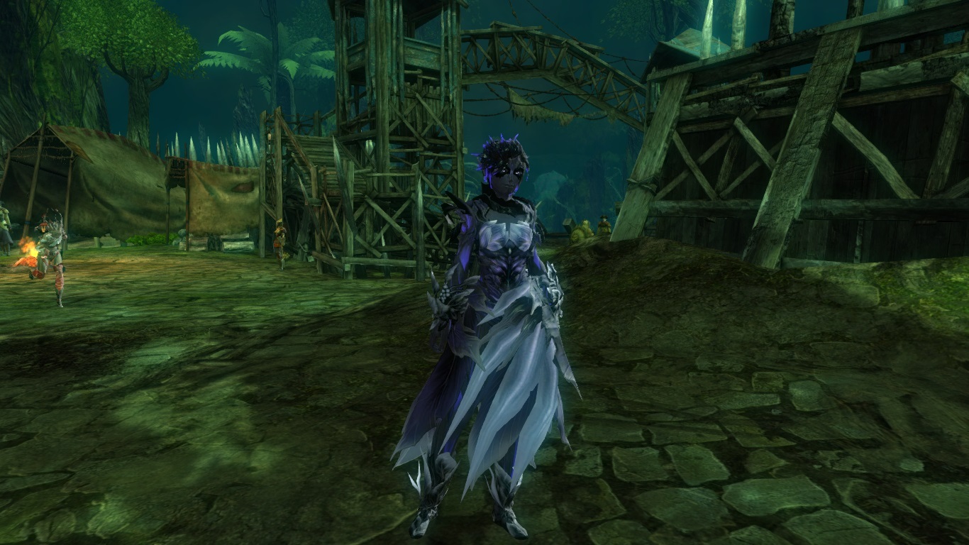
I think your Sylvari looks really lovely in the rolled back picture, but I, too, prefer the subtle shading over the extremely bright glow we got at first. So I think she looks much nicer in the top screenshot! I find it much easier to put together a nice colour scheme now that we have such nice shading again.
Included a picture of my mesmer as an example of those that… did not get a good look after the glow update. So I am relieved to have had it mostly reverted to how it was before. The extreme difference in how the dyes worked all of a sudden was pretty horrifying to me.
Attachments:

Knights of the Round Vegetable [SASS], Tarnished Coast.
And now I can’t get a glow on T3 unless I use pastels, which is annoying because the turquoise I had mine glowing was not that bright. They should just use the slider on the character creation screen for the amount of glow. Or add a special armour one – apply it to the new cash shop sets so people can tone down the flames too!