Attachments:
(edited by Xenon.4537)
Dear Anet,
I love you. I love this game. I buy gems and spend hundreds of hours per month playing. I want to spend another 4000 gems for that sweet quaggan backpack and Mr Sparkles mini. However you are making it difficult for me. You recently reverted a change to the Grenth Mask. I was about to purchase multiple copies of it AFTER the change, when I found out you were going to revert the change due to some complaints that the newer version looked bad on asurans.
My necromancer is a Charr. The newer version of the grenth hood looked great on a charr. The old, reverted version looks terrible. Allow me to explain. I ask that you direct your attention to the screen shots. These shots are of the old, reverted version that currently exists. What I am asking for is that the CHARR model for the grenth mask be changed back to the newer version. The asurans can keep their older one that shows off the eyes.
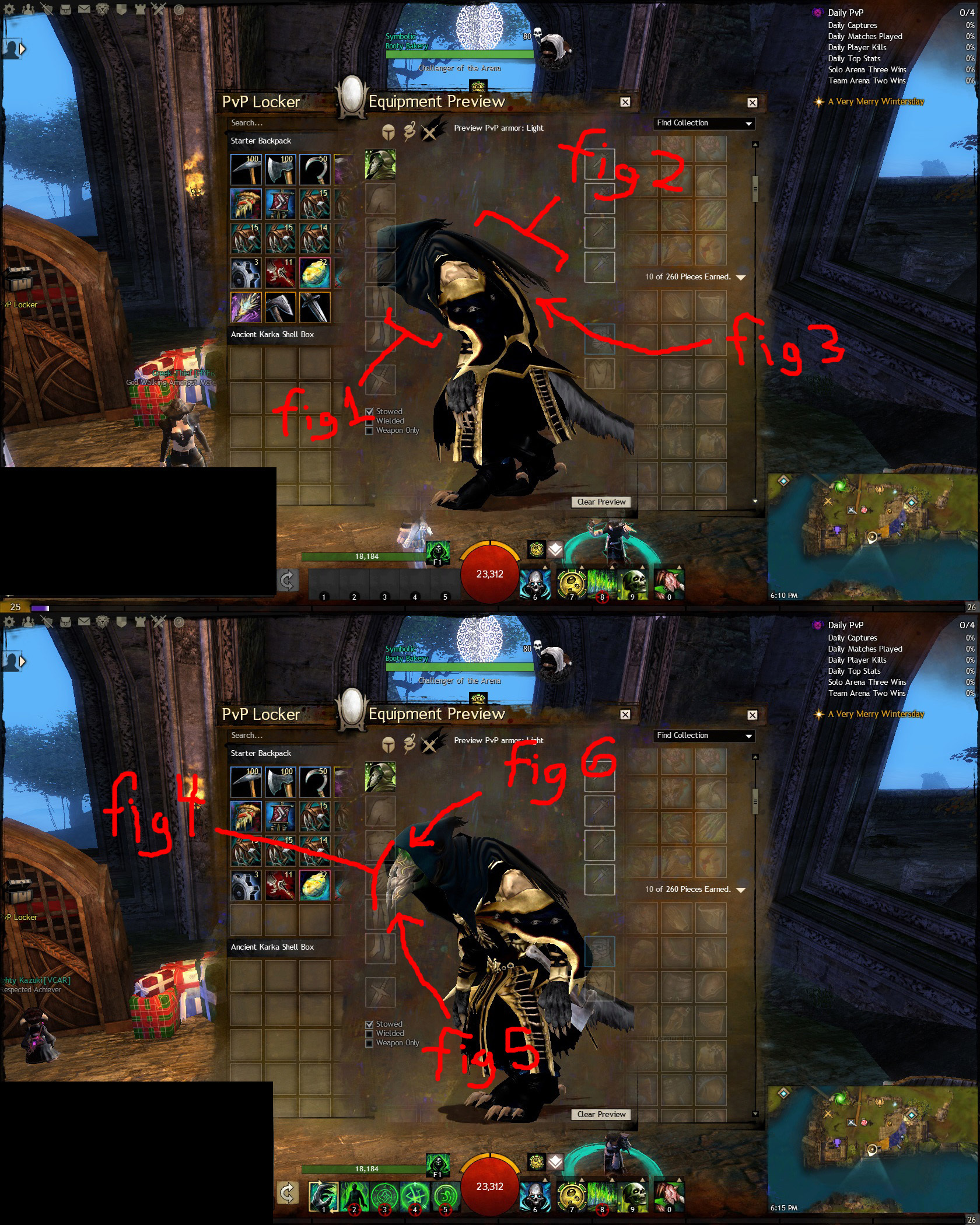
Figure 1: This area on the old version is too open and close to the neck. In the newer (removed) version it was fuller and more closed which gave a better visual balance to the overall Charr character model.
Figure 2: The Charr suffer some form of scoliosis, as we all know. They hunch over and it looks cool and more animalistic and aggressive. However when you make things that drape across the back of a character, they need to flow properly, especially when that character’s race hunches over like so. The cloth here looks bad. It sticks out like it’s crusted and stiff like an old unwashed towel. The (removed) newer version addressed this. It looked correct with the cloth draped properly.
Figure 3: Again, there is a large, stupid space here that shouldn’t exist because the cloth does not drape properly. The newer (removed) version had no such space and the end of the cloth reached farther down the back and made it look fuller.
Figure 4: The arch of the mask on this version is horrendous. It slopes back so far it looks like my charr is looking up 45 degrees which should be causing a snapped cervical vertibrae. The (removed) newer version addressed this. The mask was angled more straight on. YES, I know Charr have snouts. This still looks bad. The removed version looked better and still seemed to account for a snout.
Figure 5: Again, the mask is angled out too much. The tip sticks out like a kitten y beak. The removed version looked much better. It was more conservative on the jutting chin beak pointyness scale. Grenth is supposed to be the God of Death, not a can-opener.
Figure 6: One last time. The mask angle. It is too much here. The eyes are ridiculously far back. Also the hood itself around the top of the neck feels too sparse. Something is off in the proportions. It looked better in the newer removed version.
Please Un-revert the changes to the Grenth mask for Charr. I was planning to spend a minimum of 1000 gems on this alone because I wanted copies for multiple Charr characters, that is until you reverted the cosmetic improvements.
Sincerely,
Xenon.
Edit:
The thread that fixed the mask for asurans but ruined it for Charr, in case anyone was wondering.
https://forum-en.gw2archive.eu/forum/livingworld/wintersday2013/Grenth-hood-ruined/first#post3361146
(edited by Xenon.4537)
I appreciate everything you have listed here. I hope that they see this thread!
I also really liked the fact that my horns showed on my necro Charr. With it as the way it is, the new Grenth back item is cut by the sticking out bit of the hood :l
Let’s keep our fingers crossed that something is done about this ^.^
I liked it more when it showed horns, too. I was really happy. Then the Asura fix came and reverted my hood-horn version to hornless. Q_Q
Another “I was going to spend my life savings on gems, but now I can’t because you (anet) decided to do something I don’t like” thread.
Cool story bro.
Really though, I thought they accidently changed the grenth hood or something along those lines when they patched something else and then reverted it back when the mistake was realized?
Most likely what happened was the current version of the hood was an older version that got put in the game by mistake. At least I hope the current version on the Charr is not meant to be the final version. As I outlined, it looks bad, even if you don’t agree with the mask and whatnot, the back drapery should NOT stick out like that. It doesn’t make visual sense for it to stick out like that.
The 3d artists probably didn’t have it 100% finalized on Charr in version grenthhood_charr_x201.mb or whatever you want to call it. It looked fine on humans though, so they shipped that version before realizing grenthhood_x202.mb was available.
+1 if you know what a .mb is. :P
+2 if someone can tell me whether anet actually uses that or something else entirely. xD
(I’m not a professional 3d modeler yet ;>.>)
I support this topic, anet fix this please.
OMG fix this already.. It looks horrible.
Really though, I thought they accidently changed the grenth hood or something along those lines when they patched something else and then reverted it back when the mistake was realized?
They reverted it because someone (asura) complained. It’s like what they’ve done with the sylvari armors. The changes aren’t accidental, they just flip back and forth on cosmetics as soon as someone complains about them
I like it. Makes me think of a skeksis.
I really hope they won’t change it again. If anything, there should be 2 versions of it, because the one with horns hidden looks adorable
Not affiliated with ArenaNet or NCSOFT. No support is provided.
All assets, page layout, visual style belong to ArenaNet and are used solely to replicate the original design and preserve the original look and feel.
Contact /u/e-scrape-artist on reddit if you encounter a bug.