Attachments:
Ceterum censeo SFR esse delendam!
(edited by Dayra.7405)
I am aware that a well-dosed annoyance (like falling into a hard to see pit if you do not watch your steps) is vital to game design, but I still think that
annoyance in UI-design only indicates bad programming
Here is my Top 3 of Annoying UI-design in GW2:
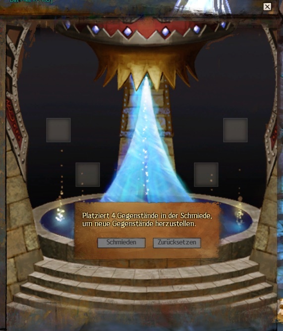
1) Mystical Forge
Figure 1 is mostly ok, I only ask myself: Why isn’t there a way to say, that I want to do this 10 times and not only once?
Figure 2 is the most annoying part in my view. A modal dialog for information-display without a choice. That’s a no-go in UI-design. If if would contain the “repeat n-times” as in crafting, ok, but just forcing me to another click is bad.
Figure 3 shows another problem: the fields have been automatically reset Why? There is a reset button, if I want a reset. It should stay as it was, just reduced by the consumed items!
Summary: The bad design forces me to many bad UI-interaction, better design is very easy!


(edited by Dayra.7405)
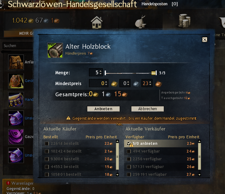
2) Trade-post
I want to sell something I see figure 1. I would love if the system would remember what I usually do (offer 1b below current offering), but it’s ok. It has some nice features like auto-adaptation to changed Inventar and others.
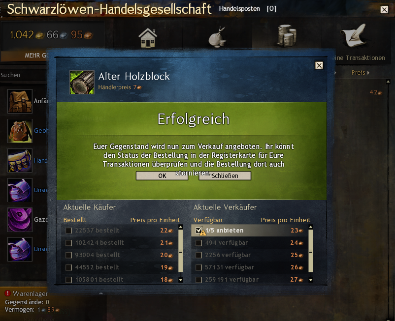
Figure 2 is again bad UI-design, an modal-blocking Info dialog (with the additional problem, that the to long text of the german localization, makes the buttons nearly inaccessible). You have the hints for such info’s you do not want to see (and especially not click) this dialog again and again.
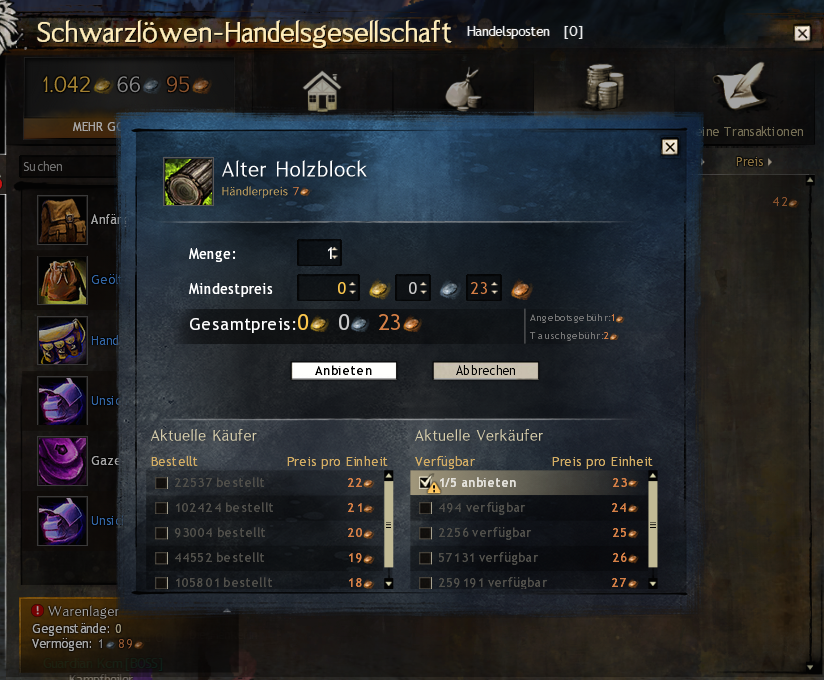
Figure 3 since the last patch (before it was better) I will be back to the 1st screen, EVEN when there is nothing left to sell
(edited by Dayra.7405)
3) Auto-targetting
Difficult to make screenshoots of that. So here only a description:
I noticed, that the FIRST attack AFTER I manually selected a target with left-click still goes to the OLD (or an auto-seected one, in case there was none) target. Why?
I mean I selected this to shoot at it, and not to shoot on something else!
Another problem with auto-selection: It seems to love to select covered targets behind walls, that cannot be shoot, instead of the bad guy that attacks me.
And a third related problem: My ranger has 1500 range, till 1200 range auto-fire works well, but above 1200, I have to press 1 again and again to keep firing.
(edited by Dayra.7405)
Btw.: I know it doesn’t fit as it is the needed annoyance in game-design
But I still think it should be logical! Why is the Fort Mariner WP in LA still blocked? Mordereds influence on the waypoints has been handled. It should work again, his tendril has disappeared as well.
That’s my TOP-3, what’s yours?
I got another:
Guild bank!
The regular bank is really nice done, if I have a piece of wood i click on it and it’s transfered into my bank.
At the guild bank i have manually put all items in there, i can’t stack them in the bank, i have to do it in my bag.
I hate this inconsistency. When i forge about 100 greatswords and put them all one by one in my bank that is a UI killer.
The Forge as well ;-)
Here are some others:
Buy stuff in bulks from vendor, if you want to do that its clickclicklickclickclick till u have RSI. Same counts for consumables and bags. (Funny enough when u select destroy it does delete the whole stack in once)
Convenience hello??
@Dayra about figure 2 with the Mystic Forge:
You don’t have to click away the modal dialog to make the 4 fields available. You don’t need to use drag and drop with the Mystic Forge.
Exactly in this stage shown in your picture, double click the 4 items you want to put into the forge and click schmieden (forge). A double click of an item puts it in the next available forge field, even if it is invisible under the modal dialog from the previous forge. If after 4 double clicks 4 valid items are put in, the button activates and you can forge the item. The old modal dialog is then replaced with a new modal dialog of the new item.
You never have to click away that dialog. It is removed automatically if you leave the Mystic Forge. The modal dialog is totally cosmetic and has no functionality behind it. The forged item was already put in your inventory at the same time the dialog appears.
The modal dialog is totally cosmetic and has no functionality behind it.
Yes, exactly this is what I don’t like on it.
Currently forging 10 superior siege needs 50 clicks using your method and 60 if you click the dialog away.
It would need 14 clicks, if the dialog never appears and the items would not reset automatically.
It would need 2 keys ‘1’ and ‘0’ and 1 click if you could enter an amount.
I would prefer the last, the 2nd would be ok, the current is pure annoyance.
PS: And this does not only apply to superior siege, but also to runes and sigils and …
Not affiliated with ArenaNet or NCSOFT. No support is provided.
All assets, page layout, visual style belong to ArenaNet and are used solely to replicate the original design and preserve the original look and feel.
Contact /u/e-scrape-artist on reddit if you encounter a bug.