(edited by DiogoSilva.7089)
Armor better in concept art than in-game
Dunno, they look the same to me. the only difference is your graphics, thats what makes them look so bad imo.
Try comparing the Orr armour, the concept ones are kitten. In game they are eh wel crap.
Dunno, they look the same to me. the only difference is your graphics, thats what makes them look so bad imo.
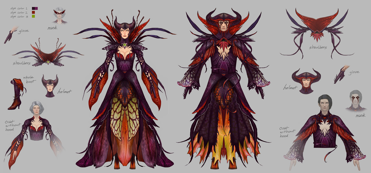
Those are pictures taken from the wiki. And no, twilight’s armor does not have have the mask nor the same horns. I’ve been testing it with 100 gold dyes (!!) on the pvp locket, and it’s near impossible to make it as impressive as it is in the concept art.
have you got a picture of what you want the horns to look like in the set? i have had a lot of success with colouring them.
I think the horns would be much cooler if they looked like the concept art I posted above. The comment about dyes was directed to the whole armor set.
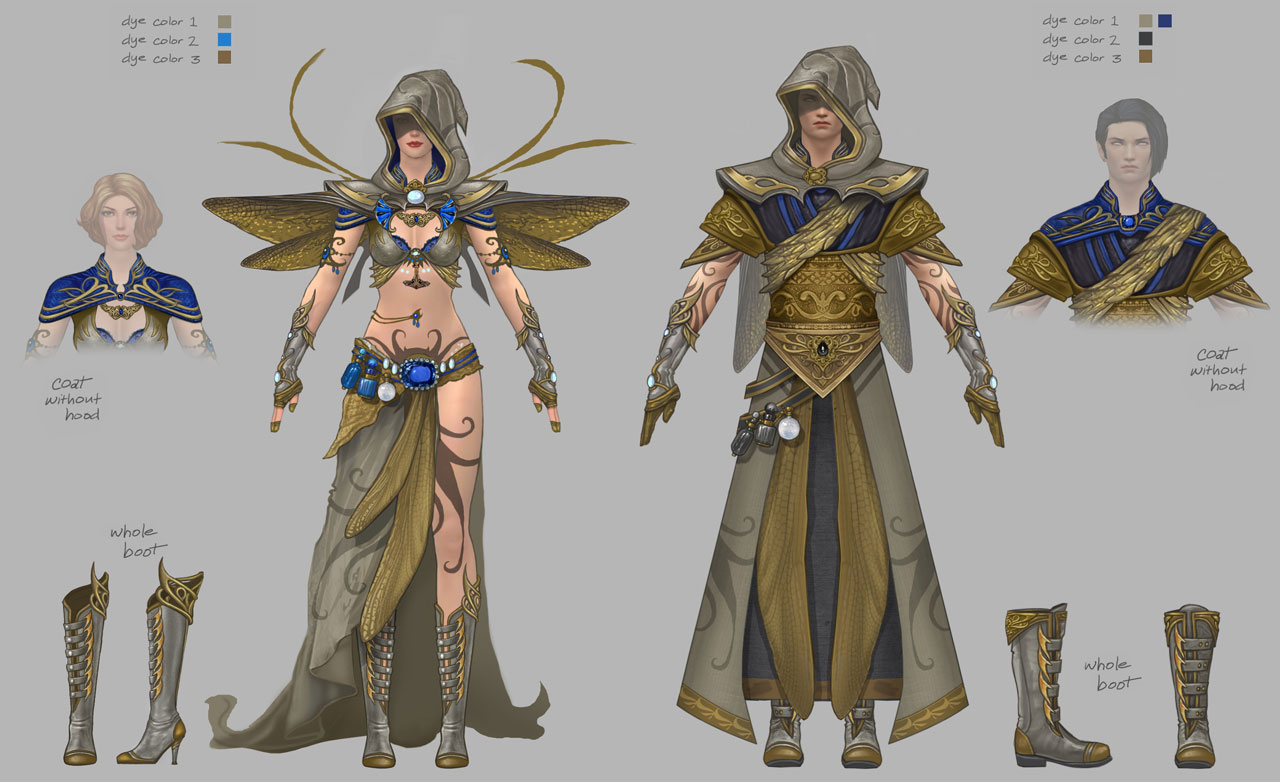
About the second example I mentioned (Feathered Armor), I’ve just tested it with dyes as well, and the color slot that affects the golden plates also affects the color of the clothes. This is lame. The purpose of GW2’s dye system is to allow us to color the different parts of each armor differently. So, why does the game forces us to dye the armored part the same as the clothes part? Not only that, but it seems anet decided to give a plastic look to the armored part, instead of using the metal look found in heavy armor. And, as I’ve said, the in-game hood for that armor is round, which takes away from the style that exists in the concept art’s hood. You just can’t have this armor set look as good as in the concept art.
(edited by DiogoSilva.7089)
Ideally, they add some ability to tweak the texture of any part of the armors and perhaps even particle effects. If you could make some parts matte, metalic, or slightly glowing, that would go a long way.
Everything looks better in the artwork than ingame, is this the first time you started a PC?
This looks more like a poor choice of dyes than the armor not looking like the concept art.
Hit level eighty
Priorities, what to do?
Spend hours with dye
Priorities, what to do?
Spend hours with dye
It’s not only about a bad choice of dyes, because I’ve experimented myself with much better dyes. It has to do with stylistic details that exist in the concept art and were not translated to the game, and/ or the way they made the dyes work better with some armor than they do with other armor. It’s stuff that could be fixed or tweaked in the future, but unfortunately, I’m not expecting this from Anet.
Everything looks better in the artwork than ingame, is this the first time you started a PC?
I would argue that armor sets like Draconic Heavy or the gorgeous female light armor sets look as great in-game as they do in the concept art.
Imo, the armor does look pretty kitten close to the concept art. The dye you selected to demo with for the Winged is horrendous, but that’s beside the point.
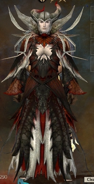
Twilight Arbor – with the exception of the horns, is spot on for the art. Sans the mask, obviously they opted to not have those. Now, how that actually plays with the various dyes and the dye zones is a different animal. Those things are bound to be tweaked and adjusted at actual implementation. The coloring as it is in the art is never actually possible in the game. On a side note, I kind of like the tweak to the horns, makes them not look like the traditional devils horns on your head. No to mention, as this is supposed to be plant like, a plant is never that perfectly symmetrical (ok there are a few exceptions, but you get my point).
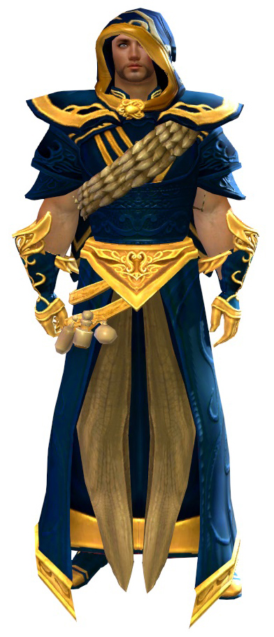
Winged – again art and actual are pretty kitten close, and again the actual dye zones and how the dyes look are going to vary drastically. Its just the difference between digital and paper, there are limits.
Also, turning your textures up might help….
Don’t look at me like that. Whatever you’ve heard, it’s probably not true.
Those images are from the wiki.
That being said, considering that some of you think they are so close to the concept art, I wouldn’t mind seeing better pictures. Show me a male human spellcaster that looks good in those armor sets.
No matter how much I try, the maskless twilight helm takes the mystery and intimidation out of the entire set, and I see no majesty in my character as I see in the art. And the winged set always looks like it’s made of plastic, regardless of the dyes I use. Besides, I don’t see how the dye system limits it, considering that it doesn’t limits many other sets in this game that work the same way. In my opinion, the metal plate and the clothes using the same dye slot feels more a consequence of a designer’s /model’s poor judgement than a technical restriction.
(edited by DiogoSilva.7089)
snicker
I never play male characters, and I rarely (if ever) use one complete set of armor.
Still, I know I’ve seen a male winged that was decent. If I run across anybody with either that I find appealing, I’ll screenie and share.
Don’t look at me like that. Whatever you’ve heard, it’s probably not true.
Think they changed the outfit and especially the horns because it looks REALLY similar to the Mistress of All Evil… turn it solid black, with the odd brush of red, or purple, and you get MALEFICENT.
If you really want to see the differences, look at the boots. A lot of the armors and outfits have really bad footwear. It looks like someone got bored and just didn’t bother with them.
Re: the Twilight Armor set. I’d say the major difference comes from the slender man in the concept art versus the thicker build of the man in the wiki screenshot. And the dyes, of course. You call the face paint majestic, I call it offputting, that’s a highly subjective view for all of us. The shoulder leaves do seem a bit smoothed out in the “live” shot. Overall however it looks far closer than, say the feathers and tattoos in that PvP armor came out compared to the concept art for same.
I would say what bothers me most in the translations from concept to live is that the physics are never right in the animated versions. Skirts ripple wrong if they ripple at all, feathers are rigid when they should tremble in the breeze, etc. I understand why this is so, of course. I’m not expressing displeasure at it. But that’s what hurts the aesthetics most for me. (As a corollary issue, cosplayers tend to make garments that hang the same way the game ones do instead of taking them to the next level of reality and making them look like something someone would wear. In all my years of costuming my goal was always to use the correct fabrics, get the right drape, and be able to move in the darn thing. But I digress).
Ofc there are differences (from 2d to 3d rendering alone) but here is my try at the concept art:
I used harrowing Maroon dye and shadow purple dye which came pretty close
Attachments:

Like what’s already been said:
Concept art almost always looks better than what you get in-game. It’s an artist’s impression of the real thing. It’s slightly stylised, exaggerates detail (to make modelling it easier, I guess) and they always pick fantastic colour combinations because they are artists.
The winged armour set, for example. The concept art is beautiful. The male set uses a dark colour on the background, to offset the pale grey throughout. If a lighter colour was used, everything would look washed out. The blue and gold work wonderfully together. Imo the in-game version made a mistake of sticking to two colours and using two very bright colours instead of a strong one and a muted one.
It’s also going to depend on your computer’s capabilites. I’m not entirely sure what graphic settings you have/the in-game screenshots use, but in my opinion the largest drawback the appearance has is the poor anti-aliasing that there is. The lines aren’t fluid for the nightmare court one, which ruins the feel a bit.
The only realistic improvement I would ask for is for them to include the face-shadow under the hood on the winged set. We see the face-shadow elsewhere on other helms (T3 norn heavy, off the top of my head) and it makes a massive difference).
As for reasonable advice, to get a similar look to the concept art:
-Learn colour theory. What compliments? What contrasts? What would be good as an accent colour?
-Use the exclusive dyes. They have more depth to them and pick up details a lot better than regular dyes. I guess it’s something to do with the amount of layers/colour of the layers that the dye has.
-Consider the form of your character and the overall look you’re going for. You might not want a broad and hulking character if you’re using an elegant, shapely armour set. (Or vice versa).