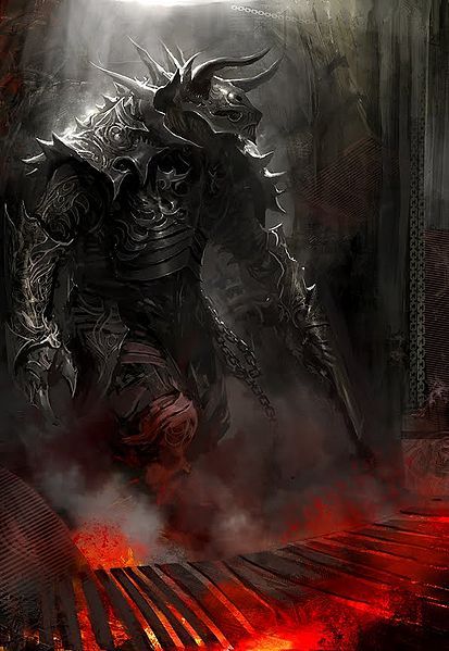
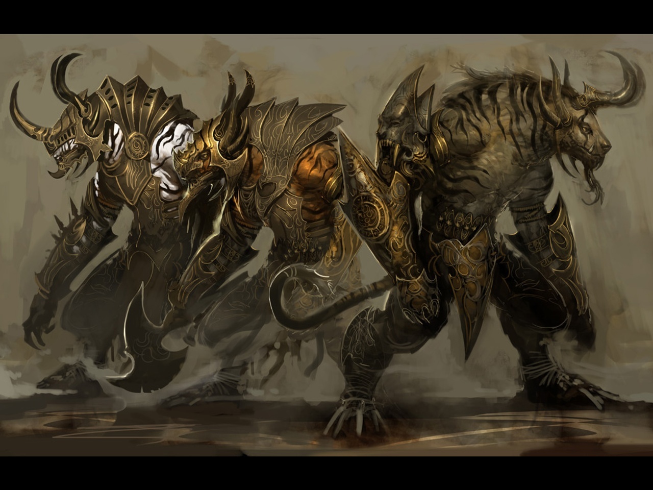
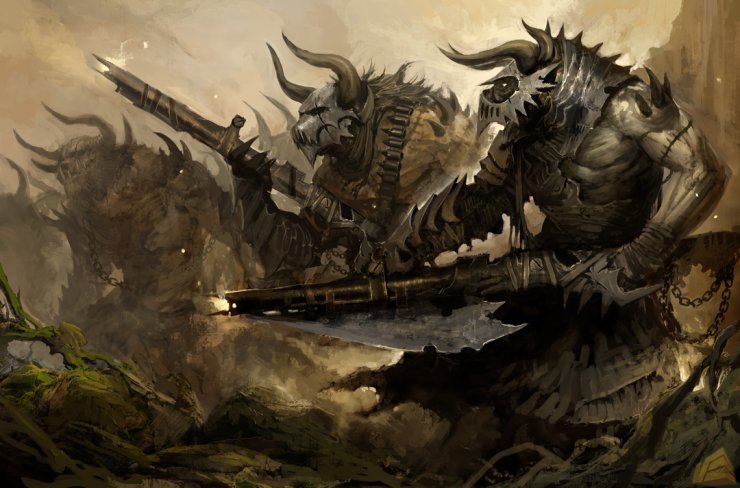
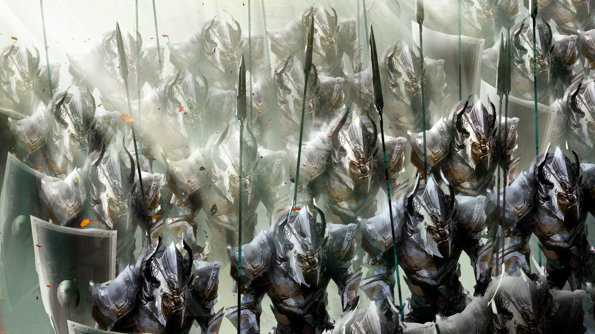
Charr and Their Visual Appearance
It would be nice if something was done. I loved Charr and their concept and lore. But their armor always looks horrible when compared to humans/norn/sylvari. I don’t know what needs to be done, but something does.
I would love my cuddlyfluffy to stand upright instead of hunched.
I rather like the current stance. Instead of changing the Charr, they should change the skins. Some skins have a tailhole, why not all? Some helmets have room for horns, why not all?
About the shoulders, they are bad on about every race, which is why most of my characters don’t show them…
I rather like the current stance. Instead of changing the Charr, they should change the skins. Some skins have a tailhole, why not all? Some helmets have room for horns, why not all?
About the shoulders, they are bad on about every race, which is why most of my characters don’t show them…
Tail holes could work, I suppose. But even that is just a quick fix for something that should be modeled specifically to each race, to make sure it looks as best as possible. You want evidence of this being a problem?
“http://wiki.guildwars2.com/images/f/f4/Flame_Legion_armor_%28heavy%29_human_male_front.jpg”
This is a Human Male wearing the Citadel of Flame armor. This armor was (at least from the game perspective) designed FOR the Charr. On the human, it doesn’t do much else than make him look a tad chubby because of the belt. The helmet fits, the shoulders work, and everything looks pretty seamless.
Here’s the Charr: “http://wiki.guildwars2.com/images/e/e4/Flame_Legion_armor_%28heavy%29_charr_male_front.jpg”
The legs are hidden by the oversized belt, the tail clips through the back, the helmet is extremely oversized, hides your hair, horns, and ears, and on top of that, shows a ton of your neck. On armor that was (still, in game perspective) DESIGNED FOR THE CHARR. This is probably one of the most extreme examples I can find, minus an old issue with one of the Charr racial armor sets.
Thanks for the feedback though!
~Kal
I rather like the current stance. Instead of changing the Charr, they should change the skins. Some skins have a tailhole, why not all? Some helmets have room for horns, why not all?
About the shoulders, they are bad on about every race, which is why most of my characters don’t show them…
I agree, I like my charr hunched over and running on all fours. It’s makes the race unique.
I would however like to see ALL armor catered for the individual races, not just the humanoid ones. Not all armor seems to have been individualized for charr. I get frustrated with the limited wardrobe options because I HATE clipping issues. I often end up sticking to the racial armor or one of the ‘outfits’ as they seem to cater well for tail and horns.
To be honest. I don’t mind the tail clipping. I’ve seen alot worse and its not all that bad.
The SHOULDERS however are the biggest pains in the tail. 90% of shoulders I don’t even toggle on because of how ridiculously oversized they are. Anet has in the past modified SOME of the shoulders, but very few and it leaves me scratching my head why.
Take for instance Banded Pauldrons in contrast to their almost EXACT countpart (except bigger) Guild Defender Shoulderplate.
Why can’t they use the same treatment? Shrink em kittenmit. Even my biggest charr still doesn’t fill those floating gaps. There’s no reason for it.
I would love my cuddlyfluffy to stand upright instead of hunched.
NUUUU!!!! Charr’s are awesome, because they are different! just a little TLC on the design side would be fine! Don’t hurt my boyzes backs and put them into medical devices to make em straight! Where is the tolerance? Where is the respect for differences! Don’t be bias or a bigot, love Charr the way they are! They were born that way, its not their fault!
*sniff…. I need a tissue.
lol, ok, fun aside, I would actually really like to see some attention given to Charr armour. Not a lot, but a little goes a long way. Tail holes… such a small thing… you have no idea how much that would mean to me though. To all us Charrs.
I think Arenanet has as priority the human race cause it’s what most players choose, though i recently created a charr and i wouldn’t mind making it my main if some visual bugs were fixed like tail cliping pixalated armos due to maiking them bigger bad shoulders etc etc. Humans i suppose is the easiest race to make as reference for all armors because it is so standard and generic all races that are bigger than human like charr and norn look bad in all armors except racial.Whatever the reason may be though makes the game disappointing and kinda forces you to go with the human race.
I like that the charr run on all fours. It’s sometimes a bit more difficult to navigate (I just recently started playing the charr, before I’ve played mostly norn) but that’s okay since it is one of the things that make the charr cool and unique.
I don’t like a lot of the clothing choices though…I personally find longer coats and most helmets just looks stupid and inpractical on the charr.
I’d prefer more specialized clothing for them.
Not only that.. I’ve bought a few outfits from the gemstore (like the northern explorer outfit for example) for my characters, and while they look cool on sylvari, norn and human, they look just fat and silly on my charr. :C
You what is really silly?
that charr women, that have fur everywhere and don’t even have noticable boobs wear a bikini top. :I
I don’t get it.
just why?
especially since the rest of the charr clothing looks pretty much unisex.
Well after so much time since the game came out I think it is pointless pointing out the real problems of the game all arenanet cares about is stupid things like musical intruments and ugly weapon skins so people can buy more gems that’s a reason why gw2 is going to die as a game sooner than other mmorpg and the expansion won’t save it. A friend of mine bought the game and after 1 month he said that’s enough and never played it again.
Charr problems as I see them:
- Charr have fur and excess clothing would likely be uncomfortable.
- Running on all fours is impractical. “Hold on while I stow/get out my gear!”
- That long neck with the head so low just seems like it would be awkward, and would limit their FoV.
- Also not sure about those non-retractable claws. “kitten, Rytlock, put on some shoes! This floor is ascended teak imported from Cantha! Each board cost as much as a mid-range precursor!” Handling things like maps and insta-level 20 experience scrolls would seem problematic.
They wont fix the charr really. Which is a shame because i have 9 of them. Charr are only played by around 15% of the game population, and players have been complaining about how horrible their armor looks since the game came out, and nothing has been really done. Of course, more people would play charr if their armor looked better, and the new armor they are coming out with has looked way better. Anet just needs to fix the old stuff now.
The proposed fix: Make Charr stand upright! We know they can do it! Heck, the male Charr in the character creation menu is standing up tall! You even get an ally in the first Guild Wars (who’s name I forget) who stands upright the entire time he’s in your party! So why are the Charr forced to be hunched over, and even worse, run on all fours! This isn’t fitting for a larger Charr, as it slows down their animation, and overall, the running is a tad awkward at times. Now, I do understand that they’re cat people, they’re very instinctive, and it’s fitting of them. But this is further in the future, where the Charr are more advanced, and more ‘civilized’…or as civilized as they can get.
Let me know what you guys think! I’d love some feedback on these ideas!
~Kal
Lol you have no idea if that solution would do anything not to mention is veiled under the goal fixing the Armor clipping by changing their idle stance. If you want to change the idle stance then stop hiding your ulterior motives behind assumptions.
As far as the stance goes, I like charr animations just like I like asura animations. Anet had done a great job making the races look and feel unique and I wouldn’t want then to take a step backward by making every race copies animation wise. For the charr, they are digitgrade creatures with an anatomy that is closer to a 4-limb Walker than most of the 2-legged races and the devs chose to illustrate that in their stance and animations. Just like how players complain that charr females look too similar to males, I’m glad anet took a stand and didn’t just give them boobs and I hope they retain that stance and leave charr stance alone. . .
… Just my opinion, btw.
I rather like the current stance. Instead of changing the Charr, they should change the skins. Some skins have a tailhole, why not all? Some helmets have room for horns, why not all?
About the shoulders, they are bad on about every race, which is why most of my characters don’t show them…Tail holes could work, I suppose. But even that is just a quick fix for something that should be modeled specifically to each race, to make sure it looks as best as possible. You want evidence of this being a problem?
“http://wiki.guildwars2.com/images/f/f4/Flame_Legion_armor_%28heavy%29_human_male_front.jpg”
This is a Human Male wearing the Citadel of Flame armor. This armor was (at least from the game perspective) designed FOR the Charr. On the human, it doesn’t do much else than make him look a tad chubby because of the belt. The helmet fits, the shoulders work, and everything looks pretty seamless.
Here’s the Charr: “http://wiki.guildwars2.com/images/e/e4/Flame_Legion_armor_%28heavy%29_charr_male_front.jpg”
The legs are hidden by the oversized belt, the tail clips through the back, the helmet is extremely oversized, hides your hair, horns, and ears, and on top of that, shows a ton of your neck. On armor that was (still, in game perspective) DESIGNED FOR THE CHARR. This is probably one of the most extreme examples I can find, minus an old issue with one of the Charr racial armor sets.
Thanks for the feedback though!
~Kal
Let me back down your complaint. . .
1. The legs aren’t hidden. I’m looking right at them. The belt? Is not hiding anything, the Armor piece that rests on the legs does the same thing as on the humans, rests on the outside thighs. They just reach closer to the knee because they have relatively shorter thighs.
2. Can’t see the tail but I’ll take your word for it. As for the helmet, Charr have larger heads, makes sense they’d have larger helmets. You know who else have big helmets? Asura.
3. His hair, horns and ears. True. But you know what else? I can’t see the hair or ears of the human either! The horns, though, are a problem that’s not going to get solved. If you want to see your hair for any race, you’re going to have to make special helmet choices which likely might affect your entire look. Same for horns.
4. Show a ton of neck? Is that a problem? First you complain ears and hair aren’t squarely visible then complain the neck (the past of the charr that often has a good portion of their hair) is too visible? Did you just want the hair and ears to clip through or something? But to take the fire off of you, some might see “visible neck portion” as a feature.
Charr neck should be armored (like cultural heavy sets) considering how large it is actually. Its not wise to run around without covered neck as someone might..cut it easily.
You wear helm for a reason and in current state nearly all of them doesnt offer the protection they should from aesthetic point of view thus they look inpractical and pointless – you cover your face but neck remain uncovered. That makes no sense. Were not human. Helm without covered neck doesnt offer protection for charr as they are not complete and the concept arts proves im right
I dont care about hairs as long our neck are covered, i could care less about ears too as they can be hided under helm. But horns? Thats our main feature just like tails and pawns.. Without them youre not charr
You even get an ally in the first Guild Wars (who’s name I forget) who stands upright the entire time he’s in your party!
~Kal
If you’re referring to Pyre Fierceshot ( a Guild Wars 1 hero), he’s hunched over like the other rangers and warriors.
You’re right though, in Guild Wars 1 the caster classes of the Charr are standing upright. If it’s possible in that game, why shouldn’t it be possible in this game? Did something happen in the 250 year time difference to make them ALL hunched over?
~who knows shrug~
| Claara
Your skin will wrinkle and your youth will fade, but your soul is endless.
Wow, that’s a TON of responses! Thanks so much for an active topic guys, I’ll try my best to reply to all of you!
NUUUU!!!! Charr’s are awesome, because they are different!
And I’m alright with them being different! But I’d like some quality control on their difference. Don’t build your stuff around a single skeleton and expect it to work on a dinosaur, yeah?
Well after so much time since the game came out I think it is pointless pointing out the real problems
I’m all too aware of this. I played back in beta and launch, and everyone was upset when they hit end game armors.
Lol you have no idea if that solution would do anything not to mention is veiled under the goal fixing the Armor clipping by changing their idle stance.
Log in as a Charr. Type /bow. Watch as your Charr stands upright, realigns its neck, and adjusts its body to fit better with the armor its wearing.
Let me back down your complaint. . .
All fair points. But, like I stated, from an in-game perspective, that particular armor looks like it was designed entirely for Charr, and the fact that it gets rid of out MAIN FEATURES is just rediculous! Also, why would you want your neck exposed in combat. Ever? As for larger helmets, this becomes REDICULOUS when you look at outfits.
Best Example: http://wiki.guildwars2.com/images/c/ca/Mad_King%27s_Outfit_charr_female_front.jpg Mad King’s Outfit
If you’re referring to Pyre Fierceshot ( a Guild Wars 1 hero), he’s hunched over like the other rangers and warriors.
Yes, him! I thought I had seen him not hunched over, but all the same, you still gave a good example of upright characters.
Thanks again for all of this feedback! It’s good to see so many differing opinions on a singular topic. Just keep it clean!
~Kal
What’s funny is if you use swiftness, a charr runs upright.
What’s funny is if you use swiftness, a charr runs upright.
Thats because you draw your weapon to use it. If someone else uses it, at least with my charr, they dont stand upright i just run faster on 4 legs. could be wrong though
What’s funny is if you use swiftness, a charr runs upright.
This is because you have your weapon drawn, so they have to hold onto it with their hands and run on their feet. If you put the weapon away using a key bind in the options, they’ll run on all fours again.

