Q:
Attachments:
(edited by blaugruen.5038)
Q:
Is there any way to change the healtbar coloring?
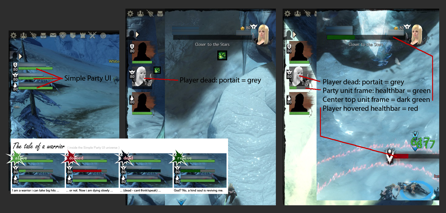
I’ve attached a picture to illustrate my problem.
With the ‘Simple Party UI’ enabled, it is very hard to distinguish ‘dead but a little revived’ from ‘alive’ party members. As you can see there are 3 different colors for dead players already, green, dark green and red.
Getting to my question from above, any way to switch ‘Simple Party UI’ healthbarcolors to ‘dark green’ or red?
Because it is annoying as hell, not to have that option.
Could also be an amazing >feature< for the Oct. 1st Patch.

(edited by blaugruen.5038)
this botheres me too. would be a nice feature.
yes, it´s kind of annoying, a little more custumization options would be very nice, and probably not so hard to change
you are not the only one whos bothered by this. i would definitely change the color setting if there was an option like this. at least an option where one could change if he/she prefers to.
Not something that bothers me necessarily, but it’s a great idea, and the reasoning is solid, in my opinion.
Hopefully other people will chime in with support before a mod dumps it in the trash-bin (a.k.a. suggestions forum)
There is one more if the party member is a necro.
This irritates me too. It’s also the same with downed iirc. The thing is on the standard UI there is the colour difference between when the player gets downed and its immediately noticeable if they’re defeated.
The simple UI needs this information, it should show the same as the standard UI only without the portraits.
Red is down state.
yes jski …pls state smthing more obvious XD
… joke, no really, the problem is not the red bar on the charakter, its the green bar (on dead ppl) on the party member icons
yes jski …pls state smthing more obvious XD
… joke, no really, the problem is not the red bar on the charakter, its the green bar (on dead ppl) on the party member icons
Grad out seems ok for an indicator for some one being down that and showing up on the minly map as downed. Now if your talking about player tunnel vision in a fight that more of a person problem that only the player them self can deal with. If we add in too many things for the game to be played for you as we seen in other mmorpgs as they get older the game play will lose a lot. So there is a “good” thing about being light on indicator of what going on.
Changing the color for dead players that have been revived a little, would not add that much of difficulty for new player, by having 100 different indicator for every situation.
“Tunnel vision” may be a problem, but i think that the indication of dead player within the minimap isnt enough for an indicator. Example: 3 players dead but 5 green heathbars. 3 “dead”-symbols on the minimap. I can not identify if the guardian is dead or the thief or any other class, within seconds.
So my request still stands for a change in healthbar colors for dead players.
yes jski …pls state smthing more obvious XD
… joke, no really, the problem is not the red bar on the charakter, its the green bar (on dead ppl) on the party member iconsGrad out seems ok for an indicator for some one being down that and showing up on the minly map as downed.
Im not quite sure, you are getting the problem here. In simple-UI, if a person is partly ressed, but still dead, the healthbar is green. No picture that can be grayed out, and even with a picture, if someone colores his char monochromatic, it´s hard to differ between colored and uncolored.
Now if your talking about player tunnel vision in a fight that more of a person problem that only the player them self can deal with. If we add in too many things for the game to be played for you as we seen in other mmorpgs as they get older the game play will lose a lot. So there is a “good” thing about being light on indicator of what going on.
And for your player tunnel vision comment, it´s NOT up to you to indirectly insult my gameplay and tell me im to focused on me instead of watching all partymember health. But instead it should be your therm of finally understanding the problem! Given the fact that there are mele classes, who can´t watch the ranged character behind him, while bashing an enemy infront of him. And you are not always near each other, if some of the group have special jobs, like pulling a lever or simply beeing somewhere ELSE.
and
how could ANYONE have a problem with ONE color more? can´t be that hard, can´t be that irritating, right?
If there are NO ways of customizaion, why not let there be one color more, to avoid missunderstandings?
I’ve tried to improve my illustration to reach the world (or one of the amazing, incredible, wonderful, lovely, kind, charming, skillful developers out there, working hard to make guildwars the game they want it to be – too much?).
It would also be good if my friends could tell when I am in death shroud so they know I am not about to die and its just ds running out. Seeing as enemies can see when I am in deathshroud it should not be in hard in theory to let party members know!
I just want the UI like in GW1, ably to place any part of the UI anywhere and resize it… IDK why they want even allow us to move/resize things.
But yes this is a good idea that anet will never add.
Personally I find the simple party UI a bit too simple. Only removing the avatar picture would have sufficed for me. A clear party UI is critical for situation assessment where visual perception of the combat can be blocked by view direction and overload of skill effects.
In my opinion the simple party UI lacks pve/wvw effects (environmental/bundle effects) and a clear health bar (deathshroud, ressing). I guess there is just always a trade-off between a non-intrusive simple UI and information that can be gained from an UI.
My suggestion would be to make the simple UI the same as you see your own boons/conditions. This also reduces guardians boons coming halfway your screen. Thus 3 bars in total top-down:
health
boons, pve/wvw effects
conditions
Red is down state.
You don’t say?
This only makes sense.
It’s a wonder why isn’t it like that already.
Maybe to send less info, as the targeted creature can only be one at all times.
You can resize the UI, if you do it all together. You can’t do pieces but you certainly can resize the UI. o.O
The fact that they use red and green has always made me go “huh”? from a accessibility standpoint.
So we have green and red in use.
Why not make the Resurrection state a blue bar?
Not affiliated with ArenaNet or NCSOFT. No support is provided.
All assets, page layout, visual style belong to ArenaNet and are used solely to replicate the original design and preserve the original look and feel.
Contact /u/e-scrape-artist on reddit if you encounter a bug.