I don't like Chaos skins
They do look decent with Celestial dye, but I wish they had given them a misty trail similar to that of Fractal skins, at least.
Alot of these skins look horribly pixelated as well, like the mace
Their appearance, along with short turnaround from the Ley Line weapons, certainly gave me the impression Anet is hurting for an influx of cash.
Their appearance, along with short turnaround from the Ley Line weapons, certainly gave me the impression Anet is hurting for an influx of cash.
I wonder if that explains the weird ‘deals’ we’ve been seeing in the gemstore. Like spend a bunch of gems for a regular red or green dye that is at MOST a few gold.
http://asuratime.tumblr.com/
I think they’re a bit ‘plain’ looking, but in terms of special effects, I like it. The pulsating currents remind me of the voltaic spear from GW1.
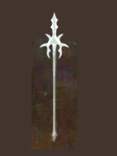
If only the spear had the shape/form of the voltaic spear with the chaos glow :-(
That’s what happens when you lack creativity. Ley line a creative set, thumbs up.
What?! I think these are some of the best skins they’ve released to date. I agree they’re relatively simplistic, but the glow is wonderful. The torch has a white flame and the lighting around your feet is also white instead of the classic orange, it’s awesome. To each their own, though.
Champion: Phantom, Hunter, Legionnaire, Genius
WvW rank: Diamond Colonel | Maguuma
I like them but I’ve only seen them on the preview screen yet. I’m hoping to see someone running around with one this evening.
Would you like some hard cheeze with your sad whine?
I love them and already got the ticket to get the sword. I like that they are shiny yet more properly proportioned compared to other sets we’ve got before. I don’t mind the apparent reuse of krytan skins, it just makes my new chaos sword fit better with the rest of my warrior equipment while still looking peculiar. To repeat just because I can’t be thankful enough, I’m so happy we got a more properly sized set of weapons, not surfboards and solid metal bows.
They recycled a lot of meshes and overall they have really low poly counts (not sure why I can count the edge faces on these when the amber weps are so smooth) but they still look really nice.
The biggest flaw for me is the fact that the glow is attached to the weapon and disappears in profile rather than being an image plain that aims at the camera like virtually all other effects in the game since launch.
That being said, I still will probably get the LB and 1h sword.
Just let us dye them like ye olde Chaos Axe…
I guess I should add, I really like the glow but the weapons themselves seem overly plain for something that technically costs money AND a gamble to get. If not money then a LOT of time. I do like that they match the radiant stuff though.
http://asuratime.tumblr.com/
If you have a char that’s wearing radiant armor, it really fits in well with that. I have a guildie who has an ele wearing the radiant helm and gloves. He got the dagger and staff and it matches very nicely.
I like the effects. I just don’t have a character that would use them.
i like them, but i love to have the glow tune down a bit to show some weapon details. Afterall i really like the shape especially great sword. If it is not the glow is too much and covered up all details, i will have it cover my sunrise before i get Belinda’s katana.
(edited by Crossaber.8934)
I love the Staff. If only I could make it orange it’d be the perfect Sunlight Spear. .-.
I like the skins, what I don’t like is that every single weapon shape looks like a common low level weapon designs. How about dropping these skins on the ascended or exotic weapon designs? Even the zodiacs had unique designs with their skins.
Why does the staff look almost exactly like the long spear? Staffs are usually badly proportioned and badly designed in this game, but that’s just taking it to a new low.
North Keep: One of the village residents will now flee if their home is destroyed.
“Game over man, Game Over!” – RIP Bill
Haven’t seen any besides the axe so far, but when I saw it I thought “o… shiiiiiiiney.”
Even if they aren’t that impressive to you, chances are they will be to many others. I would prefer them to keep releasing new skins. Eventually they’ll release some that will really appeal to you. :P
Humm I would use them if they was black they are too ‘white’ they should of name it ‘Light’ skins not Chaos
Humm I would use them if they was black they are too ‘white’ they should of name it ‘Light’ skins not Chaos
Based after the chaos axe from Guild Wars 1 which was white like this.
They look pretty bad.
Anyone know what the Greatsword model is based off?
Most anyone who played GW1 will want these skins. Granted, there weren’t as many chaos skins in that game, but ohhhhhh the nostalgia. Personally I want all of em.
Yak’s Bend Server
Crimethink [ct]
Get real, Anet aren’t hurting for an influx of cash… haven’t you been paying attention to massive sales/launch in China and also see how well NA/EU are still doing.
I like the new chaos weapons, does justice to the old Chaos Axe.
Seamarshal Belit / Initiate Xun Tsu / Mistwarden Roshone
Seafarer’s Rest | Northerner @ Dragon Season
They’re …ok? The fact that they’re a featureless white all over is a little meh. I’ve liked the krytan sword from early on but with the featureless look of the chaos sword, I’m going to stick with my fractal sword
I dunno… Preview window often lies, I already was disappointed with the Phoenix skins which were nice and glossy in the preview, but totally dull in actual world, but I think I want to get the Chaos Staff just for nostalgia’s sake. But why is it set so high on the (human, in my case) character’s back, do we really have to carry our staves like antennas?
Just did a bit of photoshopping (Excuse all the odd bits and ends).
A chaos spear skin kinda like this (the voltaic spear sort of model) would be pretty awesome in my books:
just you LOLLLL i like it and yea i also wish it had a trail similar to like foefire’s essense sorry if i misspell
They are more likely Divine skins than Chaos and I love them,I bought some gems too for Ticket scraps but with 0 chance…better I farm keys too it’s much worthy than to spend money on gems…
I’m not a fan of them. I think there are plenty of other sets that look much more polished and unique. That being said, this thread pops up for pretty much every new black lion weapon sets. I think that’s good, because it means they’re not only trying to appeal to one aesthetic, and that’s smart business. I don’t think every bit of artwork in the game must appeal to me, and I’m glad there are folks who enjoy this set.
-Mike O’Brien
Because we can’t be angry about both?
Not long ago, there was a thread asking for simpler looking weapons. These more basic/realistic meshes might not quite be what the people had in mind, but I posted in that thread too, because I prefer more realistic looking weapons and I like these better than I like a lot of the Black Lion weapons.
Of course, I loved my chaos axe in Guild Wars 1, and that could be part of the reason.
Gee, I got one in the first 5 minutes. The Axe for my Ranger. I liked it a lot better than the Orrian one she had. It matches my color scheme (green/white), so I thought they looked pretty cool.
Thanks, ArenaNet! =)
I just wish the bows had white strings instead of black…
Another disappointment to the pile. Moving on.
I like them more than some of the previous gem store sets. I guess it’s just a matter of taste. They are quite simple, but I think that works with the pure white asthetic.
I suspect my guild leader is going to love them though. They’ll go perfectly with her overall blindingly shiny look.
“Life’s a journey, not a destination.”
I love them. I think that most people saying they’re simplistic do not have high enough graphics to see the light blue designs in them. ^^
The only one that is lame to me is the shield. :P
And all who stood by and did nothing, who are they to criticize the sacrifices of others?
Our blood has bought their lives.
Looks through thread
Jup OP most of the thread missed that it’s GW1 reference Skins and they are supposed to look that way to emulate this.
Some are better than others. People in my guild went nuts when they came on the scene. I personally got the revolver pistol skin!
Yep, they have subtle light blue patterns on them. I love it, immediately bought the sword for my Guardian’s collection! First time I ever used a BL ticket. :-)
I love simple and elegant designs, high-level skins don’t need to be full of skulls and on fire to be cool. I’m glad that the majority of the weapons in this game adhere to that.
Effects are nice but the weapons themselves look lazy.
They’ve stopped trying long time ago.
I think they look nice, however they don’t fit any of my characters. I wish they would’ve done unique skins on all of them instead of (as far as I’m aware) just the Axe. I think it’s cool that they brought a classic skin like the Chaos Axe back though, and made it look even better
I don’t like any of it too, but I seldom like any skins from the Gem store. For you, I’m guessing it’s because of personal taste.
[Aeon of Wonder]
Maguuma Server
I love them, and yet I don’t. I think they have too much glow, which makes it hard to see the subtle details, even with the graphics turned all the way up. I love the sleek, simple lines of most of them, and the little shock like white waves they give off as particle effect, but the actual “glow” on the weapon itself needs to be reduced about 25% imo.
They’ve stopped trying long time ago.
Agree.
And ye i mean the chaos axe of GW1 = imba skin and GW2 released years later we have now high graphics and what does anet do?
Of course they kitten up the skin i mean really…. like the torment weapon from gw1 ….
JUST COPY PASTA IT and do some high res graphic or something!
But no anet has to do re-skin existing skins and put glow on it instead of just copy pasta from gw1 …..
http://wiki.guildwars2.com/images/archive/e/e8/20140422102427!Phoenix_Reborn.jpg
http://wiki.guildwars2.com/wiki/File:Chaos_Axe_Skin.jpg
http://wiki.guildwars.com/wiki/File:Chaos_Axe_dye_chart.jpg
Just open all 3 in a new Tab and cry / laugh….
GG WP Anet
(edited by Teniz.5249)
^^Not the same model. It has some similarities but it’s diferent.
(edited by Thiagugu.9682)
Looks through thread
Jup OP most of the thread missed that it’s GW1 reference Skins and they are supposed to look that way to emulate this.
Next in line: We brought back low-poly resolution models with no dye customization availble!
It’s a reference to Guild Wars 1 initial stages, so enjoy!
I love them. I think that most people saying they’re simplistic do not have high enough graphics to see the light blue designs in them. ^^
The only one that is lame to me is the shield. :P
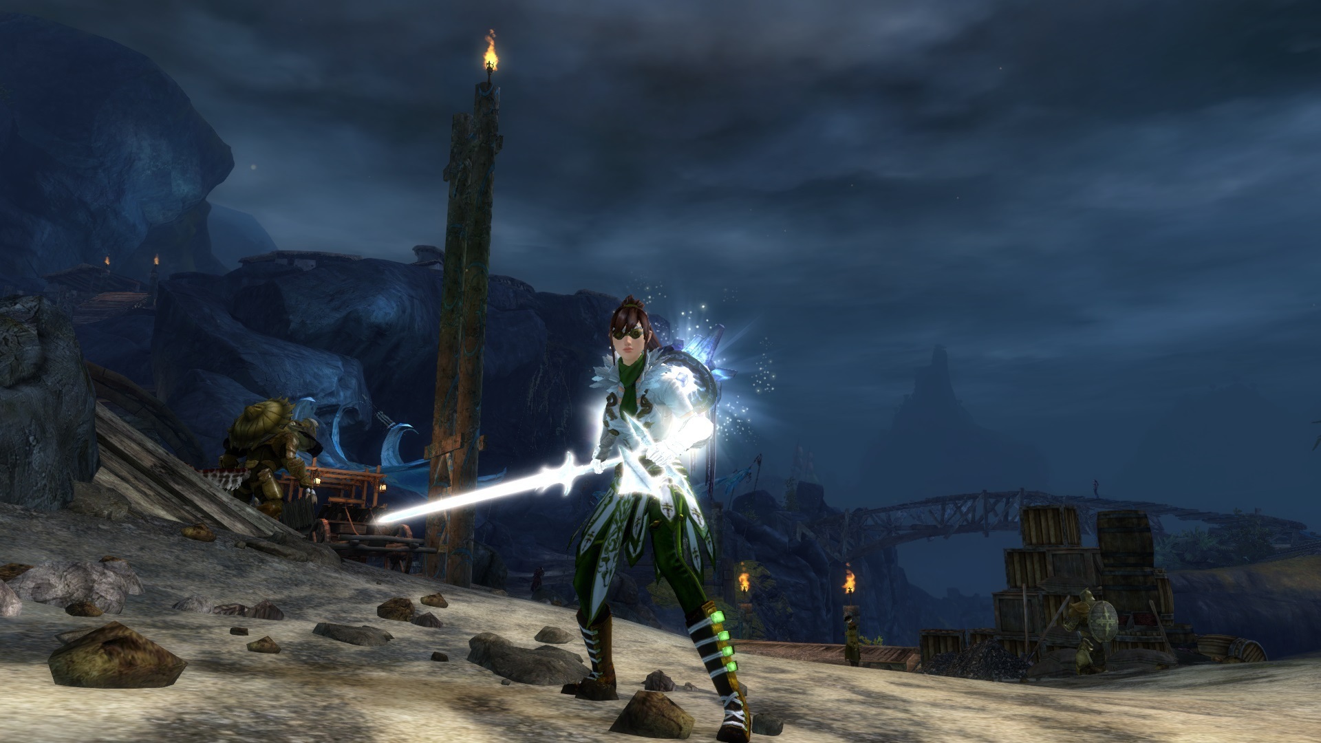
It is beautiful in actual screen shot, another proof that the preview suck. i wonder what its look in actual screen of sword skin though. I think i may spent my ticket….
Not the best angle but it’s what I have on my phone lol
And all who stood by and did nothing, who are they to criticize the sacrifices of others?
Our blood has bought their lives.
I love them. I think that most people saying they’re simplistic do not have high enough graphics to see the light blue designs in them. ^^
The only one that is lame to me is the shield. :P
It is beautiful in actual screen shot, another proof that the preview suck. i wonder what its look in actual screen of sword skin though. I think i may spent my ticket….
Not the best angle but it’s what I have on my phone lol
It is the simplicity that attract me, thanks Lilith, can’t decide which one to take. i am more lean to great sword though. Which one you think is better?
I like the greatsword but since I don’t use gs on mesmer If I had to choose I’d choose sword. But axe, sword, mace, focus, greatsword, torch, pistol, and scepter are the ones I chose for now… will be getting trident and spear and dagger next ^^
And all who stood by and did nothing, who are they to criticize the sacrifices of others?
Our blood has bought their lives.


