I wish we had a minimal UI option
I love gw2 UI. It’s simple, beautiful and clean..
How much of UI do you want gone/hide? Chat can be hidden.
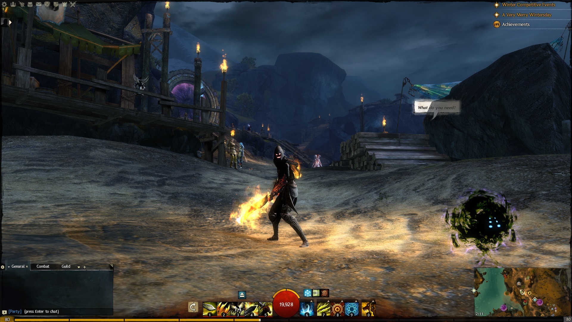
This is how my game looks like.
It’s pretty minimalistic to me. /shrug.
I love gw2 UI. It’s simple, beautiful and clean..
How much of UI do you want gone/hide? Chat can be hidden.
This is how my game looks like.
yours is pretyy clean because you dont have amy story quests etc. but i dont like the personal story and such thus these things have stuck on my screen and also i dont do dialies so i have this big UI part as well
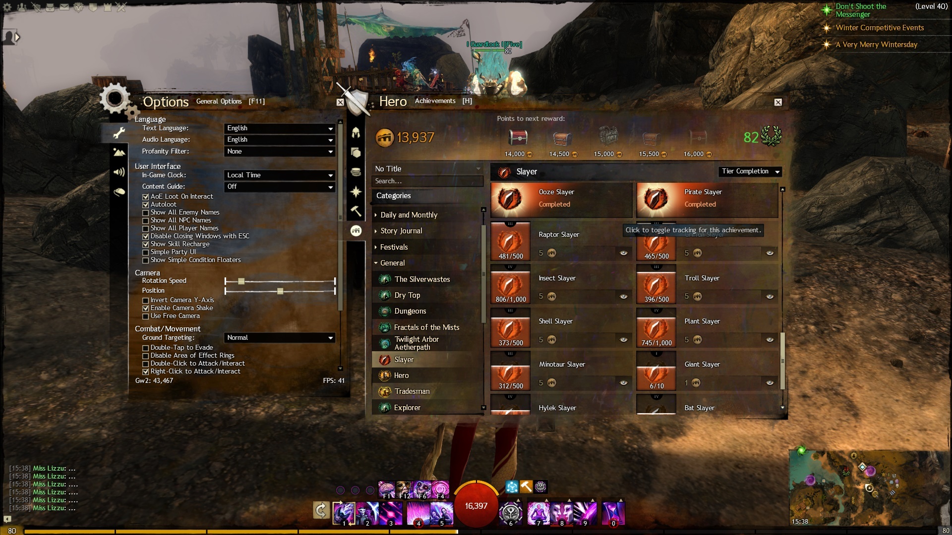
Options -> Content guide -> Off
Hero -> Achievements -> disable tracking for achivements
Personal story and events still shows up, but it doesn’t take that much of space.
You can try to play with no UI. Option → Control Options → User Interface → Show/Hide UI
(edited by Kondra.3860)
Love the idea OP. I know WoodenPotatoes uses Immersive Combat Mode
I would really like an in game way to clean up the UI though. Maybe just make everything able to be toggled on/off and moved.
I also wish we had a racial UI theme we could pick similar to Starcraft 2.
Sometime I try playing with Ctrl+Shift+H active. But it gets to be a little troublesome with loot, NPS, bag storage, map travel, etc. It does feel really good playing with usch an open screen though.
(edited by Prophet.6257)

