(edited by Ashantara.8731)
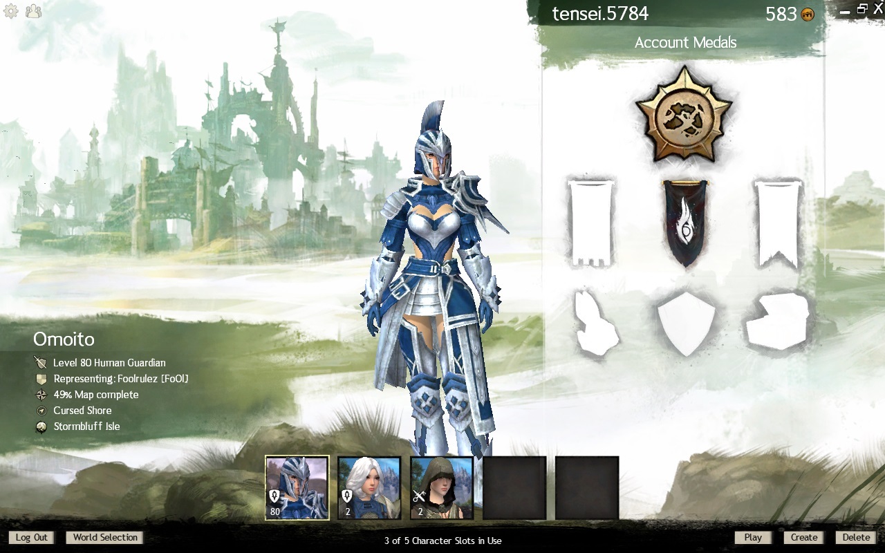
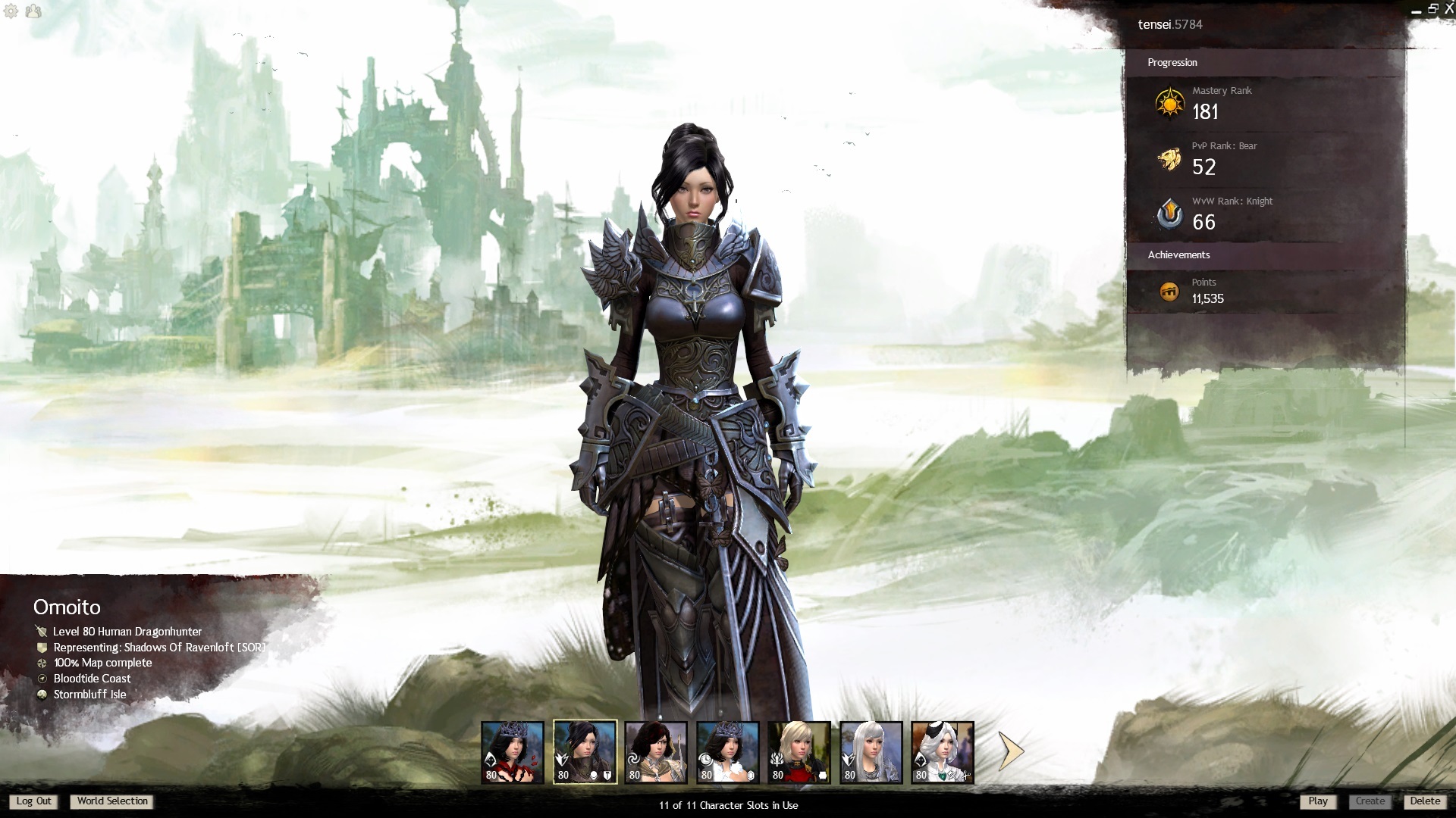
Love the new starting screen, except...
It’s just the background from the old character select screen, before they changed it for HoT. Example from 2012.
I’m just curious as to why they removed the HoT/green theme.
I’m just curious as to why they removed the HoT/green theme.
Preparing for a new expansion themed screen?
I’m just curious as to why they removed the HoT/green theme.
Likely an accident, where an in-progress update was pushed too soon. Episode 5 will be an important one, likely following up on Marjory investigating Lazarus. It’s also the more optimal time out of the 2 assumed to be remaining episodes, if they were going to reveal a trailer like season 2 did.
Yup, that’s pretty much what I was thinking: an intended change released too soon. Edit: Or some kind of placeholder version before the official “new” one is put in.
(edited by RoseofGilead.8907)
new screen? wut?
I’m just curious as to why they removed the HoT/green theme.
Preparing for a new expansion themed screen?
Here’s hoping!
I’m just curious as to why they removed the HoT/green theme.
Likely an accident
Hopefully! I had forgotten that this used to be the old character selection screen. Now it makes even more sense why it has all those flaws I mentioned in my OP (and why it is showing the old LA).
Oh well, let’s hope we will get the old new screen back soon. I like to see my characters’ feet and have more balanced player model sizes.
They returned to the old screen ??? SERIOUS!!! >WHY?
I’d understand it, if they make it a kind of “chooseable option” that everyone can decide for themself what kind of “Theme Screen” they want to use, but just changing the screen back to the first version without any reason just makes no sense!!
preparation ofr next expansion makes also no sense, as ANet just suddenly changed from the main game theme over to the HoT Theme from one day after another on HoT Release… so why shouldn’t they do the same just once the next expansion is out??
Theres no need to prepare for anything here ion regard of the theme screen.
Would be just the best option to rework the main game theme and allow all players to decide for themsel,f which kind of theme they want to use for the Login Screen to allow players to personalize their Login Screen.
this would basicalyl allow Anet also another gemstore source for makign money under the Account upgrades by selling in the future there “Login Themes” eventually for some small amount of gems, like 300-500 Gems and I’m pretty sure, ANet would find with this their target group as well as Im sure there would be alot of people who would buy stuff like that as well if anet just provides new optional login screen themes with unique new background songs for them that people like more than the original login screen and those that come automatically with expansions.
They returned to the old screen ??? SERIOUS!!! >WHY?
I’d understand it, if they make it a kind of “chooseable option” that everyone can decide for themself what kind of “Theme Screen” they want to use, but just changing the screen back to the first version without any reason just makes no sense!!
Dang, but this really brings back the memories of the aggrieved forum posts every time WoW rotated the login screen with a new xpac or whatever. I still don’t get it, do you really spend /that/ much time looking at the login screen?
It’s just the background from the old character select screen, before they changed it for HoT. Example from 2012.
it looks nothing like that, it’s all black and smoldering now
(primordus confirmed?)
They returned to the old screen ??? SERIOUS!!! >WHY?
I’d understand it, if they make it a kind of “chooseable option” that everyone can decide for themself what kind of “Theme Screen” they want to use, but just changing the screen back to the first version without any reason just makes no sense!!
Dang, but this really brings back the memories of the aggrieved forum posts every time WoW rotated the login screen with a new xpac or whatever. I still don’t get it, do you really spend /that/ much time looking at the login screen?
i like the Hot songtrack that comes with the theme alot more, than the one of the old Main Game Theme that came with the release day.
Like mentioned.. I wouldn’t be very surprised, if ANet would find with selling more unique “Login Screen Themes” that change not only the design of the theme, but also the background songtrack for the Login Screen with something unique that you can get only through the Account Upgrade from the Gemstore some kind of new target group..
People buy all kinds of stuff from the gemstore, Im pretty sure that would be also alot of people under all of us, who would buy login screen themes from the gemstore, if Anet would do that, if they offer just one, that you like prsonally much more, than the main game Theme and those that we seem to get with each Expansion as some kind of visual update, that shows the game right on login in, that something in the game has progressed in the games story, just by looking at the latest expansion login screen theme (if you chose to activate that for you as primary theme in use)
login Screen themes are just like DESKTOP THEMES… people like to switch them out once in a while if they are just in the mood for havign some kind of “simple visual change”. The audio part with unique songtracks attached to them came just from me, as I see this happening for example on my PS4 every now and then, that game develoeprs bring out unique Themes for the console,s that change not only just the background picture and UI elements of your console, but eventually come in also with background songtracks that you will hear then constantly in a loop if you choose to use that theme.
A very simple but interestign concept Ithink Anet could take over as a simple new way to generate with the gemstore more money and stuff like a new background loging screen theme and a new unique background songtrack for that are surely alot quicer done as new content, than like working on a new set of black lion weapons, or a new glider skin ,or a new minipet ct.
It’s just the background from the old character select screen, before they changed it for HoT. Example from 2012.
it looks nothing like that, it’s all black and smoldering now
(primordus confirmed?)
Notice how I used the word background. I was talking about the old LA artwork not being new artwork, not about the menu. The menu is obviously different, and yeah I think it’s about primordus given the colors.
Edit: All my characters have light skin and they all seem to have similar lighting effect that makes it look darker in areas like Ember Bay so it’s definitely scorching themed.
(edited by tensei.5784)
Didn’t even notice a change. Prob wouldn’t have ever noticed either if no one had said.
It’s just the background from the old character select screen, before they changed it for HoT. Example from 2012.
it looks nothing like that, it’s all black and smoldering now
(primordus confirmed?)Notice how I used the word background. I was talking about the old LA artwork not being new artwork, not about the menu. The menu is obviously different, and yeah I think it’s about primordus given the colors.
Edit: All my characters have light skin and they all seem to have similar lighting effect that makes it look darker in areas like Ember Bay so it’s definitely scorching themed.
although, it has a bit of a purple hue as well.. so could it be Kralkatorrik as well?
although, it has a bit of a purple hue as well.. so could it be Kralkatorrik as well?
Honestly whatever it’s meant to be I just hope it’s an intended update accidentally pushed forward too early and not just a weird bug, given that the background image isn’t new.
The lighting is definitely different, but what really bugs me is how zoomed in it is now … you can’t really get a good look at charr characters at all. Can we get that reversed please?
what really bugs me is how zoomed in it is now … you can’t really get a good look at charr characters at all. Can we get that reversed please?
Same complaint as in my OP.
What would be an excellent addition to the character selection screen is the ability to zoom in and out using the mouse wheel. That would solve said issue along with the weird size mismatch and the missing feet.
From the hotfix notes:
“Fixed a bug that caused the art on the Character Select screen to revert back to the pre-Heart of Thorns view.”
Yes!
Now add a zoom functionality (so that one can inspect all the beautiful details on armor more closely) and all will be superduper perfect here.
I only see the upper part of my Asura. Sacrilege!
Fight the queens
ehh i missed the original character select screen… feelsbadman
“We love the new screen”
“Uhh it’s just a bug…”
“Oh.”
“Mentoring engineers / mesmers and showing you what you can do with your fantastic class!
Just pm me for my advice! Always eager to help!”
People wanted a teaser and that is almost one! ;D
Checked in now – green, thorny and jungle-ish again.
I was wondering myself yesterday but didn’t give it any attention after that. Probably something like the jungle wurm model that was changed for a short time.
Combine those two things and you can slightly imagine where we are heading.

