New Background in Character select
want this! but i want to be able to change it too unlike gw1
in gw1 we got a new background every time an expansion come out and it stayed on that until the next one, i loved the first one from prophecies and factions too but didn’t like nightfall and eye of the north was ok but i always wanted the first one by the ascalon camp fire with all my characters standing around it back
(edited by Flubble.8093)
Maybe they haven’t changed it because we don’t have an expansion yet?
love the idea!
Message Body length must at least be 15.
I like this idea too, but I think they have a few more important fixes to do beforehand…
want this! but i want to be able to change it too unlike gw1
in gw1 we got a new background every time an expansion come out and it stayed on that until the next one, i loved the first one from prophecies and factions too but didn’t like nightfall and eye of the north was ok but i always wanted the first one by the ascalon camp fire with all my characters standing around it back
Ahhh! Memories.
I used to love the Guild Wars 1 screens, but you know, there’s something about the pastel understated Guild Wars 2 screen that I love as well. I’m pretty sure I’d miss it if they changed it.
In the Guild Wars 1 screens, my character was part of this great scene, but here there’s less to distract me from my character.
I think both styles have their strengths.
I’ve grown tired of the concept art background in the character select. Acctualy it’s realy turning me off. I would like to see a character select like in Guild Wars 1.
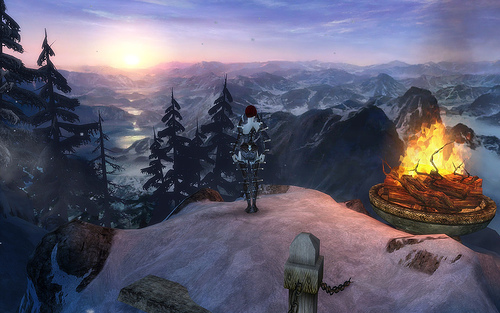
For example, when choosing your character in Guild Wars Eye of the north you where hit by a beautiful background with your character standing on a mountain in a snowstorm with this epic eye of the north theme song.
You could also turn the camera in other directions than just spinning your character around.Also, it would be great if we could see our characters backpacks. They are just as much a part of the characters appearance as the helm.
Here’s an example of GW1 eotn LOGGIN
Don’t forget seeing our weapons too!
And then, after EOTN they never changed it again. I got bored as well. I loved the Factions background. But yes, maybe they’ll change it when we have a new hopefully bigger update (Crystal Desert or something else maybe?).
‘would of been’ —> wrong
want this! but i want to be able to change it too unlike gw1
in gw1 we got a new background every time an expansion come out and it stayed on that until the next one, i loved the first one from prophecies and factions too but didn’t like nightfall and eye of the north was ok but i always wanted the first one by the ascalon camp fire with all my characters standing around it back
perhaps we could choose? =)
You know what would be nice? The background reflects where your character is currently logged out at. As in the general area: Kryta, Maguuma, Shiverpeaks, etc.
You know what would be nice? The background reflects where your character is currently logged out at. As in the general area: Kryta, Maguuma, Shiverpeaks, etc.
liking ur idea!
You know what would be nice? The background reflects where your character is currently logged out at. As in the general area: Kryta, Maguuma, Shiverpeaks, etc.
They could use the current background that shows behind each character’s head. Which is, of course, where your character last logged out from (not including PvP or WvW).
Even though there was only 1 expansion with GW1 (EOTN), the others are stand alone, I too would love to see some variations. !!! Make note ANET plz. GAME ON
+1
Thou shall rock!
Want option to see my weapons & back items on character select.
Want option to see all my characters together on character select.
[TTBH] [HATE], Yak’s Bend(NA)
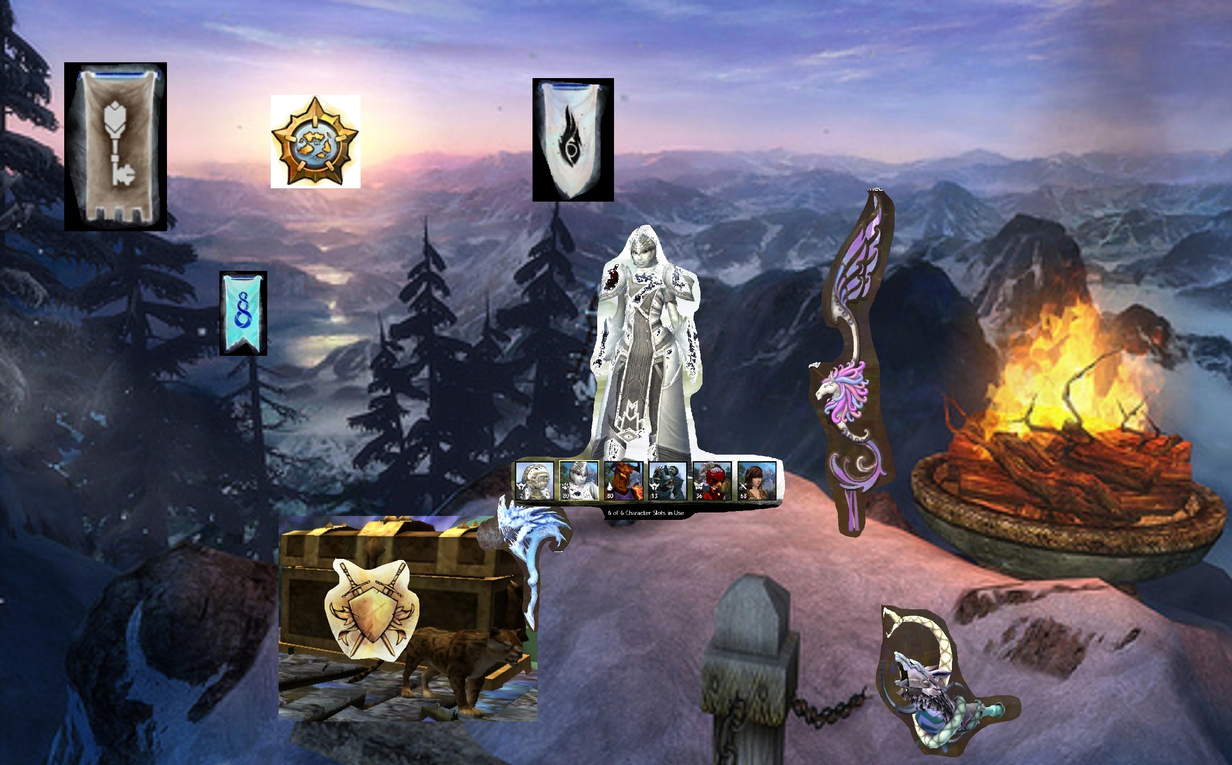
Combining the ideas of the various players here with our current chracter log in screen.
1)Shiverpeak area as last log out place.(example,can be tarnished coast/ascalon/kryta/orr themed as well)
2)Three Order banners displayed in background
3)Legendary collector will be displayed as a treasure chest and all ur legendary weapons will be scattered around the camp.
4)wvw kills will reflect ur coat of arms, it will be displayed on the body of the treasure chest.
5) spvp rank will reflect the single animal present guarding the treasure chest. rabbit/tiger/dragon etc.
6) Full Map completion will reveal a full moon or full sun, if not complete will be crescent moon in its various stages or sun obscured by clouds.
attached picture as a rough example,sorry for the laughable quality,its just to give a rough idea. other picture is current screen format with the same statitistic
(edited by Verdelet Arconia.6987)
If the character select screen remains as it is, I would just really like it to have the lighting toggle added (day/night) just as the character creation screen does. I would really like to be able to take night time lighting shots of my characters at the character select screen, as well as turn off the super bright blinding screen that we are welcomed with currently.
| [Free Ports For All “Not So Secret” JP Needs (and 1st Try Dive Tips)] |
| [Classic Thread: “all is vain”] |


