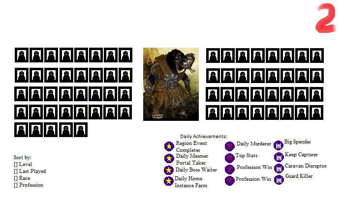
New Character Select
Ironically the beta character select screen was so popular that people were asking it to come back and some tools have developed a way to use it on their loader. Beta doesn’t necessarily mean it’s supposed to change drastically. Just saying.
As for difficult, no one change is necessarily difficult. It’s all a matter of time budgeting. Making one thing means not making another. I mean given the choice of a revamped character select screen and build saving, I know what I’d choose.
In fact, the character select screen has been redone once (not just counting the backdrop) and doesn’t bother me at all.
If it’s an ‘option’ to show other things in character select, that is fine, but I would ‘not’ want to see extra things on my character in the character select screen. I like how all my characters look in the select screen at the moment. The only issue I have is not being able to use the mouse wheel to scroll the carousel at the bottom. And I might have some issues with the new darker background being introduced with PoF (I like the lighter HoT background for contrast).
I wouldn’t seeing levels of crafting on the side margins, % of map completed, and such.
Maybe have an option to select the background that fits character.
The select screen does need a huge rework. Especially with that character slot sale coming up.
- Absolute must: A faster way to find and select characters. I had a mock-up done a long time ago, inspired by a MOBA or two.
- Orient the size of the character so it fits on the screen. Charr are over-huge, and Asura get their little feet cut off. This needs to be normalized.
- Add some useful details to the screen. Even without profession-specific PvP wins, a list of Dailies would be great.
“I’m finding companies should sell access to forums,
it seems many like them better than the games they comment on.” -Horrorscope.7632
The select screen does need a huge rework. Especially with that character slot sale coming up.
- Absolute must: A faster way to find and select characters. I had a mock-up done a long time ago, inspired by a MOBA or two.
- Orient the size of the character so it fits on the screen. Charr are over-huge, and Asura get their little feet cut off. This needs to be normalized.
- Add some useful details to the screen. Even without profession-specific PvP wins, a list of Dailies would be great.
THANK YOU
especially for the adjust the size of characters.
Personaly i don’t like how it looks now at all. It’s really offputting. I can’t even force myself to make a female character even though i want to.
I’m mostly a cosmetic player. These things are important .
We really need a new Character select screen. I’ve been requesting this sence the launch of GW2 Vanilla.
Why? Because it looks like a beta test.
We already had three (Lion’s Arch, Maguuma Jungle, Crytsal Desert). But it’s apparent that’s not what you were talking about.
• The Charr is huge, disturbingly so. You can almost see it’s pixels.
• Let characters carry weapons and backpacks in the select. Show them as they are.
• Why does all female characters lower their gaze and look down? They are to look strong and proud.Look at the GW1 Eotn character select. That was some great character select. They didn’t carry weapons but you could view your heroes from different angles.
Why not give them racial-themed-backgrounds like World of Warcraft?
I am not a programer but i can’t help from wondering: How difficult can it be?
I agree with all of these points, except that I don’t want equipment in the CSS (unless it can be toggled on and off).
We really need a new Character select screen. I’ve been requesting this sence the launch of GW2 Vanilla.
Why? Because it looks like a beta test.We already had three (Lion’s Arch, Maguuma Jungle, Crytsal Desert). But it’s apparent that’s not what you were talking about.
• The Charr is huge, disturbingly so. You can almost see it’s pixels.
• Let characters carry weapons and backpacks in the select. Show them as they are.
• Why does all female characters lower their gaze and look down? They are to look strong and proud.Look at the GW1 Eotn character select. That was some great character select. They didn’t carry weapons but you could view your heroes from different angles.
Why not give them racial-themed-backgrounds like World of Warcraft?
I am not a programer but i can’t help from wondering: How difficult can it be?I agree with all of these points, except that I don’t want equipment in the CSS (unless it can be toggled on and off).
Indeed. I’m sure there’s more people aswell
Pleeeeeease… if nothing else, at least remove the awful dark orange lighting from the PoF character selection screen.
Pleeeeeease… if nothing else, at least remove the awful dark orange lighting from the PoF character selection screen.
Agreed. It would be nice if they could come up with something lighter, but still keep the same theme they are going for.
I just wish I could hover over my character portraits and use the mousewheel to scroll through them.
I just wish I could hover over my character portraits and use the mousewheel to scroll through them.
Yeah, that’s my only other ‘would be nice’ feature. 
Well, I wish it was easier to access all (43) of my characters. Only showing 8 at a time is a pain for those of us with lots of (too many?) characters.
