Sugg- Upgrade UI and Clear Clutter

Sugg- Upgrade UI and Clear Clutter

in Guild Wars 2 Discussion

Posted by: Swagger.1459

Swagger.1459

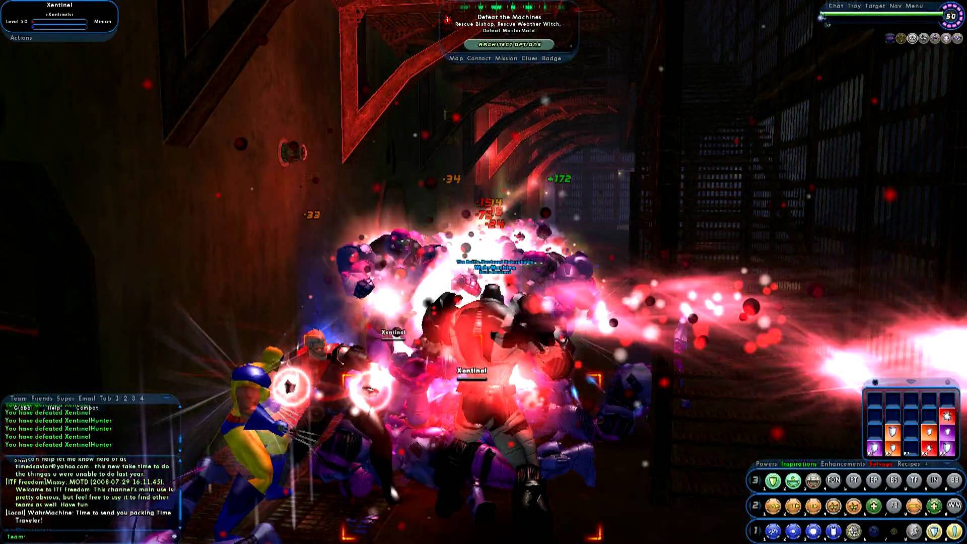
There is a lot of visual “noise” during combat that we need to focus on, and it would be nice to have less obstructing User Interface elements. Please give us a greater level of customization over the User Interface and make improvements that combat all the central screen clutter.

Thank you!

Edit- Please look at the differences in the pics.
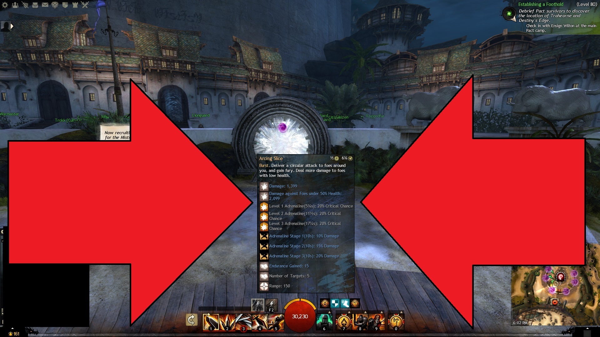
Edit 2- take a look

https://paragonwiki.com/wiki/The_Players%27_Guide_to_the_Cities/User_Interface

https://paragonwiki.com/wiki/The_Players%27_Guide_to_the_Cities/User_Interface/Powers_Window

https://paragonwiki.com/wiki/The_Players%27_Guide_to_the_Cities/User_Interface/Tray_Window

“Floating Power Trays (see below)

In the Tray Window, you will see between one and three lines of ten numbered circles. These are referred to as “power trays.”

You have a total of nine power trays, but are only able to view up to three at a time in the tray; more trays can be shown as floating trays. Each power tray is labeled 1-9 and these numbers are displayed on the left side of each power tray. You can cycle through these trays by clicking on the right or left arrows on either side of the tray numbers.

If you wish to change the number of trays you currently have displayed, you may do so by clicking on the arrow at the top of the Tray Window. Clicking this arrow when you have only one power tray displayed will cause a second power tray to appear. Clicking this arrow when you have two power trays displayed will cause a third power tray to appear. Finally, clicking this arrow when you have three power trays displayed will cause two of the trays to disappear, leaving only one. By default, you may also cycle through the number of visible power trays by pressing the right Alt key on your keyboard.

Floating power trays may also be opened by clicking the “+” at the top of the Tray Window. These trays may be placed anywhere on the screen, and their layout can be customized by right-clicking in an empty area of the tray. They may also be closed through this context menu.

Issue 23 introduced the server tray (sometimes referred to as the APB or “alternate power bar”), which appears at the top of the Tray Window. This tray is used to display certain Temporary Powers and Kheldian form powers. The tray cannot be customized and is hidden when not in use.

You can drag power icons from the Power Window to your power trays, and arrange them in whatever order you prefer. In order to remove an icon from your power tray, right click on the icon and select “Remove from Tray.” To move an icon from one slot to another, click and drag the icon to its new position. If another icon was originally in that position, the two will swap. (You may enable/disable the “Lock Powers in Tray” option in the General Miscellaneous Options to either prevent accidentally dragging power icons or allow the icons to be dragged.)

In addition, when you create a macro, if there is an empty slot available in one of your power trays, an icon with the macro name will appear. You may then activate the macro at any time by clicking on it. Pet command macros (for Mastermind and Lore pets) may also be dragged from the Pets Window to a tray."

https://paragonwiki.com/wiki/The_Players%27_Guide_to_the_Cities/User_Interface/Powers_Window

“The Powers Window may be opened by clicking on “Powers” on the outer edge of the Tray Window or selecting “Powers” from the Menu

In the Powers Window, you will see all of the powers in your selected power groups. Your primary power set will be on the left and your secondary power set will be in the middle. On the right side of the window will be several sets of powers, including temporary powers, inherent powers, any power pools from which you have selected, and ancillary or patron power pools from which you have selected, and ancillary or patron power pools.

In each power set, any powers you have not gained through training will be shaded and powers you have taken will appear brighter. Any power you have gained through training will allow you to right click to display more information. Powers that are not automatic powers (always active) may be dragged from the Powers Window and placed in the power trays in the Tray Window.
This window also gives access to the Combat Attributes Window and the Incarnate Power Window."

https://paragonwiki.com/wiki/The_Players%27_Guide_to_the_Cities/User_Interface/Options_Window#Miscellaneous_Options

Attachments:

New Main- 80 Thief – P/P- Vault Spam Pro

221 hours over 1,581 days of bank space/hot pve/lion’s arch afk and some wvw.

(edited by Swagger.1459)

Sugg- Upgrade UI and Clear Clutter

in Guild Wars 2 Discussion

Posted by: Danikat.8537

Danikat.8537

So what would you consider ‘clutter’? The entire name plate? Or only certain parts of it? If so which ones?

Do you want them removed completely, moved elsewhere on the screen or do you want an option (menu? key binding?) to turn them on or off?

I’m a little confused because when I read your post I was thinking about the things which bother me – which is mainly the text on the right hand side (the achievements especially, and sometimes the story if I’m not doing it). But your screenshot seems to indicate you want to get rid of things I actually consider to be useful information, in which case unless it’s an option each player can turn on or off I’d have to completely disagree.

Danielle Aurorel, Dear Dragon We Got Your Cookies [Nom], Desolation (EU).

“Life’s a journey, not a destination.”

Sugg- Upgrade UI and Clear Clutter

in Guild Wars 2 Discussion

Posted by: Swagger.1459

Swagger.1459

I’m not asking to get rid of anything, I’m asking for a better level of control over the UI so we can combat the UI visual clutter…

GW2 has a more “fixed” UI with very few customization options. There is a lot of central clutter with the enemy target plate, combat bar UI and tool tip pop ups. Would be nice to be able to move around and resize and hide… UI elements to our liking.

I provided screens for visual comparisons between GW2 UI and another games customizable UI… Look at the possible cleaner appearance of a customizable UI…

New Main- 80 Thief – P/P- Vault Spam Pro

221 hours over 1,581 days of bank space/hot pve/lion’s arch afk and some wvw.

(edited by Swagger.1459)

Sugg- Upgrade UI and Clear Clutter

in Guild Wars 2 Discussion

Posted by: lioka qiao.8734

lioka qiao.8734

GW2 is not like your comparison MMO:
- not that many skill buttons to use
- Has a mini map constantly visible

That other MMO has skill cards that show up on the skills too right? Those aren’t clutter they’re useful information. The target enemy’s HP and description of what it does are also useful information. The skill cards aren’t even a problem unless you’re mouse-clicking skills.

GW2’s UI is fairly good for the amount of information you get from it and fairly clean too. It’s cleaner than Final Fantasy 14’s UI at least.

Little red Lioka

Sugg- Upgrade UI and Clear Clutter

in Guild Wars 2 Discussion

Posted by: Swagger.1459

Swagger.1459

GW2 is not like your comparison MMO:
- not that many skill buttons to use
- Has a mini map constantly visible

That other MMO has skill cards that show up on the skills too right? Those aren’t clutter they’re useful information. The target enemy’s HP and description of what it does are also useful information. The skill cards aren’t even a problem unless you’re mouse-clicking skills.

GW2’s UI is fairly good for the amount of information you get from it and fairly clean too. It’s cleaner than Final Fantasy 14’s UI at least.

Have you ever played a game where you had the option to move around and resize and hide UI elements to your liking?

New Main- 80 Thief – P/P- Vault Spam Pro

221 hours over 1,581 days of bank space/hot pve/lion’s arch afk and some wvw.

Sugg- Upgrade UI and Clear Clutter

in Guild Wars 2 Discussion

Posted by: lioka qiao.8734

lioka qiao.8734

GW2 is not like your comparison MMO:
- not that many skill buttons to use
- Has a mini map constantly visible

That other MMO has skill cards that show up on the skills too right? Those aren’t clutter they’re useful information. The target enemy’s HP and description of what it does are also useful information. The skill cards aren’t even a problem unless you’re mouse-clicking skills.

GW2’s UI is fairly good for the amount of information you get from it and fairly clean too. It’s cleaner than Final Fantasy 14’s UI at least.

Have you ever played a game where you had the option to move around and resize and hide UI elements to your liking?

I have. Actually FF14 let me do that and the first Guildwars had the option. Startrek online lets me move them too. I’ve simply never felt the need to move the UI elements around. That said i’ve had the target nameplate get in the way of casting spells sometimes in GW2. Beyond that i don’t feel the UI is cluttered.

Little red Lioka

Sugg- Upgrade UI and Clear Clutter

in Guild Wars 2 Discussion

Posted by: Moyayuki.3619

Moyayuki.3619

I can see what you are talking about. Sure, hovering over a skill and showing what the skill does is important, but it is rather large. And with the UI scale, with the skill bar, we only get, what, two options, I believe? I wish it could have more cutomization, too, like WoW does. I can’t even resize my Hero page/the BLTC. I have to make sure I am not doing anything important or in the way of enemies when I pull that kind of stuff up.

Server: Dragonbrand
Guild: Moonlit Renegades (Moon)
Highest-Level Toon: Markus Emmerich, 80 Human Scrapper

Sugg- Upgrade UI and Clear Clutter

in Guild Wars 2 Discussion

Posted by: CMM.6712

CMM.6712

We want GW1 UI options!!!

Sugg- Upgrade UI and Clear Clutter

in Guild Wars 2 Discussion

Posted by: Serious.7083

Serious.7083

People have been asking for this since before day 1. So far it hasn’t happened, and I don’t expect it to happen, even if it should.

Sugg- Upgrade UI and Clear Clutter

in Guild Wars 2 Discussion

Posted by: Galtrix.7369

Galtrix.7369

You don’t know how good you have it, my friend.

Attachments:

[~Galtrix~] [~Level 80 Elementalist~] [~GoM~]

Sugg- Upgrade UI and Clear Clutter

in Guild Wars 2 Discussion

Posted by: CMM.6712

CMM.6712

You don’t know how good you have it, my friend.

Are you sure that is a game and not a migraine simulator?

Sugg- Upgrade UI and Clear Clutter

in Guild Wars 2 Discussion

Posted by: Aenaos.8160

Aenaos.8160

You don’t know how good you have it, my friend.

This is borderline misinformation.
The reason this UI is so cluttered is because the player wanted it to be that way.

This is a screenshot of a heavily moded WoW UI(the worst WoW UI I’ve ever seen btw) .
There you have the freedom to have a UI as minimalistic or as intrusive as you like.
Here we lack even basic options,like being able to resize UI elements independent of each other,being able to move the target unit frame,choosing what to track in the tracker,etc.

The current UI is a bit of an exercise in ignoring the parts of it that you don’t need or you find intrusive.

These are some improvements I would like to see.
They would provide some basic customization,and the means to reduce the UI clutter.

UI elements control/scaling
-Independent scaling for the various UI elements like the action bar,the buffs/debuffs bar,the tracker etc.

-The option to disable UI Elements,the XP bar for instance.

-Option to show/hide UI elements when in/out of combat.

Nameplates and Health Bars

-More nameplate categories and control over them
Show/hide Friendly players
Show/hide Enemy players
Show/hide Party members
Show/hide Squad members
Show/hide Guild members
Show/hide Friendly NPCs
Show/hide Enemy NPCs
Show/hide Neutral NPCs(Yellows that atm are categorized as enemies)
Show/hide Ambient NPCs(Whites that atm are categorized as enemies)

-Same for Health Bars
Show/hide Friendly players
Show/hide Enemy players
Show/hide Party members
Show/hide Squad members
Show/hide Guild members
Show/hide Friendly NPCs
Show/hide Enemy NPCs
Show/hide Neutral NPCs(Yellows that atm are categorized as enemies)

-Options for different behaviour when in and out of combat and customizable colours.

Combat Text
Show/hide Normal damage
Show/hide Condition damage
Show/hide Critical Strikes
Show/hide Combat events(blocks,stuns etc)
Show/hide Combos
Show/hide XP gain

Tracker
Show/hide Dailies
Show/hide Dynamic Events
Show/hide Personal-Living story
Show/hide Promotions

Nowhere near as extensive or UI altering as add ons,but a lot better than what we got now.

-Win a pip,lose a pip,win a pip,lose a pip,lose a pip,
lose a pip,win 2 pips,lose a pip,lose a pip…………..-
-Go go Espartz.-

(edited by Aenaos.8160)

Sugg- Upgrade UI and Clear Clutter

in Guild Wars 2 Discussion

Posted by: Rhyse.8179

Rhyse.8179

As mentioned, this is an old (pre-beta) problem. It’s never been addressed.

The tragic thing is, GW1 had a fully customizeable UI. GW2 is based on the same engine, and should have imported the customization features without even trying. Sigh.

“I care nothing for a festering industry that wantonly refuses to
provide a service that I’m willing to purchase.” – Fortuna.7259

Sugg- Upgrade UI and Clear Clutter

in Guild Wars 2 Discussion

Posted by: Swagger.1459

Swagger.1459

I can see what you are talking about. Sure, hovering over a skill and showing what the skill does is important, but it is rather large. And with the UI scale, with the skill bar, we only get, what, two options, I believe? I wish it could have more cutomization, too, like WoW does. I can’t even resize my Hero page/the BLTC. I have to make sure I am not doing anything important or in the way of enemies when I pull that kind of stuff up.

Hope something is done soon…

Attachments:

New Main- 80 Thief – P/P- Vault Spam Pro

221 hours over 1,581 days of bank space/hot pve/lion’s arch afk and some wvw.

Sugg- Upgrade UI and Clear Clutter

in Guild Wars 2 Discussion

Posted by: BrotherBelial.3094

BrotherBelial.3094

I can see what you are talking about. Sure, hovering over a skill and showing what the skill does is important, but it is rather large. And with the UI scale, with the skill bar, we only get, what, two options, I believe? I wish it could have more cutomization, too, like WoW does. I can’t even resize my Hero page/the BLTC. I have to make sure I am not doing anything important or in the way of enemies when I pull that kind of stuff up.

Hope something is done soon…

I thought there was an option in setting for skill facts, or am I thinking of GW1.

i5 4690K @ 3.5Mhz|8GB HyperX Savage 1600mHz|MSI H81M-E34|MSI GTX 960 Gaming 2GB|
|Seasonic S12G 650W|Win10 Pro X64| Corsair Spec 03 Case|

Sugg- Upgrade UI and Clear Clutter

in Guild Wars 2 Discussion

Posted by: Sagramor.7395

Sagramor.7395

Regarding the placement of tooltips, stop clicking skills?

As for the “you don’t know how good you have it” screenshot all of that clutter is due to 3rd party UI elements poorly configured as others have said.

I did a lot of rather heavy UI alteration in the latter days of my WoW career, and I very much like the stock GW2 UI. There are a lot of things that would be nice, but with the limited amount of resources that seem to be available for development I’d rather they leave the UI alone.

Sugg- Upgrade UI and Clear Clutter

in Guild Wars 2 Discussion

Posted by: Khisanth.2948

Khisanth.2948

GW2 is not like your comparison MMO:
- not that many skill buttons to use
- Has a mini map constantly visible

That other MMO has skill cards that show up on the skills too right? Those aren’t clutter they’re useful information. The target enemy’s HP and description of what it does are also useful information. The skill cards aren’t even a problem unless you’re mouse-clicking skills.

GW2’s UI is fairly good for the amount of information you get from it and fairly clean too. It’s cleaner than Final Fantasy 14’s UI at least.

Have you ever played a game where you had the option to move around and resize and hide UI elements to your liking?

I have. Actually FF14 let me do that and the first Guildwars had the option. Startrek online lets me move them too. I’ve simply never felt the need to move the UI elements around. That said i’ve had the target nameplate get in the way of casting spells sometimes in GW2. Beyond that i don’t feel the UI is cluttered.

That had made me want to move the nameplate sideways from time to time but it’s more like a bug that has been around since launch. Skill targeting shouldn’t get obstructed by the UI. Mostly a problem with very tall enemies like the statue of dwayna.

(edited by Khisanth.2948)