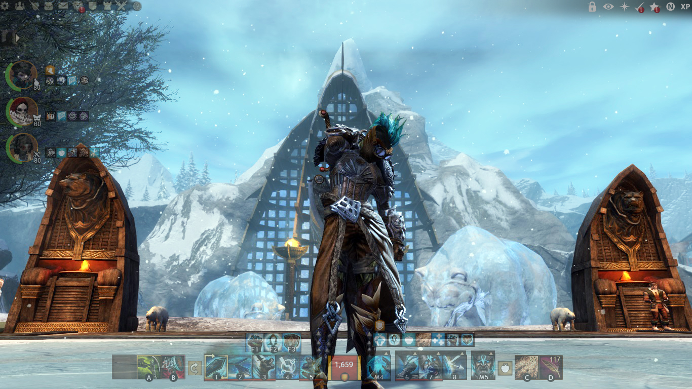
Hey guys! So just to get this off my chest; I am extremely paranoid about uploading these pictures lol I redesigned the UI on my own initiative therefore I don’t know if I’ve violated some Terms of Service etc (since nothing belongs to me). So I shall clarify: whatever elements I combined, edited, deleted and/or modified are all properties of Mr. ANet! I’m just an extremely visual person and I thought by designing my idea you guys could better visualize the concept Thanks.
—————————————————————————————————————————-
My personal problems with the current UI (I’m no unique snowflake therefore I’m sure another Joe or Jane has these same gripes).
1. Upon looking at my screen I sometimes feel there is WAY too much text!
2. The grudge border limits or “closes” the visual aspect of the game (our monitors already do this)
3. We can barely remove anything from the UI; only minimize things (Of which I am grateful
I’ve uploaded a picture where I did my best to have a clean UI: minimized everything, made the map and chat smaller.
—————————————————————————————————————————-
The 2nd image is what I did, so let’s run through everything uno by uno. Left to right.
1. Removed the grudge brush effect around the edges. “Opens” the game.
2. Changed the party UI; I feel the circular shapes are more organic, more attractive and occupies less space (more stylish too :P)
3.On the upper right hand corner I’ve added a new tray of icons:
- The lock icon locks the tray (the icons cannot be toggled on or off)
- The eye icon lowers the opacity of the entire UI (check 3 image!); However, all your skills etc may still be clicked and they remain functional
- The star icon toggles the personal story information or the living story. Depends on which one the user has activated.
- The check mark toggles your daily or monthly tasks. A red exclamation mark (notification) will remain there until you have completed your dailies, like a reminder.
- The other star will toggle the event information. Should you be in the area of an ongoing event, you get a notification until you leave the area or complete the event.
- The “N” toggles the mini map.
- The “XP” toggles the experience bar at the bottom along with our scaled and current levels.
—————————————————————————————————————————-
Whew!!! (Bare with me <3)
Now the addition to the utility bar is more of a Quality of Life feature but I thought it would be pointless to make another thread explaining my idea. Basically I’ve always wished we had more slots for weapons, gear, consumables or other miscellaneous items on the fly. I live in dungeons and do a lot of speed clears and I always have to have my inventory open and minimized at the corner so I can quickly grab something.
You Arah runners feel my pain lol plus I’ve seen this a lot in videos on YouTube.
The HP circle was modified to make the entire bar a bit more “streamlined” if you will. I view the HP circle as a visual hiccup when I run my gaze across
To fill these slots you open you inventory, right click the item and select “Assign to A” or “B” etc. These slots wouldn’t function like the utilities drop down boxes. Weapons assigned to the A and B slots could only be switched when you’re OOC. For example a guardian quickly switching to staff without opening the inventory for trash runs.
On the right we have slots for anything really! Mainly nom noms and other goodies (functions the exact same way). The slot on the far LEFT has no assignment – its function is to store the offhand weapon when switching! The slots could even be key bound!
There you have it! Would love criticism, opinions or thoughts. All that juicy stuff. Thank you for reading guys!
PS I tried to use html n textile codes to make the reading a wee bit easier but to no avail. Sorry.
PSS! I realized I forgot the icon for the chat yikes but it would also be toggled on or off. I know we have something similar but it would be nice to completely hide the chat for a bit!
(edited by Georgieee.4958)


