Attachments:
Stormïe ~ Tarnished Coast | My little monster <3 – http://valid.canardpc.com/6nbdeq
(edited by DJRiful.3749)
I came back after a long 7 months break and I found how all the UI changes are subpar downgrade in my experience. The user interface experience just got worse in some area especially for the Hero panel itself.
I feel like the current Hero UI panel is hassle to work with. Too much clicking needed especially when you need to swap things in tight timely manner.
Here is the IMGUR album with description explains everything. All done in photoshop to demo what can be improve.
Any other suggestions feel free to write.
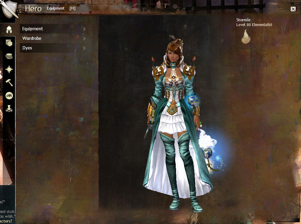
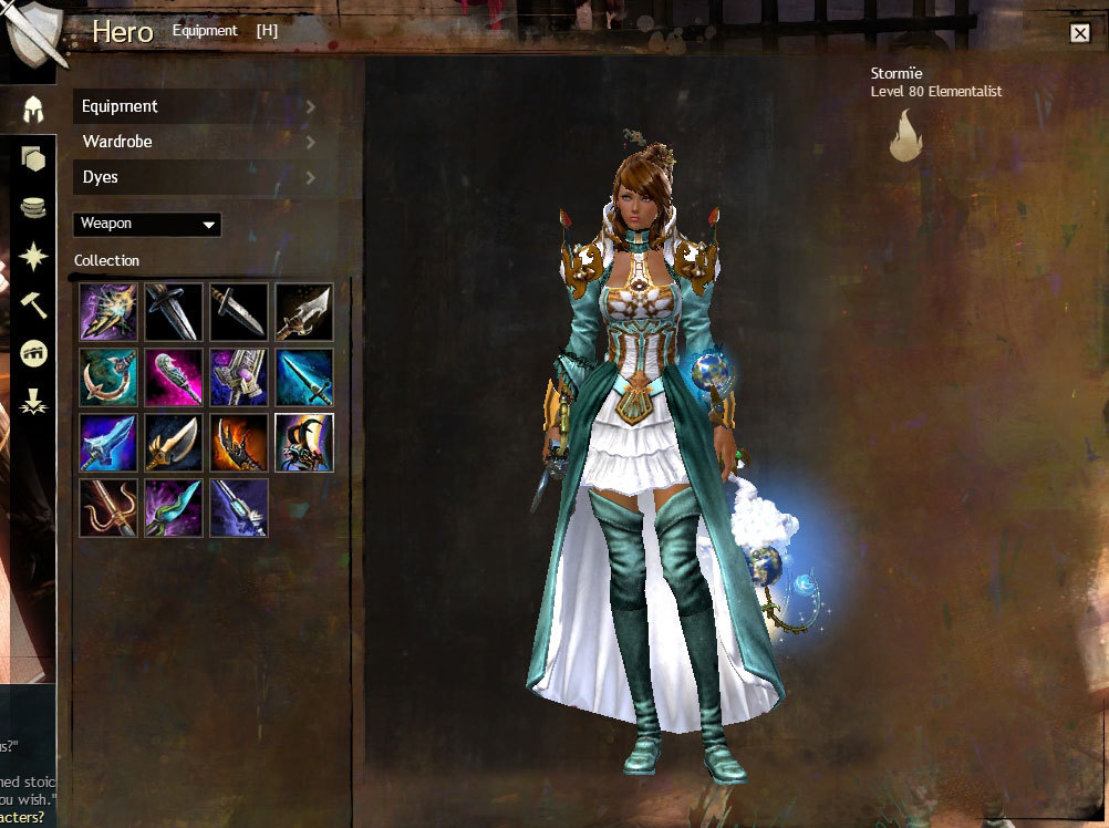
Pic 1 – Problem 1: When you first open your Hero panel… BLANK! Should be default to Equipment view and then remember last opened panel when you reopen after the first time!
Pic 2 – Variation 1 UX: Rework basic idea of better UI (User Experiences) Basically here allow you to one click switch to 1 of the 3 optional Equipment / Wardrobe / Dye panels.
Get rid of the click open and close each panel between Equipment / Wardrobe / Dyes… Oh my lord that was a terrible design.
Pic 3 – Variation 2 UX: Tab features at the top easy and fast switching to your needs instead of double time clicking open and close to open one and another!
The design is to reduce the headroom space and allow more room for the contents / selections.
Tooltip said it all.
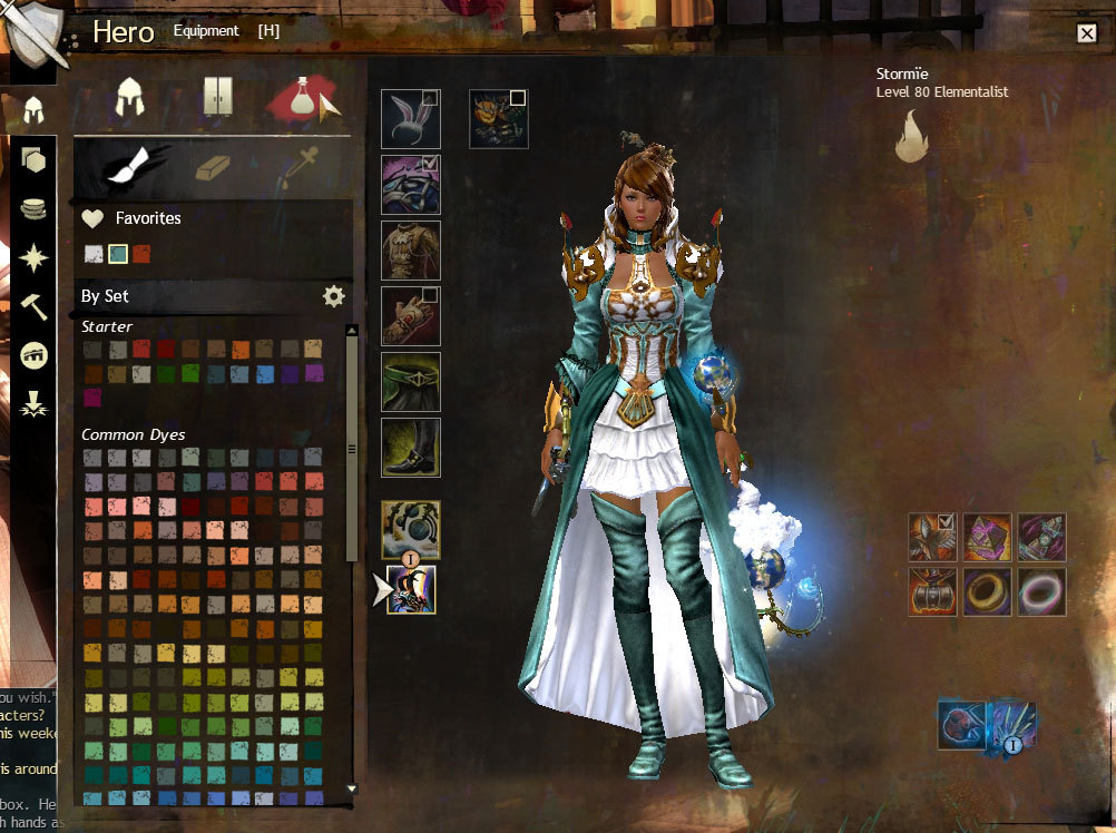
Pic 4 – Variation 2 UX: Showing the Dye Panel with Sub Tab!
Coming from Designer view, Icon / Image / Photo worth a 1k Word! Remember this, we human recognize things by shape and color quicker than details and words.

(edited by DJRiful.3749)
+1 to every word above.
This is in my mind since the wardrobe system is introduced.
Thanks for the sharing!
+1
The current Hero Panel is very clunky and tedious.
Especially when you click wardrobe before, it stays there…
all what i need is a filter show only acendend / exotic gear
and a gear switch button then im fine with the ui as it is
Yes, absolutely.
And as said, add to that gear tagging and hotkey swap or something.
Although the other suggestions may be good or not, the Hero Panel stays on last choice…at least, it does for me.
The hero panel can definitely be better. It’s not intuitive enough for new players and it’s clunky for experienced players.
The hero panel can definitely be better. It’s not intuitive enough for new players and it’s clunky for experienced players.
That is true, new player either way will have to recognize all the Guild Wars icon themes one way or another. Not just only the Hero UI.
Not affiliated with ArenaNet or NCSOFT. No support is provided.
All assets, page layout, visual style belong to ArenaNet and are used solely to replicate the original design and preserve the original look and feel.
Contact /u/e-scrape-artist on reddit if you encounter a bug.