Q:
why was the better one not used?

Maybe it didn’t fit the style of the other loading screens? Or some technical stuff? :s
Goroth – Necro | Valea – Mesmer
Naneth – Guardian | Brannoc Oakbark – Ranger
Is all that we see or seem just a dream within a dream?
Naneth – Guardian | Brannoc Oakbark – Ranger
Is all that we see or seem just a dream within a dream?
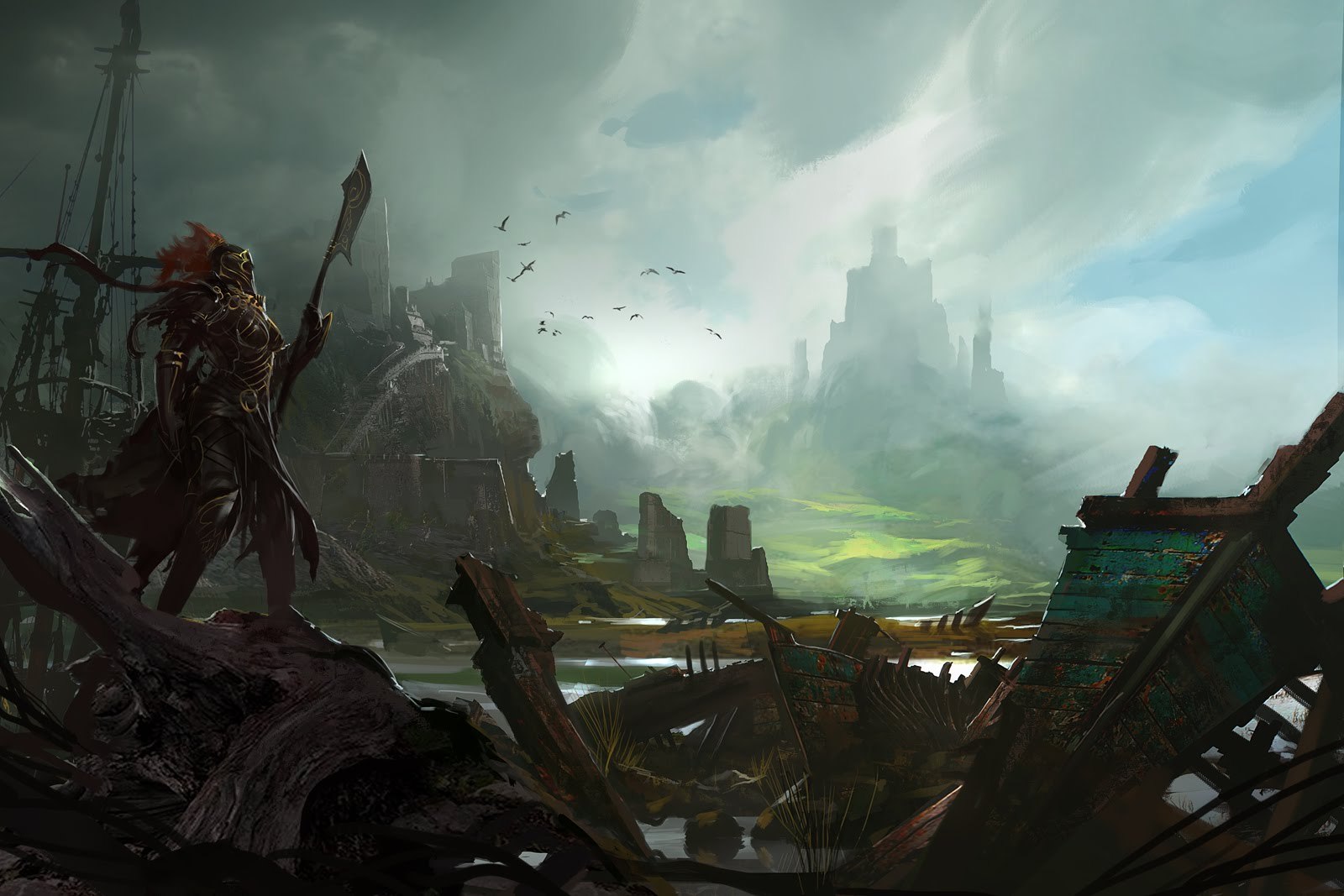
The only real difference I see is the outline of the tower / fortress. I don’t recall any structure like that existing in Timberline Falls so maybe that’s why it was altered? shrug
We go out in the world and take our chances
Fate is just the weight of circumstances
That’s the way that lady luck dances
Fate is just the weight of circumstances
That’s the way that lady luck dances
There are lost of small details for example: The gold outline added to the character and Red hair. The slightly more detailed fortress in the background, the far castle in the back, the broken ship pole andThe frist pic Has higher color density. I’m drawimg alot myself and i was just wondering why idd they make this decision
Sorry for the typos, i’m writing this on my tablet
Yeah, the art is really the only thing that makes sense. So, questions around this are relevant.