(edited by lorazcyk.8927)
1080+ display, larger UI, condition icons
I am in windowed full screen at high rez on a widescreen monitor. Sorry I don’t know the exact rez, but I promise it’s as high as my machine/monitor goes and the computer’s a good machine bought less than a year ago. Here’s Larger and Normal. I must say Larger is annoyingly large.
Attachments:
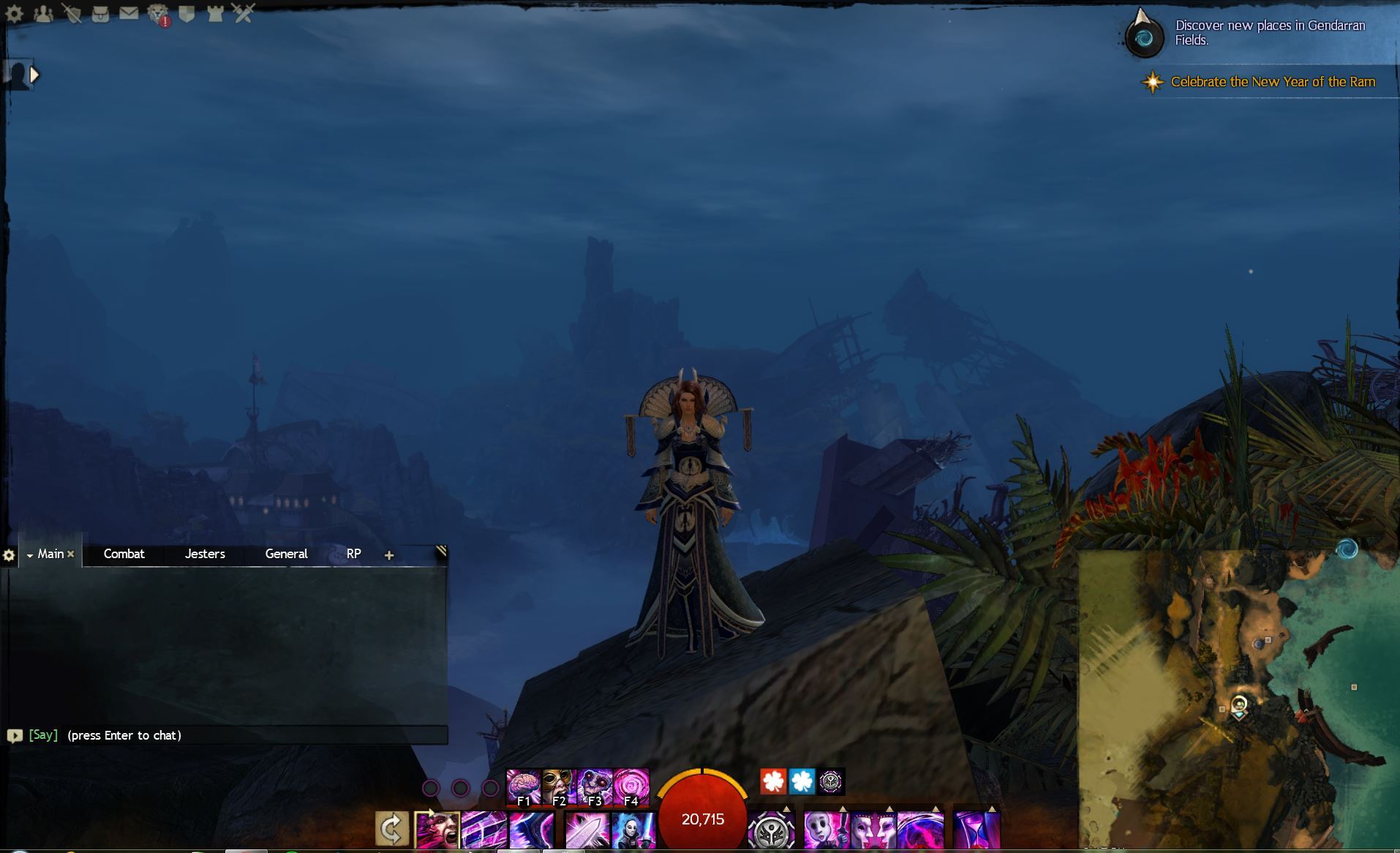
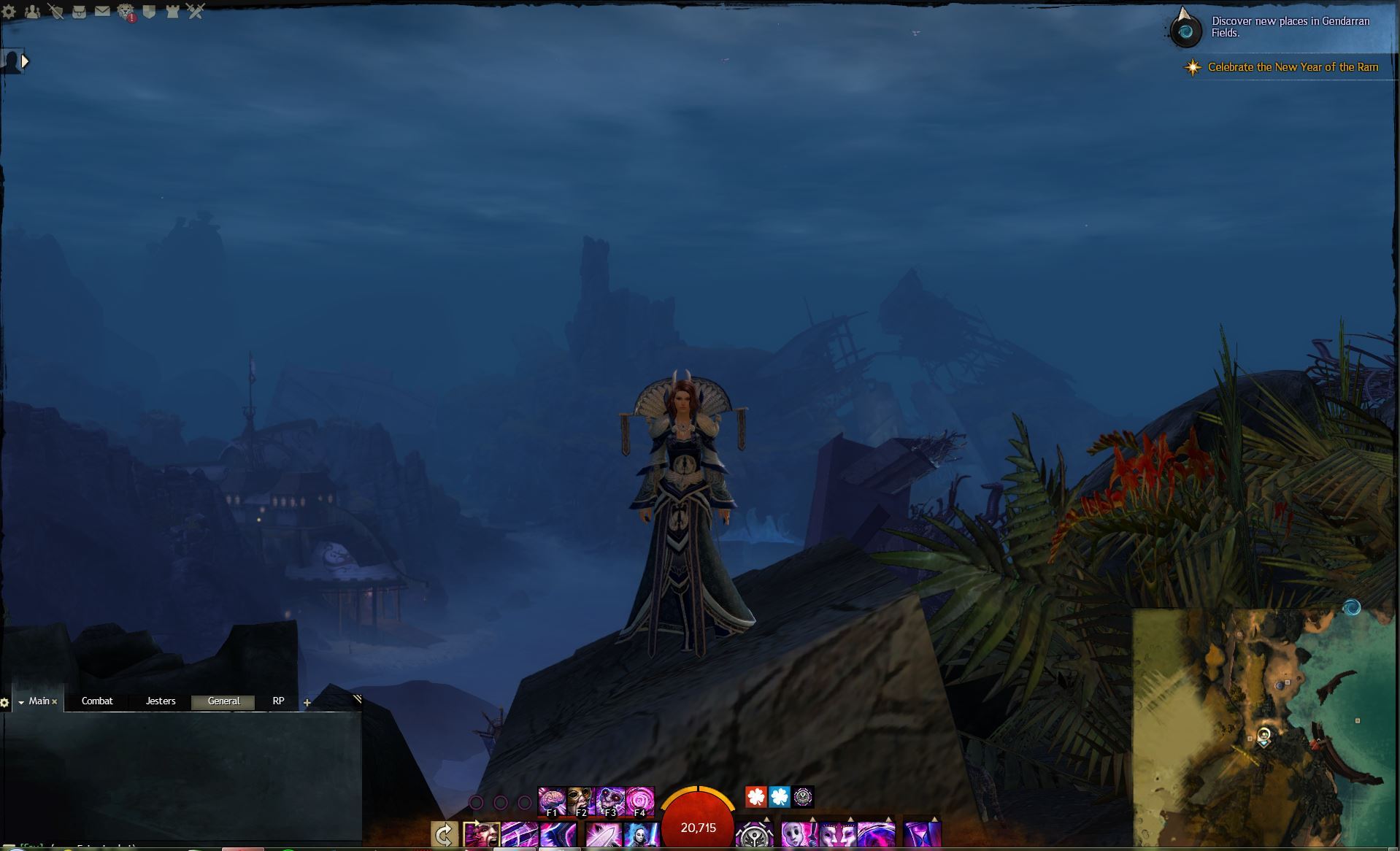
Looks like you have a 1920×1200 monitor.
We are heroes. This is what we do!
RIP City of Heroes
RIP City of Heroes
I likely should have taken a shot with the options window open, because that was the markedly larger panel. Also everything got sort of fuzzy. OP, you might not need to make the UI larger if you get higher rez; at least, being quite nearsighted and starting to need new glasses I can still see the icons just fine with my monitor more than two feet from me.
Thanks for the screenshot. There’s a lot more room than I expected. (Here’s mine! https://i.imgur.com/KmsAGVp.jpg)
Shame that the chat doesn’t fit on the left without shrinking it, but it’s no big deal.
The windows don’t bother me, since I close them when fighting anyway, though it would certainly be nice to make the status icons bigger without affecting the rest of the UI.
Hmm it’s not that I can’t see the icons, it’s that I can’t tell them apart from each other at a glance because yellow + white and red + black is too low contrast for me to tell what the icon is. Yellow + black and dark red + white would make the contrast a lot stronger, so I’d probably be able to tell what it is at a glance even with the interface on “Small” (which is what I normally use otherwise).
Anyway, thanks again.