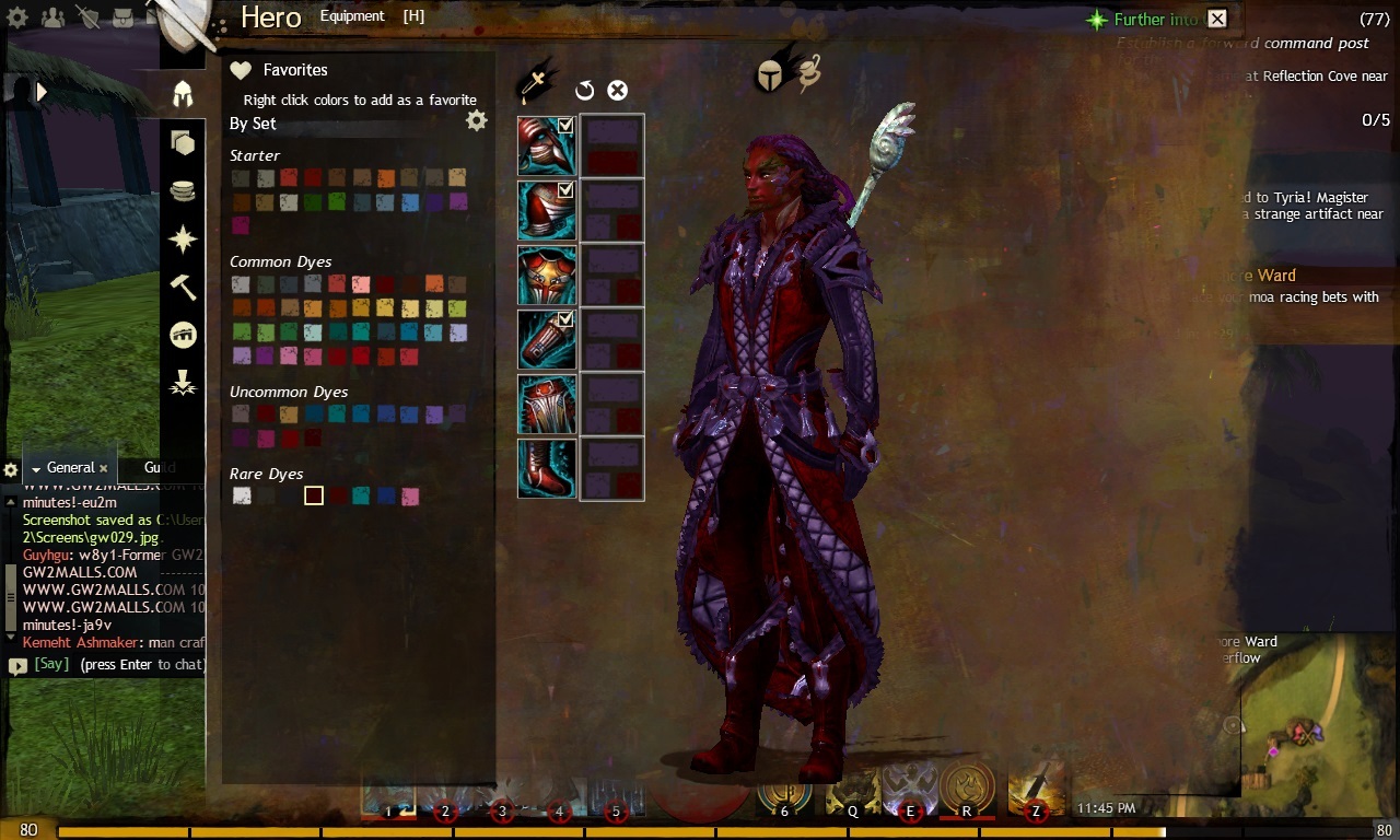
I haven’t seen very many characters that stand out, and that disappoints me. Yeah, the typical all white/black looks good, but it is exactly that, typical. To top it all off, typical dyes are expensive! With the right set of tools you can look as good as you want without spending a fortune on dyes.
I will be referring to this link anytime I talk about the color wheel, warm/cold colors, and color schemes.
http://www.tigercolor.com/color-lab/color-theory/color-theory-intro.htm
to make the colors less vibrant and more like leather or metal, you should add a tint, shade, or tone to your colors picked. which you can find from this link, too.
I will be referring to this link when I walk about color dye names (such as Daffodil being yellow) http://wiki.guildwars2.com/wiki/Dye
This guide is just to help people get on track of making their favorite color scheme, by no means do you have to follow this guide. All I hope is that I can inspire the community to be colorful and unique!
______________________________________________________
First off you can go simple with complimentary color schemes. That being colors opposite of each other on the color wheel.
Pick your main color, the one you want people to notice first when looking at your character, and then pick the color opposite on the wheel. What happens is you have one warm and one cool color. Usually I prefer the warm one to be the main color.
here is an example of Apricot (orange) and Stream (light blue), orange being my main color. My goal here was to make most of the fabric orange and have a light blue trim.
http://i.imgur.com/5YaoAdK.jpg
side note: I considered swapping the colors on the gloves to follow my “rule” of light blue trim, but I liked it better the other way. You can play around with it and see which you like best.
Next we will play with analogous color schemes. As we get into using 3 colors we need to pick our first, second and third favorite colors. Analogous schemes use colors that are next to each other on the color wheel. With this you can go either warm colors or cool colors. Only very few analogous color schemes has both, which makes this one more tricky.
I’m going to use Royal Blue as my main color. the colors on either side are Blue Rose (light blue, 2nd) and Evening (purple, 3rd) I had to play a lot with this and swap the colors around to get what was most appealing.
http://i.imgur.com/HrNOApW.jpg
here is a warm analogus color scheme using Autumn (red) Tangerine (orange) and Daffodil (yellow)
http://i.imgur.com/nQUDMv7.jpg
Next, we will work with triadic color schemes Pick your main color and your other 2 will be picked for you, but pick which of the 2 you like better for your second and third colors. This will give 2 warm and 1 cold, or 2 cold and 1 warm.
I am going to choose Autumn (red, 1st) and Daffodil (yellow, 2nd) and Stream (light blue, 3rd)
http://i.imgur.com/JrPV0hO.jpg
The split-complementary color scheme is your next best bet if you like the complimentary color scheme but cant seem to get it right, because it is difficult to mess up. In addition to the base color, it uses the two colors adjacent to its complement.
I am going to use the same Apricot (orange) as my complimentary color scheme, but my second and third colors will be Winter Sky (darker light blue) and Limette (green)
http://i.imgur.com/hQwsgs1.jpg
I won’t go into quadratic color schemes, as you should have the knowledge to try it out yourself, but I do want to share with you my Rainbow Scheme
http://i.imgur.com/tuAFr82.jpg
prices in blackgate (my server)
some good cheap dyes to buy are
- Fog (white) 4s
- Strawberry Breeze (pale pink) 1s
- Tangerine (orange) 1s
- Daffodil (yellow) 1s
- Spring leaf (lime green) 1s
- Grape Gum (purple) 1s
- Persephone (hot pink) 11s
- Evening (purple) 10s
- Evening wine (purple) 13s
- Scenic (light purple) 1s
- Fuchsia (fuchsia) 13s
- Afternoon (royal blue) 13s
- Blue Rose (medium blue) 13s
- Blueberry (close to blue) 13s
- Lava (red) 3s
- Red (red) 15s
- Humiliation (pink) 10s
- Spring Tide (turquoise) 1s
Not as cheap, but worth it if you want to.
- Cotton Candy (pink) 50s
- Royal Blue (royal blue) 70s
- Charcoal (black) 70s
good starter set colors to use (all free)
- Autumn (red)
- Apricot (orange)
- Stream (light blue)
- Limette (green)
- Jalapeno (dark green)
- Royal Rose (dark fuchsia)
If anyone can tell me some good cheap colors to use then I’ll gladly add them if I catch it in the comments
If you want to request a color anyone can help you try to find the color you are looking for.
Color schemes to help you stand out!
(edited by serisho.7053)


