Better cap point UI
PvP Gameplay Programmer
This is a pretty good suggestion. It would be nice to have a capture point separate from the rest of the game that has some PvP bells and whistles. In the mean-time, you can get information in these ways:
Icons at top of screen is absolute ownership: Blue means blue team is getting points, white means no-one is getting points, etc.
The color of the ground decal is who currently has capture progress, but does not indicate ownership.
The color of the ring around the capture point indicates who is making capture progress.
Example: Blue icon at top, half blue ground decal, red rings. Blue owns the point, red is decapping, and is halfway to neutral.
Though there are ways to get more information, its confusing. What other ways could capture points be more clear? Maybe giant +1’s in blue or red floating up from the capture pointer in-world?
Bluxgore (80 Warr), Xilz (80 Necro), Ivo (80 Eng)
Bra (80 Guard), Fixie Bow (80 Ranger), Wcharr (80 Ele)
Xdragonshadowninjax (80 Thief)
Bra (80 Guard), Fixie Bow (80 Ranger), Wcharr (80 Ele)
Xdragonshadowninjax (80 Thief)
This is a pretty good suggestion. It would be nice to have a capture point separate from the rest of the game that has some PvP bells and whistles. In the mean-time, you can get information in these ways:
Icons at top of screen is absolute ownership: Blue means blue team is getting points, white means no-one is getting points, etc.
The color of the ground decal is who currently has capture progress, but does not indicate ownership.
The color of the ring around the capture point indicates who is making capture progress.
Example: Blue icon at top, half blue ground decal, red rings. Blue owns the point, red is decapping, and is halfway to neutral.Though there are ways to get more information, its confusing. What other ways could capture points be more clear? Maybe giant +1’s in blue or red floating up from the capture pointer in-world?
That seems like a major overhaul of a UI change which hasn’t been placed in this game (obviously its implementation gives the visual feel for new players to grasp conquest mode more, I just feel more pressing UI changes can be made over it). A quick example of a UI change is the entire structure of the current rune and sigil, UI feels clunky and feels more of a chore if you want to swap builds quickly with one character. This alone takes more effort than it should (templates alleviates this problem).
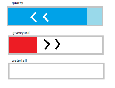
For a much easier fix UI wise, it would be to display 3 bars on all three points as default (inc gw1 rant: if you see 1 arrow in the bar and 1 person on the base it automatically means that person is 2v1 [if you want to play capture pts, more people= faster cap] the arrows meant alot before). You can attempt to make this new UI show bars for each point and do a > = 1 person >>= 2 people >>>= 3 people, etc and make it a visible UI for everyone. This alone would fix the newer player experience of running from a mid pt to help you, when it should be clear from the map that you don’t need help.
(edited by XGhoul.7426)
Though there are ways to get more information, its confusing. What other ways could capture points be more clear? Maybe giant +1’s in blue or red floating up from the capture pointer in-world?
No numbers, please! We need the screen visibility to watch animations, and damage is bad enough! BUT, here’s a less obstructive variant to kick some more brainstorming off:
The floating ring in-world shows current ownership. Every time the capture point ticks, a second ring pulses/floats up from the first, in the color taking control.
OR, a ring of up/down arrows(not in the UI, but actually textured) to indicate capture state; down for current color regaining tick (blue recovering their own point), up for other color decapping or capping.
Either of these options indicate not just the game state of who owns/has progress, but also can play an animation every time a cap tick actually occurs, so relevant people know “Hey, your team isn’t in the circle! Get to work!”
Furthermore, for the first idea you could set the rings to float high above the point, increasing visibility to people coming around corners/up stairs; this might alter play though, and I’m not sure what the consensus is for whether people prefer obscured capture points to surrender only minimal information.
Though there are ways to get more information, its confusing. What other ways could capture points be more clear? Maybe giant +1’s in blue or red floating up from the capture pointer in-world?
I think this would only add more unnecessary clutter to the game. Where having the 3 bars on the top right of the screen is only adding and improving to what we already have (which is a cap progress bar for the node that we’re standing on). It would be much nicer to have all 3 be visible at all points though.
Zietlogik [Warrior] Chronologix [Ranger] Ziet The Dreaded [Necromancer] Zietlogic [Revenant]
Of all the things needed in PvP, this shouldn’t be at the top of the list. It is easy enough to see when someone is capturing a point or contesting a point. It won’t make yolo players any more likely to do something about it.
Of all the things needed in PvP, this shouldn’t be at the top of the list. It is easy enough to see when someone is capturing a point or contesting a point. It won’t make yolo players any more likely to do something about it.
no but it helps you determine whether you should react (rush to contest) or if you are too late (stay). Sometimes its better to rush in, contest even if you die, but its worse running in while being too late just to get hammered by the other team and achieving nothing. YoloQ is mostly about zerging the nodes anyway….
Lv 80 Guard, Ranger, Ele, Thief, warr, engi
Currently @ some T1 server in EU
Currently @ some T1 server in EU
The entire design philosophy of this game was to allow you to get information just by looking at the environment and enemy characters instead of a UI (hence the various “no more healthbar wars!” quotes in pre-release publicity), hence the decision to indicate ownership using the colour of the capture point and surrounding ring.
Unfortunately, it doesn’t work. By the time you’re actually close enough to the point to see who owns and who’s capping, you’ve probably lost the point. Or, you got there in time because you were watching the UI (ie. the minimap and the 3 icons on the score bar), which does a much better job at conveying information. Even when you are there the capture point ground colour and surrounding ring are mostly occluded by spell particle effects, so you still have to look at the UI to see if you still own it. So even when you’re there it’s useless. Moreover, not only does it not provide much useful information, but in some cases it actually provides additional distraction! The surrounding ring is my main beef here, which is high enough that a small Asura character can fit in it entirely, which obscures casting animations and skill activation telegraphing. In one particular case (mid point in Temple), the surrounding ring is enough to seriously obscure your view of incoming enemies, because of how the point is on lower ground and all approaches to it are elevated. I’m not at my gaming PC now or I’d post a screenie, but when you tilt the camera up to see who’s coming the bottom half of your screen is seen as if through thick gauze because of the stupid ring around the capture point!
Why couldn’t you make it a flat 2D decal rather than a thick 3D haze that’s b igger than some character models???
A bad necromancer always blames the corpse.