Attachments:
This is the best elementalist build: https://www.youtube.com/watch?v=Hh5zjK7ITpQ
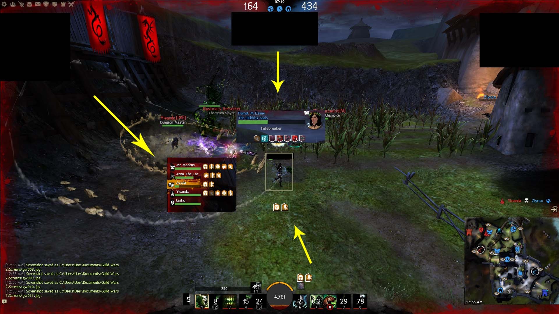
I know this may sound silly, but I strongly think interface in game should be able to change by players. Instead of having changes like Inventory “Compact” option, we should have strong changes like opponent section location (from up center to anywhere else), team location (from top left to anywhere else) and buff-condi location (from down to anywhere else).
In my opinion these changes are important, because the game is extremely fast, and your eyes struggle to look all over places; examples:
- from up (see opponent condis) to down (see your condis).
- from center down (health bar) to up center (your opponent health), and center screen (how to disengage if required).
- from spells (if you do not know them all) to your opponent (up center) to see their effect in action, or center screen to see if he has invulnerability or some damage mitigation.
- from left side (team) to right side (minimap) so you can corelate if team needs help (if you play without teamspeak (or any other form of voice chat)
I attached a screenshot of how it should look like.
Please note: this is not my idea, I only remember these options from World of Warcraft game, where I used addons like: Interrupt Bar, Gladius, GladiatorLosSA and so on.
I know this game does not support addons, that is why I feel I need the options to change locations of those interface elements to where I feel is better and more confortable.
I share the same dream m8 BUT this will NEVER EVER HAPPEN!
Bcz anet are a bunch of soup nazzys.
I am really curious how players that are better than me have their monitors arranges, like at what distance from their face. I really struggle to keep track of my teammates and boons/condis on myself and enemies. It’s so insanely small, there are so many tiny icons and I just don’t the kind of eye sight needed to find it in a fraction of a second.
I mean I do all right, statistically I play better than most, but I’m absolutely fighting the UI.
I am glad I am not the only one having trouble, so this idea can be shared.
Also a consistent interface for all games, I am a bit confused that every 5 minutes I am either red either blue, left corner right corner up down, sometimes I don’t even know what color I am anymore
It seems easier if my team would always be on the left of the screen, score included, and position on minimap bottom or left all the time, just rotate the minimap for each team.
Like this game we lost with 480 vs 500 just to see the message that we won i was reading the score in reverse
Like this game we lost with 480 vs 500 just to see the message that we won i was reading the score in reverse
This happens to me constantly. I’m not sure how much my color blindness factors in. Obviously I’m not red-blue colorblind, but colors in general are more muted for me, so I don’t instantly read color-coded interfaces. Sometimes I don’t even notice there is a color on something.
Sort of like how I read traffic lights via the light placement (by the way, the sideways traffic lights are an absolute death trap for me, I have to just assume the light is red no matter what color it is), a consistent placement would help me figure out what info I’m looking at.
Not affiliated with ArenaNet or NCSOFT. No support is provided.
All assets, page layout, visual style belong to ArenaNet and are used solely to replicate the original design and preserve the original look and feel.
Contact /u/e-scrape-artist on reddit if you encounter a bug.