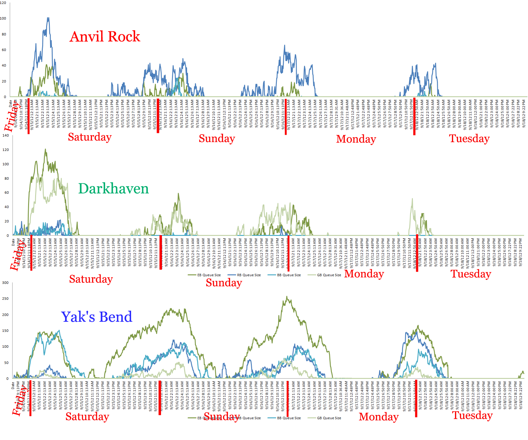
Attached are a collection of charts showing the queue size of each map for a given world. These charts are for the North American worlds.
This data was collected from 8:00PM Sept 14th to 9:30PM Sept 18th. I believe the time zone listed is UTC, but I’m not 100% sure about that.
There can be up to four lines on each chart, one for each map that world is playing on. A line is only present for a map if it was full and there were people waiting in a queue. The map abbreviations are:
EB – Eternal Battlergrounds
RB – Red Team Borderlands
BB – Blue Team Borderlands
GB – Green Team Borderlands
Be sure to pay close attention to the vertical axis on each chart as the scale changes from world to world. Some worlds have hundreds of people queued for all four maps while other worlds might peak at a hundred in queue on one or two maps.
Unfortunately I just realized I didn’t put the world names on the chart. A chart’s filename matches the world it represents, so you’ll need to look at the end of the url when looking at a chart (or before clicking on it) to see what world it represents.
We thought these charts would be useful information for people to see, as it helps illustrate why some worlds have much longer waits than others. Hopefully it will also help some people decide to leave some of those higher population worlds for one of the worlds with smaller (or no) queues, which would reduce the queue pressure on the overloaded world and help provide more manpower for the smaller world.
Some other information we gathered from this timespan:
- Almost 30% of the total players who logged into the game queued up for WvW
- About 3% of the total players who logged in and queued never got in.
We’re completely ecstatic about the first number and not happy at all about the second. We’re looking at a number of short term and long term solutions that should help make that second number go down even if the first one goes up. As we make progress on those solutions we will keep you updated.
 .
.