Just a short info why this thread was created:
Somebody on the german forum started a discussion about the visibility of commanders in PvE. During that discussion, I commented that the whole commander-gui needs an overhaul as currently pretty much no GUI exists at all.
So I wrote a small posting and added a few graphics i slapped together to show what changes should be made as a first step towards a better commander-gui.
After posting those screenshots some people asked me to create an own topic for my ideas as they liked it.
So I decided to redo the graphics and start an own thread. I posted it on the german wvw-board and again was asked to translate it because people on the german board (including me) thought that it won’t reach the devs if we didn’t post it on the english board.
First I didn’t want to translate it (yeah, i’m lazy) but finally decided to do it…
So here we go…
WARNING! -> the following changes are NOT the huge changes some people want to see (sub-squads, etc.) !!! The stuff i’m proposing are mostly minor changes to the existing system (or the system coming on September, 9th) which should be “easy” to add.
The main reason for this is, that I didn’t want ANet to be able to say “Hey, nice – but we can’t add those changes as it would require 2 coders working on them for 4 weeks”
Changes for commanders
So far, there is virtually no UI for the commander. He can use the “/squadinfo” and “/supplyinfo” chat commands but thats about it. The only squad-related UI-elements are “hidden” in the “Groups” dialog where most people wouldn’t really expect them.
My first suggestion is to add a new button to the gui for all players who bought the commander-tag. That button would be displayed the same way the small group-button is displayed on the left side of the screen and it would show a black or grey commander-icon while the player isn’t using his commander-tag.
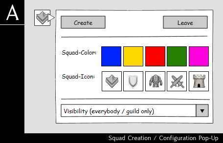
If the player clicks it, a small pop-up dialog appears (Attachment A) -> this dialog contains all GUI-elements necessary to manage the commander-tag. The commander can choose a color, an icon and he can decide who can see his tag (all players / only guild-members).
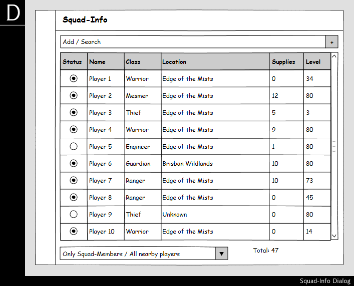
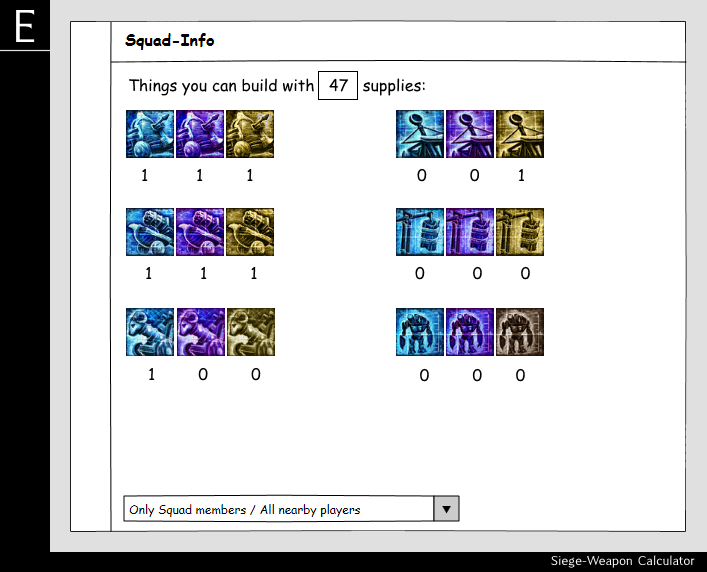
After creating a squad, the icon of the button changes to a colored version – so the commander gets a visual feedback he is using his tag. At the same time, a new window appears below the button (Attachemnt . Its a very minimal display of the squad-stats (number of players, supplies, squad-members by class, how many of them are upscaled).
One thing i forgot in that dialog is a combobox which allows the commander to switch between “Show stats for squad-members” and “Show stats for all nearby players” (lets face it: most of the time people don’t join squads).
That way, commanders get a simple way to “manage their tag” and can easily see the basic stats for their zerg.
Changes for “normal” players
The changes for normal players are pretty small. The only “obvious” change for them is a missing button in the “party” dialog. They still see the Join / Invite / Leave Party buttons, etc. – but the “Create” button should be removed from that dialog.
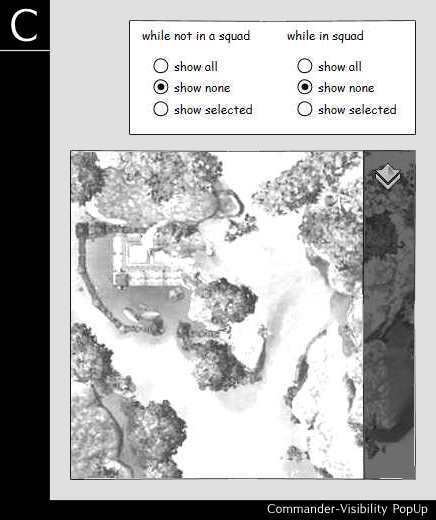
The other change involves the mini-map… right now, if the mouse-pointer hovers over the minimap, 5 icons are displayed to zoom in/out, jump to the personal story, etc. -> there should be a new button looking like a white commander-tag. If the player clicks on it, a new pop-up dialog is shown (Attachment C).
Using this pop-up, players can configure what commanders they’ll see on the minimap.
The three settings on the left are used when the player has joined a squad, the three on the right when he hasn’t.
- “show all” -> all commanders on the map are displayed (of course taking into account the visibility-setting the commander choosed (guild only / all))
- “show none” -> never display any commander (if the players joins a squad, THAT commander is ALWAYS displayed – no matter what)
- “show selected” -> only display “selected commanders” -> commanders can be selected by using “show all”, then right-click all commanders you want to see and then switch to “show selected” -> probably not the best / most userfriendly way to do it but we couldn’t come up with a better idea so far)
By default, those filters would be set to “show all”.


