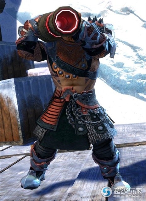
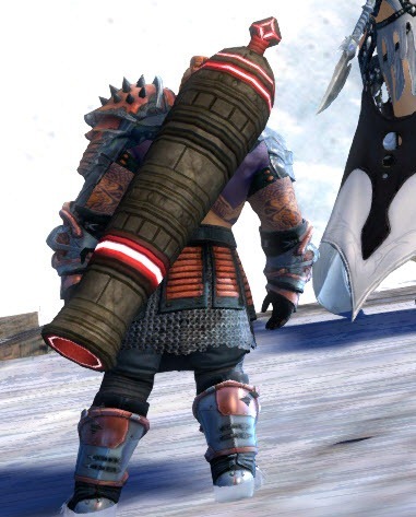
Mortar kit visual change please!
I disagree, they didn’t use just a start zone rifle, they combined this rifle model with the old mortar model and I really like it. It is just what an engineer would do, using the parts of the old unviable stationary mortar and a rifle to tinker a new mobile mortar. This cannon wouldn’t fit for this theme.
The number 2 skill “poison gas shell” icon looks like a chode.
I disagree, they didn’t use just a start zone rifle, they combined this rifle model with the old mortar model and I really like it. It is just what an engineer would do, using the parts of the old unviable stationary mortar and a rifle to tinker a new mobile mortar. This cannon wouldn’t fit for this theme.
So… you do realise what gw2 engineers are capable off AND do all the time?
Scarlet.. look at her stuff, look at the citadel, tanks, airships, siege weapons, watchwork guards, charrcopters, heck even golems and other asura shenanigans even if they are technically more magic then anything. I mean seriosly.. if i would be an engineer for real in this universe where i stand on the frontline to fight friggin dragons id take sure my equipment is TOP notch and up to par with the magical spells and armament or just the physical skills other classes bring to battle…and especially a frigging mobile siege weapon should well kitten look like one…not like a lvl 5 rifle. Im personally fed up with always (visually) looking like the weakest link in the chain and i very well hope that the devs keep their word and the current models are indeed just placeholders…
Well, if I were an engineer in this universe and had to fight a dragon, I wouldn’t care about the design of my weapon. I would care to make sure it works as it is supposed to be and it does.
i like mortar really much. I want one mortar for myself and tomorrow i want to go work with it
Why not bring back both? I was rather fond of my personal siege item that I could put somewhere and have fun with (or put it down for someone else to have fun with).
ANet could basically add the old stationary Mortar Turret back as an elite or utility while also keeping the Mortar Kit for those that prefer the mobile version.
Fojja – Vyxxi – Nymmra – Mymmra – Champion of Dwayna .. and more
Highly Over Powered Explorers [HOPE] – Desolation EU
I disagree, they didn’t use just a start zone rifle, they combined this rifle model with the old mortar model and I really like it. It is just what an engineer would do, using the parts of the old unviable stationary mortar and a rifle to tinker a new mobile mortar. This cannon wouldn’t fit for this theme.
So… you do realise what gw2 engineers are capable off AND do all the time?
Scarlet.. look at her stuff, look at the citadel, tanks, airships, siege weapons, watchwork guards, charrcopters, heck even golems and other asura shenanigans even if they are technically more magic then anything. I mean seriosly.. if i would be an engineer for real in this universe where i stand on the frontline to fight friggin dragons id take sure my equipment is TOP notch and up to par with the magical spells and armament or just the physical skills other classes bring to battle…and especially a frigging mobile siege weapon should well kitten look like one…not like a lvl 5 rifle. Im personally fed up with always (visually) looking like the weakest link in the chain and i very well hope that the devs keep their word and the current models are indeed just placeholders…Well, if I were an engineer in this universe and had to fight a dragon, I wouldn’t care about the design of my weapon. I would care to make sure it works as it is supposed to be and it does.
There is a difference between functional looking and plain bad looking imo man. The mortar’s current 3d model does not even got a _hole in the barrel, its just a black painted spot, its also pretty pathetic looking for a siege weapon. Imo something like that mokittenesign would be perfect for a grenade kit visual but not something that shoots siege ammo. Make that thing scarlet’s kiss sized and give it good textures then it should be fitting
(edited by Basaltface.2786)
As an Asura, I was hoping for an oversized weapon that we basically were hugging to try an fire.
And as a charr i hoped for a massive and scary looking horrik like bazooka
I disagree with op. Vastly prefer current look to what op proposes.
Well. I don’t want Horrik’s cannon, but the Mortar Kit could really use some visual upgrades. The model is low poly, the barrel is far too short, the textures are cheap and the colors don’t work with anything.
Guess I’m mostly grumpy because Pact and Scarlet drove technology soooo far, and the mortar is going backwards all the way to pre launch tech standards. The FT seems technologically a lot more complex.
Better model plz. Not becessarily a silly nilly cannon!
Jara Ariasdottir (Soon all classes proper!)


