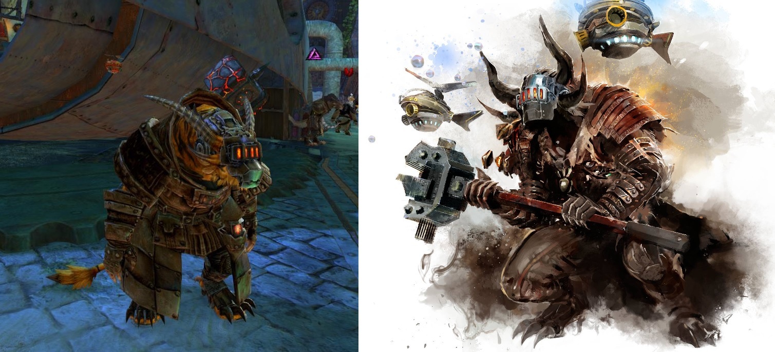
Scrapper's Mask look rework
Hmm…I actually think it looks better than the original, but I don’t think they could match the concept artwork since it would clip with the muzzle.
i actually like the current one better… engi is only my 2nd main so i didnt plan on unlocking scrapper until i’m 100% done with everything on my thief for wvw and pvp, but i hope the asuran mask looks similar to the charr mask
i agree with you OP.
even before the expansion the file in the game for that helm was the flat mask but tilted open up. looked really bad kitten and i was so looking forward to it.
now we got this. disappointed.
we its not horrible, i will probably use it. but if they can give us the other one too would be great.
I’d have to say I like the new look better.
Hello,
Anet please could you rework the Scrapper’s Mask for Charr?
The way it is looks very weird, maybe more flat like the artwork?
On all other races this mask look awesome… just not on Charr…
Charr aren’t flat-faced
Charr aren’t flat faced but I think you could still get that sort of straight vertical look by projecting it a bit farther and make it look more like the artwork. The only thing I don’t like about the newer version, which does look better, is that it does stick so closely to the charr’s head, like a skullcap and very thin on top.
Does it remove the charr’s hair style?
looks like a metal muzzle,
concept art looks alot better
Seaferer’s Rest berserker of the Mists – VOLT -
Thats the point! It looks like a metal face and not like a mask.
And yes, it removes the charr’s hair style.
And half of a charr’s face disappearing into a vacuum behind a mask isn’t weird?
I really didn’t like the old model at all, or the concept art one for the above reason, I’m glad they changed it to conform to the characters anatomy more, and the old model was clear that for a mask/faceplate it would never fit when brought down.
(edited by Woobins.1803)
Charr aren’t flat faced but I think you could still get that sort of straight vertical look by projecting it a bit farther and make it look more like the artwork. The only thing I don’t like about the newer version, which does look better, is that it does stick so closely to the charr’s head, like a skullcap and very thin on top.
Technically that would ridiculously narrow the field of view :P I prefer how it looks atm tbh.
