Druid Staff Feedback (Visuals)
Agreed. I would like Druid to hold the staff like a caster and not a melee brawler. Solar Beam is giving me issues. Even with max settings, the beam often does not show up, and when it does, it’s a rather lackluster string of light.
The animation for it is also weird for any Druid that isn’t an Asura. All the rest of the skills are ace, though. Major kudos for the hippie, peace ‘n’ love wallflower.
Also #AsuraDruidMasterRace
Will update once Path of Fire releases.
+1
I think these the auto attack animation and how the staff is held should be overworked.
Maybe they should use the guadian’s autoattack. The druid throws the head end forward, but a beam shoots out instead of the wave. The druid’s animation has to be a bit slower of course.
By the way, the druid hold his staff “normaly” in the Trailer. I do not know. what got into ANet’s head, that staves have to be hold like hammers now. It’s just stupid and lazy.
(edited by AllNightPlayer.1286)
seems they had to redo the druid so maybe they didnt have a lot of time? but yeah, the way he holds the staff is weird…moreover, i think all the animations – besides the vine skill (which is quite clunky to use tbh) – the animations look pretty lackluster…. skill 1 looks like a placeholder, 2 is just boring and VERY simple, 3 as well…. and the avatar form looks pretty “cheap” as well…. rather turn him into a celestial bear lol
thats how a solar beam should look like ^^
http://img3.wikia.nocookie.net/__cb20150121222632/pokemon/images/2/25/Ash_Sceptile_Solar_Beam.png
YOU GET A HEALS. AND YOU GET A HEALS. EVERYONE GETS A HEALS. xD
Yeah I feel like the Solar Beam should be yellow, sparkley, and wider. Not by much but to give room to have animation visuals actually visible.
I actually really like the auto-attack animation. Its not super flashy effects overload death laser, but even in its simplicity I think it looks pretty neat. Personally, anyway.
I wouldn’t mind if it was changed to be slightly wider and yellow instead of blue (as even though there ARE blue suns / stars, yellow is more commonly associated with it), but I don’t think I’d like it as well if it was some huge flashy thing with lots of sparkles and stuff.
Pretty much agree with the way the staff should be held and with the auto. Wider yellow part and some sort of splash effect on enemies you hit would be nice.
Wisp is great.
Grace is great
Vine surge is pretty much great. The vines are a bit spaced apart leaving awkward gaps if you look from the side, but almost perfect.
Water wall is nice, but the thing looks so flat. I also feel like the ripple effect of the wall should pulsate a bit faster. The flowers and the bush underneath it look kinda plasticy. You know the mushroom visuals you get from the celestial form of Glyph of Alignment? That. Underneath. In a line. Please. While I’m on it, there’s a SFX bug with it that makes it cut off before the animation fully goes away. It just cuts out.
Please keep the current druid staff stance it looks great! Don’t change it to the usual stance which is boring and overused.. Hope you read this Irenio
I would much prefer the caster staff animations. Having come from WoW three years ago I was ecstatic that my character held their staff like one would hold a staff.
Holding it like a hammer just goes back to how WoW casters hold their staff. It’s boring and doesn’t give me that “mystical” feel.
I would much prefer the caster staff animations. Having come from WoW three years ago I was ecstatic that my character held their staff like one would hold a staff.
Holding it like a hammer just goes back to how WoW casters hold their staff. It’s boring and doesn’t give me that “mystical” feel.
The feel of the stance for the staff takes away from the feel of Druid for sure. Squatting so awkwardly while shooting out of it 2 handed.
Druid has always been one of my more favorites to play in most MMORPGs and seeing the weapon handling animated this way makes me cringe a bit xD
I don’t care for how the staff is held, but I like the visual for the staff 1.
Would be sad to see it changed.
Dragonbrand
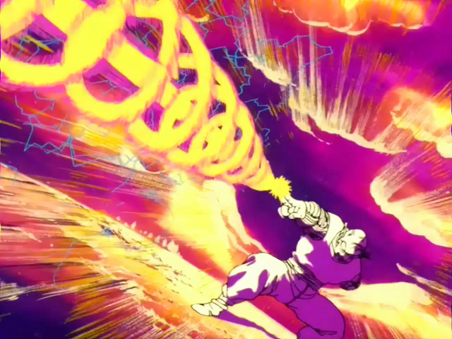
What if the auto looked more like this?
I like the swirly thing around it. Staff 1 should have a beam like that! 10/10. It’s simple. Not overcomplicated or distracting.
I personally love the way it looks on Asura.
What if the auto looked more like this?
wow, that is hilarious, I posted the exact same thing and image in the druid feedback thread XD, without seeing yours
What if the auto looked more like this?
SOLAR BEAM CANNON!!!!!!
I bet Goku wishes it healed allies like our solar beam does.
Make it grow larger with every pulse, and change colours from white to yellow to yellow-orangish.
Make it like a simple beam, but with like stars/sparks rotating around it and moving forward
