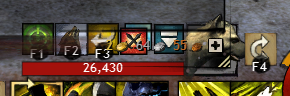
Bottom border of inventory issue
I personally think that the inability to turn off transparency is a poor design choice. Not only can it become hard to read and confusing, it’s just stupid that I have to move windows around to know which X to click to close the one I want. The transparency here serves absolutely nothing.
Same happens with Guild panel, the Represent/Stand down button appears in a almost completely transparent area.
Six months later, still can’t read this!
http://i.imgur.com/K3TEtY1.png
I can’t be the only one..
Transparent window FRAMES are nice, but not behind text you need to read. Gems on the opposing side of that window have a dark non-transparent background..
Text should not be on transparencies in this game.