Options Menu Graphic
Wow, well spotted. Maybe I never noticed that as I usually have that window on center (leaving the “odd” brushes below the achievements list at right).
I noticed this a little while ago so its nothing new but I thought I would bring it up now anyway.
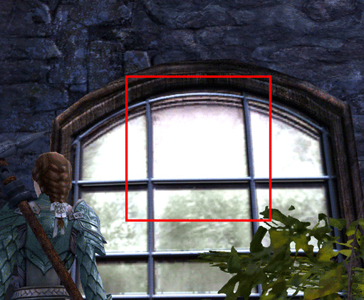
The options menu window graphic has a little more painterly style than most of the other windows and assets. It looks like some stray brush strokes have been left in that don’t really belong.
It would be easy to miss on some monitors but its especially noticeable in some areas when this menu is overlaid on something lighter colored.
It seems like bad spot to have a subtle inconsistency because of how often people tweak their visual settings from that window and that texture gets in the way.
This image shows the problem as the window is opened and closed. I changed the contrast on the later frames to make it more noticeable. You can see the extra brush strokes inside the red square although they extend beyond that area as well.
Wow, well spotted. Maybe I never noticed that as I usually have that window on center (leaving the “odd” brushes below the achievements list at right).
Not affiliated with ArenaNet or NCSOFT. No support is provided.
All assets, page layout, visual style belong to ArenaNet and are used solely to replicate the original design and preserve the original look and feel.
Contact /u/e-scrape-artist on reddit if you encounter a bug.