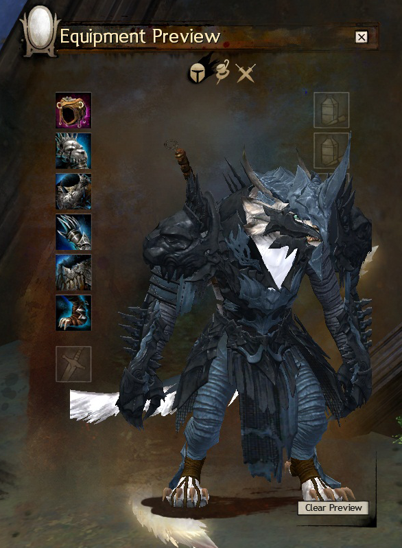
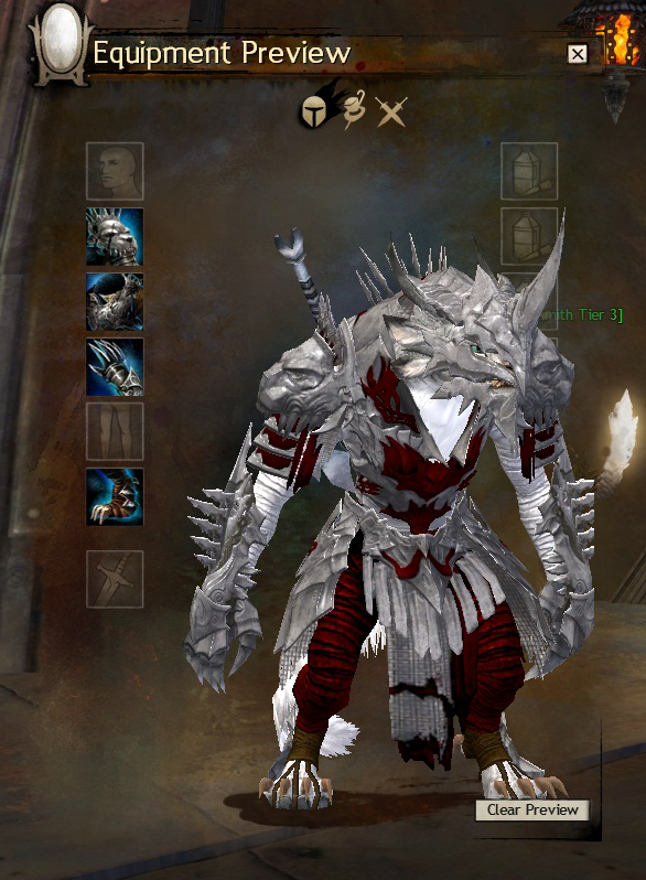
Recent change in charr shoulder armor scaling
That’s a bit disappointing because I was saving up for those! They looked great before. I do hope they reconsider and revert (if this was intentional)
The upper arm portion of the armour is also different, not just the shoulder piece, so it was almost certainly manually tweaked.
I don’t know why. It made her look a lot more intimidating before, in the second one you can see how small she really is. It would make any Charr look smaller, honestly, and that doesn’t seem like a very Charr-like thing to do.
Yes, it’s more streamlined and less clunky looking, and that’s the problem; sometimes clunky works. An artist/designer needs to know when to quit and leave things alone.
My Charr, while male, also has the smallest/thinnest body type. I kinda hope none of the medium armours have this problem.
Bump to top
I would also like the t3 charr shoulder pad to go back to original. Atm its too narrow from the side.
I also have the smallest female build for my engineer. The only shoulders that I’ve found so far that don’t look silly, are the pirate ones sadly – and that’s because they’re so small you can’t see the glaring problems.
For some reason, most medium shoulderpads float above my shoulders quite noticeably. It’s particularly easy to see, since I’m running on all fours most of the time… I’ll check it out on my Charr thief – she’s average built.
For the toast!
Wow, now I need to go check this on my Charr. That’s a real downer if that is the way it would look.
I prefer it the new way. Right now there are exactly four heavy shoulder skins in the game that don’t float on my female charr. This is become one of them, and it’s sadly the only cultural option. They don’t look puny: they look proportionate compared to the over-exagerrated Warcraft orc look that tends to plague our armor design.

