(edited by Artickaze.8647)
Login Screen
1 2
Would absolutely love to have this back!
Just as you said I also had emotion at the screen, it’s just awesome.
Classes: Guardian, Elementalist, Warrior, Thief, Engineer, Herald
Would love to see this screen logging in.
Anarai Aeonblade [GASM] – Guardian – DB
RIP my fair Engi and Ranger, you will be missed.
RIP my fair Engi and Ranger, you will be missed.
When a player enters Guild Wars must see “What is the difference” The first impact such as the Beta Test that you have created, the Login Screen breathtaking (although is necessary play a few minutes the game to understand its greatness), could create only one thing: a positive impact to the player that goes in exploration for the first time in adventure in the world of Tyria that seeing this Introduction to the game in he create epic shudders. It will not be something that will change the style of the game, characters, graphics, mechanics, simply the start window where players stop for a moment and say “wow, that’s great, lends itself very well, amazing”. For me the first impression is important.
Totally agree with you, that login screen was just GLORIOUS! Ahah! Would totally love to have it back!
I actually kind of the like the launcher… I don’t really check the website, so it’s an easy way for me to see the news and let it update the game without it taking up my entire screen. Although, I do also really like the full-screen version (like GW1) in terms of its physical appeal I do think I would miss having the news available right there.
I actually kind of the like the launcher… I don’t really check the website, so it’s an easy way for me to see the news and let it update the game without it taking up my entire screen. Although, I do also really like the full-screen version (like GW1) in terms of its physical appeal I do think I would miss having the news available right there.
Shouldn’t be that hard to implement the news on a full screen launcher really, and you know you can always alt+tab out while it updates.
So yeah i support this, was a simple yet AMAZING start screen
That would make an awesome Windows wallpaper! Make it so!
I played on 2nd beta when i first discovered Guild Wars 2, i never played GW1. This login screen was amazing and breathtaking i would want it back too.
and also you could log in as invisible from that screen too
Agree! it was Amazing!
It was great! I’m missing that login screen
I actually kind of the like the launcher… I don’t really check the website, so it’s an easy way for me to see the news and let it update the game without it taking up my entire screen. Although, I do also really like the full-screen version (like GW1) in terms of its physical appeal I do think I would miss having the news available right there.
- The Method 1 -
I imagined this answer, say a similar response, it could be a problem That of the information, news on the forum and the game, with this we are always updated . For this I think ArenaNet did this new Login Screen.I think that Arenanet not had done this “New Screen Login” only for the information and updated we things but Also Because maybe someone not holding the computer or the like. Leaving aside the second issue, we talk about the first problem, That of the information.
I would like to link to All Those who have this problem in mind this:
This link will take you to the old log Guild Wars do you remember? good times. Well as we can see in this video (from the second 6 to the second 17) as ancient Arena Net times Has Been Able to put one part the information the other part the online data access with a fantastic behind the scenes. Very well. In Guild Wars 2 Beta Test is very different, in fact we see a Dragon to our right and in the lower left access information.
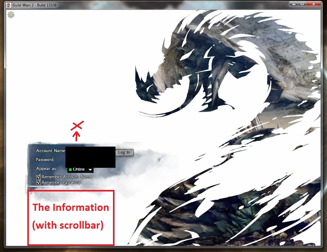
I put a picture so that it can be more clear the idea of my idea. (is in Attachments)
I think it would be enough put the data access just above, while the information, the novelty of the game and the forum putting it all in a window with a scrollbar. In Guild Wars there was such a system as we
could seen in the video, then you could probably solve the problem as well. We have a space big, with this method does not even touch the window not even drastically (The window of information can be small with the scrollbar, so that does not fill the entire window but a small portion which is located under the access data. In the image we see a large panel regarding the information but can also be small, remembers that little window of data access is raised from where he is now the image) .
Attachments:
(edited by Artickaze.8647)
- The Method 2 -
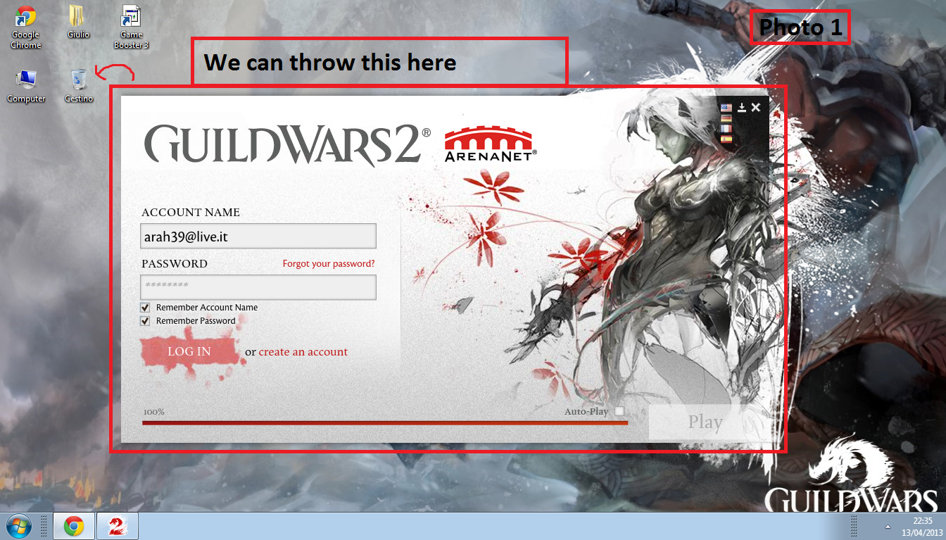
The Method 2 requires a login such as Guild Wars, in attachament I put the images for clarity.
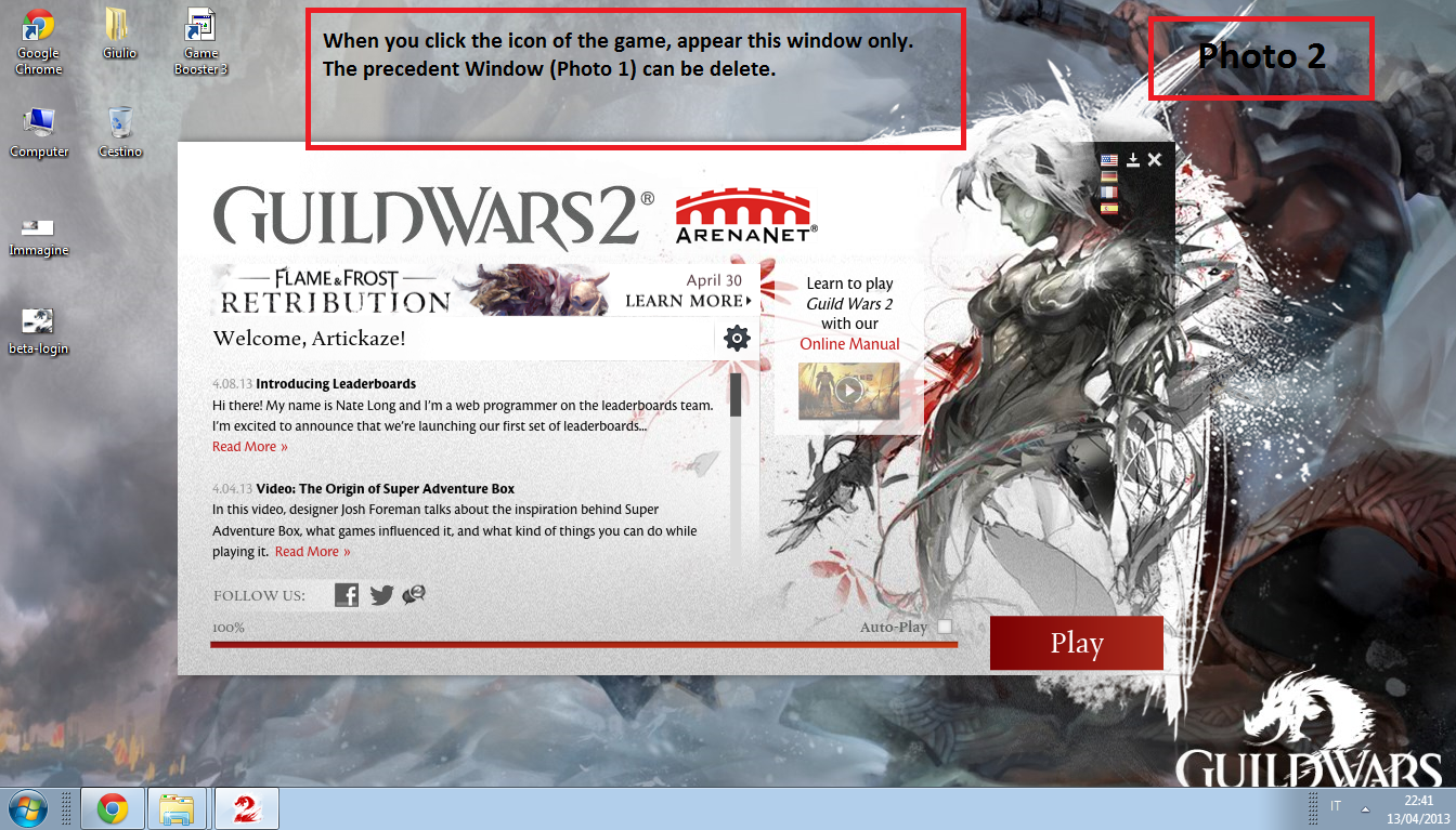
Basically, when you click on the game icon, as in Guild Wars 1, opens a screen where it makes downloading, uploading. Well, in Guild Wars 2 we can make the first image, the image of classical Login we have today. Play button, with this we can enter the second screen of the game that will tell us to enter the access data (Photo 3). Then we have the downloads bar at the bottom right, and manual online information to the left to the right in both high (as it is in Photo 2). During the download some packages maybe we can read us the news of the game to pass the time while downloading these update.
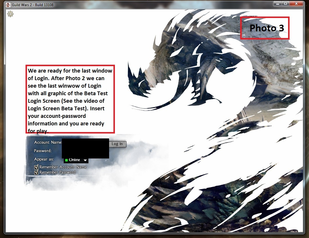
After Photo 2 we can see the last window of Login Screen with all Graphic of Screen Login of Beta Test. (See 1 video of this and you understand). Insert your information about your log and password and you play.
(In This message i post only Photo 1)
Attachments:
(In This Message i post only Photo 2)
Attachments:
(In This Message i post only Final Photo, Photo 3) – The End Method 2 -
Attachments:
Totally agree, i love this login screen.
Dreyk Quick Hand | Human Thief 80
@Artickaze: I do love the large login screen, and having played GW1 for 6+ years I do remember its appeal. Thank you for providing those methods, and the attachments. I would be perfectly content with the first method of just including the news in that small scroll box right there. As I said, the news is what I’m mostly worried about (because I don’t usually check the website/forums for it), and that looks rather nice!
+1
Yeap the launcher is too boring. We need this login screen back !
I support this idea. The launcher feels…unprofessional somehow. Having the login in-game would be much better.
The lack of log in screen + the “way to simple” character selection screen give the players, especially the new ones , a boring feeling about the game which soon will become a real feeling due to the repetitive nature of each zone (down-scaling, hearts, PoIs, Vistas)
They should put more “love” into these screens because they really feel unprofessional
The lack of log in screen + the “way to simple” character selection screen give the players, especially the new ones , a boring feeling about the game
They should put more “love” into these screens because they really feel unprofessional
Agree of this, i think that the first impact is very important and when you give this first impact, ehmm, you have done center!
Agreed. I loved the login screen! When a beta weekend was over, I just launched the log in screen and listened to the music ^^.
Aetra Ironbender, Rated E for Engineer- [WoT] Warlocks of Tyria- Far Shiverpeaks
Totally agree, and personally i don’t see the “news problem”: to know the solution log in guildwars 1. Amazing login screen with a little window for news——> EASY!.
/signs for agreement
Former PvP Forum Specialist
2015-2016
Fort Aspenwood
2015-2016
Fort Aspenwood
I also think that the previous login screen was more beautiful.
(edited by mirk.7821)
Make it an option so those who just want to log in as quickly as possible can just do so.
Not that I want it, the old login screen is epic
I Agree, this was amazing
+1
I want it back too!
-Elona Reach-
Do you realize why Google had its huge success over many others search engines?
Of course you do, but I’m saying it anyway. Because it’s simple, easy and good looking. Its interface has only the name and the search bar, it has the only informations you need to have.
People love semplicity, and you show to know this when we look at our actual login window, wich is also simple and nice.
The only thing missing in our login screen is that bit of “powerfulness” wich was present in the old login screen. The strenght that characterizes the game, the old login screen represented it greatly.
When Guild Wars 2 was in beta I used to keep open the login screen in background for a few hours even after beta over, and sometimes to open the window and listen to some Jeremy Soule’s incredible soundtrack while watching that nice dragon-2.
That big 2 is strong, is a symbol, is the mark in wich all GW2 players identify in.
Don’t underestimate the power of 2
Everyone’s getting a big badass red +1 but me.. ç_ç
(edited by Ginko Biloba.3487)
I didn’t even know this existed!!!
YES, I would love to have that log-in screen. The current log-in process is very boring, impersonal, and not very powerful. Implementing that log-in screen would greatly improve the image and presence of GW2 as an MMO game.
Brom Svánigandr – Druid
Nemata Sapshield – Dragonhunter
Lillian Estre – Tempest
Nemata Sapshield – Dragonhunter
Lillian Estre – Tempest
ArenaNet please listen to your loyal minions and bring this back. Although not as an important change as balancing classes and changing traits, it is a much simpler one. You can still keep the launcher with the news feed and the update bar and play button as now so that people see what is new but also have that login screen after the game has been updated and started. When you see the old login screen you say this game is some SERIOUS EPIC adventure that I must put my life into ( or something a bit less crazy for some weird people ), while the new launcher says this game has been handled tastefully. And I can say that because I’ve played my fair share of free MMOs and I know what launchers are out there.. just awful. But you can have both, so why not? Please listen to your playerbase on this, it’s easy, everyone will be happy and wouldn’t take too long to do.
My suggestion would be to at least have it as an option. For those who want it, and those that don’t can keep using the current method
Yess!!!
Login screen and Character select is important!!!
Thank you!!!
I want to log in and have a good look at My Characters
Standing in front of some nice background (Like Eye of
The North)
I want their lenghts to be right. Right now My Norn and Human Male is prittey
Much the same lenght. And My Asura is 55% of My norns lenght. I wanna see this fixed.
I wanna see Backpiece aswell in the Select!
Agreed. My wife and I take turns playing on the same computer, and it’s a pain to quit the entire game and relaunch to swap out.
Not to mention how awesome that log-in screen is.
I’m here to agree with all of you and to express my need for the epic log-in screen.
I would love to see that log-in screen again.
It was one of the things that pumped me up playing the game at BWEs.
Please ArenaNET. Implement it again.
(edited by Sudavar.9503)
Hello, sorry for digging (I don’t see any point of creating new topic), but I think that old login screen should return. I can’t believe there would be a lot of work with reintroducing it to the game. Please ANet, take that hint, when I first launched GW2, before first PBE I was absolutely amused with that great, yet simple looping animation.
Also swapping accounts would get much easier.
Or at least make the one we have now in full screen and a little animation on the picture.
Lol, I had the exact same feeling when I saw that screen: anticipation and excitement.
YES! Please put it back or at least make it an option! This login screen during beta was so EPIC!
Oooh how I remember the first time I woke up and GW2 had finished downloading and it was open on my screen with the awesome music, the old login screen for BWE1… I got the chills and was so amazed! It was so perfect and really fit the game feel with is amazing-ness… I feel the patcher now just doesn’t cut it. I definitely think it should at least be optional! Or maybe use the current patcher for updates and news, and when launched the ol’ awesome login screen would be used? Hope the good old memories are brought back!
I reallly hope that anet will take a look at this thread and really consider the ideas purposed here. The Login screen from the Beta was in fact amazing and definitely surpasses the current one. Even the idea purposed by Artickaze.8647 is great.
Former PvP Forum Specialist
2015-2016
Fort Aspenwood
2015-2016
Fort Aspenwood
Come on ANet, you did it really well with GW1, you CAN do the same with GW2.
+5 (*10)
+1
Agreed, the login screen was amazing . I’m actually using it as a video wallpaper on my desktop now.
New Rainbow Guild – An open-minded guild exclusively for Transgender people!
Warning: link may contain traces of awesome.
Lyssa’s Grimoire – a guide every Mesmer should read.
Warning: link may contain traces of awesome.
Lyssa’s Grimoire – a guide every Mesmer should read.
1 2