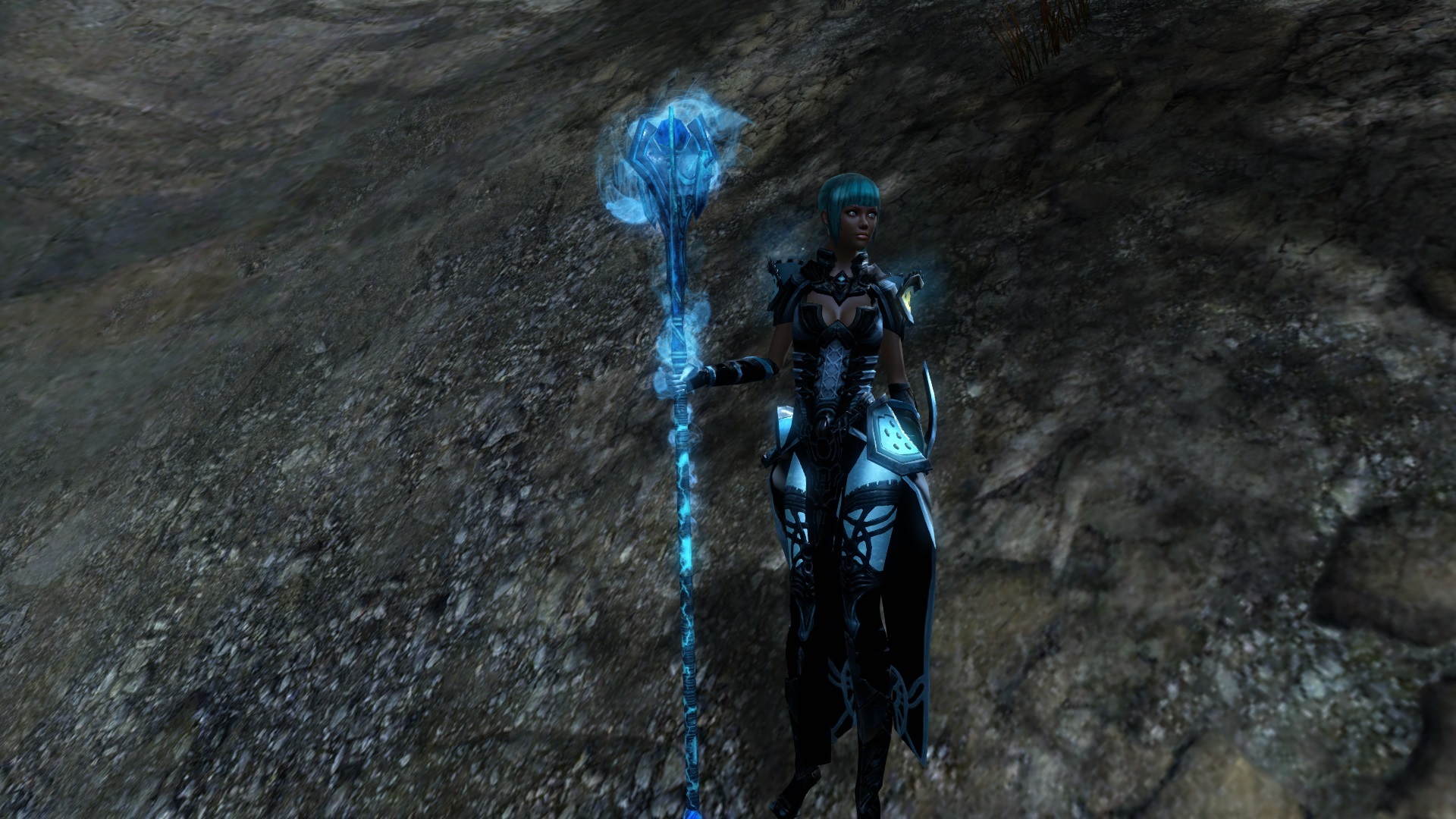
(edited by Astral Projections.7320)
Zodiac Armors Feeback
My big complaints:
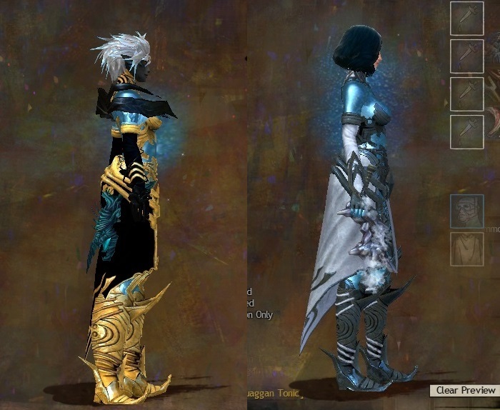
- Light armor on a female: Giant and disproportionate “behind” = ;-(
- Heavy Armor: Curly toe boots = :-(
A suggestion:
- Make the blue parts a bit darker and a bit more transparent. Would give it a more “space nebula” awesomeness to it.
King Arcturus X~80 Ranger | Suki Serra~80 Thief | Count Charon~80 Necro | Regulus Leo~80 Ele
HoD since launch
(edited by Sean.8274)
I loved this armor set when I first saw it. I’m overjoyed there’s finally some attractive-yet-revealing sets for the boys (humanoid and otherwise). I like the effects and the design.
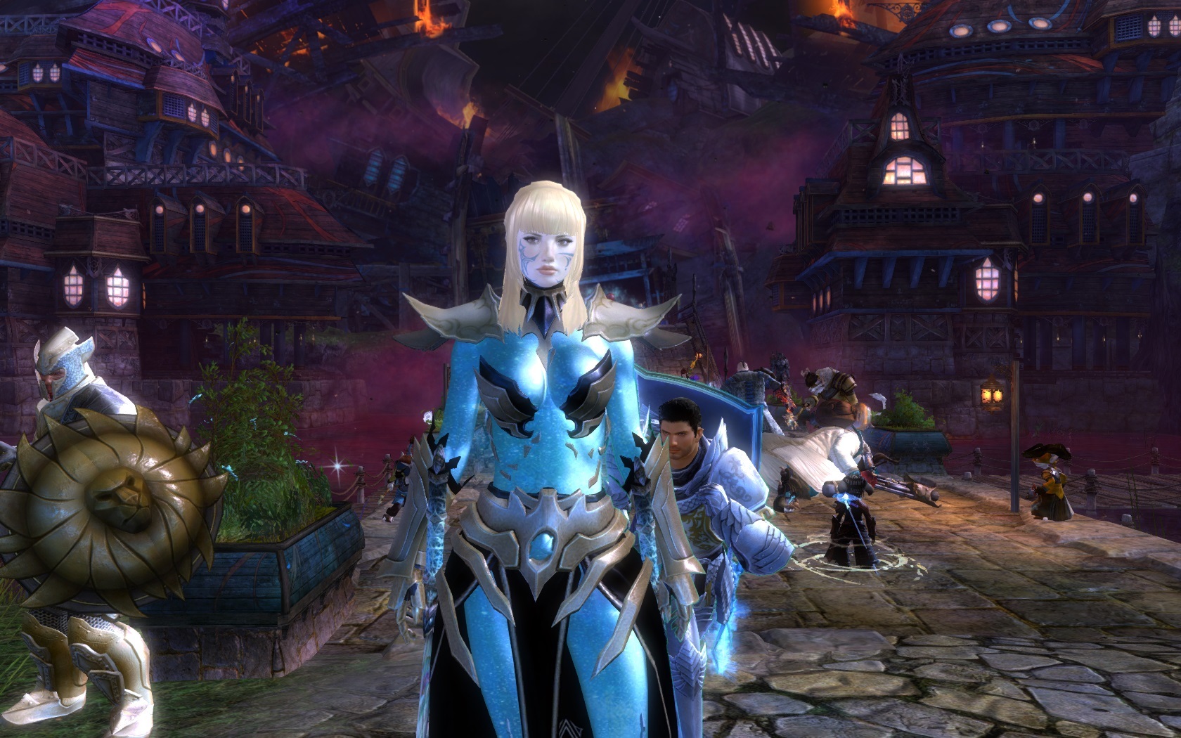
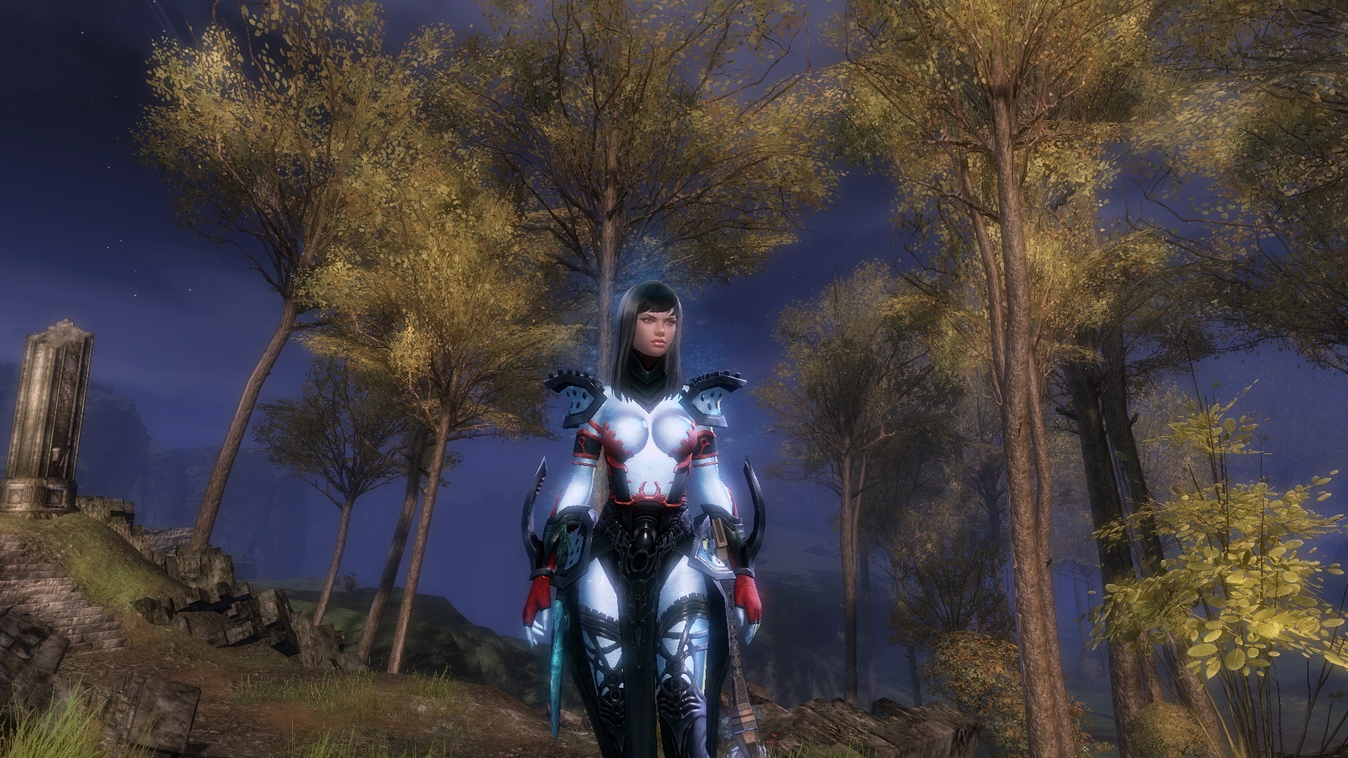
I do not like the “blue skin” effect. I see what the artists were trying to do and I can appreciate it – it’s supposed to be like the Zodiac weapons where the character itself is reminiscent of a constellation. The blue base, though, is very off-putting. I’d prefer to see a lower alpha on all of those areas so that my character was more ethereal than having the blue there instead.
I find the blue off-putting for several reasons. First, it’s very bright, a la Dr. Manhattan (Watchmen), Diva Plavalaguna (Fifth Element), or (I hesitate to say) the Smurfs. The result of the intensity of this color is that it appears to me like the skin is being covered by spandex, an effect that is intensified by the second reason: The blue completely covers the face. I feel as though my character is wearing a blue zentai (a kind of all-over bodysuit). Here are several examples (they are safe, don’t worry):
http://upload.wikimedia.org/wikipedia/commons/9/9d/Blue_Zentai.jpg
http://images4.fanpop.com/image/photos/21400000/ICE-MAN-zentai-21465470-1222-1000.jpgI know it’s a little bit cliche to complain about armor with a Charr model, but in this case I think the preview on my character truly emphasizes what I’m trying to say.
http://i3.minus.com/jMyyjsxJVmGcM.png
His face appears chiseled and shiny, with a similar shiny effect showing up elsewhere on the body as well. I play on the highest graphics settings possible (because this game is absolutely gorgeous) and I don’t think the armor preview renders at the same detail; however, this is my primary way of determining whether or not to buy the item.
I like the peekaboo chest and thighs, I like the gloves, and if I could see the skin/fur instead of this blueness, it would be a sure purchase (for what it’s worth, I typically trade real money for gems rather than gold). Based on some of the outraged comments above, maybe there are cultural constraints preventing this from happening. If that’s the case, and the blue can’t be removed outright, perhaps consider toning it down around the face and significantly lowering the alpha everywhere else – maybe 0.2 on the 0-1 scale. I’d be a little disappointed about not having this awesome armor “cleanly,” but it would be a major improvement and a look I could see myself using.
Hopefully this kind of feedback is something you can use – it’s a bit scary to post here!
TOTALLY AGREE! you put it an informed nice way. I grow tired of doing that myself but yes you nailed it.. the blue is the main thing that really urks me… it makes me ask, why even have a character customization screen in the first place?
+1 to this; I think there could have been another way to implement the ‘zodiac’ feel instead of taking our characters features away & making them look like clay models- but I get they’re supposed to look ‘serene’ I’d just rather have my characters features in there minus the blue skin, instead of pre-made features. Makes me wish I never spent the time on getting makeover kits.
I like the armor the way it is. Good job on this one.
And there’s no such thing of a woman having too much “backside”. More is always better.
(edited by Hot Boy.7138)
so how does it look with the Juggernaut effects?
I love boobies.
Andúnë Faroth, level 80 sylvari ranger.
I bought my mesmer a set because it’s one of the only armour sets worth buying.
With gold of course. Still not spending real money on this game.
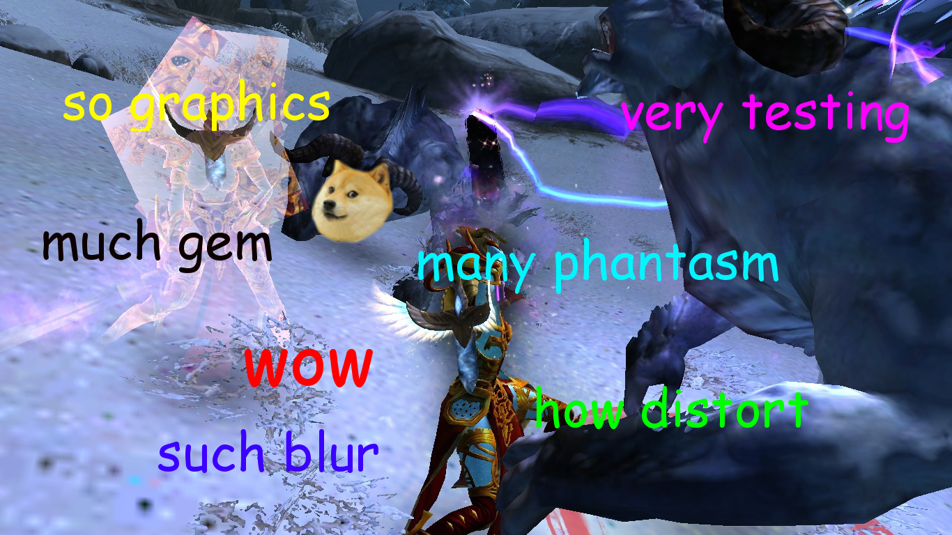
Zodiac armor makes mesmer phantasms look horrible!
Not even considering buying it untill that gets fixed.
Warning: link may contain traces of awesome.
Lyssa’s Grimoire – a guide every Mesmer should read.
Zodiac armor makes mesmer phantasms look horrible!
Not even considering buying it untill that gets fixed.
Which one is the illusion? Dang it’s got me fooled!
PvP modes are the “endgame” in all MMOs.
Stop failing at PvE, and fix WvW/SPvP. Thank you.
Hold up… Some people are saying this is revealing and others, in some cases the same people, are saying it’d be nicer if you could change the colour? What… So people can make the blue skin coloured and your characters look even more naked?
…
…….
I don’t understand the logic behind this.
Anyway, back to what I said before. Looks great. Don’t like it, don’t buy it. Don’t turn this in to another ordeal where so many people cry about it ANet actually listens and changes/removes the armors for those of us who enjoy it. The end.
Champion: Phantom, Hunter, Legionnaire, Genius
WvW rank: Diamond Colonel | Maguuma
You have to admit though, it seems that they colored the characters blue so that they could have indecent armors… Personally, I just don’t like how it looks. It just seems…. wrong.
Please, make an armor that is both skimpy and classy. Like http://wiki.guildwars2.com/images/b/be/Norn_Raven_Shaman_render.jpg
(hint, hint)
Note: I’m cool with pretty much anything but breast showing. open backs are awesome (particularly for Sylvari and tatooed Norn, I’d also like it for my Charr gal), open arms are great (particularly for my patterned Sylvari and tatooed Norn, and patterned Charr!), showing legs is great, and feet (why I like the T2 on my Sylvari to show her darker toes), midriff to show rock hard abs (I chose the muscular Norn builds).Go ahead and keep the armor as-is, but there are major problems with it:
1. It takes away any and all characteristics of your characters – A major problem for female Charr and Asura since they use the male version of the armor. My lady Asura and Charr look like men now.
2. The blue covers up tatoos, Sylvari patterns, Norn Tatoos, Charr stripes, etc.
This armor makes make-over kits and work put into character design worthless…What you could do instead:
Masques (so that hair shows)
Long gloves (I would love long gloves and no sleeves!)
cool boots (high boots)
elegant dress (with no sleeves and an open back for example to go with the long gloves)
maybe transparent sleeves/veils/leggings instead of opaque covering such that tattoos show?
Wow, I want that raven shaman top so bad for my Norn warrior. Lovely. The bottoms could use some work if they wanted me to pay gems for it, but. Yeah. That is so right up my alley in the mix between skimpy and haute. Great suggestions and accompanying explanations :) The headpieces would be so much cooler if they were blue masks that still showed some face in the vein of the “tattoo” skins they’ve been releasing lately. I would buy probably too many of those.
I highly suggest the artists look at runway fashions like this, this, this, this, these, this, or really just anything fashion related and take some inspiration time.
I think this (nsfw?) male fashion might be a little more on par for the male design of Zodiac.
So I have played with this medium armor since last night. I have seen screenshots on this forum and others. I have yet to see a screenshot of a character with the helm visible. Obviously, the helm is not very popular.
Of course, the “blue” in the armor is not very popular with some people. I think the blue looks preposterous myself. I thought we would be able to dye it. My mistake there.
One improvement I have made it to hide the shoulder armor. Frankly, the shoulder armor is pretty shoddy. It looks like it was added as an afterthought. The ensemble looks better without the shoulder armor (medium).
Had I realized (again, my mistake) that the blue areas were not dyeable, I would never have purchased this armor. I guess I will just have to swallow my pride and either salvage them, or re-roll.
Let us dye the “starfield” and you’ve got multiple sales from me despite curling-toed boots being about the dumbest looking clothing concept ever in my book.
I wonder what your basis for comparison is…”
- Jareth, King of Goblins.
Keep in mind, though, the other one was a significant ordeal. IF the other sets had been T3 armor sets, maybe they would have kept the armor set as it was. But it was the only one that was. So they had to be consistent and have them all not be T3 sets (and it was a bit unfair to the humans).
I’d just like some more cultural sets and sets that don’t look as looney. On the positive side, I am so glad ArenaNet hasn’t made a good armor set as it has made me less tempted to spend money in their store…
the odd thing is that all they’d have to do to get me tempted would be to put up any of about 10 different NPC armors…
(edited by Lorelei.7809)
This probably won’t get read by ANet, but just in case…
It’s just too wacky. A lot, almost all, of the gemstore armors are just… What? I am an impulsive buyer, I like my characters to look good. But sadly there just haven’t been any sets put out that don’t make me look like Lord of Admirals God King Slayer Titan Rider, or part of an elaborate circus act.
Please consider adding armors that.. Well… Someone would actually wear. There are a few Light, Medium, and Heavy armors from launch that are down to earth and look good. Nothing like that since.
Also if you want to make some money, add a light/medium/heavy armor skin of the thief starter hood. Seriously. I will buy ten.
Also if you want to make some money, add a light/medium/heavy armor skin of the thief starter hood. Seriously. I will buy ten.
Alternatively you could buy another character slot (if you’re full), one time 800 gems, then remake a thief 10 times transmuting the hood. Much cheaper!
PvP modes are the “endgame” in all MMOs.
Stop failing at PvE, and fix WvW/SPvP. Thank you.
You can’t dye the starfield cuz zodiac will always have the Blue theme
id buy it for my one of my charr if only
a) the tail would not clip. cmon its a gemstore item… why does it have to not have a hole or some other fancy space for our tails?
b) the blueish stuff could be toggled off.
right now its fun to look at on blue sylvari, but thats pretty much it.
ability to dye the blue areas please!
I dont think that will ever ahppen, people will end up dying it to match the skin colour, and then imagine the complaints!
that happened in CoH and still happens in CO, they are still in the T rated area.
Take away the blue ‘star’ skin- leave the armor
the stars look more like white noise than anything
it’s and interesting design- but I dont see why it gives my norn mesmer a horrible preset face.
Maybe Anet you should take a vote on what armor ppl would like more next time.
(edited by SnowHawk.3615)
I absolutely love the new armor set, I mixed it with the female light Human T3 and I think it looks amazing. I will post pictures as soon as I get off of work.
I do think you should allow people to dye the blue portion of the armor. I personally don’t mind it and like the color, but it definitely limits a lot of what others can do with the set. That being said I really like the starfield, so pretty o
Someone got a “Avatar” fetish…Finally we got some new armors, the only sad part is that they want to keep having us spending all our money on it. I mean, kitten . Why not lock all the armors behind bosses, AH, crafting etc. Because this is a terrible ide, I can’t spend more money than I already do on this game.
Please make an expansion and release kitten ton of content once every year instead of this bullcrap tactics.
You need a slap of Gw1 in your face. Because that game is my chilldhood and this is my teenage years. Don’t you dare kitten them up!!
As a woman who is extremely modest(Almost to the point of being labeled prudish at times), yet very feminine in her choice of fashion(Example: One, Two.) and I still do not really see the issue with this armour set. Sure is seems to show a lot more, but the fact of the matter is that it is fabric. It is a skin tight fabric that does cling and smooth around the edges. Ladies, we get this affect when we wear leggings and yoga pants, do we not? Sure men might pant and swoon over such bits of clothing but we aren’t showing off skin or private parts, now are we? No, not really. That is the case here, it’s just fabric. Now if the blue area wasn’t fabric I’d be slightly bothered due to the fact that the other fabric line is below the lowest part of the female areola line. But, that being said, I just wouldn’t personally buy it is all. When you look at real life, if a woman is dressed inappropriately that is on her and not me. It doesn’t effect me whatsoever. Yes I may think she is under dressed and slightly resembling a lady of the evening, but that doesn’t effect me personally.
I’m sure an iron fist feminist would disagree with my outlook. Yes I understand the idea that SOME men(Absolutely not all) overly sexualize women but the truth is a lot of women over sexualize themselves as well. No one is innocent in society when it comes to that aspect.
Now for what I think needs to be done with the armour, well I believe you should be able to dye the blue part. I understand what Anet was going for with this set but I’m sure a lot more people would be happy if they could dye it to their liking. This is Guild Wars 2 but it is also Fashion Wars 2.
PS. I would really love some evil queen types of light armour. Long ballgowns, waist clinchers and whatnot. That would be lovely! Elegance is what I’m after, darlin’!
Companion of Starlight Honeybuns.
You stole me, and I stole you.
(edited by bokkieskitten.8023)
This, so much this. The two black dresses in that list are great – although to be fair, we’ve gotten some pretty good ones with the Phoenix, Trickster, and Viper armors.
I think this (nsfw?) male fashion might be a little more on par for the male design of Zodiac.
Seriously, if that (or anything even close to that) was a male armor set I would buy it with gems.
This, so much this. The two black dresses in that list are great – although to be fair, we’ve gotten some pretty good ones with the Phoenix, Trickster, and Viper armors.
Phoenix is loooovely and the Viper’s really grown on me. I was waiting to see what gemstore armors would be out with this patch before I pick up the Phoenix, hoping something would pull me away from being yet another female character wearing Kasmeer’s getup but. So perfectly pretty and revealing just enough… those floating feathers! That phoenix at the back! Swoon.
This, so much this. The two black dresses in that list are great – although to be fair, we’ve gotten some pretty good ones with the Phoenix, Trickster, and Viper armors.
I think this (nsfw?) male fashion might be a little more on par for the male design of Zodiac.
Seriously, if that (or anything even close to that) was a male armor set I would buy it with gems.
I’d buy that too! I think the chest and arms look so awesome. Although, if it were up to me, I’d alter the pants somewhat. I say this not because of the amount of Skin it shows, but because the crotch on that costume just looks painful. To be blunt, it looks like his man bits are being crushed or smashed.
My two coppers on the new armors:
This set is receiving more hate than it deserves. It looks really cool to me, but this is just an opinion. There will always be something that someone likes and someone doesn’t.
The only thing that really bothers me, and i think that everyone will agree with this, is the face being replaced by that blue model. CloneWars2 looks like a star wars mmorpg, it would be great to have this very nice armor and it’s helmet and keeping the appearances we created on our characters (spending gems to add the new facial features and so on..)
Fix that, and i’ll buy one per toon probably..
Zodiac armor makes mesmer phantasms look horrible!
Not even considering buying it untill that gets fixed.
dont think they will fix it especially since it has the same effect that the celestial gloves/helm/boots (upcoming) give off when I summon my phantasms. They haven fixed that either.
I bought it just for the medium pants. I love them.
Well, some people like it, but I’m really disappointed. I don’t like overly revealing armor because I feel uncomfortable with my character wearing it, like all the guys are probably ogling her. I don’t want to create another spectacle for guys to fantasize over. I’m not going to buy it. I wish there had been more sets released than just this one.
I just noticed how it has little stars all over it. that’s kinda neat. but why can’t it be like the starry tattoos just implanted in an armor (like the leg thing with the winged set) with more cloth covering the breasts? I’m not saying do that now, just saying for future reference for neat effects…
And yeah, before I thought phoenix was goofy with all the feathers but now it looks classy and awesome in comparison… trickster and viper are good too. but trickster has too much poof for me and viper’s just okay. I would say those three are my favorite gem sets (but they just aren’t good enough for me to buy – my Sylvari Mesmer only wears leaves >_<)
my human necro is perpetually in Hall of Monument armor until something better shows up… my sylvari mesmer is in cultural T2 (LOVE the gloves and feet) and well, my asura ele is well, asura.
(edited by Lorelei.7809)
Zodiac armor makes mesmer phantasms look horrible!
Not even considering buying it untill that gets fixed.
That pic had me laughing far harder than I ever thought I would. But I expect a speedy fix so I don’t mind it too much.
Also, it affects stealth I’ve noticed.
I like blue color but armor is too reveling.
I really hope they do not cave in and change the armor. I think people are being too sensitive. Some people like revealing armor (I like it) while some don’t. I don’t understand why they should remove it though just because some people feel that it shows too much.
By that logic, they should remove all of the armor that I feel is not revealing enough.
I like blue color but armor is too reveling.
It doesnt reveal anything, its a bodysuit comparable to the bodysuits superheroines wear:
Compare it too and youll see it looks quite similar:
I like blue color but armor is too reveling.
It doesnt reveal anything, its a bodysuit comparable to the bodysuits superheroines wear:
Compare it too and youll see it looks quite similar:
No. That’s your actual skin. You can tell, because your character’s belly button is an obvious divot. If it were a zentai suit (catsuit, superhero suit, whatever you want to call it) then the divot of your belly button would be obscured by the fabric, it wouldn’t get magically sucked in.
Painbow.6059: Ignore what anyone else who doesn’t agree with me has said because its wrong.
Wishlist:
1. Changeable “skin” color. Perhaps using the “dye remover” option would show your actual skin/fur/leaf color?
2. Remove those ugly looking blue things on the heavy helm/shoulders.
Norn Ranger medium armor,
I like the sets but the toe curl was not working for me.
The armor is revealing when it covers every single inch of the whole body, even the face?
Seriously?
The beach or the bath house must be a nightmare for you guys :/
The armor is the most unique and most fitting armor for the gem store so far. ANet, you’re really showing signs that you’re improving with this patch. Very nice work.
I do enjoy the latexy look of the armor quite a bit, there’s not much of that in the game. It’s arguable if there -should- be much of it. But in this case I think it works quite well since it seems to play on the theme with the celestials from Cantha.
I love this armor. Not because of the star effect or because it’s very well designed (though it is a very nice set) but because the male and female versions actually look like the same set: they’re equally revealing and each part of the armor looks basically the same. Revealing sets are perfectly acceptable when they are revealing on both genders like this, but they’re not okay when they’re revealing on one gender but not the other like Phalanx, Arah, and pretty much any light armor. The faces kind of creep me out and I wish that they were available through playing the game rather than the gem store but I still think it’s a great set and I’ll probably buy it
Absolutly love how the male characters are allowed to show some skin too.
Well, the shoes are horrible, but the Chest and Leggins Pieces are awesome!
But then I saw that blue latex covering, which keeps me from seeing the character I created to well… see him.
So no Zodiac Armor for me, even if I would’ve liked them otherwise.
And well… Asura. Why can’t they show blue latex covered ears, while wearing those helmets?
It’s sad how they have to wrap their ears around their heads to fit into so many headpieces.
Can we have some revealing clothes for male characters, too? Without blue latex stuff?
Especially the leather ones doesn’t have much clothes, that shows even a little bit of skin.
Would love some shoes for Asura which cover all of their three toes (which is extremly cool featured on that heavy aetherblade skin!) and not only the middle one. Most of their Black Lion Trading Co Clothes feature that, and fingerless gloves for Asura. There could be some different designs.
Same thing with the horns and ears on a Charr. How can they just disappear after a Charr puts his/her helmet on? Are those that smooth, that a Charr can just bend them away?
You can’t dye the starfield cuz zodiac will always have the Blue theme
This was was a lame excuse even when ANet first used it for justifying the removal of the dye option on the CoF armor’s flames.
Armor is not applied as a set, it is applied in pieces which you can MIX and MATCH. Meaning that players may want to take a piece or group of pieces and make a set of armor which fills a completely different aesthetic than any of the sets the pieces come from fill. And there is no sensible reason why they shouldn’t be able to.
I use a mix of gear that gives my D/D elementalist a street-fighter look, none of the armor sets those pieces come from fulfill anything close to a street-fighter look. If for some reason ANet had decided to lock dye channels on any of those pieces, I would likely have no way of fulfilling that aesthetic.
Locking dye channels is a horrible idea and ANet should not have done it on ANY armor to start with, let alone continue making more and more armor with the same problem.
EDIT: But at the same time, the non-skin bits of this armor in particular were so poorly thought out I can’t see ANet allowing the playerbase to dye this. I mean, how they’ve managed to get away with topless little girls for a year and a half is beyond me, they really shouldn’t push it anymore.
(edited by Conncept.7638)
I like blue color but armor is too reveling.
It doesnt reveal anything, its a bodysuit comparable to the bodysuits superheroines wear:
Compare it too and youll see it looks quite similar:
No. That’s your actual skin. You can tell, because your character’s belly button is an obvious divot. If it were a zentai suit (catsuit, superhero suit, whatever you want to call it) then the divot of your belly button would be obscured by the fabric, it wouldn’t get magically sucked in.
It’s not actual skin. It’s the same stuff the Zodiac Weapons are made from. That’s why the shoulder armor and head armor (the fins, specifically) look the same way, even though those pieces are (very obviously) not part of the character’s body.
Please please please correct the “BEHINDS”… I don’t see it as a “cape” or whatever was intended… No cloth looks that way without a HUGE butt filling it. And my toon is slim and I like her slim :/
Please please please correct the “BEHINDS”… I don’t see it as a “cape” or whatever was intended… No cloth looks that way without a HUGE butt filling it. And my toon is slim and I like her slim :/
LOL!
No. That’s your actual skin. You can tell, because your character’s belly button is an obvious divot. If it were a zentai suit (catsuit, superhero suit, whatever you want to call it) then the divot of your belly button would be obscured by the fabric, it wouldn’t get magically sucked in.
My characters belly button doesnt even show in the light blue area. Its under the red + dark blue decoration*. And even if it did show (which it doesnt)….
http://www.giantsizemarvel.com/2011/01/alan-davis-women-of-marvel-cover.html
Almost all of all these classic american superheriones have “divots” where their bellybutton is. So i guess those comics contain a lot of nudity aswell and YOU would consider that cover a collection of naked superheroines?
(edited by Locuz.2651)
Please please please correct the “BEHINDS”… I don’t see it as a “cape” or whatever was intended… No cloth looks that way without a HUGE butt filling it. And my toon is slim and I like her slim :/
Anet likes big Butts and we cannot lie lol
If the mesmer bug gets fixed I think I will be very happy with this look but those phantasms are not going to work with giant squares all around them.
