Daydreamer's Outfit: False Advertising?
It resizes based upon your character model.
A size 18 model looks differently wearing the same dress compared to a size 0 model. 
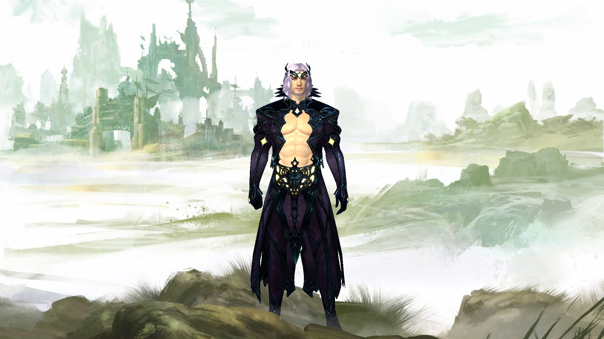
I’d get it if it wasn’t for the complete lack of front torso covering for males.
Showing off some abs is one thing, completely leaving out a panel of material just looks kitten y.
Female characters, as usual, get the best deal
It resizes based upon your character model.
A size 18 model looks differently wearing the same dress compared to a size 0 model.
Mainly you need to be human and it will scale strangely on everything else.
(edited by Doggie.3184)
They’re nice looking, but I’m one of >those people< that will never buy an outfit. I like mixing and matching, so full armour sets that let you do that are more appealing to me. So I’m voting with my dollars.
I’m glad to see more mesmer-ey stuff, even if it’s locked in the gem store.
I’d get it if it wasn’t for the complete lack of front torso covering for males.
Showing off some abs is one thing, completely leaving out a panel of material just looks kitten y.
Female characters, as usual, get the best deal
I’m just… god I hope this is sarcasm.
looks at the boobwindows, exposed belly’s and legs for a lot of female armor
Right.
Either way I don’t have much to say on the armor/outfit thing. Not my taste though I like that it’s more equal for female and male characters in showing skin.
The mysteries dissapear and life stands explained.”
Abs are nice but it’s too flamboyant and covers everything else like a wetsuit so it’s not even really appealing as a skin-bearing male outfit.
I am glad they finally gave us a revealing male outfit. Of all the boobs/midrifs spilling out of female outfits in the game and there are people that complain that guys show off their gut for one outfit? Good for Anet finally. I’d like to see more of that.
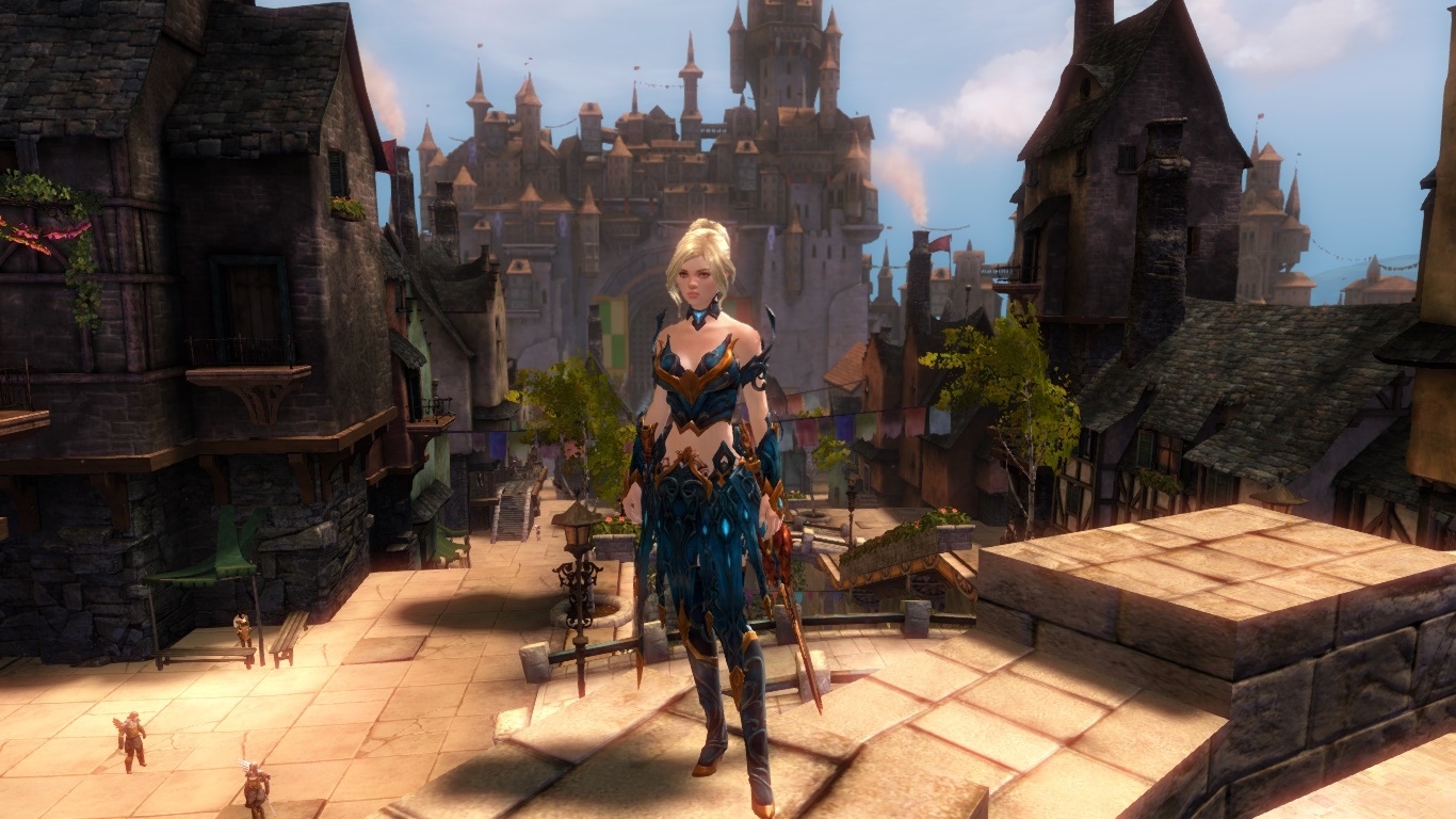
I love this outfit BUT after I tried it on my norn female I am again dissapointed what they do to skirts on norn females=( It’s wayy too poofy and doesn’t sit on her hips properly at all. It sits very nice on human females and sylvari but I go look at my norn and YIKES. She doesn’t even have big hips.. in fact I think her hip to waist ratio is even less than most humans. I wouldnt play a light armor class female norn just because of this skirt problem but I wish they would fit the outfits better on them =(
I’d get it if it wasn’t for the complete lack of front torso covering for males.
Showing off some abs is one thing, completely leaving out a panel of material just looks kitten y.
Female characters, as usual, get the best deal
I’m just… god I hope this is sarcasm.
looks at the boobwindows, exposed belly’s and legs for a lot of female armor
Right.Either way I don’t have much to say on the armor/outfit thing. Not my taste though I like that it’s more equal for female and male characters in showing skin.
Nah, the Male armor like Gladiator show more skin. I don’t mind showing skin on the males if it’s cool. It’s not about this self-righteous whining about “equality”, it’s about what looks good. Conan the barbarian looks awesome & he wears less than any woman in GW. Boob windows look good. That’s why lots of outfits have cleavage for women & for the guys they just remove the entire top. looks better. This guy just looks like an idiot.
(edited by DarksunG.9537)
I’d get it if it wasn’t for the complete lack of front torso covering for males.
Showing off some abs is one thing, completely leaving out a panel of material just looks kitten y.
Female characters, as usual, get the best deal
I’m just… god I hope this is sarcasm.
looks at the boobwindows, exposed belly’s and legs for a lot of female armor
Right.Either way I don’t have much to say on the armor/outfit thing. Not my taste though I like that it’s more equal for female and male characters in showing skin.
Nah, the Male armor like Gladiator show more skin. I don’t mind showing skin on the males if it’s cool. It’s not about this self-righteous whining about “equality”, it’s about what looks good. Conan the barbarian looks awesome & he wears less than any woman in GW. Boob windows look good. That’s why lots of outfits have cleavage for women & for the guys they just remove the entire top. looks better. This guy just looks like an idiot.
It’s a matter of opinion.. the new outfit suits more of a light armor class and the gladiator/conan look is better for heavy sets. I think the new outfits would look awesome on a mesmer male for example. But gladiators (if they could wear it) would look wrong
I really like that A-net have added something “light armour-y” that shows off some male skin. I certainly appreciate that as it adds more variety, even if the look isn’t my taste.
I do hope that they add a similar armour/outfit to the male version but without the “torso window”. I’ve heard that a lot of people really love the way that the male version looks detail-wise (especially the back) but get put off by the torso window.
I absolutely love the female version- it looks very organic. One of my sylvari is wearing it and she looks fab.
I can see that there is a marked difference between the Gem Store art and the actual product- this isn’t something I mind as I always preview it in the Gem Store and I like the outift anyway. I can understand that some players wouldn’t like the outfit as much as the art, though. The female skirt in the art is a lot neater/clean looking, perhaps slightly less organic and leafy.
(edited by Crimson Clouds.4853)
At least the male and female outfits are different. I HATE the unisex ones.
I like this outfit. One of the better ones
I kinda wish the front of the skirt wasn’t soo bulky and busy, like if the two side straps weren’t there it would look better (in the front, on either side of the one in the center)
I like this outfit. One of the better ones
gah, that giant chest window.
Why couldn’t they make it like a half cut showing off just the abs. I’d buy it in an instant if it wasn’t for the total lack of chest material
I love it on female chars.
It’s very Art Nouveau (or wood nymph, as my BF called it) and I love that.
Ideally, the lower skirt would be slightly more drapey and less bulky, but I’ve kind of got used to the bustle type thing going on with light armour styles in this game and this is such a gorgeous design, I can live with it.
Would buy if it was in separate armor pieces but not sure as an outfit… I don’t like being restricted this way.
They really should’ve left outfits the way they were and given us a better way to store them.
I’d get it if it wasn’t for the complete lack of front torso covering for males.
Showing off some abs is one thing, completely leaving out a panel of material just looks kitten y.
Female characters, as usual, get the best deal
I’m just… god I hope this is sarcasm.
looks at the boobwindows, exposed belly’s and legs for a lot of female armor
Right.Either way I don’t have much to say on the armor/outfit thing. Not my taste though I like that it’s more equal for female and male characters in showing skin.
Nah, the Male armor like Gladiator show more skin. I don’t mind showing skin on the males if it’s cool. It’s not about this self-righteous whining about “equality”, it’s about what looks good. Conan the barbarian looks awesome & he wears less than any woman in GW. Boob windows look good. That’s why lots of outfits have cleavage for women & for the guys they just remove the entire top. looks better. This guy just looks like an idiot.
It’s a matter of opinion.. the new outfit suits more of a light armor class and the gladiator/conan look is better for heavy sets. I think the new outfits would look awesome on a mesmer male for example. But gladiators (if they could wear it) would look wrong
Yeah, but there are ways to accentuate the inherent features of men/women that generally match the biological make up of the 2. That’s why cleavage works on a female & on a male it just looks like a random hole. Also, Date is wearing cloth & his setup is good. So do the Castanics. The Castanics are sexy, yet masculine, & the gear works. This just looks like a dude wearing clothes that were designed for someone else entirely.
I like this outfit. One of the better ones
Could you tell me what the colour options are? Is it one colour for the whole outfit?
I like this outfit. One of the better ones
Could you tell me what the colour options are? Is it one colour for the whole outfit?
It is like any outfit, you have 4 areas you can dye to your liking.
I love how it looks on my Sylvari Ranger, Frosty Nightmare.
League of Omnipotents [Omni], Fort Aspenwood
I like this outfit. One of the better ones
Could you tell me what the colour options are? Is it one colour for the whole outfit?
It is like any outfit, you have 4 areas you can dye to your liking.
I love how it looks on my Sylvari Ranger, Frosty Nightmare.
Truly Awesome! I think your Frosty rocks the look XD
The male version looks good. Gives you nice window that says “please stab me here, I hate it when my vital organs go unperforated!”
People always say that there aren’t enough revealing mens’ armors, but I never once saw anyone wearing scar or tattoo armor in GW1.
It resizes based upon your character model.
A size 18 model looks differently wearing the same dress compared to a size 0 model.
Actually, although this would be true IRL, it isn’t true in the game.
The hip/bottom area doesn’t resize properly, according to your char’s proportions – that is the entire problem.
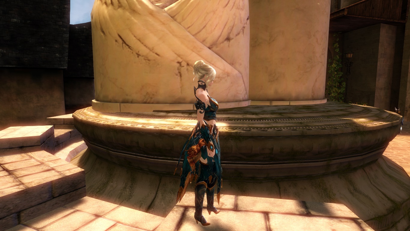
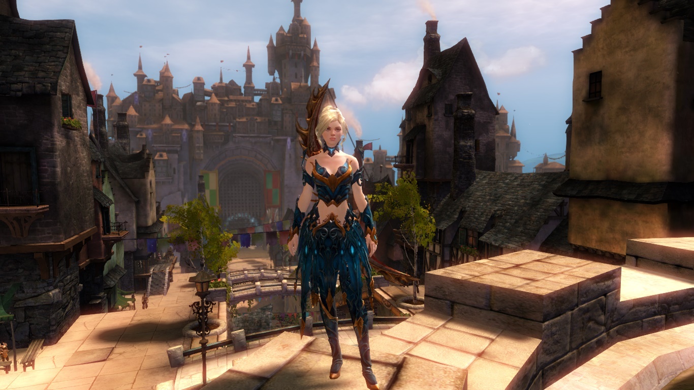
I’ve noticed that what happens with long jackets, coats and skirts, on human females (and I think all females with a female human type shape) in the game, is that the area below the waist flares/puffs out, in the same way it would on the largest body/hip-type, on ALL body/hip types.
So, they flare out way beyond your char’s actual hips/bottom, unless your char has the largest hips/bottom available to its race.
Of course, it’s not shown like that in the promotional artwork, where the skirt is represented as actually fitting the “model”.
Another thing is that, in the promotional artwork, the female human appears to have slightly broader shoulders than any (or at least most) of the human female body types, in the game, without having very wide hips.
So, she looks better (or, at least, differently) proportioned, anyway.
It’s possible it’s just a flattering angle, though…
As I say, it’s still a very pretty outfit, but it does seem to suffer from the same issues other female clothing items of this type have.
I love this outfit BUT after I tried it on my norn female I am again dissapointed what they do to skirts on norn females=( It’s wayy too poofy and doesn’t sit on her hips properly at all. It sits very nice on human females and sylvari but I go look at my norn and YIKES. She doesn’t even have big hips.. in fact I think her hip to waist ratio is even less than most humans. I wouldnt play a light armor class female norn just because of this skirt problem but I wish they would fit the outfits better on them =(
TBH, there is something very wrong with a lot of the female hips in this game.
They come out far too gradually.
So, the lower hips are quite big, generally (too big, in many cases), but they have no upper hip at all.
This is definitely the case with the slimmest Norn body type, but it’s certainly not the only one.
In reality, I’m not even sure they would have (vertical) room for a female pelvis.
(edited by Tigaseye.2047)
Yeah, but there are ways to accentuate the inherent features of men/women that generally match the biological make up of the 2. That’s why cleavage works on a female & on a male it just looks like a random hole. Also, Date is wearing cloth & his setup is good. So do the Castanics. The Castanics are sexy, yet masculine, & the gear works. This just looks like a dude wearing clothes that were designed for someone else entirely.
Yeah, I’m going to have to agree: the scene missing bit on the male version isn’t quite right. I think it doesn’t go far enough south, leaving the sexy out of it and making it just odd. We don’t even get the opportunity to see manly man arms (but the female version shows arm! Why are lady arms better than man arms? Are man arms offensive?! Don’t answer that. Really. Don’t).
I had to Google Castanics (What?! I don’t TERA), and found a wonderful example of how to make male armour of this type look nice and schmexy (link prolly not for everyone, prolly NSFW):
The individual shows a suitably low enough waistline and the difference between a random try-hard window and a window for a reason (which has nothing to do with being functional armour in the slightest!). Of course, I can’t abide the shoulders and the gauntlets, but apparently I can’t get everything! XD
One day in the life of GW2, I hope we can get just one pair of troosers of similar low waist with a top section which does not inhibit the sexy. Then I shall be happy.
I’d get it if it wasn’t for the complete lack of front torso covering for males.
Showing off some abs is one thing, completely leaving out a panel of material just looks kitten y.
Female characters, as usual, get the best deal
I’m just… god I hope this is sarcasm.
looks at the boobwindows, exposed belly’s and legs for a lot of female armor
Right.Either way I don’t have much to say on the armor/outfit thing. Not my taste though I like that it’s more equal for female and male characters in showing skin.
Nah, the Male armor like Gladiator show more skin. I don’t mind showing skin on the males if it’s cool. It’s not about this self-righteous whining about “equality”, it’s about what looks good. Conan the barbarian looks awesome & he wears less than any woman in GW. Boob windows look good. That’s why lots of outfits have cleavage for women & for the guys they just remove the entire top. looks better. This guy just looks like an idiot.
I personally don’t think the way they exposed the skin with this outfit looks bad. I do agree that some others that show it in a different way do it better, like indeed gladiator armor. However we really could use more options imo.
And I generally think the boob-window on armor is terrible, on light armor I can go ‘oh well’ but on heavy armor it’s just ridiculous, just like the boob-shaped armor for that matter. shrugs
It all stays a matter of opinion I suppose.
The mysteries dissapear and life stands explained.”
The individual shows a suitably low enough waistline and the difference between a random try-hard window and a window for a reason (which has nothing to do with being functional armour in the slightest!).
Yes, the Castanic looks like he put a coat on without a shirt underneath.
The Daydreamer’s looks like “if we just cut away a piece here, it’ll give all those people who want skimpy male armor a thrill”.
Someone at ArenaNet has really odd ideas about what looks good in a “revealing” design. What’s the deal with bare stomach and all of these fully covered backs and long, flaring sleeves? It makes the bare stomach look like a mistake, rather than a design that just has low coverage.
And of course, there’s always the odd, asymetric underboob of the medium human cultural armor.
Just because it’s worth spamming, this “outfit” could be made into a normal armor set on both males and females with some work. And I think it would be worth taking whoever did this off of HoT/else to make that happen for all 3 weights since it’s just a single set.
I don’t mind outfits existing, but normal armors still need to be being created, and when an outfit design comes that doesn’t have all the visual things that should separate outfits from armor. Things like intricate cross piece designs, unbreakable design links between more than just the 3 torso pieces, a suit-wide theme that would not stand being broken off and used alone on all 6 potential pieces. They made a male and female ARMOR and are selling it as an outfit. I would be okay with this if they had taken that extra step and actually made it into armor. I might even let it slide if it was light armor only since this clearly falls under that category of looks. That’s my #1 hangup here.
And to the topic of the post, its for advertisement and thus it will be embellished even more to make it look cool, like all the spears in the cinematic at the end of LS2. >.>


