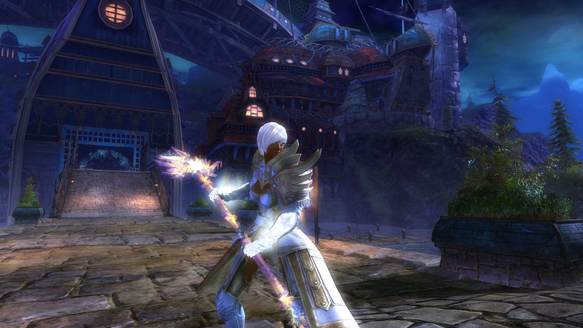
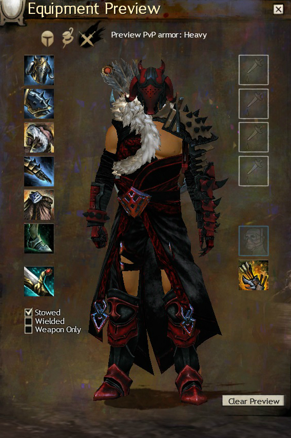
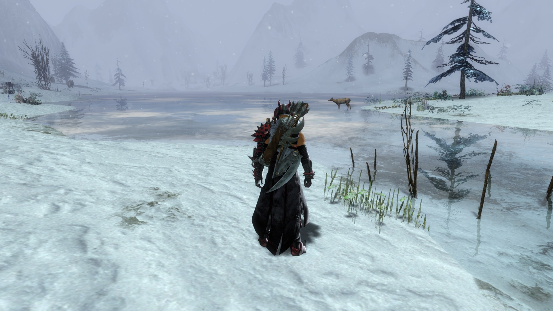
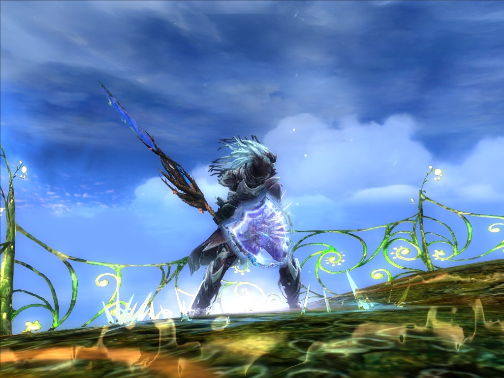
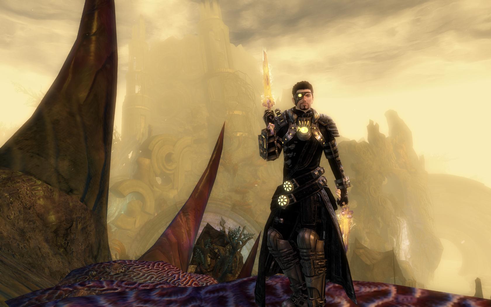
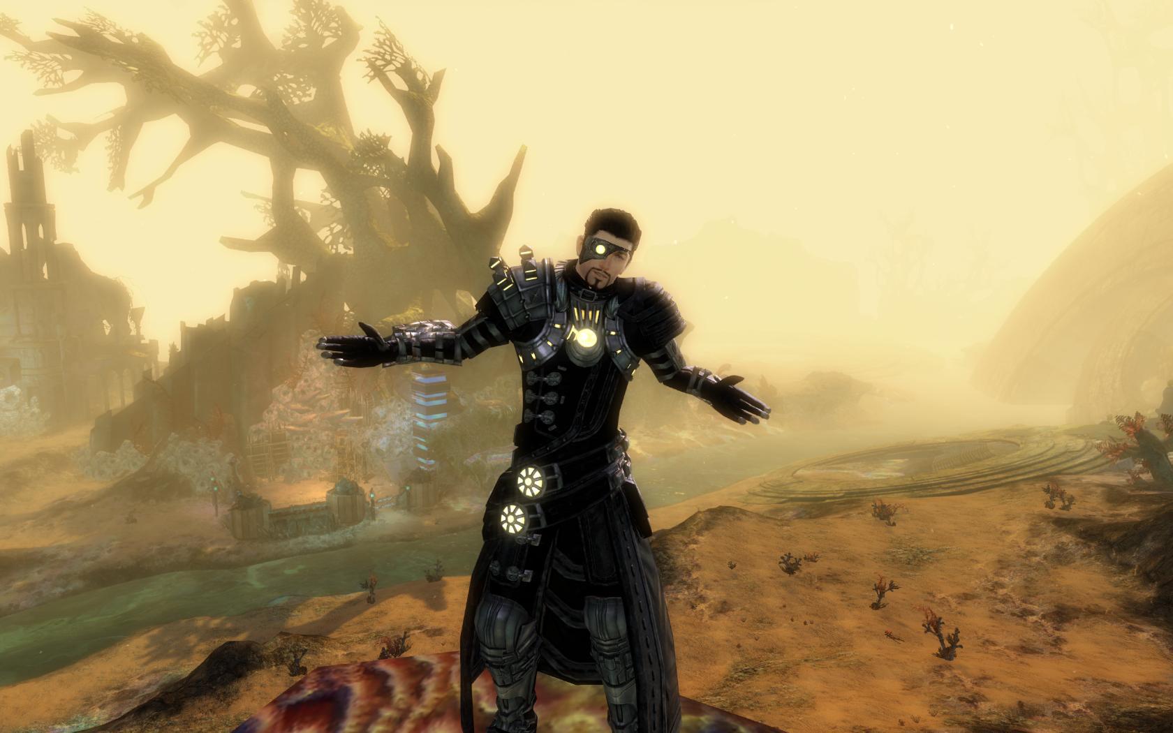
Rate the looks of the person above you!
Bump! Why is no one taking part? They do it on the WoW forums xD
Hmm this isn’t WoW sorry. What flies there is usually a “No Fly zone here”.
I’d participate, but my pics are at home (at work atm). Maybe after I get home, I’ll toss one up. Could be fun, as long as I can use the ‘armor goal’ not the ‘current’ armor haha.
Haha yeah thats fine post it when ya get home
@Nybor
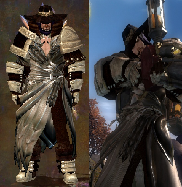
That looks very unique, but I don’t like the bland colors at all. That same look with two contrasting colors such as (Warning super mainstream) black or white (or even midnight blue) + a light color would make it much cooler in my opinion.
5/10
Mine is a mesmer
Please no abyss + celestial or the likes… just… no
(will add my horrible non mix n match Guardian later)
“You can’t have more than 10 HS decks because that would confuse people”
“30 fps is more cinematic”
First off.. is it possible to post two characters? I have a warrior and a necro.. Anyways,
I like the look. It’s not overdone, it simple, yet unique… but i don’t like the black and white colours… Feels so mainstream
7/10
I will post both mine, rate both or which one you like best
Warrior first then necro second
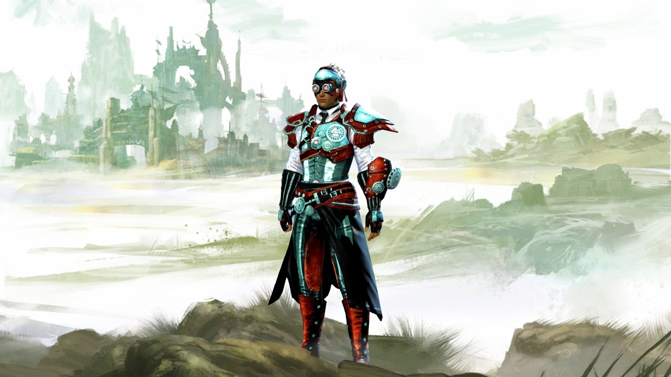
I like the metallic looks, but the shoulders are a little over the top. Probably looks better ingame, with a weapon n stuff. Still 8/10. Needs Twilight.
My Warrior looks similar, so i’ll post a picture of my mesmer instead:
(edited by Molch.2078)
haha there some massive choppers your Mesmer has there!
I don’t think ive seen a mes like that before so you get unique points ^^
8.5/10
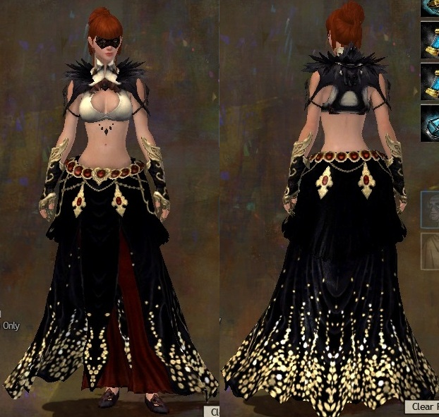
heres my main, bland I know, but I love the look :P
Okey shawn, heavy armor and female, well that makes it beutifull, because all heavy armor is epic in this game and the female armor is always well designed.
Coloring is a bit meh, black and red
(edited by An Oak Knob.1275)
My eyes. They are bleeding…
My eyes. They are bleeding…
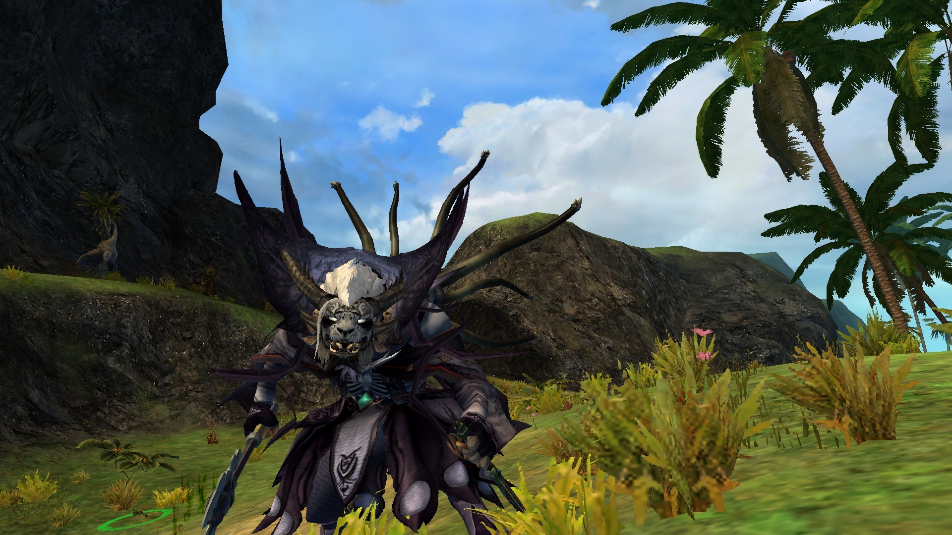
Kodan style
Mah turn!
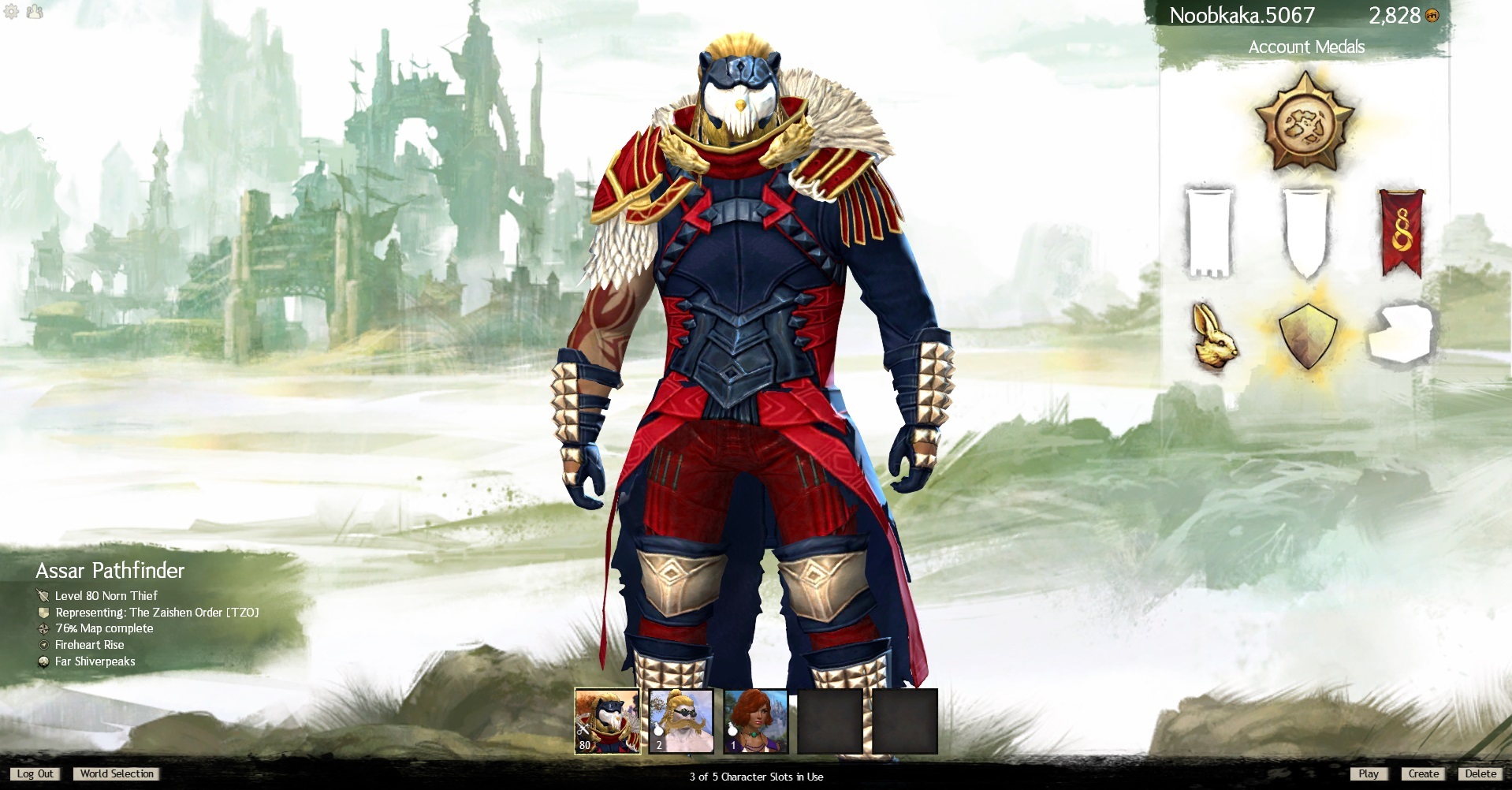
@ Noobkaka (heck of a name bud)
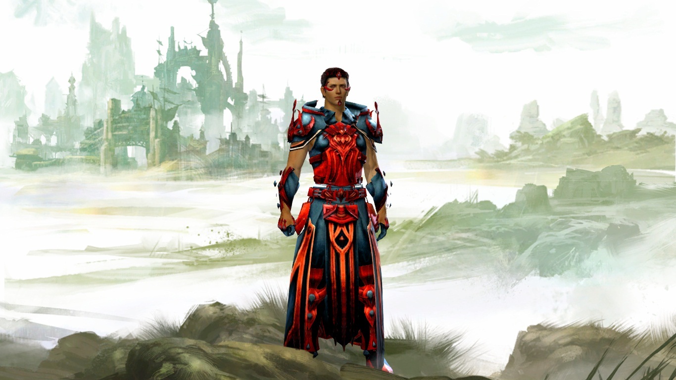
I like the red/gold combo, although its not as clean/obvious on the gloves/boots as it is on your shoulders. The mismatch bothers me a bit. I also don’t think the blue really fits. The overall look almost screams ’I’m a flag, wave me!’ The armor itself is nice though, although I don’t like the mask myself. I might like it a little better if the blue where a more neutral color, since that’s a leather type section, a more realistic leather type color might look good. I think it would also help make the red pop.
Attached: My necro monger mancer
everyone doing 7/10.. ill say 8/10 because i like yellow
Voted “most likely to die/fail” by peers
7/10
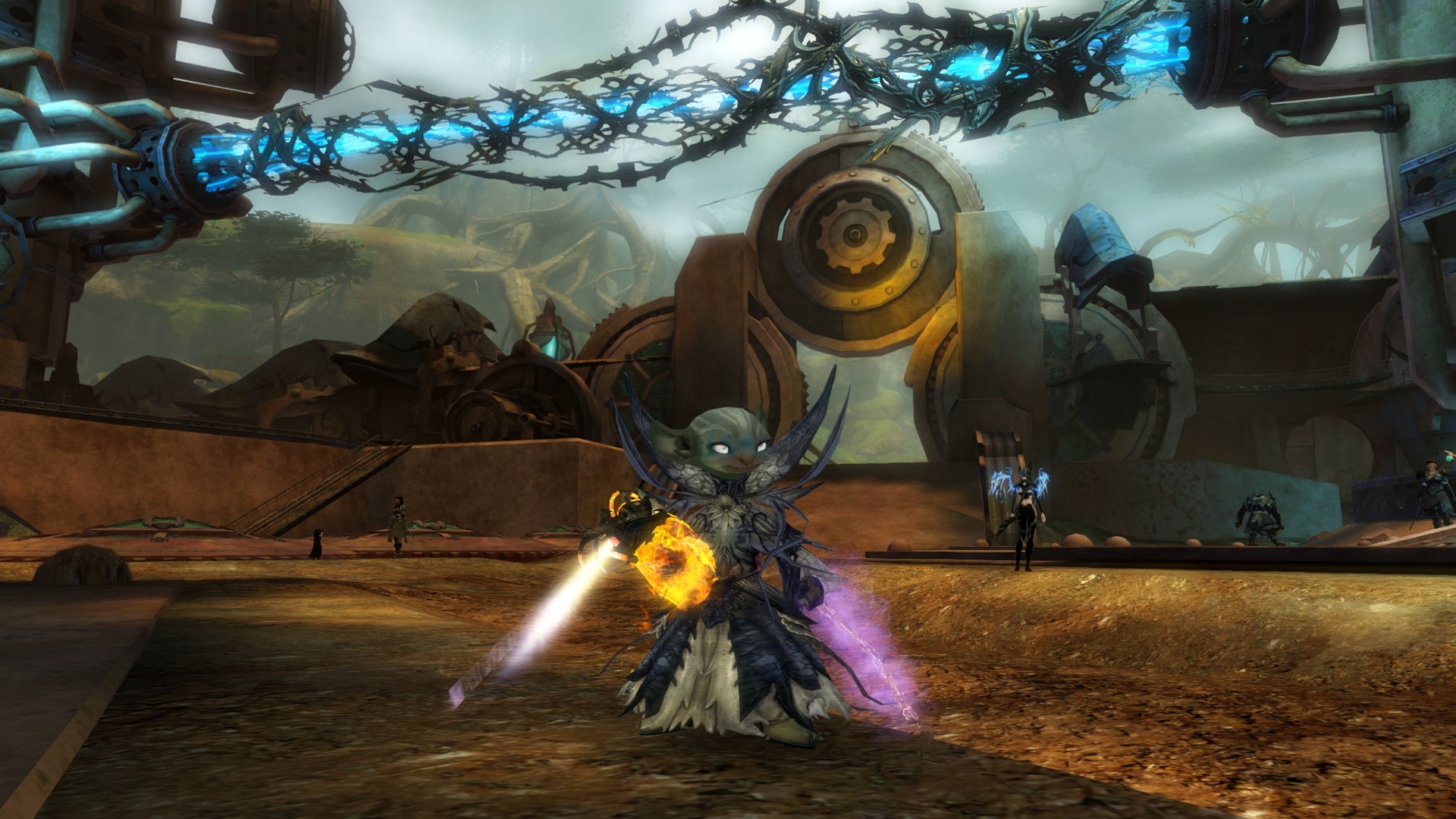
That asura looks really…. happy about something
Unfortunately, it’s going to be a while until I get a screenshot, so how about Nic cage?
Wow no one’s rated you yet bw?
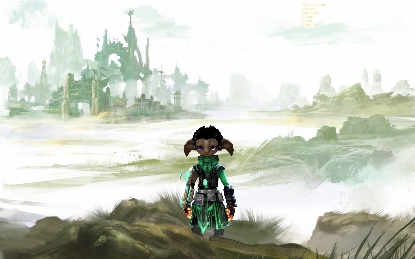
You make me think mint, yum. Its cute, although I don’t like the gloves with it. Maybe if they were green instead of lava red. Still, I give you an 8/10…
..now to go find myself some mint choc chip ice cream…
Edit….kitten SeNo beat me in….. and thats a scary look for him
8/10
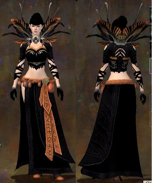
Not bad, i like the color scheme, and while i know the skimpy chest works with the look, at the same time i can see something with a bit more cloth.
I was gonna post my engi, but on phone and no pics. So necro once again.
9/10 because the set looks fantastic but the combination of me being insanely jealous of your weapon and how strange charr armor looks takes off a point.
Set I’ve used since I’ve hit 80, I think I might dull down the hair a bit to make it more fluid. Yet to find a matching longbow/sword/dagger/greatsword that doesn’t clip horribly with that sylvari booty.
Garbage at every profession 2015
Wow no one’s rated you yet bw?
You make me think mint, yum. Its cute, although I don’t like the gloves with it. Maybe if they were green instead of lava red. Still, I give you an 8/10…
..now to go find myself some mint choc chip ice cream…
Edit….kitten SeNo beat me in….. and thats a scary look for him
8/10
Not bad, i like the color scheme, and while i know the skimpy chest works with the look, at the same time i can see something with a bit more cloth.
I was gonna post my engi, but on phone and no pics. So necro once again.
8/10
seriously that’s some cool (edited because censor lol) necro, that face paint make it look more terrifying
(edit* i got delayed on posting so…. for Celebratty 6/10, i just… not fond of sylvari lol)
this is my warrior, actually it’s not black or abyss or something. it’s dusk, a dark but more subtle color (it even categorized in the purple hue). i never like the black or abbys color actually.
(edited by Noein.9238)
@noe 8/10 i like both the armor and your dye combination
@my 2 sets first: aetherblade light with flame and deep glacial teal; second: t3 cultural light with flame and deep glacial sky
Does anyone ever rate someone below a 7/10 in these threads? 
It would be more fun if it was rate the person below you. Adding a predictive factor makes it more challenging.
Does anyone ever rate someone below a 7/10 in these threads?
It would be more fun if it was rate the person below you. Adding a predictive factor makes it more challenging.
I got a 6/10 for being a plant
8/10 on the red, 6.5/10 on the blue set because its just meh imo. I already posted in this thread, so rate this beautiful charr I got a shot of. Utilizing rewards, bro.
Garbage at every profession 2015
5/10 your character disappear in the background and you really can’t rate it correctly.
an old look of mine since i don’t have new screenshots of myself and my mac graphic card is awful anyway
Join the Rainbow Pride
5/10, would’ve given you an 8/10 if you used a better shirt, that’s how bad this shirt is… dyes, helmet and shoulders are awesome though.
here is a pic of my ele
Is currently emotionally unstable because Breaking Bad is over
5/10, would’ve given you an 8/10 if you used a better shirt, that’s how bad this shirt is… dyes, helmet and shoulders are awesome though.
here is a pic of my ele
it’s all because of the sleeves! that’s why i’m not using it anymore^^
Join the Rainbow Pride
5/10, would’ve given you an 8/10 if you used a better shirt, that’s how bad this shirt is… dyes, helmet and shoulders are awesome though.
here is a pic of my ele
One of the cooler male eles I have seen. 9/10
My Guardian.
8/10
I really like the look and the dye- very subtle and almost eerie looking- you loose points tough for the gloves. A bit too much for my taste
Here is my Ranger
@Morrigan – is that the Desert Rose back piece your Sylvari is wearing? Sorry to derail thread, but … YOU CAN DYE THE ROSE??? That is awesome if true.
@Morrigan – is that the Desert Rose back piece your Sylvari is wearing? Sorry to derail thread, but … YOU CAN DYE THE ROSE??? That is awesome if true.
no the desert rose is on my Ele.
This was the Fervid censer you got as an achievement in the Southsun episode Sorry about that !
It’s not the desert rose, it’s the fervid encenser. It shares the same skin as the rose but it is glowly yellow/pale gold/ white.
It was available as a reward for an achievement during the Southsun living story about one or two months ago.
EDIT : Ninjaed. Sorry no pic, I’m at work atm. You’ll see my charr when I’m home^^.
Oh, awww. Thanks, Morrigan and Minos (the glimpse I caught looked similar). I missed the Southsun story, so I guess I’ll just keep the red rose from this one!
No one is rating my Ranger?
awww and I’m so proud her too. :P
OK fine here is my Ele, she is only a baby so some of her things I’ll put in preview of what she will look like when she is all grown
First off.. is it possible to post two characters? I have a warrior and a necro.. Anyways,
I like the look. It’s not overdone, it simple, yet unique… but i don’t like the black and white colours… Feels so mainstream
7/10
I will post both mine, rate both or which one you like best
Warrior first then necro second
What gear/dye are you using for your warrior? Im in love with the combination
80 Warrior | Mesmer in the works |
[Abys] & [Zone]
No one is rating my Ranger?
awww and I’m so proud her too. :POK fine here is my Ele, she is only a baby so some of her things I’ll put in preview of what she will look like when she is all grown
Oops, sorry! Was too excited by the prospect of being able to dye a backpiece, then too disappointed about it proving untrue that I forgot to rate!
8/10 for the Ranger (love the colour scheme ankitten ow jealous of the back piece!)
7/10 for the Elementalist (only less because I am not a fan of the top of the cultural light armor for Sylvaris)
Afraid I can’t post a photo as I am at work.
First off.. is it possible to post two characters? I have a warrior and a necro.. Anyways,
I like the look. It’s not overdone, it simple, yet unique… but i don’t like the black and white colours… Feels so mainstream
7/10
I will post both mine, rate both or which one you like best
Warrior first then necro second
What gear/dye are you using for your warrior? Im in love with the combination
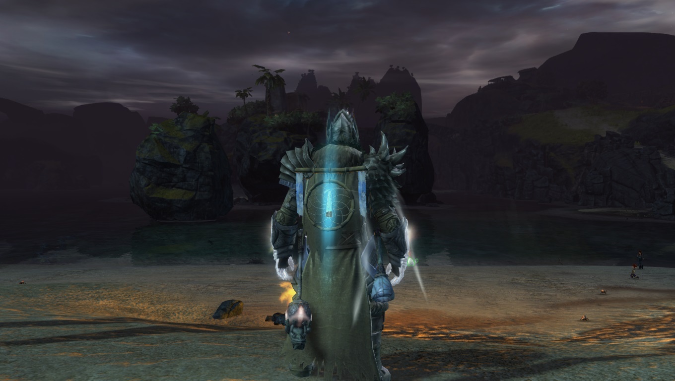
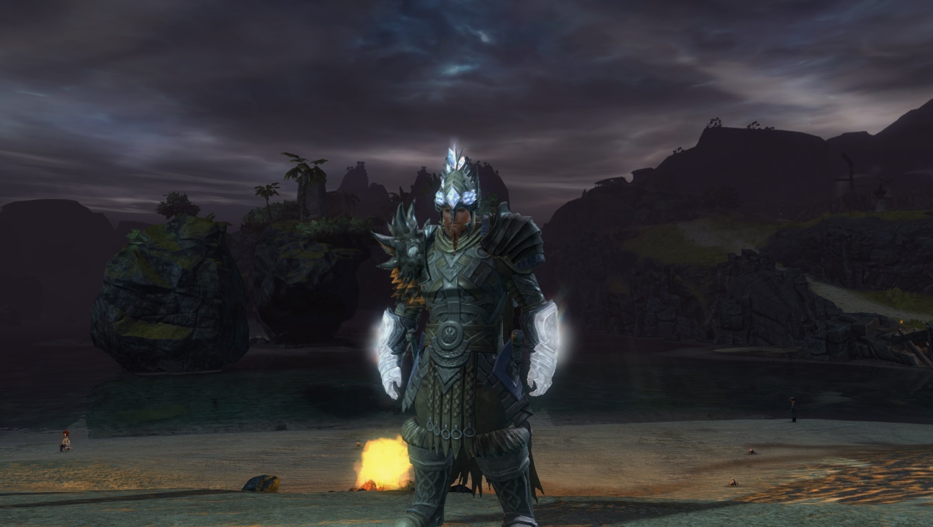
The dyes are just black and white (no, not abyss and celestial, just normal Black and White dye). Very boring and mainstream, but i love it because ot looks so metallic on that gear.
Helm: Primeval (From the gem store if you didnt know)
shoulders: tactical pauldrons (Bought from tactician Lyan in fireheart rise, its a heart guy)
Body: Armageddon (Temple armor)
Gloves: Primeval
Legs: Armageddon
Boots: Primeval
Thats pretty much it, and not to brag, but… I agree, the combination is super awesome. One of the best warriors i have seen, even though it is my own. :d
First off.. is it possible to post two characters? I have a warrior and a necro.. Anyways,
I like the look. It’s not overdone, it simple, yet unique… but i don’t like the black and white colours… Feels so mainstream
7/10
I will post both mine, rate both or which one you like best
Warrior first then necro second
What gear/dye are you using for your warrior? Im in love with the combination
The dyes are just black and white (no, not abyss and celestial, just normal Black and White dye). Very boring and mainstream, but i love it because ot looks so metallic on that gear.
Helm: Primeval (From the gem store if you didnt know)
shoulders: tactical pauldrons (Bought from tactician Lyan in fireheart rise, its a heart guy)
Body: Armageddon (Temple armor)
Gloves: Primeval
Legs: Armageddon
Boots: PrimevalThats pretty much it, and not to brag, but… I agree, the combination is super awesome. One of the best warriors i have seen, even though it is my own. :d
Ty so much
80 Warrior | Mesmer in the works |
[Abys] & [Zone]
Not bad, i like the color scheme, and while i know the skimpy chest works with the look, at the same time i can see something with a bit more cloth.
Yeah, I think almost all of my other chars are ‘non skimpy’ and my Mesmer in GW1 was very non skimpy, so I opted to let her show some skin in GW2. =) I need at least one skimpy char right? chuckle
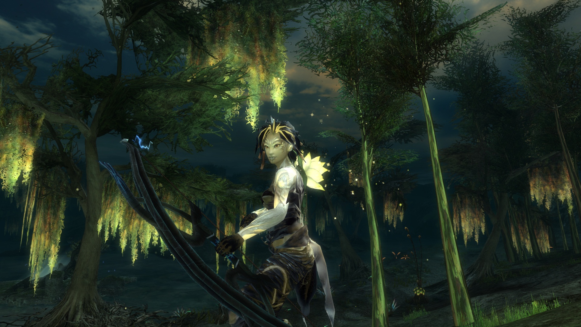
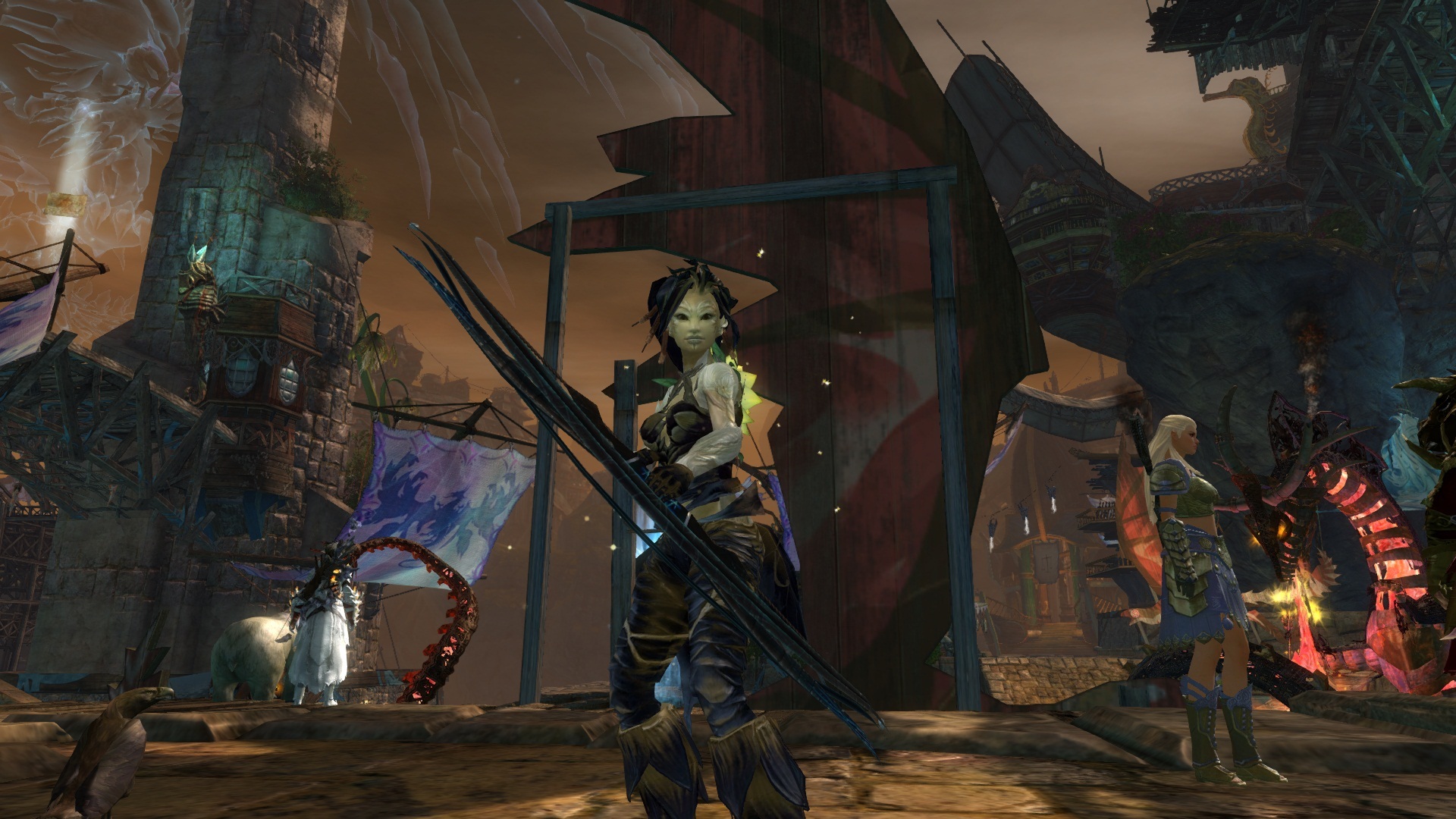
I’m going to give a 9/10 to the sylvari ranger. I think she looks awesome, and I really like the coloring. My Norn Ranger, just finished getting her the look I want.
7.5/10 I love the natural look that you give her, but I’d like to see different gloves
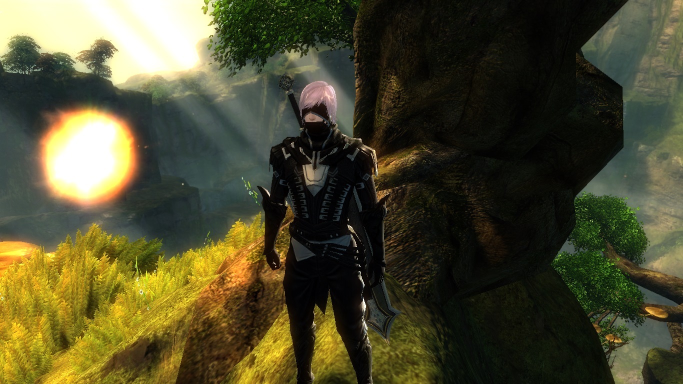
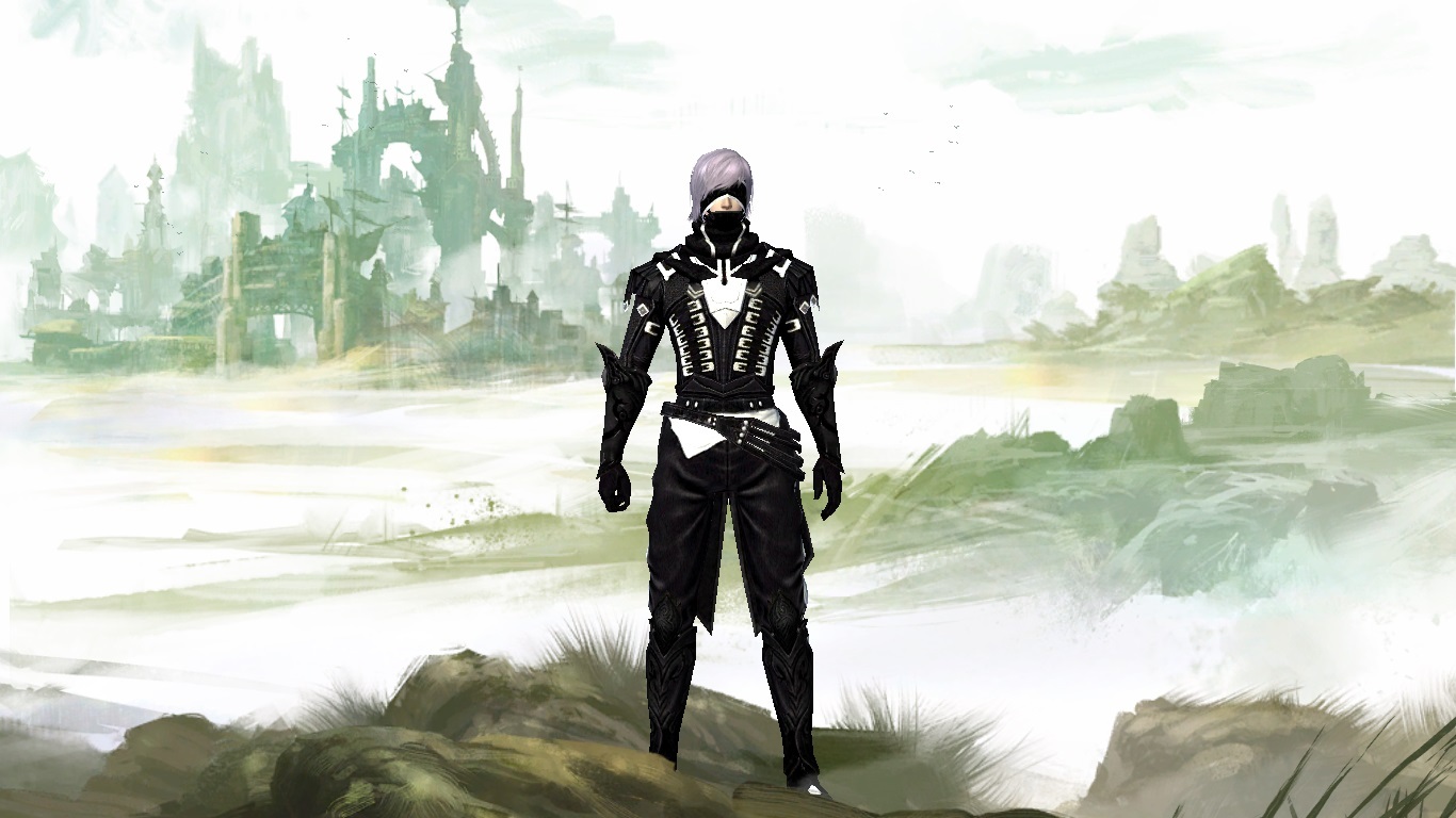
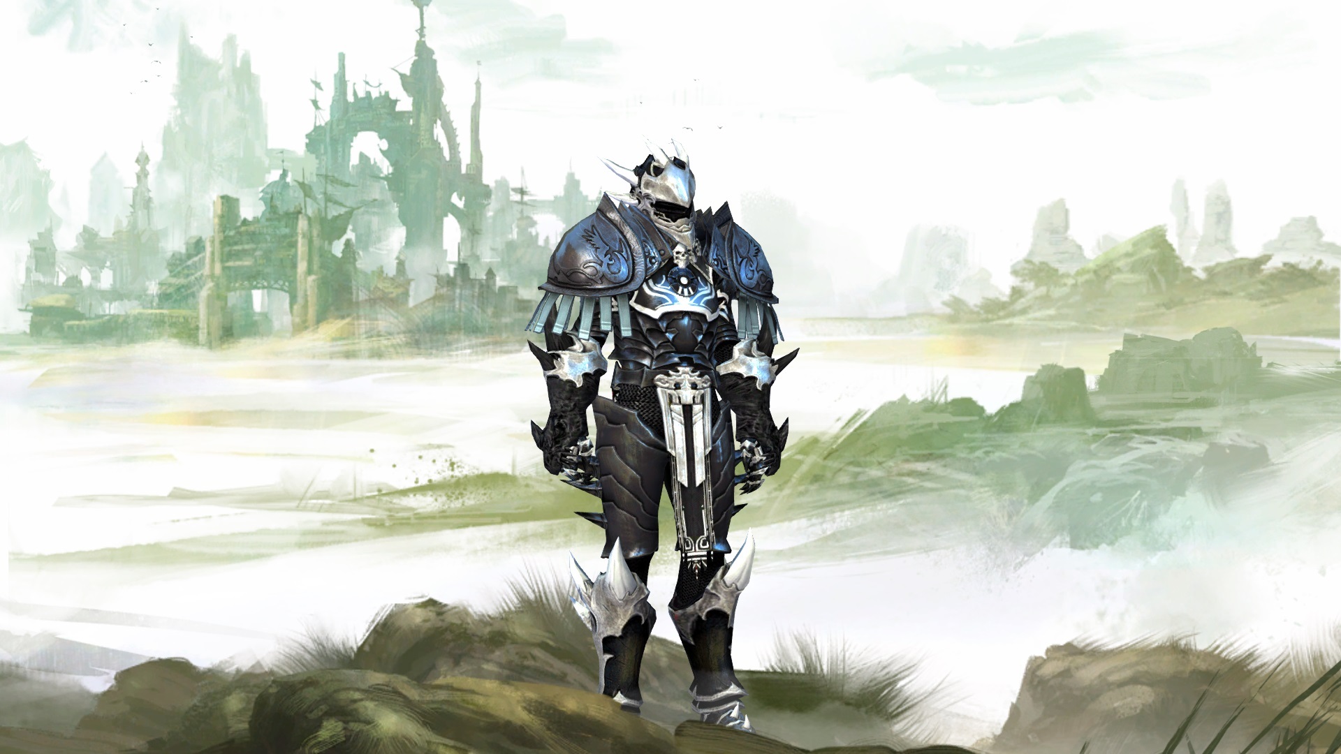
From Top to Bottom: Warrior (main), Guardian (PvE/dungeon alt), and thief (WvW)
“A release is 7 days or less away or has just happened within the last 7 days…
These are the only two states you’ll find the world of Tyria.”
Warrior= I like the celestial work, I think it works well altogether as an ensemble. I can dig it. Of course this is just my opinion 8/10
Guardian = Looks very classic imo. The Colour I’am somewhat disenchanted as I’d prefer slightly more contrast in colours. It suits the background of a Guardian though. 6.5/10
Thief= Very nice look! Sort of like a hunter with light armor armor. I like the winged theme in gold given it an elegant royal special forces look. 7-8/10
Ok I have only one pic, its a bit of an unorthodox combo but I really like it xD!
Edit: Err… How would I go about posting the pictures directly instead of links :X?
Edit edit: Thank you Molch!
Also thanks for the generous review Lanfear! ^^ Glad you like it, yeah I’ve got many friends who prefer no helm xD I’m just one of those odd few who love helms!
(edited by PistolWhip.2697)
More posting & formatting options…
Attachments:
choose
With the exception of the boots and mask, I love it Pistol. I just like being able to see the char’s face, so I don’t like many (if any) helms really. I find the boots too clunky, but I honor that this is a heavy armor char. I’ll give you a 9/10 here. Cause I just like it hehe. I’ll let someone else rate and toss, a pic in though, I’ve already done a couple of mine. =)
6/10 to the “dragon sylvari” – I really dislike the headpiece (no fault of yours ofc), but it actually looks okay with your choice of armor.
wow Thomassasinate, that is amazing!
I really really like how you pulled everything together and the helm looks wonderful in that setting.
I’ll lets someone else rate it since I already posted my Sylvaris
ninjaed
oh So is yours Tien!
(edited by Morrigan.2809)
Tien: I’ll give you 8/10 for the hair and good colour combination. 
Here is my norn warrior and human thief.
