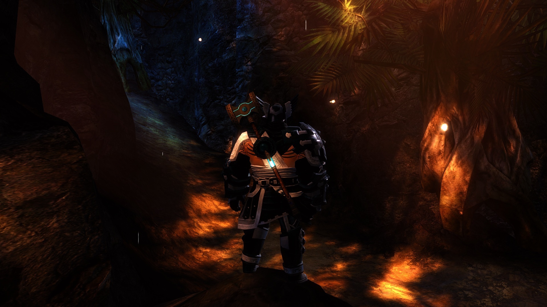
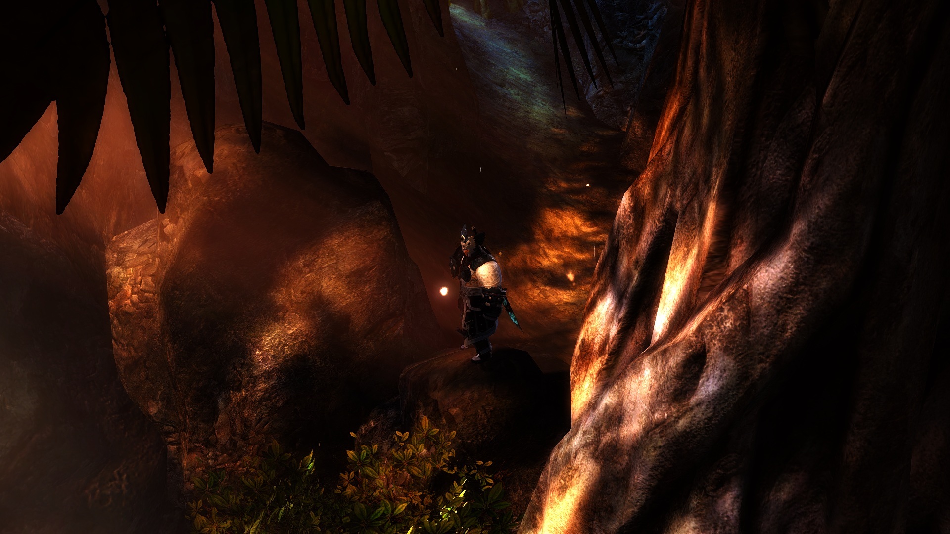
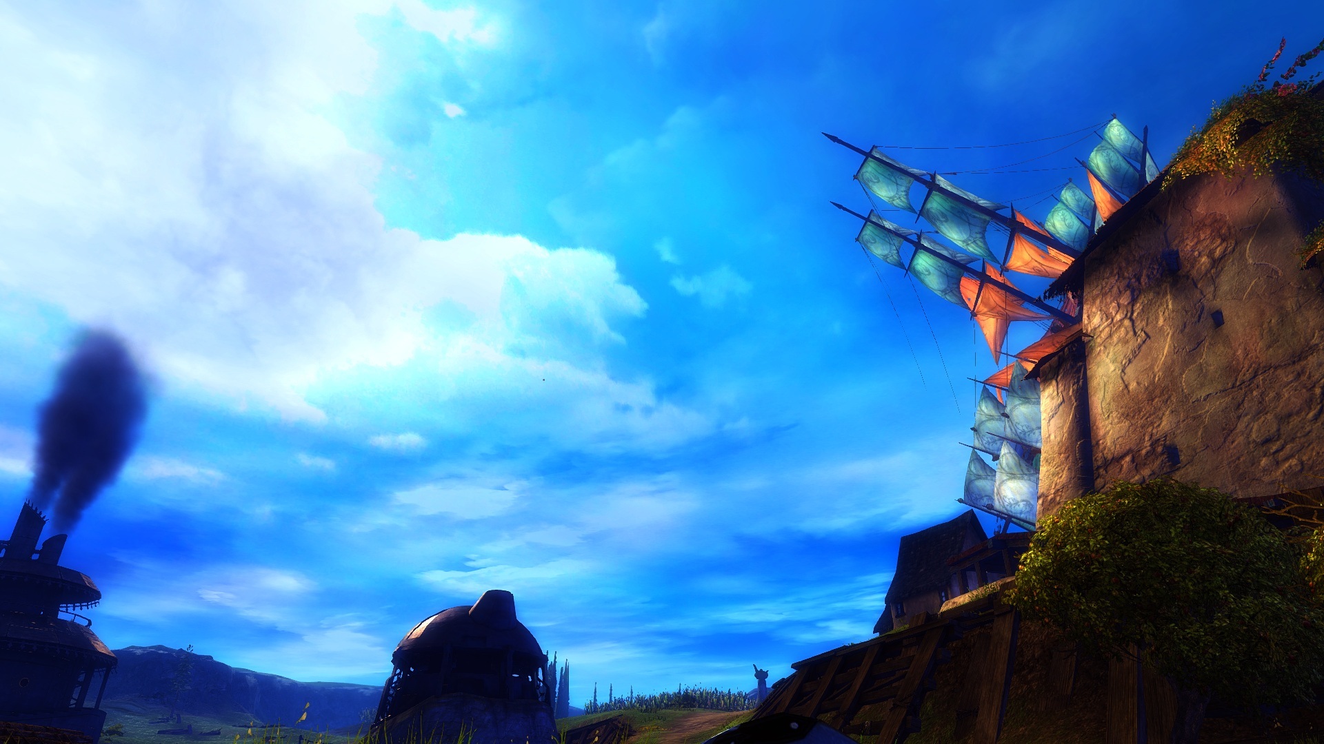
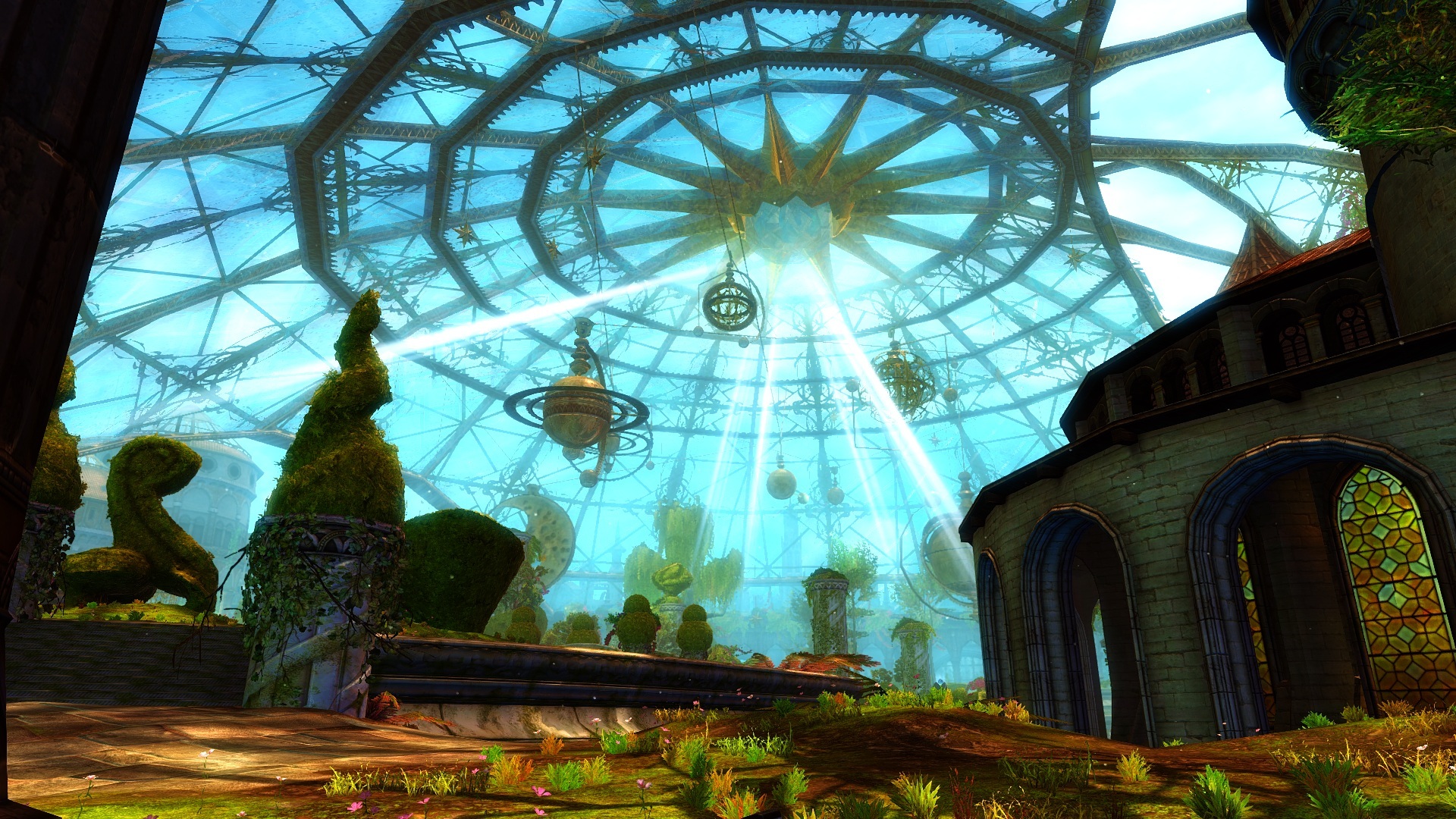
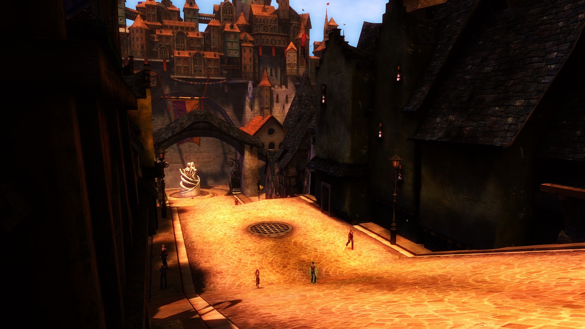
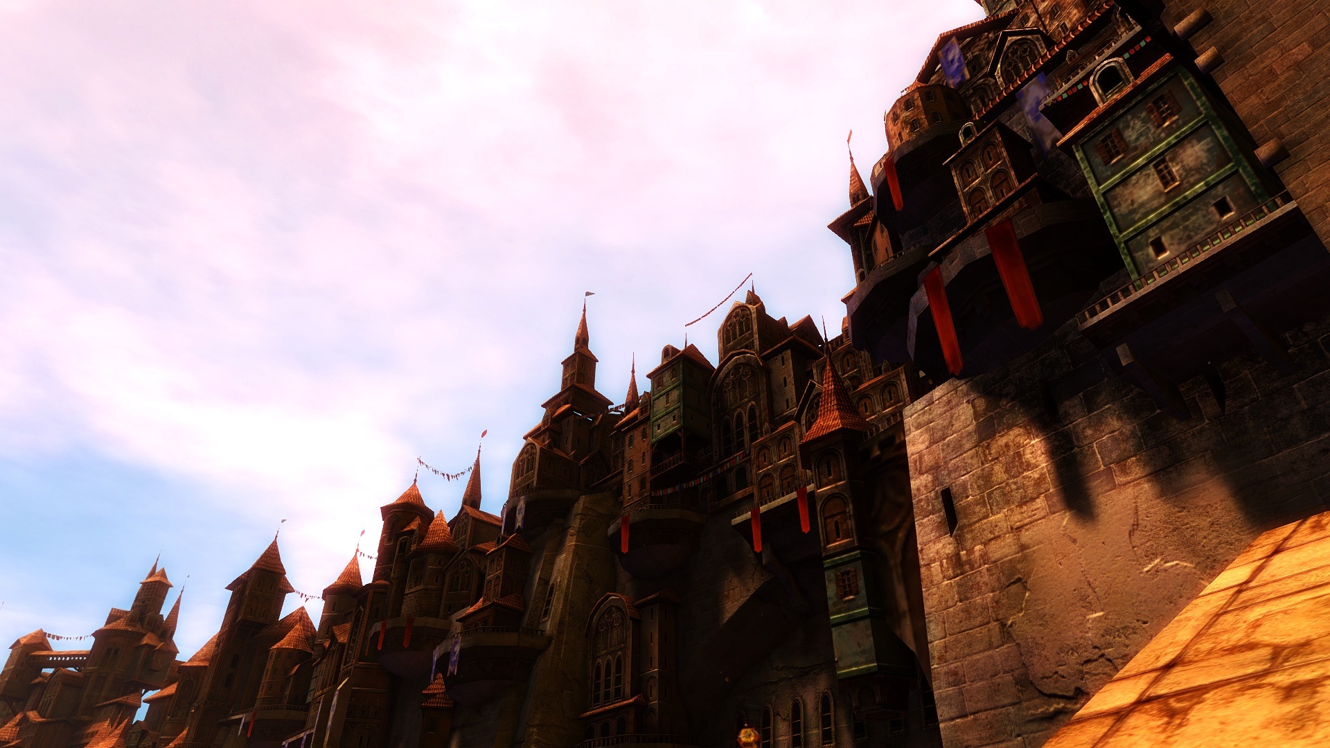
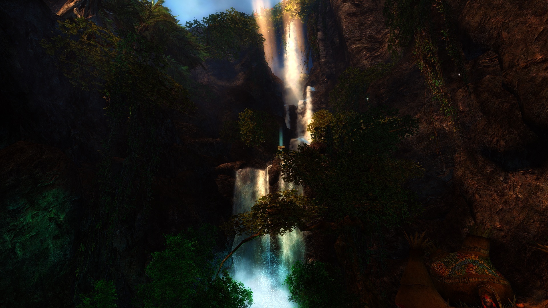
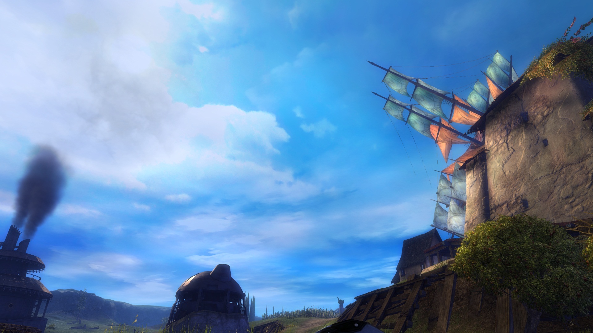
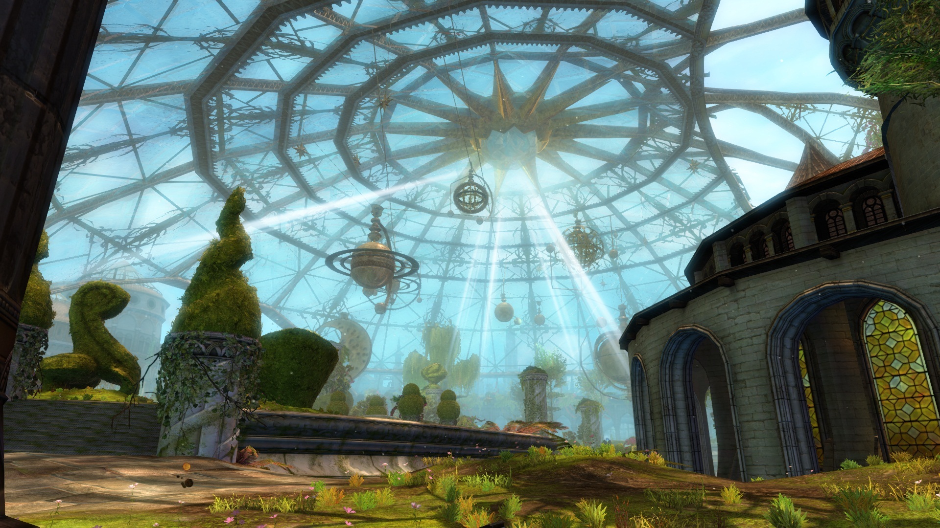
better colour + overall graphic - FXAA
I also installed Cezton’s settings & the game definitely looked much better. And the performance was smoother as well.
The key problem with GW2’s graphics is that a lot of details are lost at a far away distance (a lot to do with having the bloom effect enabled). IMO the best thing that I had experienced with this MOD was that the details and colors in the distances looked much sharper compare to before applying the mod; and the performance did not suffer at all from modding.
So needless to say, I’m really liking this mod!
EDIT: After playing it for 2 hours, I’m definitely hooked to this new graphics I can see “everything!” (even the broken shreds from my Ice Shards).
(edited by FluffyDoe.7539)
If my white colors seem to be a bit to bright how do I tone them down? Some of the reflections off of light sources seem hard to look at because of the brightness.
If my white colors seem to be a bit to bright how do I tone them down? Some of the reflections off of light sources seem hard to look at because of the brightness.
Disable post processing (bloom) on the ingame graphics settings. My latest graphics settings are also back a page or so; I did my best to address, amongst other things, bright light issues.
Where do you guys get all the different settings from?
I guess the real question is: are the default settings enough to see a difference? Because I see zero difference.
(edited by Ayan.1750)
Yep, I even tried mokaiba’s settings and nothing has changed.
try
#define USE_SPLITSCREEN 1 //[0 or 1] Splitscreen : Enables the before-and-after splitscreen comparison mode.
and you will know if its working or not, easy on/off
ultimately ive found the best set up is to max the game and barebones sweets
1-1-0-0-0-0-0-0-1-0-0-0-0
use the stock file, should give a nice overlay without overdoing it
a lot of modified ones are pretty raw imo.,
to get the most out of the HDR feature you will need to almost invert its base values to offset the saturation.
im happy with it as it is so i wont be delving into this any further.
Guys please help me…
I don’t know how to change settings :/ . I extracted the files. Do you edit SweetFx_Settings with notepad to change them? If yes do you just add numbers? How ? Also how do you turn it off or on?
I post gw2 screenshots if you wanna take a look :)
Am I the only one who likes the original (intended) Guild Wars 2 look better?
Except for the better antialiasing, all the color modifications and supposed “enhancements” make it way too flashy – like turning Clint Eastwood in some sort of carnival Las Vegas cow boy…
Because you’re obviously using the wrong settings,dont say things like that because you give people a false impression.You need to actually Tweak the settings to your likings,wich can take up some time
If my white colors seem to be a bit to bright how do I tone them down? Some of the reflections off of light sources seem hard to look at because of the brightness.
Disable post processing (bloom) on the ingame graphics settings. My latest graphics settings are also back a page or so; I did my best to address, amongst other things, bright light issues.
You dont need to disable it at all,i find bloom ( both ingame and sweetfx ) giving a nice quality effect when tweaked correctly.Just tone it down a bit.
Yep, I even tried mokaiba’s settings and nothing has changed.
You turned off FXAA in the F11 graphics settings panel, right?
and the stupidest grown-ups who are the most grown-up.”
- C. S. Lewis
These are my settings after a few days of changing.This is really the sweet spot for me,my game looks incredible.I suffered from too much red,and too much colours etc,the way ive set it up now is just ffing perfect.Note they might seem different for you depending on your monitor type.I have SMAA disabled and still use the ingame’s FXAA,when having FXAA enabled i find the shadows are looking a bit better especially around plants and such and luma makes the game sharp enough,you really don’t want to overdo it.SMAA makes Guild wars 2 way to sharp when having Luma enabled aswell,imo.
_______________________________________________________
Lumasharpen=1
#define sharp_strength 0.62 ( Keep it between 60 – 65 )
#define sharp_clamp 0.250
#define pattern 4 ( Pyramid shape )
#define offset_bias 1.0
#define show_sharpen 0
_____________________________________________________________
Bloom=1
#define BloomThreshold 24.05
#define BloomPower 1.646
#define BloomWidth 0.0300
__________________________________________________________
HDR=1
#define HDRPower 1.26
#define radius2 0.87
____________________________________________________________
DPX=1
#define Red 6.0
#define Green 8.0
#define Blue 8.0
#define ColorGamma 0.2
#define DPXSaturation 1.0
#define RedC 0.35
#define GreenC 0.36
#define BlueC 0.36
#define Blend 0.1
__________________________________________________________
Tonemap=1
#define Gamma 1.16
#define Exposure 0.00
#define Saturation 0.10
#define Bleach 0.00
#define Defog 0.000
______________________________________________________________
Vibrance=1
#define Vibrance 0.2
Curves=1
#define Curves_contrast 0.05
#define Curves_formula 7
Screens are a little bit darker then they actually are
(edited by Caedmon.6798)
Guys please help me…
I don’t know how to change settings :/ . I extracted the files. Do you edit SweetFx_Settings with notepad to change them? If yes do you just add numbers? How ? Also how do you turn it off or on?
I would really recommend reading the included readme because it explains everything in wonderful detail. I read through that and it made it much easier to understand what I needed to do.
These are my settings after a few days of changing.This is really the sweet spot for me,my game looks incredible.I suffered from too much red,and too much colours etc,the way ive set it up now is just ffing perfect.Note they might seem different for you depending on your monitor type.I have SMAA disabled and still use the ingame’s FXAA,when having FXAA enabled i find the shadows are looking a bit better especially around plants and such,SMAA makes Guild wars 2 way to sharp when having Luma enabled aswell,imo.
_______________________________________________________
Lumasharpen=1#define sharp_strength 0.62 ( Keep it between 60 – 65 )
#define sharp_clamp 0.250#define pattern 4 ( Pyramid shape )
#define offset_bias 1.0
#define show_sharpen 0
_____________________________________________________________
Bloom=1#define BloomThreshold 24.05
#define BloomPower 1.646
#define BloomWidth 0.0300
__________________________________________________________
HDR=1#define HDRPower 1.26
#define radius2 0.87
____________________________________________________________
DPX=1#define Red 6.0
#define Green 8.0
#define Blue 8.0#define ColorGamma 0.2
#define DPXSaturation 1.0#define RedC 0.35
#define GreenC 0.36
#define BlueC 0.36#define Blend 0.1
__________________________________________________________
Tonemap=1#define Gamma 1.16
#define Exposure 0.00
#define Saturation 0.10
#define Bleach 0.00
#define Defog 0.000
______________________________________________________________
Vibrance=1#define Vibrance 0.2
Curves=1
#define Curves_contrast 0.05
#define Curves_formula 7
Screens are a little bit darker then they actually are
Hey Caedmon, do you have a screenshot of you outdoors in a bright area? I’d like to see what your settings look like outside of a cave.
[/quote]
Hey Caedmon, do you have a screenshot of you outdoors in a bright area? I’d like to see what your settings look like outside of a cave. [/quote]
Yeah sure,ill hop in game in a few mins and make some outdoor shots,but don’t worry i went to about every kitten map i could find to test it ( The last 2 days ive mostly been busy tweaking this,and seeing the effects in other maps ) in different areas,bright,dark,alot of colour,alot of blurring,alot of smoke etc.Every area is looking great.
(edited by Caedmon.6798)
Ugh,double post.. my bad.
Ya, im having troubles getting sweet fx to work. I copy all the files to the gw2 directory, but when i launch it… Gw 2 has the send report crash window come up. Any help?
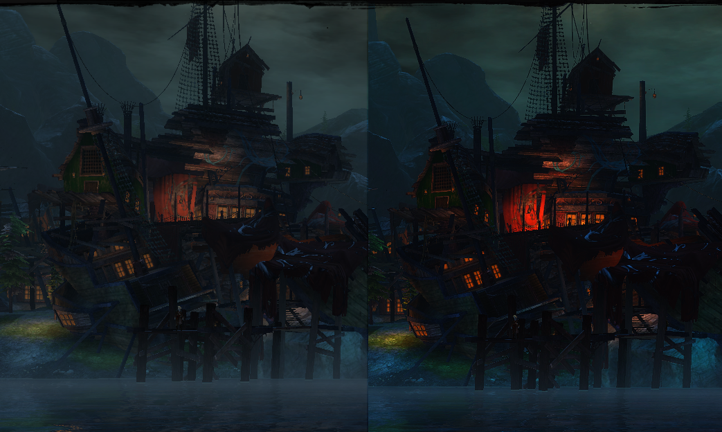
Grr i made a whole bunch of other shots aswell in Norn area aswell showing off some night areas to let you see how “nighty” the night and how realistic the water now looks..but alot didn’t get saved,well in the wrong folder and with the standard settings.Anyway here are the few that did get saved.
Am I the only one who likes the original (intended) Guild Wars 2 look better?
Except for the better antialiasing, all the color modifications and supposed “enhancements” make it way too flashy – like turning Clint Eastwood in some sort of carnival Las Vegas cow boy…Because you’re obviously using the wrong settings,dont say things like that because you give people a false impression.You need to actually Tweak the settings to your likings,wich can take up some time
Of course I can say things like that, because that’s my opinion about this “tweak”. Beside my own experience, I find all the screenshots posted here more or less ugly.
As I said, the only real benefit I see is the “better” antialiasing, and even that causes compatibility problems with other programs like Steam or voice chat overlays.
If ANet wanted GW2 to look like a hippie on drugs game, they’d have made it that way. I prefer the original look. To each his own though
A PvX guild for mature players with a life.
Honestly, it doesn’t look that great to me. The screenies just look like they over-saturated the lighting and added a yellow tinge.
Honestly, it doesn’t look that great to me. The screenies just look like they over-saturated the lighting and added a yellow tinge.
Infact they are not oversaturated i toned it down quite a bit,something like this depends from monitor to monitor and what your windows calibration is,or your nvidia settings,vibration,gamma,contrast etc etc.Btw,Guild wars 2 does not use your nvidia video settings when playing fullscreen,so you have to disable this when looking at screenshots or use the windows calibration video settings.
So you can honestly say that screenshot 1 looks better then screenshot 2 ?
You do not notice the blurry grey layer on screenshot 1 ?
(edited by Caedmon.6798)
Ya, im having troubles getting sweet fx to work. I copy all the files to the gw2 directory, but when i launch it… Gw 2 has the send report crash window come up. Any help?
Ya, im having troubles getting sweet fx to work. I copy all the files to the gw2 directory, but when i launch it… Gw 2 has the send report crash window come up. Any help?
Set it to administrator..
So you can honestly say that screenshot 1 looks better then screenshot 2 ?
You do not notice the blurry grey layer on screenshot 1 ?
Yes I can. I like screenshot 1 way more than the 2. The 2 has over-saturated colors, the sky just looks like something you’d see in an episode of “My Little Pony”, not in an heroic fantasy MMORPG.
A PvX guild for mature players with a life.
Am I the only one who likes the original (intended) Guild Wars 2 look better?
Except for the better antialiasing, all the color modifications and supposed “enhancements” make it way too flashy – like turning Clint Eastwood in some sort of carnival Las Vegas cow boy…Because you’re obviously using the wrong settings,dont say things like that because you give people a false impression.You need to actually Tweak the settings to your likings,wich can take up some time
Of course I can say things like that, because that’s my opinion about this “tweak”. Beside my own experience, I find all the screenshots posted here more or less ugly.
As I said, the only real benefit I see is the “better” antialiasing, and even that causes compatibility problems with other programs like Steam or voice chat overlays.If ANet wanted GW2 to look like a hippie on drugs game, they’d have made it that way. I prefer the original look. To each his own though
The problem is, it’s like saying that a filter than can be set to tint the screen any colour is too red.
It’s only too red if you have it set to red, if you had changed it you could have whatever colour you want.
SweetFX isn’t designed and written for GW2 so the default settings will not necessarily be the best ones for you to use. Did you test various settings files posted here by other users to see what effect a tweaked settings file gives?
Personally mine is no more “flashy”. If anything disabling bloom has made it less flashy. But with tweaked AA & sharpening I’m able to enjoy more visible textures at various distances where the default GW2 settings would result in blurring.
in the list of developers I have the least faith & trust in.
Congratulations ArenaNet!
So you can honestly say that screenshot 1 looks better then screenshot 2 ?
You do not notice the blurry grey layer on screenshot 1 ?Yes I can. I like screenshot 1 way more than the 2. The 2 has over-saturated colors, the sky just looks like something you’d see in an episode of “My Little Pony”, not in an heroic fantasy MMORPG.
You obviously have a thing for blurry grey layers,well all fine by me! I do know what looks good though,blurry grey layers aren’t one of them.
No, my friend, you have an OPINION. And specially when it comes to something as subjective as graphic art, it remains an opinion, nothing more. You know nothing more than I do concerning what looks good. We just have a different take on it, but you definitely don’t know better than me.
So no, sorry to burst your bubble, but you do NOT “know what looks good” for anyone else but yourself. And definitely not for me.
A PvX guild for mature players with a life.
So you can honestly say that screenshot 1 looks better then screenshot 2 ?
You do not notice the blurry grey layer on screenshot 1 ?Yes I can. I like screenshot 1 way more than the 2. The 2 has over-saturated colors, the sky just looks like something you’d see in an episode of “My Little Pony”, not in an heroic fantasy MMORPG.
You obviously have a thing for blurry grey layers,well all fine by me! I do know what looks good though,blurry grey layers aren’t one of them.
No, my friend, you have an OPINION. And specially when it comes to something as subjective as graphic art, it remains an opinion, nothing more. You know nothing more than I do concerning what looks good. We just have a different take on it, but you definitely don’t know better than me.
So no, sorry to burst your bubble, but you do NOT “know what looks good” for anyone else but yourself. And definitely not for me.
Are you realizing how much of an hypocrite you are right now ? I’m guessing…not.Btw..I never said Anything as a fact,i think it’s just obvious that a sharper more colourfull,darker image looks better then an image with high gamma,low amount of colours and a grey blurry layer on top of it.
Back on topic again for people that do have taste !
(edited by Caedmon.6798)
So you can honestly say that screenshot 1 looks better then screenshot 2 ?
You do not notice the blurry grey layer on screenshot 1 ?Yes I can. I like screenshot 1 way more than the 2. The 2 has over-saturated colors, the sky just looks like something you’d see in an episode of “My Little Pony”, not in an heroic fantasy MMORPG.
You obviously have a thing for blurry grey layers,well all fine by me! I do know what looks good though,blurry grey layers aren’t one of them.
No, my friend, you have an OPINION. And specially when it comes to something as subjective as graphic art, it remains an opinion, nothing more. You know nothing more than I do concerning what looks good. We just have a different take on it, but you definitely don’t know better than me.
So no, sorry to burst your bubble, but you do NOT “know what looks good” for anyone else but yourself. And definitely not for me.
While art is always very subjective, there is a clear objective line that is normally true for most people : a greyish cloudy smog looks worse than the same setting without it unless you are actually trying to simulate fog or clouds which is not the case in 99% of this game.
Infact they are not oversaturated i toned it down quite a bit,something like this depends from monitor to monitor and what your windows calibration is,or your nvidia settings,vibration,gamma,contrast etc etc.Btw,Guild wars 2 does not use your nvidia video settings when playing fullscreen,so you have to disable this when looking at screenshots or use the windows calibration video settings.
But they are oversaturated. My monitor is calibrated using an external hardware device and the saturation and contrast of your screenshots are very high indeed. Too high for my tastes, and I like saturated colours. But it is a preference thing, each to their own. Something like this is totally subjective and you can’t really use the word “better”, it’s just a case of what you personally prefer.
So you can honestly say that screenshot 1 looks better then screenshot 2 ?
You do not notice the blurry grey layer on screenshot 1 ?Yes I can. I like screenshot 1 way more than the 2. The 2 has over-saturated colors, the sky just looks like something you’d see in an episode of “My Little Pony”, not in an heroic fantasy MMORPG.
You obviously have a thing for blurry grey layers,well all fine by me! I do know what looks good though,blurry grey layers aren’t one of them.
No, my friend, you have an OPINION. And specially when it comes to something as subjective as graphic art, it remains an opinion, nothing more. You know nothing more than I do concerning what looks good. We just have a different take on it, but you definitely don’t know better than me.
So no, sorry to burst your bubble, but you do NOT “know what looks good” for anyone else but yourself. And definitely not for me.
Are you realizing how much of an hypocrite you are right now ? I’m guessing…not.Btw..I never said Anything as a fact,i think it’s just obvious that a sharper more colourfull,darker image looks better then an image with high gamma,low amount of colours and a grey blurry layer on top of it.
Back on topic again for people that do have taste !
I’m definitely not an hypocrite, and it’s sad you had to resort to insults now too. Pretty much shows your tolerance for other people’s opinions though.
I’ve always said “I prefer the non-tweaked version”, I never pretended everyone should agree with me, I only gave my opinion. Unlike you, who tries to force your opinion of what looks good onto me and others – and you do it again in your last posts, with your little “for people that do have taste” remark.
But I understand you can’t accept that some people aren’t overly impressed with your new toy, so I will leave it at that. Keep in mind though that there are many people out there who are fully satisfied with the way ANet made their game look, whether you accept that or not doesn’t matter, it’s a hard fact.
Have fun with your colors – I never said you should stop using them even if they don’t match my personal taste ;-)
A PvX guild for mature players with a life.
(edited by Korrigan.4837)
Honestly, it doesn’t look that great to me. The screenies just look like they over-saturated the lighting and added a yellow tinge.
Infact they are not oversaturated i toned it down quite a bit,something like this depends from monitor to monitor and what your windows calibration is,or your nvidia settings,vibration,gamma,contrast etc etc.Btw,Guild wars 2 does not use your nvidia video settings when playing fullscreen,so you have to disable this when looking at screenshots or use the windows calibration video settings.
Matter of screen settings. On a nearly perfectly setup monitor when it comes to movie or just nature colors standards, your screenshots do appear oversaturrated, and not by a little.
People can just tone down the saturation a bit to fit their personnal preference or monitor anyway, other than that I think you’ve got a good spot for the crispness and sharpness.
(edited by RamzaBehoulve.5640)
Honestly, it doesn’t look that great to me. The screenies just look like they over-saturated the lighting and added a yellow tinge.
Infact they are not oversaturated i toned it down quite a bit,something like this depends from monitor to monitor and what your windows calibration is,or your nvidia settings,vibration,gamma,contrast etc etc.Btw,Guild wars 2 does not use your nvidia video settings when playing fullscreen,so you have to disable this when looking at screenshots or use the windows calibration video settings.
Matter of screen settings. On a nearly perfectly setup monitor when it comes to movie or just nature colors standards, your screenshots do appear oversaturrated, and not by a little.
People can just tone down the saturation a bit to fit their personnal preference or monitor anyway, other than that I think you’ve got a good spot for the crispness and sharpness.
A positive response ? What the.. Glad you like it !
So you can honestly say that screenshot 1 looks better then screenshot 2 ?
You do not notice the blurry grey layer on screenshot 1 ?Yes I can. I like screenshot 1 way more than the 2. The 2 has over-saturated colors, the sky just looks like something you’d see in an episode of “My Little Pony”, not in an heroic fantasy MMORPG.
You obviously have a thing for blurry grey layers,well all fine by me! I do know what looks good though,blurry grey layers aren’t one of them.
No, my friend, you have an OPINION. And specially when it comes to something as subjective as graphic art, it remains an opinion, nothing more. You know nothing more than I do concerning what looks good. We just have a different take on it, but you definitely don’t know better than me.
So no, sorry to burst your bubble, but you do NOT “know what looks good” for anyone else but yourself. And definitely not for me.
Like your earlier comment about art gallery.
You aren’t one of those that goes to an art gallery, and then looks at a piece of artwork and says “wow that looks fail, I can do way better”
Anyway, Caedmon. Your settings look mostly good on my monitor, but lights are way too bright. Was in Lion’s Arch and it was really apparent there. According to Timebomb (who I was using his settings before), it is due to Bloom. So I’ll see if getting rid of Bloom, and adjusting some of the lighting to match his settings, that I was using. Kind of see how a hybrid of yours two’s looks.
In the screen shots you’ve been posting, leaving aside the issue of colour saturation you are losing a lot of dynamic range in the adjusted images. Highlights are blowing and shadow detail has been removed. There’s a big loss of colour information in the mid range . You can tell all of this visually with a properly calibrated monitor. But if you need hard proof, just take your before and after screenshots into Photoshop and compare the Levels histograms.
So you can honestly say that screenshot 1 looks better then screenshot 2 ?
You do not notice the blurry grey layer on screenshot 1 ?Yes I can. I like screenshot 1 way more than the 2. The 2 has over-saturated colors, the sky just looks like something you’d see in an episode of “My Little Pony”, not in an heroic fantasy MMORPG.
You obviously have a thing for blurry grey layers,well all fine by me! I do know what looks good though,blurry grey layers aren’t one of them.
No, my friend, you have an OPINION. And specially when it comes to something as subjective as graphic art, it remains an opinion, nothing more. You know nothing more than I do concerning what looks good. We just have a different take on it, but you definitely don’t know better than me.
So no, sorry to burst your bubble, but you do NOT “know what looks good” for anyone else but yourself. And definitely not for me.
Like your earlier comment about art gallery.
You aren’t one of those that goes to an art gallery, and then looks at a piece of artwork and says “wow that looks fail, I can do way better”
Anyway, Caedmon. Your settings look mostly good on my monitor, but lights are way too bright. Was in Lion’s Arch and it was really apparent there. According to Timebomb (who I was using his settings before), it is due to Bloom. So I’ll see if getting rid of Bloom, and adjusting some of the lighting to match his settings, that I was using. Kind of see how a hybrid of yours two’s looks.
If you want to get rid of the bright lightning you need to Up the value of Bloomthreshold and put it to 30.00 for a test,i dont think you want to go over 30 since it then removes too much lightning imo.
@Cernow,actually i find this to be quite the opposite,i find the shadows to be more appealing and alot darker,like shadows should look like.My monitor is properly calibrated btw.
(edited by Caedmon.6798)
Ya, im having troubles getting sweet fx to work. I copy all the files to the gw2 directory, but when i launch it… Gw 2 has the send report crash window come up. Any help?
Set it to administrator..
Wow, i feel like an idiot for not thinking of that.. Have some bacon!
Ya, im having troubles getting sweet fx to work. I copy all the files to the gw2 directory, but when i launch it… Gw 2 has the send report crash window come up. Any help?
Set it to administrator..
Wow, i feel like an idiot for not thinking of that.. Have some bacon!
Thanks ! I like bacon
@Cernow,actually i find this to be quite the opposite,i find the shadows to be more appealing and alot darker,like shadows should look like.My monitor is properly calibrated btw.
If you find the shadows more appealing to your eyes, that’s fine. I don’t share that taste. But I’m just pointing out you’ve actually lost shadow detail, areas of the image that were previously a shade of grey (or some other colour) are now 100% black. And highlights have suffered in a similar way, going to 100% white.
As for your monitor, is it calibrated with an external device (eg a colorimter)?
That’s your opinion,i already stated a number of times..that i do find this appealing and imo the areas that were grey,should have been black in the first place.Thats what i was aiming for btw..white = true white , black = true black .
Btw for people that do find it to be oversaturated just tone down the following.
Tonemap Settings
#define Saturation 0.10 —> 0.5 or anything inbetween.
Agreed with Cernow, the colors are crushed to the extremes. As result, the mid range colors lose resolution, and the extremes equally, since dark grays become back and light grays become white. At the end, you have truncated extreme colors (dark or bright ones) and a major loss of resolution at the mid ranges.
A PvX guild for mature players with a life.
This injector doesn’t really do any more than the Nvidia Control Panel can do. You can change the Digital Vibrance, adjust gamma, scale the color values, sharpness and in game options to disable the lighting will bring in the draw distance detail more.
From all the screenies I’m looking at you can tell there are a whole lot of color values that are missing, over saturated and muddy looking. The shadows seem to be gone and gives it a way too cartoony look.
If you calibrate your monitor correctly and use CCC or NVCPL, you should be hitting these color and light values naturally without the need for an injector, while keeping intricate detail in the graphics visible.
This actually reminds me of what Kingdoms of Amalur looks like, which is not bad but KoA was designed for over saturation in colors and certain light effects to darken areas while keeping the glow of the world around you.
Personal preference and opinion only, but thamks to the OP for bringing something to the community even though it’s not for everyone taste.
Again…oversaturation can be elimited with changing Tonemap Settings.I do know what you mean,but it was an effect i was going for wich looked good in alot of maps but can look too much on some other maps aswell.if you want to get rid of it,simply disable it.Same for the blooming effect,up the bloomthreshold from 24.05 to around 30 if you dont like the effect it’s giving.
#define Saturation 0.10 —> Put it at 0.0 to completely disable it.
@Grandizer you cannot get the same effects with just using Nvida control panel,it’s impossible NVCPL has the standard contrast,gamma,brightness,vibrance and thats it..SweetFX does alot more then that alone.And Guild wars 2 does not use nvcpl settings when playing in fullscreen mode.You need to use windowed fullscreen for those settings to be used.
(edited by Caedmon.6798)
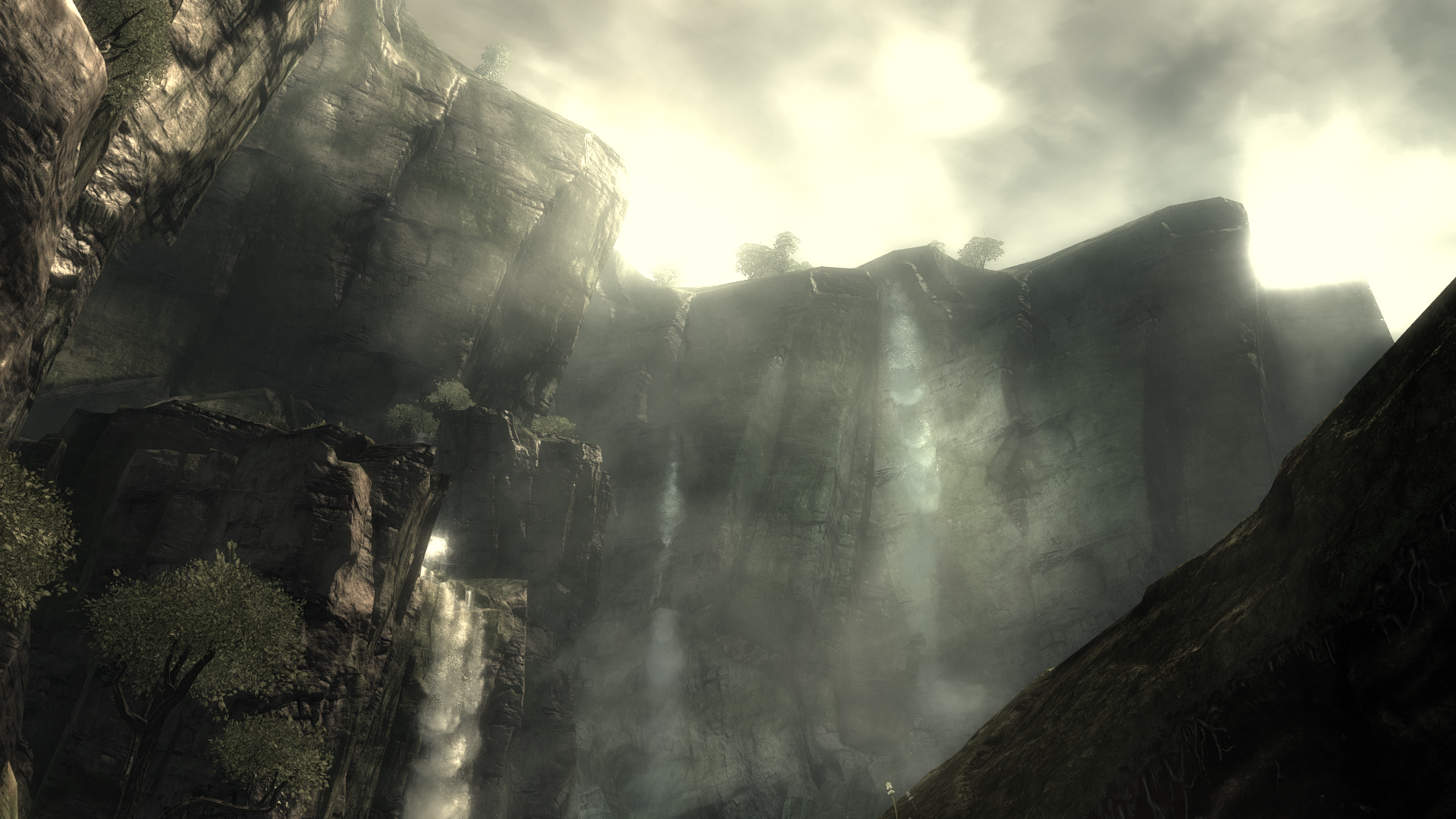
i messed around with the settings for about an hour until i got a Shadow of the Colossus look. i don’t actually play the game with those settings, but it’s nice for some artsy pics, plus it’s pretty easy to switch back and forth between settings, since you don’t have to close the application to do it.
i messed around with the settings for about an hour until i got a Shadow of the Colossus look. i don’t actually play the game with those settings, but it’s nice for some artsy pics, plus it’s pretty easy to switch back and forth between settings, since you don’t have to close the application to do it.
Awesome shot ! How does it look in other areas ?
Well that is correct, but it still can be done. I don’t know how bad the game looked for you based on monitor calibration and monitor capabilities but on my Asus VH236H with some RGB and other tweaks, colors look natural and gradient.Lighting looks more natural instead of full on. Maybe it’s because I have the back light, contrast and brightness tweaked so games don’t scream at me.
All I’m saying is in some ways it looks good but overall, there is a lot lost and looks more unnatural than the game already does.
Well before sweetfx i was forcing gw2 in windowed fullscreen to make use of nvcpl,but it still felt like i was missing something.I know what you mean about the saturation and blooming honestly,but it was really just an effect i was going for,you can easily change this to your likings,remove the saturation and eliminate the stronger blooming effect like i said in a post above.
Well I still say, nice offering to those in the community who don’t know about it and want to use it. Personally not for me.
I’m loving the difference atm, it just makes the game look so much more colourful and better to look at.
Not been playing with the settings for too long atm but with what I’ve done I can notice a nice big difference:
