(edited by CharrGirl.7896)
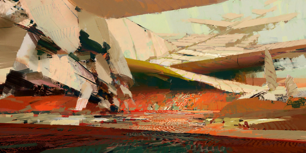
Dry Top concept art
1 2
What are you talking about? The overall style of the map or that picture in the loading screen? I must admit that picture looks very weird and yes, I couldn’t get what is in it.
What do you mean, the loading screen?
NOOOO I don’t like it at all, as you said it’s just a bunch of paint brushes all over the image, can’t really tell if it’s a mountain or a cliff. I would prefer that they keep doing the loading screens just like in the previous versions.
Gliradda – The Lil Death – Too Drunk to Aim
Guerreros de la Ultima Alianza [GDUA]
#TeamKiel #TeamPrecipice
Guerreros de la Ultima Alianza [GDUA]
#TeamKiel #TeamPrecipice
I assume we are talking about the loading screen.
http://wiki.guildwars2.com/images/2/26/Dry_Top_loading_screen.jpg
Yeah, it’s a bit rougher than others.
“Whose Kitten is this?” – “It’s a Charr baby.”
“Whose Charr is this?”- “Ted’s.”
“Who’s Ted?”- “Ted’s dead, baby. Ted’s dead.”
“Whose Charr is this?”- “Ted’s.”
“Who’s Ted?”- “Ted’s dead, baby. Ted’s dead.”
I don’t mind the loading screen… it’s very… red though. But, it’s just a concept art and Maguuma always was very red…
Don’t look at me like that. Whatever you’ve heard, it’s probably not true.
It’s quite clearly the dunes, rocks and the wreckage of the Zephyr ship.
I like all the art styles GW2 takes, including their more abstract paintings.
| Lithia |
No it’s terrible.
They’re trying to continue Kotakis style even though he’s not with the company anymore, and while I think they largely do a good job of that, this and the Kessex hills art are giant ugly mars on the game. Kekai knew where to reign in his composition so that there was still multiple clearly distinct elements in a piece in spite of his heavy stylizations, this loading screen is not clear beyond the most basic shape of the positive and negative space.
(edited by Moderator)
I think it’s unfair to say it’s terrible. It’s just a different art style.
I like the Kotaki style slightly more, but I do think the abstract style is also beautiful.
Some of my favourite pieces of art work in the game though are the images that come up when you mouse over the different dungeons in LFG.
| Lithia |
Some of my favourite pieces of art work in the game though are the images that come up when you mouse over the different dungeons in LFG.
True that, but those pieces look gazillion times better then the new ones we’ve been getting.
I agree, it’s horrible and easily the ugliest art in the game. Though new Lion’s Arch and Kessex Hills aren’t far behind. They do absolutely nothing for me.
It looks like a cheap knockoff of Kotaki style art, only more abstract. I don’t like it.
It’s a beautiful, lusciously bold piece – you can see why this artist is winning international art awards 
While some may like it, I have to say I find the loading screen simply ugly. I fully understand art is a subjective thing but I’ve never been a big fan of modern art….
We go out in the world and take our chances
Fate is just the weight of circumstances
That’s the way that lady luck dances
Fate is just the weight of circumstances
That’s the way that lady luck dances
While some may like it, I have to say I find the loading screen simply ugly. I fully understand art is a subjective thing but I’ve never been a big fan of modern art….
^This. For the most part, I have loved the loading screens and I am not a big fan of the watercolor stuff. This loading screen is just fugly IMO.
Many people in my Guild TS channel were asking what it was. After we told them it was supposed to be part of the wreckage. Some still said “Huh?” and others just commented on how terrible it was. I hate to say that about an artists work, but I just think this missed the mark.
I really don’t care about the loading screen.
Then again, I don’t care about art in general. Whether or not you like it depends on your personal tastes. I don’t mind it, but I don’t like it. It’s not an important issue for me.
I certainly understand why it looks the way it does – it is the art style that Anet decided to go with this game.
I bet.. every time the zone gets another part open, the loading screen gets more clear as not the full zone is open to play
IIRC we’ve had a similar “rushed” minimalistic map art previously at some point, and it was updated a bit later (when, apparently, the team had extra time to finish it).
20 level 80s and counting.
I think it’s unfair to say it’s terrible. It’s just a different art style.
The problem is the style does not fit the subject matter in an aesthetically pleasing way. It’s a landscape where you can’t distinguish any of the land except wherein it touches the most extreme negative space, the sky. If it weren’t for the tiny grouping of sails jutting out over the horizon line you wouldn’t even be able to tell it was depicting the zephyr ship wreckage or even the Dry Top area.
It is an intriguing concept art, not one to my personal taste, but that doesn’t mean I would hate it. As it is only a loading screen, I personally find it acceptable.
If they had an event where the image was broken into a 1,000 piece puzzle and players had to solve it, then I would likely dislike it. But as a loading screen? It seems fine.
I don’t like it, just like that Flame and Frost dungeon artwork loading screen, it just look unfinish (too abstract).
No I’m not saying it should look like realistic artwork, it should just be consistent with the other artworks in the game already (the other loading screen) therefore it should have more details into it.
I bet.. every time the zone gets another part open, the loading screen gets more clear as not the full zone is open to play
That’s actually quite good idea.
when i first saw the loading screen the first thing that came to me is “did steve’s little son make this?”
That loading screen is hideous to my eyes. I was very disappointed in it, especially since the map itself was done beautifully.
It’s better to keep your mouth shut and appear stupid than to open it and remove all doubt.
Yes, there’s been a lot of sponge painting recently.
Probably the worst loading screen ever.
Dry Top itself is home to plenty of unique features and ideas could include;
- Vines symbolizing the Gates of Maguuma
- Sandstorm
- Destiny Edge in the background of a Sandstorm
- Llamas
- Crash Site (preferably not in YouTube 144p)
*Etc
Gold Cape via Hall of Monuments pls…
My problem is that while abstract art is fine… it doesn’t really come across instantly as being anything in particular at least to me.
Totally subjective, but I prefer this style of art:
http://www.guildmag.com/wp-content/uploads/a77b4KiteCity.jpg
Clearer, and I like the overall style. Not sure if it was ever used.
Totally subjective, but I prefer this style of art:
http://www.guildmag.com/wp-content/uploads/a77b4KiteCity.jpg
Clearer, and I like the overall style. Not sure if it was ever used.
A lot of GW uses this style indeed. Lots of nicely placed photos and textures if I’m not mistaken.
when I first saw the loading screen, I thought i was having some graphic glitch =.=
ign: Larxene Rakushinu
Incoming Quaggans [iQ]
Incoming Quaggans [iQ]
As someone who appreciates art and regularly attends art galleries, I have to say I like it a lot. No it’s not a realistic representation of the zone, as others have said, it’s an abstract one. It makes you study the elements in the image, which in a way tricks you into appreciating the brush strokes instead of what they represent. That’s a connection to the artist that’s not present in realistic artwork. The color palette is bold and represents the zone well. In a way, the style represents it well, too. Elements in the image are broken and don’t fit together perfectly just as the airship no longer fits together as it once did. The abstract style makes it hard to depict what the image is. In the zone, Dry Top, during the sandstorm it is also hard to make out things in the distance. The image and zone share this uncertainty.
The image itself and what it depicts forms this monumental form towering above. Through the shadows and highlights one is able to understand the landforms. When I first saw it, I thought it was a great loading image as it keeps your curiosity high. It waits until you’re in the zone to see what the real thing looks like. You can sit in the zone and take all the screenshots you want to get a realistic image of it, but the loading screen is a little more flexible.
10 Level 80s | http://tinyurl.com/oj4e9hr
1900+ Hrs Played | http://tinyurl.com/ppq4ksz
No Precursor | http://tinyurl.com/njgsg3l
1900+ Hrs Played | http://tinyurl.com/ppq4ksz
No Precursor | http://tinyurl.com/njgsg3l
I find this smeared/blurry style just plain ugly and lazy (personal opinion), compared to say https://d3b4yo2b5lbfy.cloudfront.net/wp-content/uploads/wallpapers/HumanBonusWP_DivReach-1024x768.jpg.
I find this smeared/blurry style just plain ugly and lazy (personal opinion), compared to say https://d3b4yo2b5lbfy.cloudfront.net/wp-content/uploads/wallpapers/HumanBonusWP_DivReach-1024x768.jpg.
Sadly, it really comes of as whoever drew that invested 10 times more skill and time then the current piece of art.
(edited by CharrGirl.7896)
I zoned from Dry Top to Brisban and I became really sad that we don’t have that artist making map art anymore. But whether or not I am a fan of concept art, I think DT’s is a little too abstract. Having the Kessex Hills (which looks really close to DTs) and then the art for Lion’s Arch you can tell what is going on in the picture. DT’s is just bad…
JQ – The ‘veggie’ Knight
Berserker = Skilled http://i.imgur.com/g1rkIub.jpg
Never forget – http://i.imgur.com/Oxra9sj.jpg
Berserker = Skilled http://i.imgur.com/g1rkIub.jpg
Never forget – http://i.imgur.com/Oxra9sj.jpg
I mean no disrispect to the artist, but the loading screen of Dry Top is just too abstract, thus showing us too little about the zone we’re venturing in.
(edited by Seraphina.6859)
I love this artstyle, but it just doesn’t fit loading screens. In fact, most of the game’s loading screens are bad loading screens, and most of the few nice ones don’t even make sense with what they’re supposed to reference (Old Kessex Hills loading screen is the most obvious example).
I understand that they recycle cool and awesome art, but the loading screens deserve art of their own. The Queensdale loading screen is superb, all the loading screens should follow that pattern.
Elonian elite specialization ideas: El: Dervish
M: Bladedancer – N: Scourge – En: Occultist – Ra: Swampstalker
T: Sharpshooter – G: Sunspear – Re: Hierophant – W: Corsair
M: Bladedancer – N: Scourge – En: Occultist – Ra: Swampstalker
T: Sharpshooter – G: Sunspear – Re: Hierophant – W: Corsair
when you look at the style of GW1, i wonder why they even considered using the dirty kind of art in the first place.
we never had any complains in GW1 about the art style, better yet, we used it as a desktop wallpaper because it’s done so well.
now in GW2 i see more and more lazy art, not in a way of “they can’t draw” because i don’t think i can do it but more in a way that most ppl like to see a clear art style so there is something to look at.
I know some people likes abstract art also it’s a matter of taste actually. But IMO having an abstract art in a loading screen doesn’t seem to be a good idea. Usually you would need more time to assimilate that art and the elements in it than the time that the loading screen usually takes. That’s why the most of people would see only scratches and stuff all around instead really assimilating and realizing what’s in it.
To me it looks like the first stage of creating a painting, block in basic shapes and colors, then continue to refine and add details eventually turning into something recognisable. Unless highly abstract art was the goal, in which case you nailed it?
At this point I would rather high-quality screenshots of areas of the world over these latest loading screens… the one for Dry Top is the one I like least of this new style.
I love the art style of GW2, but this one is too fuzzy
I don’t like the loading screen either. Too abstract and way too much orange in an area that feels like sandstone. Perhaps it represents an area that is still evolving. Still too much orange though.
It’s terrible. If you were shown that art out of context (not knowing that it represented a specific area in a video game), you’d probably be hard pressed to even know what it was.
I would love it if it were only a little clearer. All those weird brush strokes make it very difficult to tell what the subject of the painting actually is. Is that a cliff, a crashed airship, or both? I can’t tell.
And that’s unfortunate.
wanderingstoryteller.tumblr.com – Guild Wars content that’s only 75% terrible!
I believe an important part of any good piece of art, no matter the style, is a feeling of effortlessness.
This does not have that. It looks rushed, messy, and like the artist was struggling. It looks like what I would do to make sure my colors were balanced and laid out nicely before going in and adding the details of the finished piece.
Maybe it upsets me more than it should, but I’ve always loved Guild War’s art in both games, and this is really disappointing.
Its bad. It barely even looks like Dry Top, the only thing I can make out that looks like anything in-game is the crashed ship (and even that’s hard to make out). Doesn’t even have the same color scheme, Dry Top is mainly browns and yellows and yet here we have a ton of orange and red.
And not only does it not really look like Dry Top, it barely looks like anything at all. Its just a big blob of brush strokes. Maybe its meant to be abstract style or whatever, but none of the other zones or concept arts have been like that (a few have been semi-abstract, but none to this degree) so it feels out of place.
If you’re talking about the loading screen art, then yeah, I don’t care for it. To me all it is is a bunch of colors. I can’t make anything specific out of it, unlike every other LS/Map loading image. Dry top is mostly brown, but it could have been a picture of the crash site or the town (but done in that painterly style that other loading screens have). Hopefully it changes with the next patch.
Darkhaven server
Please give us a keyring…
Please give us a keyring…
There was a thread on this very same subject a few days ago, it got deleted for being disrespectful. I personally consider this feedback.
I mean no disrespect to the artist and I’m sure no one else here does either, but this particular piece just doesn’t seem to represent the zone very well and makes people wonder what it actually is.
Swift Mending – Guardian
Thorny Scrub – Thief
Desolation
Thorny Scrub – Thief
Desolation
I wonder if the art work will become more and more clear as the season goes on. I think its safe to say that what we have for Dry Top isn’t going to be the whole map, so like the map, maybe the art work will become more and more clear as more and more patches are released. If this doesn’t happen, hopefully the artwork changes to be a completely different one.
Darkhaven server
Please give us a keyring…
Please give us a keyring…
The first second i saw this art on the Gates preview page, I was extremely disappointed with it, and I still don’t like. Although I will admit that over time it has become more noticeable as to what anything is in the picture as far as a horizon line and such, but it really is just a mess of orange, they should really just stop with this art style.
I would prefer a more clear fantasy fairytale look in the future, I’ve never been enthralled by the muddy brush stroke stuff they’ve given to us.
What about rating it? Hehe
What about rating it? Hehe
Hey, good idea I will put it in my post.
1 2