Just a easy QoL UI change
Believe in Evan. He’s the one’s that might be able to make this happen.
Server Programmer (sPvP)
Isle of Janthir: Flux, Latch, Aegir
Isle of Janthir: Flux, Latch, Aegir
then i’ll no longer believe in you but Evan. He is now the new messiah!
(oh can you please don’t make it a different shade of green cuz i have problem with green)
Don’t make things in general color coded. I can’t see color!! Has caused me so many problems that you guys eventually fix, but don’t do it to begin with por favor!
It shall be done. If I can remember when I’m at my desk on Monday. Maybe.
Fluffball, can you think of some iconic way of showing health state in the UI?
The healthbar is pretty tiny, but it miiight be able to fit some text over it like “Downed”, “Defeated”, or “Deathshroud”. Though for other languages it may not fit. That could also make the actual health value hard to see.
Maybe the player name could change to add health state afterwards like:
“Bluxgore (Downed like a scrub.)”
Bluxgore (80 Warr), Xilz (80 Necro), Ivo (80 Eng)
Bra (80 Guard), Fixie Bow (80 Ranger), Wcharr (80 Ele)
Xdragonshadowninjax (80 Thief)
Bra (80 Guard), Fixie Bow (80 Ranger), Wcharr (80 Ele)
Xdragonshadowninjax (80 Thief)
Rather than place the information inside the health bar itself, why not add some sort of frame around the character portrait (or class icon in simple mode)? It would be similar to the way veterans, champions and legendary NPCs have different portrait frames.
Rather than place the information inside the health bar itself, why not add some sort of frame around the character portrait (or class icon in simple mode)? It would be similar to the way veterans, champions and legendary NPCs have different portrait frames.
With the ‘Simple Party UI’ option turned on, I can’t imagine there being enough room between the text, health, and icon for a visually distinct border (if we’re trying to avoid colors).
We coooould however use the icon that shows up on the map and put it at the end of he healthbar. Skull for defeated, ankh for downed, something(?) for deathshroud.
Bluxgore (80 Warr), Xilz (80 Necro), Ivo (80 Eng)
Bra (80 Guard), Fixie Bow (80 Ranger), Wcharr (80 Ele)
Xdragonshadowninjax (80 Thief)
Bra (80 Guard), Fixie Bow (80 Ranger), Wcharr (80 Ele)
Xdragonshadowninjax (80 Thief)
That sounds good, but might be difficult to see if there are buffs on the player. What if we moved the icon to the left of the health bar, or made a cut out in the lower left of the the portrait?
It shall be done. If I can remember when I’m at my desk on Monday. Maybe.
Fluffball, can you think of some iconic way of showing health state in the UI?
The healthbar is pretty tiny, but it miiight be able to fit some text over it like “Downed”, “Defeated”, or “Deathshroud”. Though for other languages it may not fit. That could also make the actual health value hard to see.
Yup. No matter what type of color blindness people have, we can see shades really well (better than “normal” people.) So if a health bar is 100% white in one case and 40% white in a death shroud case, there is no mistaking it. Edit: White is a bad example, let’s compare dark green vs light green instead.
But pure color like the wurm pheromones or the WvW map is just not readable for many of us (BTW thanks to whoever upped the contrast on WvW colors several months ago.)
That sounds good, but might be difficult to see if there are buffs on the player. What if we moved the icon to the left of the health bar?
You know, we don’t have to show level under the profession icon in PvP, we could hijack that screen space.
Bluxgore (80 Warr), Xilz (80 Necro), Ivo (80 Eng)
Bra (80 Guard), Fixie Bow (80 Ranger), Wcharr (80 Ele)
Xdragonshadowninjax (80 Thief)
Bra (80 Guard), Fixie Bow (80 Ranger), Wcharr (80 Ele)
Xdragonshadowninjax (80 Thief)
It shall be done. If I can remember when I’m at my desk on Monday. Maybe.
Fluffball, can you think of some iconic way of showing health state in the UI?
The healthbar is pretty tiny, but it miiight be able to fit some text over it like “Downed”, “Defeated”, or “Deathshroud”. Though for other languages it may not fit. That could also make the actual health value hard to see.Yup. No matter what type of color blindness people have, we can see shades really well (better than “normal” people.) So if a health bar is 100% white in one case and 40% white in a death shroud case, there is no mistaking it.
But pure color like the wurm pheromones or the WvW map is just not readable for many of us (BTW thanks to whoever upped the contrast on WvW colors several months ago.)
That’s pretty interesting. So how well can you read the shades of green used for the double healthbar while targeting a necro in deathshroud? The deathshroud color is a more desaturated green.
lol at the wvw colors. That partially an accident because wvw and pvp shared team colors. I quite like the newer blue. (maybe because I was the one that updated it)
Bluxgore (80 Warr), Xilz (80 Necro), Ivo (80 Eng)
Bra (80 Guard), Fixie Bow (80 Ranger), Wcharr (80 Ele)
Xdragonshadowninjax (80 Thief)
Bra (80 Guard), Fixie Bow (80 Ranger), Wcharr (80 Ele)
Xdragonshadowninjax (80 Thief)
That’s pretty interesting. So how well can you read the shades of green used for the double healthbar while targeting a necro in deathshroud? The deathshroud color is a more desaturated green.
lol at the wvw colors. That partially an accident because wvw and pvp shared team colors. I quite like the newer blue. (maybe because I was the one that updated it)
I’m actually not sure, I couldn’t find an image on google showing the color difference and it’s not something that I’ve ever noticed.
I thought the WvW colors were directly in response to us color blinders! I even made a post in the suggestion forum thanking you guys and suggesting you take it to the painterly colors below the server names (which to this day are useless to me! )
)
Change the colors of the health bar Evan.
Davinci plays this account in game.
Possible suggestion:
Change the colour of the border of the health bar to something that has high contrast against the colour inside it. With the regular dark red of health bars, a very pale green would still be visible to most colour-blind players. Alternately, add a pattern to the bar itself, like stripes, again in a high contrast colour or shade. Oh, also, the regular red health bars – my eyes struggle with those against the black background. Would prefer a more defined edge on them in general. Even just a white bar at the end of the actual health.
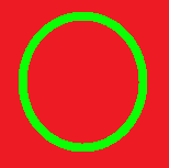
Even most red-green colour-blind people can at least tell there’s two very different colours in the attached image, even if they couldn’t tell you the name of them. At least, I hope they’re red and green. The RGB values say they are…
It’s something I really like about the markers that have been used in Living Story recently (though I’d prefer if they turned to blue at the borders so there’s less potential environments they’d blend into), and I wish there was an option to make all enemy AoE markers use them.
Attachments:
Best way to make sure something is color-blind-ok? Take a screenshot in to Photoshop and grayscale it. There are ALL sorts of colorblindness, but if everything works in grayscale, its good to go.
“Chaos Archangel (Downed like a scrub)”
I can’t lie. I’d lmao the first time I see that in-game.
Server: Anvil Rock [NA] / Aeoldyn [OMFG]
Learn 2 Play Mesmer Here! || Lookit! Gots me a youtube!
Mesmer Personality Quiz! Exclamation Points!
Learn 2 Play Mesmer Here! || Lookit! Gots me a youtube!
Mesmer Personality Quiz! Exclamation Points!
Ehhh… why not just making the health bar becoming “flamy”. I mean the effect that guardian has when s/he activates the virtue of justice. The health bar would become flame’y around. You know what I mean?
Change the colors of the health bar Evan.
^
Also, very, very difficult for support players to gauge when to give heals to necro teammates.
(edited by zone.1073)
Notice how an “easy” QoL change has suddenly grown complex and difficult. This is a great example why stuff takes time to do around here. Don’t blame the devs.
Notice how an “easy” QoL change has suddenly grown complex and difficult. This is a great example why stuff takes time to do around here. Don’t blame the devs.
Original post: “Change the colors of the health bars.”
Color blind player: “But I’m color blind!”
Players: “But you are not BLIND. You can still use visual cues like shading to understand things…”
Color blind player: “Ok, continue.”
Dev: “GOOD IDEA! Let’s put an icon next to the bar.”
Players: “…N-no, it would be too hard to see with other buff icons around… Just change the colors of the health bars.”
Dev: “Let’s move the icon to the left side of the bar, then???”
Players: “…Please just change the colors of the bars.”
Even tho this is a PvP thread, often when in party with Necros in WvW I sometimes have trouble checking if he’s at low life or it’s just death shroud (gotta use the heal shouts or prepare war banner!) .
So, in my opinion, a health bar color or pattern change when in death shroud would be awesome and welcomed across all game modes!
Roker
Tarnished Coast
Tarnished Coast
Notice how an “easy” QoL change has suddenly grown complex and difficult. This is a great example why stuff takes time to do around here. Don’t blame the devs.
Original post: “Change the colors of the health bars.”
Color blind player: “But I’m color blind!”
Players: “But you are not BLIND. You can still use visual cues like shading to understand things…”
Color blind player: “Ok, continue.”
Dev: “GOOD IDEA! Let’s put an icon next to the bar.”
Players: “…N-no, it would be too hard to see with other buff icons around… Just change the colors of the health bars.”
Dev: “Let’s move the icon to the left side of the bar, then???”
Players: “…Please just change the colors of the bars.”
Don’t infract this please, it’s funny :P
I’d share my experiences with quoing stuff + infractions… But I think that’s infractable o.o
New Rainbow Guild – An open-minded guild exclusively for Transgender people!
Warning: link may contain traces of awesome.
Lyssa’s Grimoire – a guide every Mesmer should read.
Warning: link may contain traces of awesome.
Lyssa’s Grimoire – a guide every Mesmer should read.
In the case of necros specifically I think the best solution would be to always show their health bar ONLY in the party window. If it’s a case of letting allies know when the necro is low or not, DS is not a reliable indicator: not only is life force smaller than a necro’s true health pool, but it also degenerates pretty quickly on its own. To let allies be able to tell at a glance whether their necro is in trouble or not, therefore, have the party window always and only show their healthbar.
(The double healthbar on the target UI is pretty awesome though, that was a great change!)
A bad necromancer always blames the corpse.
It shall be done. If I can remember when I’m at my desk on Monday. Maybe.
Fluffball, can you think of some iconic way of showing health state in the UI?
The healthbar is pretty tiny, but it miiight be able to fit some text over it like “Downed”, “Defeated”, or “Deathshroud”. Though for other languages it may not fit. That could also make the actual health value hard to see.Maybe the player name could change to add health state afterwards like:
“Bluxgore (Downed like a scrub.)”
Hm…
- Normal health bar: The current bar. Red. Soft, straight lines. The downed bar appears as a dark translucent shadow behind it, slightly lower.
- Downed health bar: Red. Wavy flickering borders, like the flame of a candle in the wind. The normal bar appears on top of it as an empty rectangle with light-colored borders, like an empty bottle. In the tiny bars, the animation is a dark shade moving towards the left from the end of the health pool, kind of like one of those infinite progress bars inside the bar of a percentage progress bar.
- Deathshrourd bar: Green. Crooked smoke-flame animated dark borders. Placed slightly over the normal and downned bars, as if it had two shadows. In the tiny bar, the animation is a dark shade going vertically from top to bottom.
That should work even with tiny bars and even for colorblind people, and regardless of language, as it’ll not only the color, but movement and shapes would be different.
It’ll require some UI rework, though.
(edited by MithranArkanere.8957)
Make it pink please ?
Or rainbow
It shall be done. If I can remember when I’m at my desk on Monday. Maybe.
Fluffball, can you think of some iconic way of showing health state in the UI?
The healthbar is pretty tiny, but it miiight be able to fit some text over it like “Downed”, “Defeated”, or “Deathshroud”. Though for other languages it may not fit. That could also make the actual health value hard to see.Yup. No matter what type of color blindness people have, we can see shades really well (better than “normal” people.) So if a health bar is 100% white in one case and 40% white in a death shroud case, there is no mistaking it.
But pure color like the wurm pheromones or the WvW map is just not readable for many of us (BTW thanks to whoever upped the contrast on WvW colors several months ago.)
That’s pretty interesting. So how well can you read the shades of green used for the double healthbar while targeting a necro in deathshroud? The deathshroud color is a more desaturated green.
lol at the wvw colors. That partially an accident because wvw and pvp shared team colors. I quite like the newer blue. (maybe because I was the one that updated it)
One of my best friends in high school was red/green colorblind, and he was a machine when it came to finding four-leaf clovers. I think he said it was something to do with better contrast.
Also, I would love it if the party UI distinguished between health and death shroud, and not just in PvP. I’ve wasted a lot of guardian heals on my wife’s death shrouded necro, only to facepalm when she comes out of it.
“It is the stupidest children who are the most childish
and the stupidest grown-ups who are the most grown-up.”
- C. S. Lewis
and the stupidest grown-ups who are the most grown-up.”
- C. S. Lewis