Playing Smite since mid s2, f broken gw2.
That facet looks much better
Playing Smite since mid s2, f broken gw2.
i disagree. i like it how it is
Agreed with OP. Especially the sound has to go, it is so annoying I have to play with instruments off whenever I play herald.
Crystals would be sweet. Kind of like that ele earth skill where rocks float around you in a circle but maybe a little bugger. They would also make more sense with glint and it being crystal related.
Agreed with OP. Especially the sound has to go, it is so annoying I have to play with instruments off whenever I play herald.
And it would be far more annoying to those of us that love it if it were removed completely.
Agree with the OP… although I think completely removing the circle is not really necessary. What we need – maybe just as an option for those that love the current OTT effect – is removing the pulsating center of the current glyph ring. Or maybe just stopping the constant strobe effect. Or lowering the brightness A LOT.
Just please do something about it.
I swear that slow pulsation hurts my eyes more with each passing hour.
Why does anyone want the circle to stay? It is objectively the most horrific looking effect in the game with how badly it stretches over different level terrain.
You guys have no souls, the music and the effect is pure perfection.
The circle is literally the best part of the expansion. Sometimes when I’m feeling down, I just boot up the game, activate some facets, and it just brightens my day up again. If I could, I would quit work and school and stare at it 24 hours a day.
without the circle the rev will look just as bland as warrior
and I love warrior
Agreed with OP. Especially the sound has to go, it is so annoying I have to play with instruments off whenever I play herald.
Does this also get rid of Glint’s “voiceacting”? You know, the guttural shout that sounds like a little old lady passing a kidney stone?
I would pay $$$ for the ability to remove/mute the overhead icon and voice-acting every time I switch legends!
I like the circle and the effects as it is.
Don’t like it? play another class.
No, the circle sucks. Just needs to be less opaque and it would be fine.
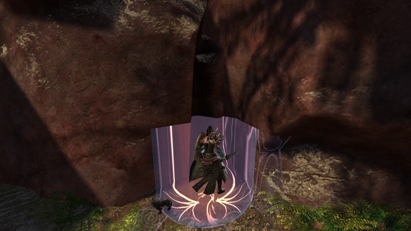
The circle is really jarring and stands out within the GW2 world, in a bad way. The dragon graphic on it is terrible. Sorry to whomever designed it, but it is absolutely appalling to look at, within Guild Wars 2. It looks like the kind of thing a beginner with Photoshop would draw and it stretches on different surfaces.. ugh.. no, please ArenaNet, re-design that hideous monstrosity. I liked the idea of floating 3D crystals of some sort.
Seafarer’s Rest
My biggest issue with the circle is its opacity. Makes my herald the only toon that I have trouble with on jumping puzzles. If the circle didn’t blot out the terrain entirely, I wouldn’t have as much of a problem with it.
I really like how facets are and the sound effects that come with them. I don’t want anet touching any other animations after seeing the latest changes of “reduced noise”, because they will end up removing the entire thing.
I like it. Don’t change it.
Sorry but I like it too :/ I’m with Ragion on this one XD
The circle is really jarring and stands out within the GW2 world, in a bad way. The dragon graphic on it is terrible. Sorry to whomever designed it, but it is absolutely appalling to look at, within Guild Wars 2. It looks like the kind of thing a beginner with Photoshop would draw and it stretches on different surfaces.. ugh.. no, please ArenaNet, re-design that hideous monstrosity. I liked the idea of floating 3D crystals of some sort.
It’s laughable anyone thinks that effect is fine as it is. Look at that beautiful stretching.
(edited by SaulWolfden.6178)
The circle is really jarring and stands out within the GW2 world, in a bad way. The dragon graphic on it is terrible. Sorry to whomever designed it, but it is absolutely appalling to look at, within Guild Wars 2. It looks like the kind of thing a beginner with Photoshop would draw and it stretches on different surfaces.. ugh.. no, please ArenaNet, re-design that hideous monstrosity. I liked the idea of floating 3D crystals of some sort.
It’s laughable anyone thinks that effect is fine as it is. Look at that beautiful stretching.
It’s called an opinion, better get used to it. Personally I love the design, but I could do without the sound, and I understand why people would want them gone. An option to toggle them would be the only choice.
It’s the fact that people think it is fine right now and doesn’t need to be changed at all they think the stretching is fine by saying that. Those are the people I don’t understand.
Its terrible..just like our auto sword animations for first and second strike. I dont understand how someone could def it.
Its weird that we channel crystal dragon that has nothing to do with crystals at all.
Playing Smite since mid s2, f broken gw2.
I quit herald/rev cuz or it, i know it sounds silly but dev never got back to our feedback and how to change it.
I used to be a power ranger, now not sure anymore
I think you all are acting very dramatic towards something that, functionally, makes no difference.
I think you all are acting very dramatic towards something that, functionally, makes no difference.
It affects gameplay because the effect can cover red circles and cues for certain skills or abilities.
I think you all are acting very dramatic towards something that, functionally, makes no difference.
It affects gameplay because the effect can cover red circles and cues for certain skills or abilities.
Except it doesn’t cover them. The red circles still show up bright red over the top of the aura.
I think you all are acting very dramatic towards something that, functionally, makes no difference.
It affects gameplay because the effect can cover red circles and cues for certain skills or abilities.
Except it doesn’t cover them. The red circles still show up bright red over the top of the aura.
Except it’s hardly noticeable if that is indeed the case, during Teq my herald is the only character I cannot properly see red circles, I can see them just fine on any other character I play on.
Well I’m sorry you can’t see the bright red circles. I certainly don’t have trouble seeing them. Like I said the only proper solution to this is for anet to add a option in the graphics setting to toggle the visuals.
everyone is entitled to their own opinion. Rich people pays crazy money for Picasso’s paintings, while I think they look like crap. You dont like it, fine, but dont tell others what they should like or dont like.
Pain Train Choo [Choo]
Mind Smack – Mesmer

