Attachments:
(edited by Yuioppe.9407)
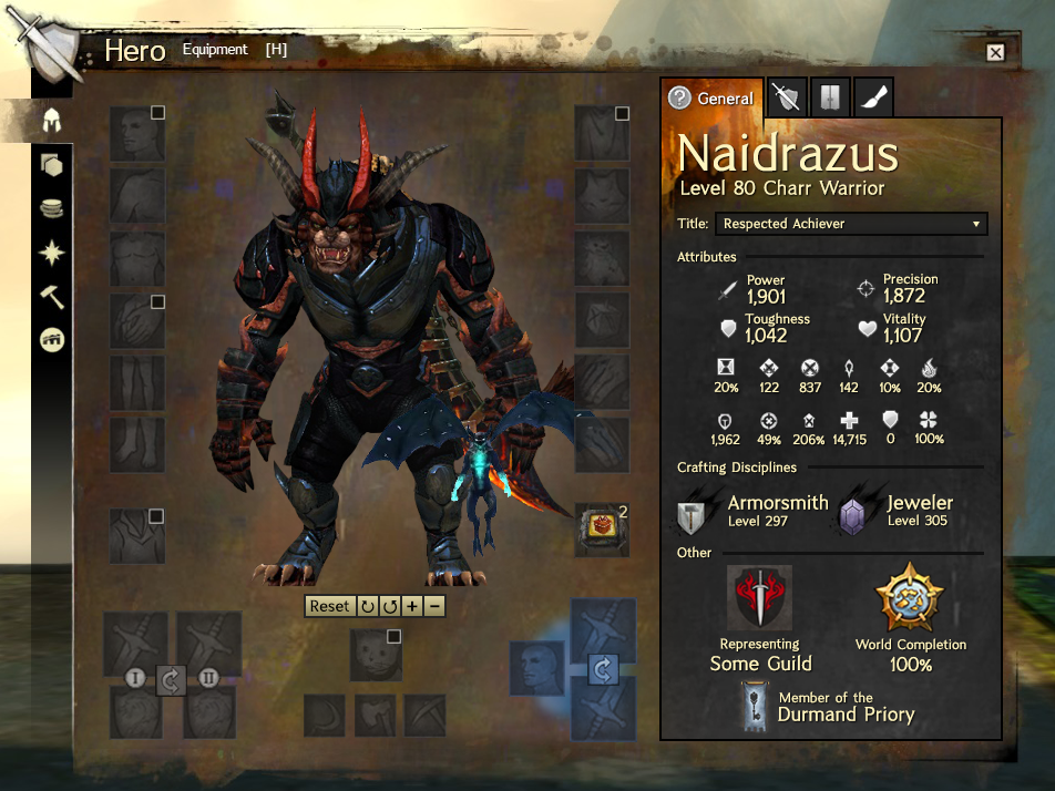
Hey there guys!
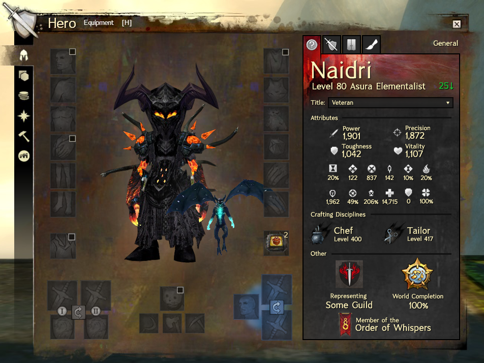
I decided to have a go at redesigning the Equipment tab on the Hero panel. This is because I think that the current design is a little confusing, and also because I think that there’s other character information that ought to be shown too: such as your Order, your crafting levels, world completion etc.
I’ve attached an image!
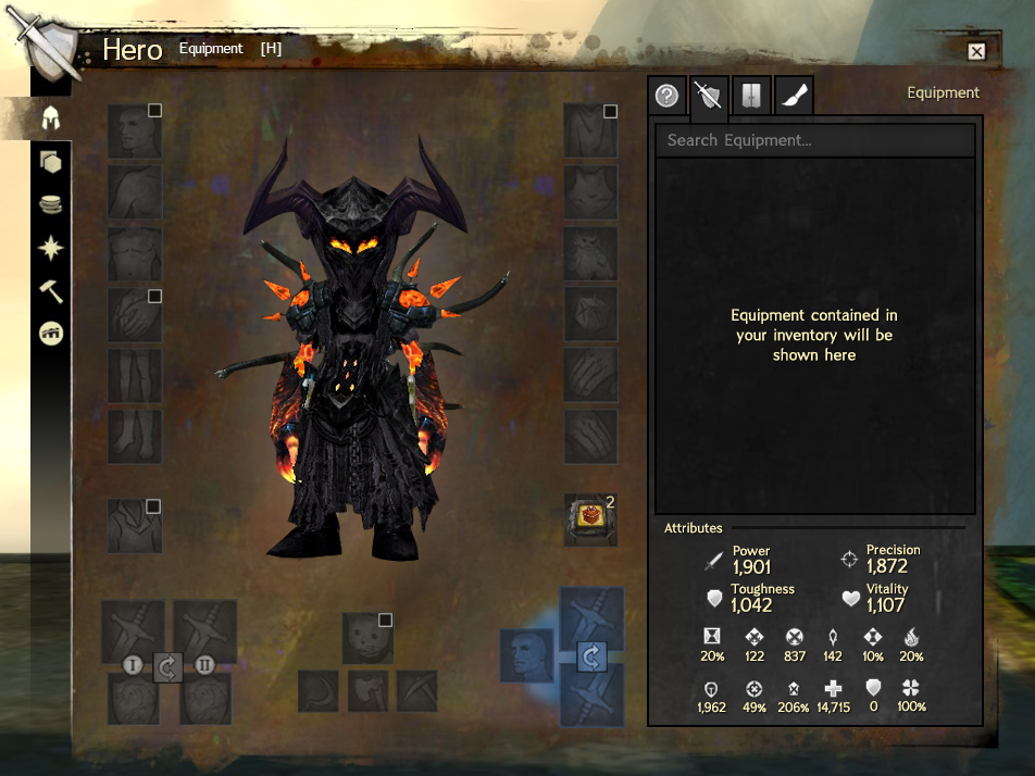
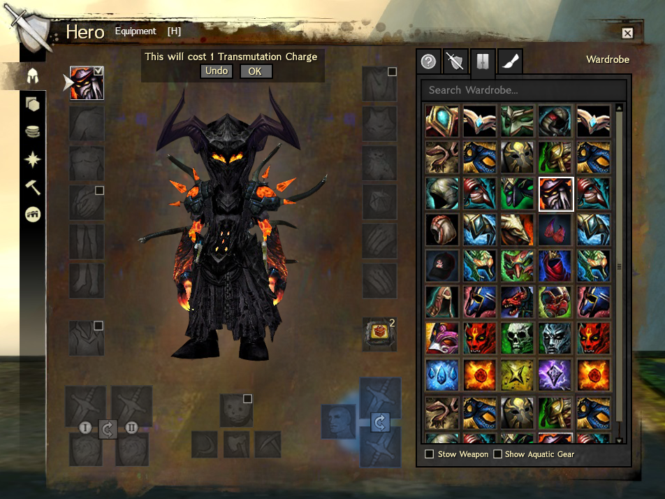
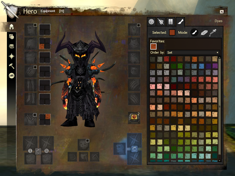
As you can see, on the left is your character and equipment slots (all of them), and on the right is a tabbed panel. The tabs are General, Equipment, Wardrobe, and Dyes
I also wrote a pretty lengthly reddit post on r/GuildWars2 going into a lot more detail about it, which you can see here.
(edited by Yuioppe.9407)
Wow! I’m impressed man.
As much as I like the way GW2 has it right now, this is just genius.
+1 to you.
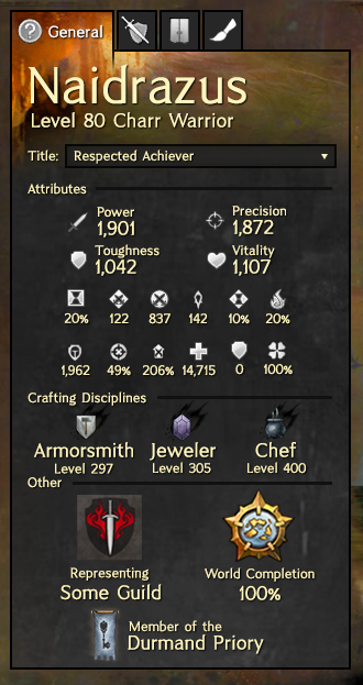
Hey there guys!
I decided to have a go at redesigning the Equipment tab on the Hero panel. This is because I think that the current design is a little confusing, and also because I think that there’s other character information that ought to be shown too: such as your Order, your crafting levels, world completion etc.
I’ve attached an image!
As you can see, on the left is your character and equipment slots (all of them), and on the right is a tabbed panel. The tabs are General (image above), Equipment, Wardrobe, and Dyes
I also wrote a pretty lengthly reddit post on r/GuildWars2 going into a lot more detail about it, which you can see hereequipment_tab_redesign/._
Great Job! U’d deserve to be employed in GW2 Team(nos sarcasm or anything, gave u + 1). I keep swapping to the wrong tab all the time, and i never get all the info i was looking for with recent changes.
Tho i’m really curious of what u wuld do with the awful new tp interface now. In my opinion old 1 didnt need changes but everything can be improved :-D
^ I agree, This guy needs to be hired.
And I like the new look of the tp, it’s more eye candy than the old one.
If that’s really what your Guild is called, I want to join it.
^ I agree, This guy needs to be hired.
And I like the new look of the tp, it’s more eye candy than the old one.
I agree on the “eye-candy aspect”….but what about the time sinking? 1 fractal run is enugh to fill your bags with good of various types, often in little stacks….re-adding the “sell max amount” wuld be already a great improvement (or roll-back :-p)
This is really well done! I do graphic design / UI design and this is, well…great. All the good stuff is in there and it’s easily understandable and well organized. Also aesthetically appealing. A+
Great job!
It’s a bit disorienting in the wardrobe and dyes part, but I like the effort to incorporate guild/world/order information. The character page certainly looks more personalized than what we have now.
Awesome job! This would be a huge improvement from the current interface.
10/10. Would choose this over feature pack.
Really nice work! This would be amazing ingame!
SOMEONE HIRE THIS GUYS, HURRY!
Love this. +1.
my only critique is that you swap the trinkets to the left side and armor to the right side. it’s minor, but having the armor slots closer to the wardrobe and dye colors so your mouse has to travel minimal distance when trying out new looks.
I can see your feet, that will not do at all!
Great Job.
/15dancingcharr
This is amazing! Anet should seriously consider doing something like this.
my only critique is that you swap the trinkets to the left side and armor to the right side. it’s minor, but having the armor slots closer to the wardrobe and dye colors so your mouse has to travel minimal distance when trying out new looks.
Yeah now that you mention it I think it would make more sense to have that entire block of info/tabs on the left rather than the right. That way the name is prominent in the upper left (first place your eye naturally goes) as well as being less distance to equip & dye armor.
I love it. I don’t like the current nested deign, the right-side tabs work out a lot better.
That looks amazing! Awesome work =)
That looks pretty amazing actually! I hope ANet will take a look at it.
Very nice, I’d love to see this implemented. The ability to click the crafting / Order / etc. to go straight to their tab means it’s even more likely players will discover them.
Great work.
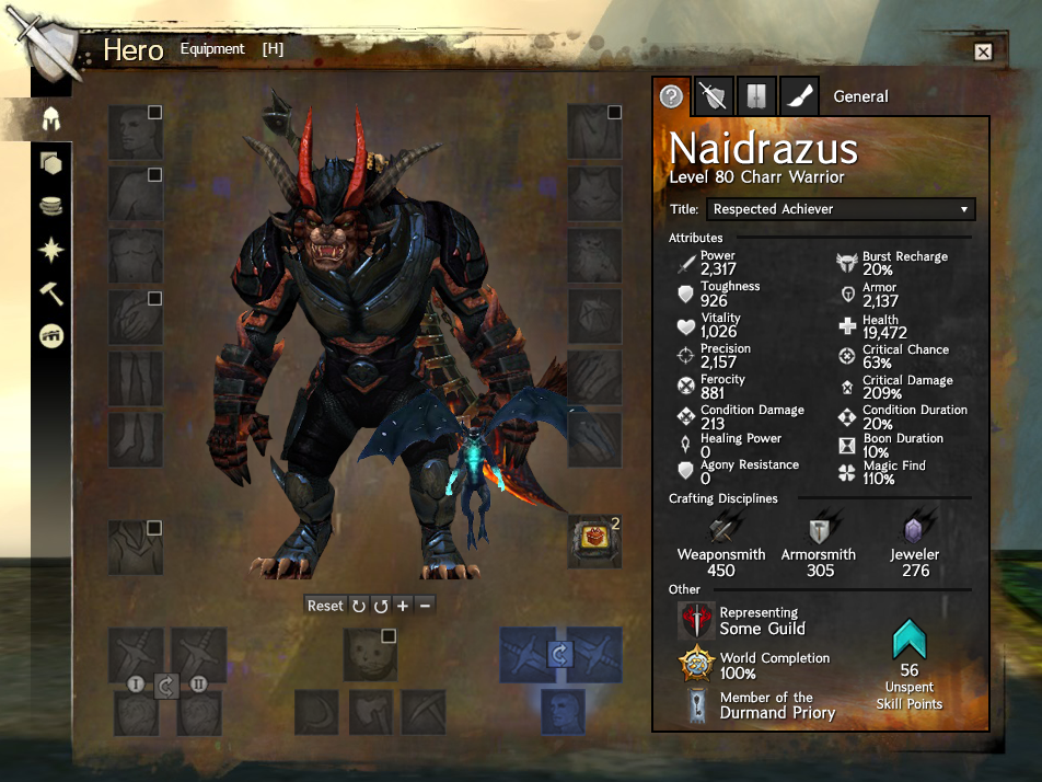
Here are some of the other images from the reddit post (all in the imgur album anyway).
I did one showing a warrior that included a couple of tweaks based off of feedback: such as buttons for zooming in or out on your character in the window.
Then there’s also a shot of the sidebar showing how it would work with three crafting disciplines.
(edited by Yuioppe.9407)
And this is how it should have been done……
Amazing!
This guy knows what he’s doing. Hire HIM! -.-
I clicked on the tab expecting it to be terrible…but this is actually fantastic. I hope someone sees this and utilizes your design ideas in the game…and then gives you credit for it…
This is the best hero panel I’ve ever seen, hands down. He forgot a couple drop downs, such as the dye sorting drop down, but those are easy enough to put in their proper place in his mockup.
I like it a lot, great job.
Absolutely adore your new design. It’s very informative but yet minimalistic, and doesn’t take up too much space. +1!
+1…
what i dislike most of what we have now is that when you click “equipment” the other tabs disappear. and you have to click “equipment” again to transfer to another tab.
This is fantastic!
That “general” tab is just pure awesomeness.
Why? I can see all my crafts, my order, and my guild all in one tab. I love you.
i hope they would consider this. XD
High Five !
Looks great they should do this !!
I like this a lot better than the recent redesign!
I… need this in my life…. Like seriously. ANet has taken player-made ideas in the past and implemented them in similar fashion (Heres looking at you GW2lfg.com)! Seriously I need this in my life, make it so.. its so… streamlined and pretty and I don’t have to bounce around multiple pages =O I want.
I just wonder if a dev will recognize this, and be awe struck that someone else, not a dev, came up with this design, or just shrug it off, and be like “eh, ours is better”.
I think it’s a compliment to the devs that did the original design. This guy simply took what was already there, and made it more user friendly.
And like Chris Whiteside said in the CDI – Guilds – Logistics and QoL thread:
“Please note this is not a competition, either between yourselves or the developers in regard to one up man ship. The point of this Initiative is to work together to make the game better.”
And this would make the game better. At least imo.
This is awesome!
One suggestions: The order flag is kinda weird on the bottom right there.
Maybe you could put a big one behind the character? Like its standing in front of the flag?
Aaaaaaaaaaaah these look amazing
I just wonder if a dev will recognize this, and be awe struck that someone else, not a dev, came up with this design, or just shrug it off, and be like “eh, ours is better”.
I think it’s a compliment to the devs that did the original design. This guy simply took what was already there, and made it more user friendly.
And like Chris Whiteside said in the CDI – Guilds – Logistics and QoL thread:
“Please note this is not a competition, either between yourselves or the developers in regard to one up man ship. The point of this Initiative is to work together to make the game better.”
And this would make the game better.
ANet has a good habit of recognizing peoples work and not shrug it off. our LFG system in game is an almost direct port from an old external website we used to use. And from what I know through various threads about it the creators of said tool was consulted or at least spoken to about it.
Yuioppe.9407 I would be interested to see what it would look like if the section on the right is on the left instead.
10/10, would pay gems to unlock.
On a serious note, this is sleek as hell. Well done. I’d upvote it more than twice if I could.
Really, really good work.
That would improve the existing one a lot.
Great job man! It’s awesome, just make the zooming in and out and turning, of the character model use the mouse to scroll, and click and drag.
This. Is. Awesome!
This is great design work! I would LOVE something like this. My main issue with the hero panel is that I often want to view my stats or swap equipment on the fly, and if I was recently playing with dyes or wardrobe or what have you…then it’s frustrating and often confusing to click back to the selection menu and then click into equipment.
The way you’ve added tabs is a great idea, and I love how the UI is full, but not cluttered. I would love the kitten out of this.
Thanks so much guys
I’ve created another update based off of some of the feedback I’ve been getting, with minor tweaks to the overall layout of it, as well as some additional information.
Remember to check out the more detailed write up of what I’ve done and why, over at r/GuildWars2 on reddit. Link.
I might add that I’m not 100% happy with the presentation of the attributes – let me know any ideas you have.
What about a fifth tab which only shows Attributes? You then would have much more space for them. Right now it seems a bit overcrowded.
What about a fifth tab which only shows Attributes? You then would have much more space for them. Right now it seems a bit overcrowded.
That could be one way of doing it.
When it comes to the tabs though, I was thinking that additional tabs could include possible future features, like equipment sets. They could even put some sort of commander UI as a tab there, for advanced squad capabilities… when/if they do that eventually.
Not affiliated with ArenaNet or NCSOFT. No support is provided.
All assets, page layout, visual style belong to ArenaNet and are used solely to replicate the original design and preserve the original look and feel.
Contact /u/e-scrape-artist on reddit if you encounter a bug.