Duty is heavier than death.
My Equipment Tab Redesign
1 2
Which order you’re in isn’t information used often enough to warrant it being on the “main” page, in my opinion. There are a lot of things I’d rather have there than order: more space for everything else that’s already on there, current spec (in something akin to 6/6/2/0/0-format), number of guild members or friends online right now – or which guild I’m a part of currently has the most online members, my achievement points, completion of current zone, pvp rank, amount of xp since last death, longest time I’ve managed to hold my breath, the luck-bar that’s under achievements, my favorite pre-made dye combos. Not saying I want those things there, just that it’s valuable space that’s wasted.
Which order you’re in isn’t information used often enough to warrant it being on the “main” page, in my opinion. There are a lot of things I’d rather have there than order: more space for everything else that’s already on there, current spec (in something akin to 6/6/2/0/0-format), number of guild members or friends online right now – or which guild I’m a part of currently has the most online members, my achievement points, completion of current zone, pvp rank, amount of xp since last death, longest time I’ve managed to hold my breath, the luck-bar that’s under achievements, my favorite pre-made dye combos. Not saying I want those things there, just that it’s valuable space that’s wasted.
Thanks for the ideas I’m hoping that one day Anet may put in more order-related stuff, so this may become more important to know. Right now though, it is a tad irrelevant.
Not gonna lie – was struggling a bit when it came to working out what things to show there. I originally had PvP but I wanted to try and show per-character information only. XP since last death etc is an interesting idea – handy for Lifetime Survivor
More detailed map completion info would be quite good too (WPs, Vistas etc) – did cross my mind, but didn’t really have room. Other problem is: once you’ve got 100%, this kind of becomes irrelevant, so it really would be wasted space. Interesting things to think about though.
Very impressive :O
Resident smug Englishman on the NA servers, just because.
A little suggestion, on the “other” section, I think you are putting too much stuff there now. The unspent skills and world completion imo shouldn’t be there.
Maybe “other” should be renamed “Member of” or “Representing” or “Alliances”, and having the guild (or having all guilds) and the Order you are from would make more sense there.
And maybe that could totally be in a different tab all altogether. Just food for thought.
“I got a fever! And the only prescription, is more COWBELL!”
I rarely log in on the forums, but this caught my eye.
+1, it’s very neat and it would be a lot easier to switch between tabs while busy (combat, running).
I liked some of the changes they added to the system, but it did feel a little disjointed with only one option changeable between some of the tabs (i.e. Outfit, Mini, and Finisher).
You just compiled it all into one proof of concept and it seems great! I hope you get a mini dolyak from this suggestion! :p
Some people might find it a bit busy, but honestly, I think you separated the icons perfectly.
Homura Li
Kaineng – GM[GoAT]
Kaineng – GM[GoAT]
Really awesome job, im impressed, 10/10 bro!
Senpou Chou Oodama Bijuu Rasen Tarengan!
Guardian Lv80 [ODH] – Baruch Bay
Guardian Lv80 [ODH] – Baruch Bay
Hey there guys!
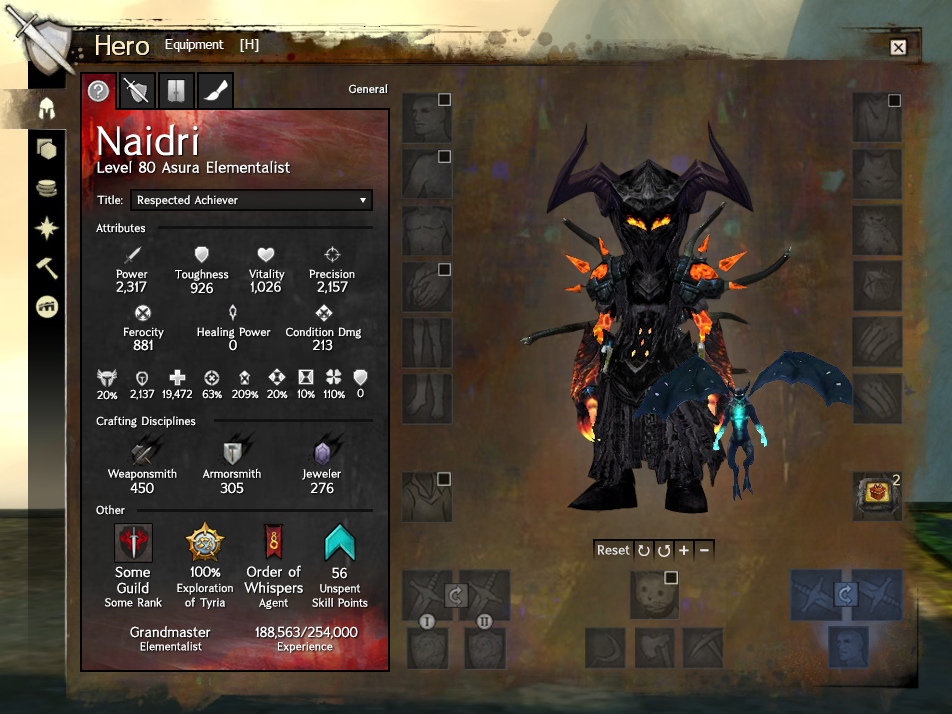
I decided to have a go at redesigning the Equipment tab on the Hero panel. This is because I think that the current design is a little confusing, and also because I think that there’s other character information that ought to be shown too: such as your Order, your crafting levels, world completion etc.
I’ve attached an image!
As you can see, on the left is your character and equipment slots (all of them), and on the right is a tabbed panel. The tabs are General, Equipment, Wardrobe, and Dyes
I also wrote a pretty lengthly reddit post on r/GuildWars2 going into a lot more detail about it, which you can see here.
All the friggin’ +1s!
I really hope the devs see this and get crackin’ on it right away.
Many alts; handle it!
“I’m finding companies should sell access to forums,
it seems many like them better than the games they comment on.” -Horrorscope.7632
“I’m finding companies should sell access to forums,
it seems many like them better than the games they comment on.” -Horrorscope.7632
Getting better ^^
Personally, I wouldn’t need to see non-spent skill points on there – but all the rest of the information is nice.
I have one more request (or inspiration, or whatever):
Can you put the personality back on? The bit that was somehow undocumentedly lost in the last hero panel overhaul? (Rogue, Diplomat, etc. based on the dialog options a character typically chooses when talking to NPCs)
I miss that information, and together with guild, order and title it would be nice to have that back, to give the characters a little bit of *visible) personality again.
I support Portable Doors: Player Housing anywhere!
~ Whips ~ City Minigames ~ City Jumping Puzzles ~
~ Whips ~ City Minigames ~ City Jumping Puzzles ~
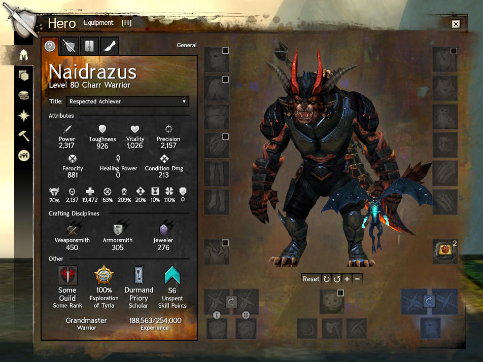
Been taking on board as much of the feedback as I can. Biggest request was to have the panel on the left. I also spaced out certain elements to make it appear less noisy.
Attachments:
I also prefer the panel on the left .
I think removing stats name would make it less busy and give you more space to organize them. Their name would appear on mouseover.
Oh I like it even better on the left. =)
-It’s Lady Paradox- Sweet Adrenaline
“What Part Of Living Says You Gotta Die?
I Plan On Burnin Through Another 9 Lives”
“What Part Of Living Says You Gotta Die?
I Plan On Burnin Through Another 9 Lives”
Armor stat > Toughness Stat, just saying ;P
mouth too blunt, truth too loud
Any news on that? :-)
HIRE THIS PLAYER, QUICK! It’s reaaaaaaaally good! Very clear, not “too empty”, kudos!
Guild leader of The Nephilim of Elysium.
Son of Elonia.
Son of Elonia.
(edited by VergilDeZaniah.3295)
1 2