Showing Posts For amax.8034:

I've redesigned the UI & the official website

in Guild Wars 2 Discussion

Posted by: amax.8034

amax.8034

Hi guys,

I’m a Senior UX UI designer and I’ve been playing GW2 since the betas, with long breaks in-between and since I’ve spent quite a lot of hours with this game, I’ve noticed some flaws in the games UX (user experience) and thus I decided to tackle it in order to diversify my portfolio. This lead me to redesigning some of the in-game UI’s & the official website.

Basically, let’s say that Anet was working on something similar to what you’ve presented to them here, they might have to shelve it now or risk having to compensate you in some way, even if they’d been working on it first since you could argue your work gave them these ideas even if that wasn’t the case.

Well if they were working on something like this then I don’t have a problem them using the concept, as this would benefit both parties, but they need to reach out if they are interested in using it and a compensation isn’t required as this was done more for fun as I love what I do and thought to give something back to the community.

Also thank you to all who continued to share the opinion in the last 24 hours since I posted the new information. I really appreciate it guys.

Some clarifications

Technical I’m not familiar with the technical limitations of the current system they have in place thus I didn’t take it into consideration, if this would have been a real project then I would have collaborated with other departments to come up with a solution, but since I’m not familiar with their tech I just assumed it could get implemented without affecting fps, since I do agree that fps is more important then a UI.

Hero Panel this thread is over 5 pages now and I noticed some people like the new redesign and some don’t. I also noticed the most common reason why people didn’t like the Hero Panel was the fact that it was considered to be too cluttered and some of you mentioned it would intimidate new users. I totally agree with this and in fact that’s why in my original presentation I proposed a concept that in a nut-shell hid some of the slots/features for new players and gradually unlocked them as they level up, thus slowly getting accustomed to the ui. Based on this project I learned that the best approach would be to have two options a more clean and a more advanced version in order to meet both user groups and actually build a more user-centric product.

Refinement just a heads up, the UI would definitely need more improvements and testing, however since I don’t have the resources or data gathering tech as ANet has that’s all I can do for now, since without actual data I won’t be able to clearly refine it as there always be certain things that some of the +1 million players would dislike or really like.

Hire this guy Thank you to all who suggested hiring me, unfortunately I’m based in Europe and for me to relocate to the US, although would be a dream, it would involve a lot of costs on their part that I’m aware of. This project also generated some awareness in the gaming community and was approached by some recruiters from big companies, so hopefully it will go well.

Thank you once again to all who contributed to the discussion, it’s really overwhelming to think that a design I made in my free time got so much exposure, for this I thank you guys.

(edited by amax.8034)

I've redesigned the UI & the official website

in Guild Wars 2 Discussion

Posted by: amax.8034

amax.8034

Since some of you wanted to see how this would look in-game, I made a quick prototype:
https://www.youtube.com/watch?v=RUHYOEGKtJs

and in case some of you are interested in seeing the behind the scenes process like the research, sketches, what I learned and so on, feel free to check out the link from my portfolio.

http://builtbyg.com/portfolio/guild-wars-2-redesign

I've redesigned the UI & the official website

in Guild Wars 2 Discussion

Posted by: amax.8034

amax.8034

@Donari.5237 That’s a fair point of view, however “I’ve been willing to kill my darlings” as you put it as seen in my previous post where I’ve stated some facts that came up based on the feedback provided by the community. However the design has mixed reception for people, even on this forum page you can see people, for example disliking the Hero Panel changes, while above or below that certain page another person liking it. I’m aware that each person has it’s own point of view, but to actually come with a solution that would be widely accepted, that would imply lots of testing & data gathering, that if it would be for actual production then ANET would have the time for. Overall the design has been received quite positively, with different things disliked and liked by certain people.

@teeoneimme.3960 thank you

@Aidan Savage.2078 Please view one of my previous post regarding your first two concerns, since I’ve already answered them and it seams you’ve misunderstood how they would work.

I haven’t stated that AP are hard or that it displays a players skills, what I said is that AP act as a guideline, if a new player joins the game he could use the AP system to ask for information. A player with 10k AP, for example, is more likely to be able to answer a whole lot more questions then a player with 200AP.

There are in fact players who play in other guilds, for example there are guilds that don’t do too many WvW or PvP activities, only PVE stuff. This leads to players swapping to those guilds when they want to do those type of activities. Similar is to people who play in RP guilds or Dungeon Duoing guilds…. and on my few occasions that I’ve participated to Wurm or Tequatl events I did see people still jumping from a certain guild to one that’s doing that event, on my server, in order to better coordinate since other commanders or players might be talking in map chat.

Regarding LFG, people with a visual memory can’t always remember where certain things are placed if all looks the same, like in the case of the current LFG. Also I haven’t changed things just because of the sake of changing it, there was a reasoning behind it and please see some of my previous posts for an in-depth explanation.

How many people care enough about the lore? quite a lot in fact, plus it helps them catch up with what has happened without having to visit third party websites that break immersion. As previous stated please read some of my previous post regarding why it’s important to have a lore journal in-game.

@Gulesave.5073 That’s actually the same conclusion I’ve came to, based on the number of feedback provided, the best approach for the Hero Panel would be to have a minimalist version and an detailed version for people who want all the info. Another option that I was made aware of after the amount of feedback provided, would to include things such as crafting professions, guild & order banner directly on the character select screen.

@Aedelric.1287 glad you enjoyed those parts of the concept

@das neue spiel.5902 Thank you

@jnfinley.2158 Thank you

@Draconius.9076 Thank you

@nGumball.1283 Thank you for pointing that out.

@Liz.1497 Thank you for the feedback and no worries I’m not offended. Please see some of my previous posts regarding the grid imaged based approach. Regarding hype sure that might be some of the factors, but I think it’s more complex then that.

@haresean.3856 Glad you liked it

@Lishtenbird.2814 thanks for the feedback and I’m glad you enjoyed at least those aspects of my design.

I've redesigned the UI & the official website

in Guild Wars 2 Discussion

Posted by: amax.8034

amax.8034

Thanks for the feedback, that’s a fair point of view due keep in mind that there are a lot of explanations in those images, which would make it a lot more cluttered then it actually is. In my previous posts I’ve already stated some possible fixes for some of the feedback that I’ve got and I agree that it can definitely be improved if proper time and resources would be allocated to it.

You can cut out all the explanations on all the mock ups, and some would still look as cluttered as they actually are, especially the redesigned character panel.

Fair enough, you’re entitled to your opinion, that doesn’t mean everyone thinks that, as you have seen there are people who think differently and this redesign has provided a lot of helpful feedback that ANet can analyze and use to improve the UI & UX.

(edited by amax.8034)

I've redesigned the UI & the official website

in Guild Wars 2 Discussion

Posted by: amax.8034

amax.8034

IMO, the design/layout is great for an experienced and/or die-hard GW2 fan.

The problem is that it is a cluster (too many images, too much in your face, and not enough “white space”) and especially if you are new to GW or GW2. Less is actually more.

Don’t get me wrong. The effort put into this is absolutely astounding (and quite frankly, looks like you want a job or a consultant gig with ANet). But from my eyes (and I have seen a lot of this), it has way too much cramped into so little. Generally speaking, audiences want intuitive drill down menus (we all want graphical versions) but there should be no more than a left/top bar for options and no more than 9 images to click through on a single layout. Some of these mock-ups have way way too much (it takes way too long to read through all of the options per page because of all the data shown).

Honest feedback, you need to create far more click-through depth and then cross-reference to related topics (especially when you get down to the end of the drill down). It’s a great draft with some interesting benefits (like the character paper-doll UI redo).

Thanks for the feedback, that’s a fair point of view due keep in mind that there are a lot of explanations in those images, which would make it a lot more cluttered then it actually is. In my previous posts I’ve already stated some possible fixes for some of the feedback that I’ve got and I agree that it can definitely be improved if proper time and resources would be allocated to it.

Regarding the job thingy, I would be lying if I would say that I wouldn’t be interested but on the other hand I do know that they are based in the US and I’m based in Europe which would be a real headache for them or any company to get sorted due to visa, paperwork and other relocation things… although the US still is my ultimate goal.

However the design was really not made as a way to apply for them since in the past I’ve received job offers from other high profile companies like Ubisoft & EA that have seen my portfolio, but due to focusing on my masters degree I had to turn them down, which by itself turned to be a good decision since it lead to representing my university at Archiprix – worlds best graduation projects.

The reason why I stated this is to show that it was a design made from pure passion and as a way to spice up my portfolio with something more interesting then just web based work. I’m really flatered by the amount of comments received regarding hiring me and if the guys at ANET are really interested, we could talk and see how we could approach it.

On another note, I can’t believe this is still getting comments after so many days and that yesterday it got picked up by Massively. Once again I would like to thank the community for the amount of feedback they’ve provided.

I've redesigned the UI & the official website

in Guild Wars 2 Discussion

Posted by: amax.8034

amax.8034

HOLY MOTHER OF DWAYNA and everything that is wrong with the Zaithan fight !!!!!!!!

THIS IS EPIC.

ANET !!!!!!!!! needs to use this and give this guy 10k free gems lol

Don’t tempt me with those free gems and I’m glad you enjoyed it… ohh and your Zhaitan & Dwayna reference made me laugh, ty for that

I've redesigned the UI & the official website

in Guild Wars 2 Discussion

Posted by: amax.8034

amax.8034

Let’s use the entry I provided as an example. I’m reading about Kryta, the region, in the Places section (in the Kryta subsection). Suddenly the Centaur War catches my attention, and I want to read more about that.

How would the Centaur War catch your attention? If it caught your attention by it being mentioned in the text you are reading in the lore journal, then a clickable link of that text would be a better implementation of jumping from topic A to topic X, similar to how I did with Lord Faren panel, where I mentioned his current location. If however it just pops up in your head as you read then yes I agree a global search function would be extremely helpful, especially if it would include auto-complete function to reduce the time you spend typing. That coupled with a tab navigation that acts like a drop-down menu function would help improve the general flow while avoiding the list approach, due to the mentioned issues in my previous reply.

There’s nothing wrong with the wiki, other than that its out of the game. It kills immersion to have to go to an external website to find out information about something. The way the website is designed kills immersion. Not only that, but the way many of the pages on the website are worded also kills immersion, so just having a built in wiki browser isn’t really the answer.

That’s exactly what I said in my latest post on this thread, at least we can agree that the wiki breaks immersion.

It could work, if the website was redesigned, or a new web site/engine was created for the purpose of being GW2’s Lore Journal (kind of like the trading post), and it looks like it actually belongs in the game (kind of like the trading post).

Initially with the release of the Living World Website that featured a gigantic interactive map, I thought that was the plan that ANET had in mind, creating a website that would feature lore and that would get updated as events happen. However it turned out to be something different and only related to season 1 and yes having the entire lore journal in game would be a lot easier, hence the design, and it would definitely make it easier for people to actual see or read, while they are waiting for their friends to come online, finish a dungeon and so on. I discussed why it’s better to have an actual journal in-game rather then a wiki in my previous post so I’ll try not to repeat myself

That might take options away though. For example, what if the devs made it so all lore entries are locked, and you have to go speak to people and discover places and find items and read books to unlock the lore entries? In this way, you know as much in-game as your character does. If the lore journal was entirely in the game, this would probably be a little easier (not to mention being more immersive) than having an external website with everything on it already.

That could be an option and it would be immersive, however due keep in mind that there would be players who wouldn’t want to have to go to hunt all this lore. There’a s lot of lore regarding the game, so people would do quite a lot of walking which would lead to a massive problem… which is skipping… people would get burn out and just start skipping content.

Building upon this initial idea, a better approach could probably be if once a player enters/discovers a zone he would unlock that zones story, while defeating a certain enemy for the first time would reveal that enemies lore and it’s strengths/weakness. While meeting NPC’s in the actual living/personal story would unlock their lore. However there might be some NPC’s that aren’t part of the living story as well as areas that aren’t in the game yet, and those areas could be discovered/revelead by default to all users.

This would make it that new players would only see lore they’ve actually took part in while also having access to lore that was once forgotten. This could also be further expanded by letting users find rare books that tell stories about certain events that took place in GW1 and these books could be exchanged with others to unlock the entire chapter of that said event.

However we must be somewhat realistic and understand that this kind of implementation although would be mind blowing, it would take an amazing effort from the entire dev team to get it done.

I've redesigned the UI & the official website

in Guild Wars 2 Discussion

Posted by: amax.8034

amax.8034

@Filaha.1678 Thank you for your feedback, although most of this has already been answered I will try to provide an answer.

1. Hero Panel:
- crafting panel is present in order to reduce number of user interaction & clicks between different tabs while also encouraging new users to pick up crafting. Some people switch crafting professions quite a lot or have multiple crafting licenses and thus keeping track of all that information becomes a chore. Imagine if you have 10 characters (having multiple alts is as you know a common habit since each class plays differently) and you need to find out which of those characters has ascended weapon smiting, that leads to logging into each character clicking the hero panel, clicking the crafting tab, clicking the drop down, see if that’s the character you were looking for, log out and move to the next and repeat. An alternate solution that I can see now, after a users suggestion for orders to be displayed in the character selection, would be to display crafting information on the character selection screen.

2. Guild Panel:
- character portraits help with the immersion while also being potential conversation starters (socializing) since as you know this is a heavy cosmetic game, thus it would lead to “showoff” their character, making new players have a glimpse at what their characters could look at max level.

- Achievement points were displayed as a way to help players identify which players to seek help while also pointing out their importance while also creating status. Imagine you are in a guild where are a bunch of new players, you’re in a zone and you have a lot of guildies there with you, now how would you know which one to ask? you might ask some random guildie, you wait, no answer, because that new player doesn’t know how to reply to whispers… you then contact another one and you find out he’s a new player like you, at this point the new player might give up contacting others or might continue. He could post in guild chat but that assumes he knows how to post there, typing /g before the message or selecting guild chat, however in some scenarios like if it’s a small guild there might not be enough players paying attention to the guild chat or might be engaged in other activities.

- there are quite a lot of people that join different guilds and play in different guilds (role-playing, speed killing, dungeon selling, wvw, pvp, etc). For example when Tequatl was redesigned there were a lot of guilds specialized in killing him, thus those guilds would have certain times that they would group up and try to kill him, members being in different guild-zone created confusion when to show up, while some forgetting about that.

3. LFG:
- this has been answered multiple times, the short answer is it’s more easy to click, generates interests for new players and makes it more easily to remember for people who have visual memory. Regarding back buttoning, this also has been answered, short answer is there’s another layout that I’ve proposed which involve using a smaller grid size that would activate while the user hovers on the "Citadel of Flame " button.

4. Journal:
- please see some of my earlier posts for the reson behind it and a potential second solution.

5. Lore Journal:
- sorry but time required to get something implemented isn’t a valid statement,
- regarding using /wiki sure that works now, however how many players actually now about that feature? how many of those actually use that? and how would new players find and get comfortable with while there are tons of other things they need to grasp. The answer to the first two is… not many, even I as a player although know that command, don’t use it, the reason is because it breaks immersion, it forces you to change to a bright white page filled with text and when you come back you realize you missed a world boss, a event, a whisper or you’re dead because a dynamic event just started and killed you. The reason why you didn’t see a search bar present is because for that certain page I didn’t think GW2 would have that many key NPC’s that it would need one. The implementation I thought of would involve right clicking an enemies icon where he’s health bar is, then selecting lore which would bring up that panel. Although I agree that a search function might be needed for some parts of the journal that are more complex.

I respect your feedback and taking the time to write such a lengthy post, however you must understand that just because you play the game a certain way, that doesn’t mean everyone plays like it and not everyone has such a vast knowledge when they just start playing.

I've redesigned the UI & the official website

in Guild Wars 2 Discussion

Posted by: amax.8034

amax.8034

@Chrispy.5641 It’s not about level locking, it’s about creating a user experience for new players that might be new to MMO’s or RPG’s since not everyone is experienced with them. By doing that you slowly introduce the player to multiple mechanics. Although your 3 click lore journal issue is valid, you assume that users will jump from reading a characters lore, to reading the lore behind a certain place, or maybe the lore behind a weapon. That’s a valid point of view, however I’m more inclined to believe that users will most likely jump from a characters lore to anothers characters lore and another characters lore and probably after that move to other sections of the lore journal. However your point of view is valid and a fix would be to use tabs at the bottom or at the top, that would let users jump between categories faster. Although your proposed redesign features the same type of layout as found in the achievement panels, it still involves users to read the navigation, making it less intuitive. Using a vertical layout, for navigation, when you have let’s say 30 entries would involve users to find content a lot harder, rather then if it would feature images. The main page provides a lot of random information that’s although valid, it distracts user from actual content. Although I respect your approach, we have different approaches, which isn’t a bad thing it shows that we think differently and without further testing and actual data gathering we can’t know which one would perform better, we can only assume.

@Age.9320 Ty for taking the time to write such a lenghty feedback and don’t get intimitade by my experience since every feedback is important, hopefully it will help ANET understand what the community classify as the most important things when it comes to UI redesign and what the majority thinks and thus how to approach the problems in the future. You did a great job of understanding my approach and yes the LFG- Advertise for party, would work quite similar to how it is know with just some extra filters present. Regarding the story journal, it acts as a slider since the devs usually add a living story season each year and using a vertical navigation would lead to lot of empty space/ placeholder images present until that said content is released. Using a auto scrolling horizontal layout ensures users have less interactions present and it also uses the existing tech, since we already have sliders in the game (gem store images). Thank you once again for taking the time to write such a lengthy feedback.

Thank you all again for your passion towards this game and providing feedback, I really appreciate it, however due to how reddit & the forum work, It’s really hard for users to go through all the amount of comments that I provided and that discusses most of the concerns so please don’t feel offended that I didn’t answer your concerns, in most cases it’s been answered either on Reddit or in a previous forum post.

Cheers and ty again for over 22.000 views of my designs and making it reach the second page of Reddit the other day.

I've redesigned the UI & the official website

in Guild Wars 2 Discussion

Posted by: amax.8034

amax.8034

Thank you guys to all who commented, I’m really overwhelmed by the amount of interaction my design created and I never would have imagined it would generate so much interest since it was done in such a short time-frame and usually you spend months for such a project. I’m aware some areas might not be to everyone’s licking and there is room for further improvement. If this was for production, there would be extra iterations and multiple new redesigns, multiple user interviews, lots and lots of user testing and feedback gathering. I hope that might design will help the guys over ANET by pointing out what the community is looking for, since a lot of feedback has been generated on both Reddit and here. I tried to answer most of the comments and although some points keep repeating them I can’t post the answer multiple times, since that would be spamming.

@MithranArkanere.8957 there are always multiple ways to implement new features, we don’t have too much info at the moment regarding what ANET is working on but I see quite a lot of ways to add new stuff if they wanted to, sure some might require tweaking but overall I still think there are ways to integrate new features. Although I value the importance of the wiki, I don’t think either new or returning users or even the press would consider that an important element to be featured on the front-page. It could be added as a website navigation element or even in the footer. The reason behind this is that new users are more interested in what the game has too offer, while existing or returning users are more interested in what has changed. I’m not saying it shouldn’t be on the website, I’m saying it must be integrated carefully. The lore journal would use the API to pull data from the official wiki, I don’t know how much stress that would create for the game client, but that’s a possible integration of the wiki that I thought of when I was designing that.

@Shaaba.5672 there was another layout that I proposed, which is present in the document that showcases smaller grids elements. Where you see written Citadel of flame now, that’s a dropdown that allows you to quick select other dungeons, by mousing over any of those elements you would then be able too see exactly what LFG posts are written there. Please read the Hero Panel descriptions and you will see that there are 2 ways of interacting with it, since I’ve created slots for mini pets, finishers, outfits,etc that require a single click to bring up the existing preview panel where you can select your choice.

@UnitedChaos.8364 @MithranArkanere.8957 Thank you and It seams I wasn’t clear enough with that buy dungeon runs check-box wording, it should have stated “show dungeon runs”. The reason behind that check-box is that new players who just join the game might get the feeling that it’s a common thing and that they need to pay gold for dungeons, by having that option to filter out dungeon selling, people who are interested in doing that can still do while other won’t feel pressured to do so if they don’t want to.

I've redesigned the UI & the official website

in Guild Wars 2 Discussion

Posted by: amax.8034

amax.8034

Somehow I knew you were going to use that saying.

Can I twist it around by saying that having a thousand words every time you want to select a certain category would be a bit too much or is that silly? :p

Kidding aside, aren’t icons a better way to go by that standard? I mean a piece of artwork does say alot more, but it might also say too much.

:) and yes icons are lightweight and might work, my design was just an example of the approach and not the actual final design since that would take months, however further data & analysis would need to be done to determine the best approach.

@dace.8019 glad you enjoyed it and thx for taking the time to comment

I've redesigned the UI & the official website

in Guild Wars 2 Discussion

Posted by: amax.8034

amax.8034

@FrizzFreston.5290 Don’t worry I’m not taking it to heart I’m used to criticism I went through 6 years of architecture university and have 9 years in the web & design industry, thus I’m really familiar with it and the fact that not anyone will like a certain design, that’s why we have so many brands that do the same thing but different depending on their targeted audience.

@sephism.8279 that was the most “soft & pleasant” feedback I ever received, you sir are awesome and did a great job of understanding my design & approach…. sure more tweaks & user data could be gathered, but since I don’t have access to that for now it must do. A similar project would stretch a few months when put in a real live environment, however my approach was to give a general idea of what could be done and it’s not the final actual design, since that as stated would take months to refine & test and I don’t have that luxury.

@Doctor Faustus.6372 @hermescragsniper.2713 Comments like this is why I love my job & the gw2 community, you guys made my day. Cheers

I've redesigned the UI & the official website

in Guild Wars 2 Discussion

Posted by: amax.8034

amax.8034

Yeah…I think I’ll be one of the, like, 3 people that must dissent.

The redesigned hero panel doesn’t actually do anything to make my life easier, it just moves things around, and moves things on top of things. One word can describe this mess…clutter.

Clutter is a bad thing in video games, and a minimalist style is always the best way to do things, and if minimalist style can’t be done, its still always better to have as few things in your face as possible.

In this aspect, the current Hero panel does a pretty darn good job for what it has, since Crafting is kept separate from battle stats, which is kept separate from all the cosmetic stuff.) You talk of being friendlier to new players, but it does the exact opposite to flood the player with all the information at once instead of smaller bits.

Story/lore journal is alright, so is the guild panel and looking for group. The thing I have a problem with is all the freaking pictures of concept art everywhere. GW2 has awesome art, I get that. It stops being awesome when it gets way oversaturated in every aspect of the game, and gets thrown in such trivial things as a list of dungeons. It makes it look like Windows 8, which isn’t exactly the most elegant/well executed way of navigating menus/lists.

No comment on the website redesign, since the whole minimalist thing I was talking about before works really well for the current site.

Thanks for commenting, regarding your clutter issues and the fact that new players would be instantly be “thrown” into a lot of information is a valid statement. However please note that as stated in the document, some features would be hidden as in not visible till they reach a certain level.

For example the order would appear at level 35 I think, where you have to join an order, the crafting would be displayed at a certain level and so on. This way users would start with a UI that’s really basic at the early levels and tabs/slots would be revealed as they level up, similar to the current feature unlocks. Thus the design showcases it at level 80 when everything is unlocked.

For players who think it’s too cluttered or want a more simplistic view, some of the information could be displayed under a tab thus giving users a basic overview and a more detailed overview.

Regarding artwork use, you must understand that there are people who are more visual oriented, who have a visual memory and thus it’s easier for them to remember such things. For new players or existing players, having artwork displayed would help them identify/remember/ put a face to certain characters or generate curiosity/interest for a certain dungeon that they haven’t done before. As the saying goes “a picture is worth a thousand words” some people would get an easier understanding that PVP & WvW is for large competitive combat, while an image with a dungeon would make it easier for them to understand it’s something that you do in PVE. Also by using images you are required to read a lot less since you get the general idea from that said image thus the mentioned popular saying.

I've redesigned the UI & the official website

in Guild Wars 2 Discussion

Posted by: amax.8034

amax.8034

@nethykins.7986 @Hanzlo.3148 @sdcmgs.7348 @Dumoch.3649 @tico.9814 @Rafeno.9673 @weskay.9217 @Castien.1872 @VergilDeZaniah.3295 @Naru.4521
Thank you, I’m just glad people enjoyed it and my time wasn’t wasted

@aRestless.6213 Don’t worry you brought up valid points and the extra information I provided hopefully helped you get a better sense of my concept… ohh and don’t worry, I’ve been in the industry for over 9 years so I’m used to criticism and thus I don’t take it personally and I totally understand what you meant.

@Adelas.6598 those actions would be linked to the LFG, so when someone posts something on LFG they would have an option to turn guild members only which would make it appear on the guild panel. This is to let people just sit around, as you stated.

@JackDaniels.1697 @Palador.2170 that’s right, we’re all passionate about it and hopefully some of their designers will be able to take a different approach, they are the only ones knowing the current technical limitations of their pipeline.

@Elegy.2159 This made me laugh, thank you

@purecontact.1680 The reason why I moved them around is that people usually read from left-right, thus the most important information is seen first. This would need to be tested with a larger focus group in order to actually see if it would perform better. Regarding the rest of your comment, that’s exactly the reason behind some of my design decissions you illustrate them really well and understood the essence behind my design, good job.

@mexay.3902 @xjoh.1396
sorry about getting your hopes up I’m not affiliated with ANET, I just thought of doing this small project for creative purposes.

@TheBlackLeech.9360 @inscribed.6849
thank you and yes although their previous UI designer left the company, I think they’ve already hired a new one since I remember seeing a UX designer job description a while back. This alongside the fact that I’m based in Europe and not the US would make it really hard to get that done as well as a hire cost for them as a company compared to a similar peer already based in the US. Thank you for the kind comments and again this was done just to illustrate my concepts, I’m sure they have a talented team that can get inspired by my design to push a new UI out.

@Delirious.9278 Thank you for the very kind comment, it’s really flattering.

@defi.4127 Thank you for the feedback, regarding the wardrobe/dyes/etc I’ve actually implemented two ways of swapping between this panels. If you look closely you will notice that mini pets, finishers, outfits, etc all have their own tab/slot present in the ui, thus users only need to click that, select a mini for example and done. The second option was to use the dropdown, which would remember your last selection, similar to how it is now, however without further testing there’s no way of me knowing which one would perform better. By using the first approach it would resolve the main concern you had, which would be ease of use and the increase number of clicks.

@EdgarMTanaka.7291 I know that gear checks won’t ever happen, that’s why I proposed ready checks so for large groups like in WvW, World Bosses, Guild Missions, commanders would know how many players are AFK so they don’t start the event and find out that half of their afk is away or not in the right position. The only reason why I included AP is that I’ve noticed in LFG that people look up players with a certain AP level as well as Anet creating the rewards for the AP tiers and a lot of guildies feel like AP prove that you’re a veteran or your skilled enough.

@FrizzFreston.5290 Fair enough, just because a UI has multiple images doesn’t mean it’s not a UI, since that’s part of the solution to the UX UI, to make it easily usable as well as attractive. Pinterest, Adobe bridge and so on have their entire layout focused around images, thus you can’t just simply assume that those aren’t UIs. Dropdown wise it would function similar to what it’s already implemented, thus having a preview available. The character potraits would function similar to the existing party potraits, displaying a headshot of your character and unfortunately I don’t know how much stress that puts on the game since only Anet knows the tech behind their MMO. Dungeon wise that would need further testing for new players to see how they would interact with the LFG tool.

I've redesigned the UI & the official website

in Guild Wars 2 Discussion

Posted by: amax.8034

amax.8034

As a programmer I feel obliged to step in.
The general opinion seems to be “this is so much better than the current state” and “hire this guy, introduce this now”. But I want to point out that many of those things you might like about that design aren’t actual UI/UX redesigns, but features you are currently missing (lore journal, build templates). And that they are missing has more reasons to it than UI designers not knowing where to place a button.

I had to shorten the quoted text to avoid users having to scroll so much, here’s a copy-paste from my Reddit answer since I’ve noticed you posted it there also.
——————————————————-
Thank you for posting this, it’s true what you’ve said about the features part, that shows how much people want to actually get those in-game. Also just because I didn’t tackle each UI element in the game, doesn’t mean it’s not important or I haven’t thought about it, it’s just I choose to tackle some of the UI panels that were more interesting to me. Tackling the entire UI would take weeks of work to fine tune everything, time that I don’t have since as any other person I have bills and other projects and clients that need my attention.

Since you brought up the guild panel and 70 main raids, I actually answered this question for WvW raids, but currently there’s another tab in the GUILD tab that showcases the entire guild player list, their level, professions and so on. That tab would be used in raids since in raids you need a list type of view and not grid as stated, currently both the home/main guild panel and the mentioned tab act similar in functionality. With the redesign I wanted to use the home/main guild panel tab for users activity thus making users actually use it, not just for looking who is online but to encourage guild member activities. Also just because I displayed 9 guild mates, doesn’t mean that only 9 will be there. This was done in order to cut down presentation material and compact the information so the general idea of tabs would be seen.

When users would list a post on the LFG they would have an option to choose to what type of users to join: guild members only, all players. When such a post is posted on LFG, it automatically shows in the guilds tab so when new users just come online they can see which guild activities he can join. Regarding your “push the social aspects” statement, please read the explanations since there was a statement that this feature was also developed for users who come online after a certain user just posted in guild chat that he is looking for 3 more for a dungeon and thus he posts again the same thing. This is just an example , there are a lot more scenarios like a user asking for a dungeon group, then going afk and another guild group gets filled just because he was afk and wasn’t able to post in guild chat.

Regarding your concerns of guild message scrolling, there’s actually a scroll bar present, unfortunately it seams I cut it out when I did the layouts. Border wise, I don’t feel like you need an actual border since there’s an actual “border” around the entire guild message area, if you really want a border, one could be implemented on mouse hover so it would be displayed only when a user moves his mouse over that area.

Regarding the LFG tool and possible additions to it when new dungeons are added, yes I took that into consideration. Since there’s no news if the upcoming expansion would divide the community or not, there are two ways… if they choose to divide the community that new content could be accessed via a different tab/button found above the current dungeons or maybe not even been displayed if that content would be locked. Another option would to make it scrollable or act as a slider.

I’m aware that developers are more hands on and want to know all the data and analyze information based on what they can see or know and thus I appreciate your feedback, but remember just because it’s not there it doesn’t mean it hasn’t been thought off or just because user Y doesn’t like it, doesn’t mean user X won’t like it, everything when it comes to design is subjective and as long as the majority likes it, your job as a designer is complete.

I've redesigned the UI & the official website

in Guild Wars 2 Discussion

Posted by: amax.8034

amax.8034

Fellow UX & Front End Designer here. First: Amazing Job! Second, that is an amazing Interface, but it does not feel like gw2 at all.

Wow, this was the lengthiest post I’ve seen, thank you for providing feedback and for taking the time to write that entire post. I had to cut parts of it out when I quoted it, so users won’t have to scroll the entire post again.

Now regarding your feedback, color palette wise sure I took some creative liberties however since you’re a fellow designer you’re familiar with conversion optimization and A/B / Split testing / MV Testing. In a live environment, you would have multiple designs with different colors, these would help identify the best colors & style that would produce the best results. This means that colors would likely be adapted/changed to fit the companies end-goal. Using a white background wouldn’t create enough contrast which creates immersion, that’s the reason why most movie & game websites use a dark color.

Regarding titles and discovering other panels, sure I understand what you mean and why you would think this is a good idea, since in most projects you encourage users to explore other UI’s and I totally agree with that. However take into consideration the fact that you assign a lower value to the importance of titles for new players who will eventually become regular players, if you group them with the achievements. The reason why, is because users in the early stages of the game are only interested in what they can equip, thus the most important information for them is the Hero Panel and all the tabs there. Once they discover the achievements panel, they don’t care since they are overwhelmed by all the information and they close the panel after browsing it for a little bit. By equipping it the Hero Panel, users would understand that’s something that has value and strive to get one. Plus having all the equipable items in one tab ensures users see all the information at a glance and are not forced to “guess” or remember how to equip titles or where they can find them. I totally understand your point of view, however this would need to be tested in a live environment since my assumptions are made on a low number of new players that I’ve played with.

Regarding inconsistencies, sure there might be some since I haven’t redesigned the entire UI found in the game and since I decided to change the approach of the existing UI in order to improve the functionality of it, keeping the existing UI consistency would limit me to create the same type of UI and thus not iterate and create a possible better one.

You probably agree with me that as a UX designer, we are aimed at creating the simplest UI or most intuitive one. Keeping the dyes,wardrobe,etc tabs although I included them as a drop down option, I also included them as “buttons” similar to the ones that you click to equip your armor, weapons,etc. Users by simply clicking on these would be able to quickly swap mini’s, outfits, finishers,etc. This ensures the fewest number of interactions/clicks, which in return results in a UI that’s familiar and has the same action present, keeping the learning curve flat rather then the existing 5 click per action necessary when it comes to dyes, wardrobe,etc.

Typography wise, agreed, I’ve used different fonts due to not having access to the original one and it was Helvetica Neue – Black. However again in a live environment this would just be used directly by the system.

The reason behind dungeon stats, to be present in the LFG was due to being able too see stats for that specific dungeon. Grouping them in another panel would just create another tab that’s filled with stats/information, it’s more easy for users who are already queud for that dungeon too see those stats. For new players these would be hidden until they reach lvl 80, to prevent confusion. The whole dungeon stats was aimed for people who solo or do speed runs as well as encourage users to become better for weekly rewards based on personal/guild/server performance, giving an extra reason to do dungeons. Putting these stats in the achievement panel would work, however having 8 dungeons + others incoming + fractals, would involve a lot of stats to be displayed in one place. This way users while they wait for the group, they could see how they rank as well as what other things they need to finish.

Hopefully this answers some of your questions & doubts and thank you again for the lengthy post.

I've redesigned the UI & the official website

in Guild Wars 2 Discussion

Posted by: amax.8034

amax.8034

The concept is decent, I like the dungeon tab solution using images; makes it much more interesting. A lot of the tabs (particularly the Hero Tab) are both overcrowded and communicated poorly, I think.

If this is for your portfolio, there’s a few things you should work on. A lot of it is just the existing UI copied and pasted in a different layout. This doesn’t show off your ability to make a UI, it shows your ability to rearrange one.

It looks particularly amateurish when you can tell that the majority of UI elements are just copy and pasted.
Instead of copying and pasting bits, try recreating the style yourself. This will make it easier to design as well.

You’ve also got inconsistent button design in a lot of places; there’s about 3 or 4 different button styles. The “Back” button design, for example, doesn’t fit with the rest of the UI.

Basically, it could do with some polishing and refinement. I’d also steer very clear of super large images for presentation. You’d be better off making a webpage to link to which would showcase the work in the best way.

The website design, however, looks great. Far more interesting than the existing one.

Thank you for your detailed feedback, I’m a UX UI designer, part of being a UX (user experience) designer involves rearranging the elements as well as thinking of flows, how users interact with other elements, what happens when a user clicks on a button or mouses over and so on. As a UX designer I’m not required to create any visual designs, but instead improve the flow, user interactions, users navigation and so on, thus the reason why some elements look “copy-pasted”, since I thought that those UI elements were already present and did a great job thus it would keep the users familiarity with the UI.

On the UI side, it’s where it becomes visual, this is the part of the job that involves creating new assets that blend well with the existing app or new UI’s that stand out and feel fresh. Since there was already a UI in place, thus not talking about a new product, I had to design some elements that would fit the art direction. I could have completely redesigned the entire UI, however that would have impacted the existing users, making them flee or feel lost, that’s why most major website don’t completely change the UI. This ensures that users still get the same experience as before although from time to time small changes are made.

I thought of creating a page for the presentation, however this requires coding, saving images, copy-pasting the information, tweaking the page, optimizing and so on. Plus in some cases when I send my portfolio, clients don’t have time to click on each project but prefer to browse my portfolio fast, while some require to bring the portfolio to the interview and so on, thus why I aimed for a pdf / big jpg approach.

Thank you once again for the in-depth feedback and taking the time to view my project.

(edited by amax.8034)

I've redesigned the UI & the official website

in Guild Wars 2 Discussion

Posted by: amax.8034

amax.8034

You must know the “get used” factor it’s extremely important. If you are going to add usability to the UI, you can’t change everything radically. Also, the style of the design should make you know immediately you are in a GW2 website or ingame, being unique, and not similar at all to any other game.

Anyway, the work is good, you could even work for ArenaNet, but is easier when you design with your own tools/software than actually adding that to an existing game.

Thank you for the comment, yes I’m aware of progressively updating the UI’s in order to retain the users familiarity with it and not actually backfire and make them rage quit . However that aspect is more regarding the actual delivery of the UI elements, since as you’ve probably seen ANET has been releasing slowly updates to the UI in order to get users accustomed to it and ease the transition.

The current redesign would be delivered in phases in order to make the existing users comfortable with the UI and yes exactly, there should be a strong relationship between the look & feel of the website and the actual game, in order to keep the users familiarity and too make it more immersive, that’s what I tried to achieve with the two redesigns. I could have designed something completely different but that wouldn’t have fit the existing art style/art direction as well as made the users transition extremely difficult.

I've redesigned the UI & the official website

in Guild Wars 2 Discussion

Posted by: amax.8034

amax.8034

I can’t even open the links, they keep loading forever.

Please try again later, try in a different browser or it might be a hosting issue since those links were already viewed by 5000 people and growing fast and thus it might stress the web server, hopefully it won’t go down.

I've redesigned the UI & the official website

in Guild Wars 2 Discussion

Posted by: amax.8034

amax.8034

@Pixelpumpkin.4608 @MakubeC.3026 @Malkavian.4516 @Orpheal.8263 @Zalman.8719 @The Tee Why.4807 @Incognito.3529 @sawworm.8749 @Dwaynas Avatar.1562 @DestroyerElf.5372 @Royal Hammer.7621 @Knighthonor.4061 @BenGrech.3912
Thank you guys, really glad my hard work wasn’t a waste, thanks again

@Andred.1087 We can dream, who knows they might have some UI changes done in GW2 HOT

@Farming Flats.5370 @Azzer.8137
thank you the reason why I didn’t add class restrictions is due to knowing that ANET doesn’t want to separate the playerbase, I remember when fractals were introduced and everyone was looking for warriors, that wasn’t fun especially if you had only a character.

@cheshader.5081 Yes that’s build templates you’ve noticed there, there are a lot of other hidden things scattered in the design that I knew the community wanted. Thanks for the honest feedback and yes it would require 2 clicks, I had to compromise, in order to make it more friendly for new players and yes those rectangles would be a lot easier to click then the current dungeon text

@SettusBlake.1689 Thanks for your feedback, I understand why it may be confusing for some people, however there was a a “quick fix” that I mentioned there, which would solve the main problem with the hero panel, which is going back & forth between tabs. By implementing that, they could keep the existing Hero Panel UI.

@Kuruptz.4782 If the links don’t work, try again a little bit later (might be the server although you’re the first one to report that they can’t see them ) or maybe in a different browser.

@Erick Alastor.3917 glad you liked it and don’t worry I’m passioate about design and this wasn’t a waste of time, just wanted to do something different that I haven’t done for years

@Donari.5237 exactly, it was more for fun since I mostly due web & mobile work and this was something unique in a different art style that I haven’t done in a while. I’m really passionate about design and everything I do it’s from pure passion.

@Nick.6972 thank you, I only did it to diversify my portfolio and hopefully point out some issues that I’ve noticed, which hopefully will get fixed when they have time and thus it would improve the overall day to day activities.

@leman.7682 Thank you for the kind and flattering comment

@Darketower.5218 Exactly, that’s exactly what I wanted since currently the website and the in-game are somehow different in style, although I respect ANET for wanting to keep it simple and readable (white background) I just think there are way better alternatives.

@Miltek.2104 thx for the feedback, due note that it might also feel cluttered due to all the information that’s present. I might upload the UI’s that are displayed in the actual game setting, since I’ve designed them over actual game screenshots.

@Bunnikk.2146 those are valid suggestions that I will take into consideration, unfortunately at this time I don’t have anymore free time since I’m job hunting and finishing some other projects and thus I don’t have enough free time, since I still have to pay the bills. Thank you though for your suggestions and for taking the time to point them out.

@mrauls.6519 You and all the rest made my day, thank you for that

@PeskyJNixon.8236 Sorry about that, played a lot of MMO’s in the past month until the living world finished so I could go though it from start to finish and thus forgot that they are called professions, my bad and glad you like it

(edited by amax.8034)

I've redesigned the UI & the official website

in Guild Wars 2 Discussion

Posted by: amax.8034

amax.8034

@ Orpheal Thank you, I’m glad you enjoyed them. The Hero Panel UI was actually the one that made me start redesigning the UI since moving between the dyes, finishers, armor, wardrobe isn’t fun, especially when you have multiple alts #tyriafashion.

@LadyRhonwyn thank you for the feedback, glad you took the time to take a peak. It’s really hard to design something without having actual player data and a way to test things and I know that not all people will like it, that’s the deal with designs. Also due to the number of annotations present, the UI’s might look a lot more crowded. Thanks again for the feedback and for taking the time to comment.

(edited by amax.8034)

I've redesigned the UI & the official website

in Guild Wars 2 Discussion

Posted by: amax.8034

amax.8034

Hi guys,

I’m a Senior UX UI designer and I’ve been playing GW2 since the betas, with long breaks in-between and since I’ve spent quite a lot of hours with this game, I’ve noticed some flaws in the games UX (user experience) and thus I decided to tackle it in order to diversify my portfolio. This lead me to redesigning some of the in-game UI’s & the official website.

About the project
The project started last summer, as I was redesigning my portfolio website, I wanted to take a break from my regular website design so I started redesigning the GW2 official website, since I missed working on a more creative & artsy website. This last holiday season I had a few days free so I decided to continue this project and tackle the in-game UI’s since I wasn’t really a fan of how some things were currently done.

What I’ve redesigned

  • Looking for Group Panel & the related tabs
  • Character Panel
  • Guild Tab
  • The Story Journal & the related tabs
  • Created a Lore Journal & related tabs

The Entire Design in PDF format – Horizontal layout

The Entire Design in JPG format – Vertical layout

Note
There are a lot of explanations that point out to different things & the reason behind my design decisions. The entire project took roughly 2-3 weeks, so It could be better, but unfortunately I don’t have access to actual game or player data and I kinda ran out of free time.

Hope you enjoy.

UPDATE:
Since some of you wanted to see how this would look in-game, I made a quick in-game prototype:
https://www.youtube.com/watch?v=RUHYOEGKtJs

In case some of you are interested in seeing the behind the scenes process like the research, sketches, what I learned and so on, feel free to check out the link from my portfolio.
http://builtbyg.com/portfolio/guild-wars-2-redesign

(edited by amax.8034)

#OccupySAB2014

in Guild Wars 2 Discussion

Posted by: amax.8034

amax.8034

During this hard times I think this song is fitting for all the riots that are going on. #SAB4LIFE

Jay-Z: Hard Knock Life
http://youtu.be/zxtn6-XQupM?t=40s

Super Adventure Box [merged]

in Guild Wars 2 Discussion

Posted by: amax.8034

amax.8034

Agreed the EU and US community are fantastic…best community in any MMO.
Just hope ANET does something about SAB.

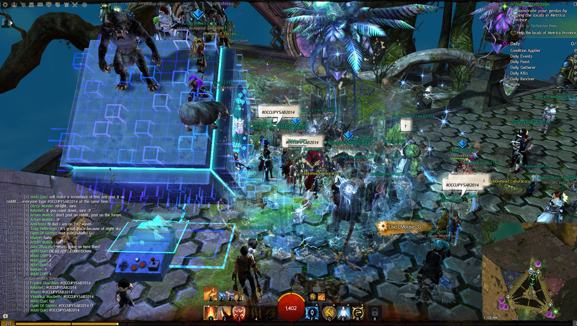
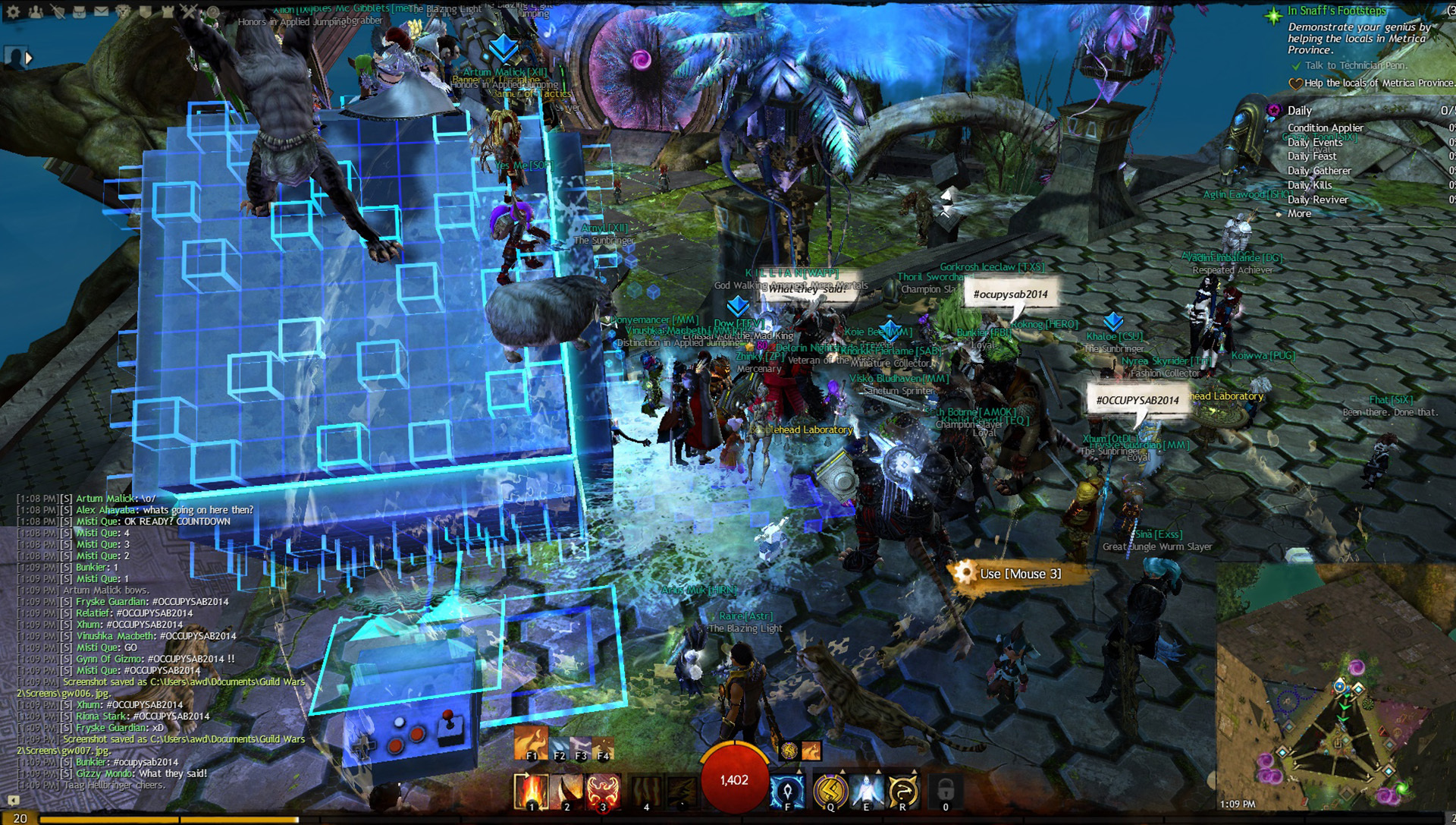
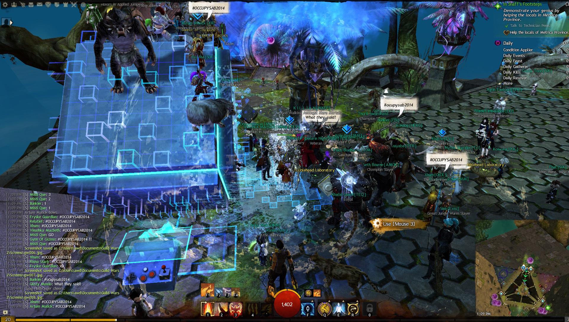
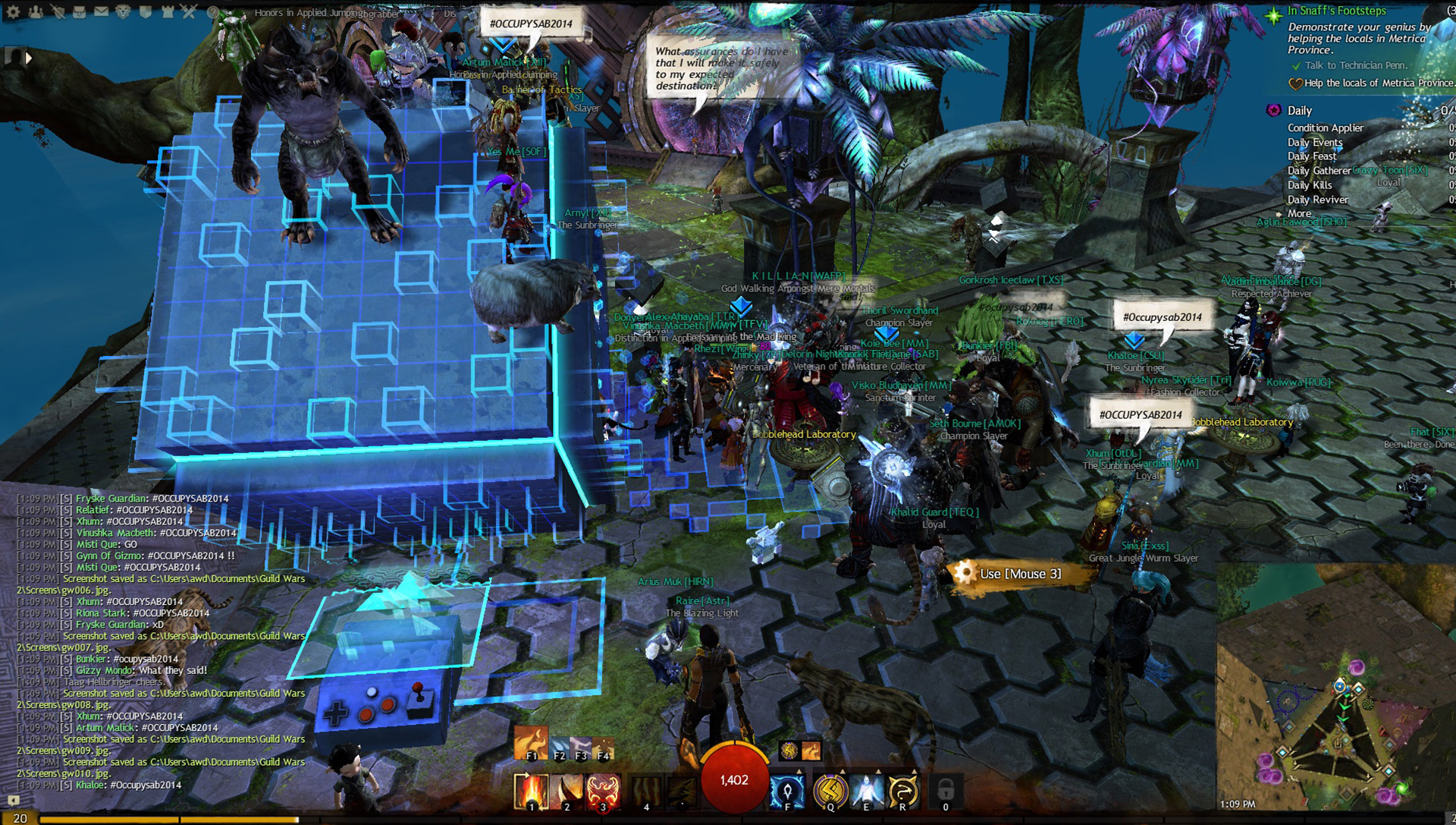
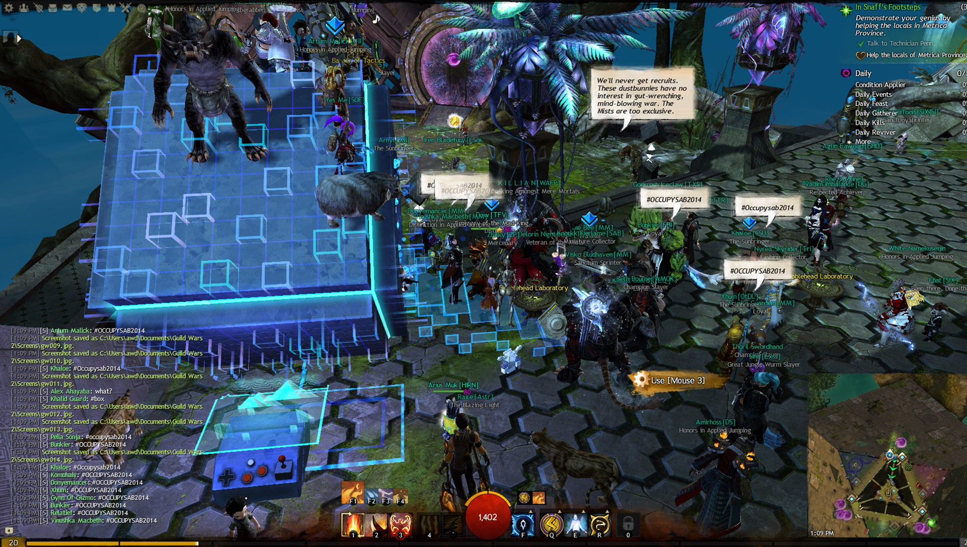
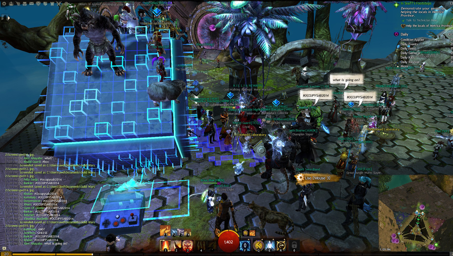
The riot is escalating….fire,love, boomboxes…the passion for #OCCUPYSAB2014 is real.

Attachments:

Super Adventure Box [merged]

in Guild Wars 2 Discussion

Posted by: amax.8034

amax.8034

We welcome you fellow Gandara traveler… no matter who you are or from where you are, on Seafarer’s Rest your always welcomed.

More screenshots from the protest
#OCCUPYSAB2014 is REAL

Attachments:

Super Adventure Box [merged]

in Guild Wars 2 Discussion

Posted by: amax.8034

amax.8034

We fellow Asuras, Charrs, Sylvari, Human and Norn….support our fellow colleagues from other servers in the riot against Anet decision to not bring SAB back.

Some screenshots of the gathering:
http://imgur.com/a/h2L1u

More info about #OCCUPYSAB2014:
https://forum-en.gw2archive.eu/forum/game/gw2/OccupySAB2014/first#post4307575

Attachments:

Looking for info on lag in WvW

in WvW

Posted by: amax.8034

amax.8034

1. Skill Lag/Blinking skills, Players Teleporting , Players walking around in walls/cliffs and then suddenly fast forward to regular/normal state. By fast forwarind I mean suddenly seing all the skills they’ve casted while they we’re appearing to walk into walls, all those skills casted in like 3 seconds and then back to regular, server delay or something.

2. Seafarer’s Rest

3. Yes, sometimes me or my mates… more often in the last few months.

4. No, usually we all lagg or in rare occasions it’s the case of question 3

5 No, it happens randomly sometimes extreme massive lag even though we are like 5-10ppl fighting and no zerg around….. two zergs fighting doesn’t produce any noticeable lag….and sometimes only certain areas of the map have massive lag spikes, even though there are no zergs around. By massive i mean all the problems listed at question 1.

Happy Valentines Day Tyria ! from Scarlet

in Community Creations

Posted by: amax.8034

amax.8034

Scarlet’s feeling a little lonely for Valentines Day so she decided to spice things up by kidnapping someone special to her heart, while also blindfolding a quaggan for fun, so he won’t see all the naughty things that she has planned.

Let me know if you like my artwork.

Attachments:

Back Piece Ideas

in Guild Wars 2 Discussion

Posted by: amax.8034

amax.8034

Wings, wings, wings … All outplayed Aion or smth O_o ? You have to be more original. Beyond simply cloaks (oh thank you, charrs!) I would prefer greater diversity of quivers.
It’s almost no cloaks to magic-oriented classes. Only giant books. Something like a huge flasks on straps, or a plurality of such. Large scroll hanging over shoulder, ligaments with scrolls. Some sort of tattered ribbons with runes hanging out the back. Mmm… skulls on the ropes, mb? It would be interesting. Some sort of claws or huge vertebrae on the back. Floating in the air crumbled plate with the text? Cage with skritt on the back. Oh! Oh! Or better with a bone fiend, like necromancers have. Floating lanterns on the chains… Some natural feature for silvary. Large bunch of leaves hanging from the back. Whimsical driftwood on with insects on it. Or one large insect on the back. Funny…

Omg! Best ideas I’ve heard … I’ve just logged in to say that….Anet should definetly make all of these.This game needs more epic ness and all these would help get there, the floating lanterns would be amazing for a Halloween reward.

Super Adventure Box anyone? =)

in Guild Wars 2 Discussion

Posted by: amax.8034

amax.8034

Loved SAB quite a lot, my favorite activity so far alongside Halloween. Those SAB skins are awesome, I have like 4 of them + backpack, it’s just pure entertainment and it brings back memories of the early Mario era.

Is legendary armor coming out

in Guild Wars 2 Discussion

Posted by: amax.8034

amax.8034

There was a mention in the blog post which described the future plans for 2013, in which legendary accesories/trinkets will be appearing this year… will they still make the 2013 mark?

I really don’t see the point of legendary trinkets. They don’t have any visible graphics. Plus, legendaries have the same stats as the highest tier, which is ascended and we already have ascended trinkets.

Well legendary trinkets could have effects, imagine how Frodo puts the ring on in the Lord of the Rings and he becomes invisible.Im thinking that trinkets will mostly give an effect to the character, like maybe have a death shroud look when they move or maybe have a ghost type look made out of flames when they move, or even make the character look in a certain way at night and during the day.

While i picture legendary armour as something similar to Arah heavy armour, but with lots of animations on it, like maybe have the chest piece made of a dark material where you could actually see figures trying to get out, but are pulled back by the darkness or the shoulders having skulls that randomly try to push out of the armour. Even armour that could change its animation based on the night/day , could be an option like have a chestpiece where the rib cage is visible , that during the day erupts fire from the rib cage, which drips on the floor and at night your armour is made of flames and see souls of the ones you’ve slayed in the rib cage, when u look closely or have souls hovering out from the rib cage.It could be made out of the material that “fuels” The Shatterer, that you attain in an epic quest in which you wound him and he drops a piece of that mystic darkness.Now that’s how a real legendary armour should be.

Ascended armour, on the other hand, I’m thinking it will be quite shiny with a few particles effects, and tied to gw1 lore.

(edited by amax.8034)

Is legendary armor coming out

in Guild Wars 2 Discussion

Posted by: amax.8034

amax.8034

You won’t see legendary armor any time soon, you will see Ascended Armor in 2013 for sure though, yes.

There was a mention in the blog post which described the future plans for 2013, in which legendary accesories/trinkets will be appearing this year… will they still make the 2013 mark?

Also will ascended armour have particles effects? or cool animations? cause fractal weapons currently have a white trail.

Last thing, when are you planning on releasing more info about legendaries? Since in the blog post you mentioned that you weren’t ready to go into details, so was wondering…. aren’t you ready yet ?

Thanks!

Liadri Slayer Club

in Queen's Jubilee

Posted by: amax.8034

amax.8034

Me and a friend got to beat her last weekend, he managed to kill her on Friday after playing almost all day/night since the patch dropped and I managed to kill her the next day, playing a lot more casual like 3hours/day since patch dropped.

We both roll a thief and we both used condition builds 0/0/30/20/20 with endurance regen traits and food, as well as regen health in stealth and move 50% faster in stealth.

I used to die a lot at the second crystal phase, because of all the mobs cornering me when I tried to get pull the mob in the second vortex.Then I realized that If I just wait in the opposite corner of the vortex till the mob spawn next to the vortex, I can then easily move to the right and thus the mob that will spawn there will go into the vortex.Then I used hide in shadows went to pick that crystal up, and pull the mobs to the 3rd vortex at which point I grabbed the crystal, used shadow refuge, thrown the crystal, popped thieves guild used skill 1of pistol/dagger to inflict bleeding then use skill 3 to inflict torment then mug which gave me stealth and use another stack of bleeding via skill 1,torment again and she was almost dead, then used hide in shadow, for stealth and applied the rotation above one more time and she died.

I can say it took me like 130 tries to get it done and 40g, but it was worth it.My friend used like 60-70g and like over 200 tries, we tried backstab builds but you need like 18k hp to survive there and thus backstab builds we’re a lot harder to achieve, thus ended using condi build with shortbow/pistol+dagger.The gold was used to buy condi armour + sigils + food + sprockets for tickets?

(edited by amax.8034)

Your perfect patch

in Guild Wars 2 Discussion

Posted by: amax.8034

amax.8034

- 2 new WvW maps with objectives for small 3-4 man teams and other spvp things like capture the orb, on screen messages like killing spree, user roles like scouts where they can mark enemy targets and they appear on the map so everybody can see them
- new weapons and armors for low levels cause most armor till u reach lvl 80 looks the same
- more epic lvl 80 weapons and armors since gw2 doesn’t have trully epic weapons or armors compared to games like Aion, Wow, Tera, etc
- more daggers with particle effects and more daggers cause its clear Anet has no love for this, currently daggers are the fewest weapons out there
- scavenger hunt with epic background story, possibly linked to one of the dungeons depending on the required gift that would help tell the story or maybe participate in epic events that happened in the past and lead to the forging of that precursor/legendary this should be presented to the user as you are dreaming or your a ghost
- more legendary weapons and equal amounts of them…so for example if there are 4 legendary great swords then all other weapons should have 4 legendary equivalents
- more back pieces that look good and don’t require 500ectos to get…like in the case of the beta fractal capacitator… don’t know what was in Anet head when they added this, it’s clearly a grind aimed to hide the lack of gearing
- arenas or dueling in WvW and PvE just want to backstab my friends
- nerf warriors cause they keep considering the best class and elitist thus ruining the game… leaving games if there is a thief in the party,trolling thiefs that everything they can do is better then thiefs…. and don’t know how Anet can let a class have 25-30k dps and let the rest of the classes suffer and still nerf thiefs and mug for having too much dps
- new dyes like metallic ones or chameleon like the car ones and dyes that during the day you have a color for example celestial and at night it’s abyss
- new dungeons/raids
- new gemstore items that aren’t cute or town clothes …why would I buy them? Town clothes are a waste of time/dev time since nobody uses them and there’s no purpose to use them like maybe a speed buff or something
- more pvp games like the ones from winters day and Halloween
- increase mini pets size and the distance they are when I run..they keep falling behind and I can’t see them so why bother summoning them
- stacking of dungeon tokens and they shouldn’t stay in the inventory

Disappointed & Quitting GW2 | post yours

in Guild Wars 2 Discussion

Posted by: amax.8034

amax.8034

- lack of bank space… this gives me the impression your forcing us to buy bank space, just increase it with 1 or 2 more rows and we will be happy, since all those items u add need to stack somewhere

- why was the Mad Kings Outfit marked as Town Clothes instead of gear skins, they looked 100 x better then the Mad Kings armor set which was a reskin

- lack of proper marketing regarding legendaries,exotics,etc… why not make videos displaying all of them so we can see them and have a goal instead of just letting us think there may or may not be something cooler out there… same goes for the discovery process… why use the forge and not have a quest line for them or something more epic like Kings Arthur story.

-lack of proper marketing regarding events…. stop already with the teasers, they are pointless just make a video highlighting what new content will be added gear/

- lack of a PTR…seriously after tonights event I definitely think this is a no1 priority.

- WvW is too big for the amount of people there and the traveling time is way too slow, give us a speed buff and let more players join + add new maps

- stop already with the Jumping puzzles, the reason why people are doing them is they keep thinking better drops will be at the end, and each time they are dissapointed… focus instead on the things above

- make it more action focussed by implementing a Terra like gameplay, where for example on this event u would have needed to aim the Karka’s limbs or something like that… there’s already a mod out there, just contact the dev and use the mod since with the new FOV you’re one step closer to this and also give use the ability to crouch to do stealth kills/fatalities

- let us form raid groups on world events and let commanders give instructions since based on the way the game is planned, we are forced to form isolated parties just so we would get better drops… why not try creating automatically a raid group when we enter a new event area or tackle a champion, this way we could get communicate and be better organized

Nice aspects I’ve noticed during the 2 big events and play throughs:

- Fractals of the Mists it’s looking very good, too bad the rewards are utterly worthless
- Drop rate of legendaries after the LS event was nice, although I didn’t get one, the idea was good
- the legendary effects are really nice
- liked the tech used on day 2 of the Lost Shore event when the trees were cut down, bridge built in from of your eyes… this reminded me of the days before release when u kept mentioning the world will change around you
-Like the Dulfy reference in the new Dungeon
-The Halloween event was 100 X times more fun then this, it had PVP variety although I don’t play PVP but I enjoyed it a whole lot more, this was basically a overhyped raid event,

Overall the game needs around a year till it’s mature enough and all these things are fixed,added… my only concern is that based on the way it’s going GW2 won’t make it.

I’m sure i’m not the only one sharing these opinions, so guys/gals feel free to share your thoughts regarding the reason GW2 makes you part ways…

Disappointed & Quitting GW2 | post yours

in Guild Wars 2 Discussion

Posted by: amax.8034

amax.8034

I’ve been playing GW2 since the 2nd beta during this time, I’ve kept my thoughts to myself but after the Lost Shore event I too I’m saying goodbye for a while to GW2 as many other people. I’ve been following this game for 2 or 3 years now and In the pre-beta and beta days I was quite anxious to get my hands on it since due to the hype it looked like the most awesome game ever, as I played I couldn’t get enough of it but after playing it for a while and participating in the Halloween and Lost Shore events + getting past the hype…. I finally realized tonight that the game was rushed out alongside the LS content.

The Reasons:

- lack of fun things to do at endgame like Keg brawl, halloween PVP/labyrinth game mode and Mad King dungeon or the final beta events like The Hunger Games

- the complete lack of a preview option to view items from TP…seriously even after 3 months it’s still not implemented yet :|

- lack of gear variety that truly looks epic, the Citadel of Flame gear comes close, most of them fall short in the looks department, thus the popularity of this set -> gear with effects like the ones from legendaries or other things like that… It would be cool if a Thief would have an armor that would give him an ink effect like the Eternity legendary or shadowstep or a cloud effect like the necro’s deathshroud when stealthed. My main was a thief and during all my lvling I’ve seen like 20 medium armor sets/10 dagger skins, including the leatherworker/weaponsmith ones, that’s not enough variety at all! in other games u see this by the time you are level 40-50 but not till endgame

- since unlocking my elite skill, I have been using the same weapon skills and by now it got extremely boring doing/viewing the same actions over and over again, I need variety in my skills, not doing the same weapon rotation combo -> creating an alt isn’t an option, it’s basically going through the same content again which basically translates into grinding and the different personal story isn’t worth doing.

- lack of clear information regarding things like legendaries/exotic weapons, show us a video of all of them so we can see and know they exist, give us a purpose and for gods sake add more of them and make them more affordable (1 million karma + 200 skill points + 80 clovers…really ANET ? really) since now when I’m playing I have to make decisions, I either keep the daggers that have the same model like the ones from lvl 1 and try my best to go for a legendary(which is ugly but the fire steps are nice) or buy an eldtritch scroll (50 skill points x 2 = 100 skill points for 2 daggers) and use the forge to create Corrupted Shard which basically makes me say goodbye to the legendary due to involving too much grind to get back the 100 skill points

- complete lag & bug fest during events like The Lost Shore…the 3 days were hans down boring, my guildies and other people were talking during todays event how boring it is to do the same things over and over and over again for 3 hours… u have the tech to implement things like turrets, catapults,etc why not apply your WvW strategy to PVE events like assign a group as medics to revive people, a group to pull mobs in a direction, use mesmers portals to get hunters at higher grounds so they will have a vantage point as well also get commanders at higher grounds so they could coordinate the battle, think Braveheart Anet

- the NEW gem store stuff looks absolutely terrible… nobody likes them and there’s a lack of items like weapons/gear skins

- what’s the reason of collecting pets? implement a pokemon battle system and be done with it.

- dungeon rewards aren’t motivating enough

- lack of a looking for group feature which halted me from doing dungeons especially on story mode

- lack of Black Lion Keys… I have over 30 chests in my bank, if you want to get our money don’t force us to buy keys, just add cool skins and we will happily spend money

Color blind gamer: Issues seeing red circles

in Suggestions

Posted by: amax.8034

amax.8034

+1 to make them bright yellow or something similar

Glowing Daggers List

in Guild Wars 2 Discussion

Posted by: amax.8034

amax.8034

I’ve recently hit 80 and I’m on the quest to find a set of cool looking glowing dagger, however there seams to be a lack of info regarding this topic.

From what I’ve managed to find out these ones have a glow to them:

Corrupted Shard – Crafting
http://www.youtube.com/watch?v=b1BgApwl2yI

Ghastly Dagger – Ascalon Catacombs Dungeon Tokens
http://www.flickr.com/photos/82937458@N02/8027102811/

So… I was wondering if we can all post pictures/videos with daggers that have a glow or particle effect to them because they look quite cool and help others discover them.

Largos must be a new race

in Suggestions

Posted by: amax.8034

amax.8034

+1 for Largos

I’ve came across 1 in Brisban Wildlands and one in my personal story. I remembered saying wow that’s cool when I’ve met her in the personal story and afterwards analyzing it’s gear/looks and it looked insane.

After reading the wiki I got even more hooked on the idea taking into consideration they are an assassin type class so probably introducing them with a new class like the assassin with the difference from thieves that assassins should be more stealth focused like when they enter stealth they have new weapon skills or something like the necro’s death shroud and new weapons like glaives.

Night/Day armor skins

in Suggestions

Posted by: amax.8034

amax.8034

+1 to the idea… I would absolutely love the idea of having armors that change their looks at night/day or have glows and particle effects on them.

Stop making end areas ugly

in Suggestions

Posted by: amax.8034

amax.8034

+1 too have other 80 zones with a more fantasy look since not all areas are affected by the war & Zhaitan, by fantasy I’m referring to something similar to the new Maelstrom jumping puzzle with the huge tree.

Weapon scaling and asura

in Suggestions

Posted by: amax.8034

amax.8034

+1 for bigger asura weapons

I’ve leveled my main asura thief till level 40 and then after noticing how much bigger the weapons on other characters are I had to re roll as a sylvari.

Although I absolutely loved the asura story, the re roll forced me to play with a race that had a weaker story, replay through the content and basically miss on all the fun asura animations that I love and the weapon size is currently holding me back to make another asura alt.

What was the point of the 2 PvP events?

in Halloween Event

Posted by: amax.8034

amax.8034

Overall PVP thoughts:
As a person that has not spent a single hour in PVP or WvW I can fairly say that the 2 PVP events made me quite interested in the future development of the PVP aspects of this game. The reason why I haven’t played PVP or WvW is due to having the feeling it involves too much grinding, with no actual rewards on the short term.

I would probably play PVP if some rewards (gear/skins/minis) were introduced in order for me to really want to play and get them. These rewards should be unique to PVP and be available in PVE since I see no point now (just fun, which lasts I guess 10 matches) to play PVP just for the same gear I can get in PVE and once I get it, I can only show it in PVP.

However getting to the 2 PVP Halloween events, I can say they are quite promising and would have enjoyed them if rewards would have been introduced, similar to the skins from black lion chests + the ability to combine the drops like tonics/boosts to form the mad king chests for an extra chance at a better/unique reward.

The Lunatic Inquisition:
I absolutely love the idea, I was like WOW… unfortunately as I played I realized the flaws which were mostly related to the pacing. Everybody should have been given a speed boost that’s on all the time since the zone was quite big and I felt it took ages to be able to kill a player, like 5 minutes of walking for 10 seconds of actions.I could have easily seen me play this for hours, even though as mentioned above I really didn’t play any PVP/WvW since launch and I’ve been in almost all the betas so congrats for the idea.

The level design was a little boring as well since there wasn’t too much to do to survive, I understand the time limit constrain but I would have enjoyed it if there more things to do like hide in crop fields, possibly shape shift into a scarecrow and just stay while ghosts would pass me similar to Assassins Creed multiplayer were you blend into the crowds, but in this case with the environment. The survive idea could have been further emphasized by having to get food/water/etc and thus not just have me stay in a scarecrow form all the time for example.

Reapers Rumble:
Love this idea too, although not a fan of moba games however again the pacing was way off since the area was quite big for the number of people that were present and it took too much time to get to the other side were the conflict was.This maps general look would probably have been better set for the Lunatic Inquisition.

Also some general gamification tips for PVP/WwW
- people need short(10 runs)/medium (50 runs)/long (100 runs) term rewards
- people need variety on these PVP maps in order to avoid the feeling of grinding/lack of content
- people need to know that they’ve achieved something after investing X amount of time, giving the feeling of accomplishment (this is were short term achievements come in), this feeling is temporary since it lasts a couple of minutes due to people forgetting about them, this is why visual cues above their characters or below their characters are important so other people can see that he has a crown above he’s head or something and wants to get that too.
- people need visual stimulation (on screen messages like X is now on a killing spree)

Rewards:
- Minis
medium term reward for sPVP and 2 Halloween PVP events
(not enough of people have them, making them feel like they aren’t in the game + no pokemon like battle system in place, hinting at Lions Arch mini arena, making them feel without a purpose to have them on display, or other features for them like send them to town to sell junk or gear similar to Torchlight )

- Weapons Skins:
Medium/Long term rewards for sPVP

- Town Clothing
short/long term rewards for PVP events

- Armor
Short/long term rewards for sPVP and PVP events

- Titles
medium/long term rewards for sPVP and PVP events

- Icons
short/long term rewards for sPVP and PVP events

Overall this was an absolutely great start for Anet and hopefully we will see a lot more amazing content.

Combat UI improvements

in Suggestions

Posted by: amax.8034

amax.8034

logged in just to show my support for this feature, actually I was thinking of giving Tera a try aswell, just to see the combat, but seeing this video/mod made me reconsider, can’t wait to see it ingame, since Anet will most likely implement it, based on the amount of attention it got.